He wakes in the middle of the night and fumbles to reach his lamp. His breathing is quick and his vision is blurry. His actions are routine.
Sitting up, he pulls the tools of his trade from a drawer by his side: paper and pencil. He records his thoughts though they move to escape him. At some point, he is satisfied in his task. He places the paper and the pencil back in the drawer. Turning off the light and drawing up the covers, he sleeps soundly once again.
Designers are an idiosyncratic bunch. What others might see as eccentric or downright schizophrenic behavior, designers will routinely refer to as bouts of “inspiration.” Call it what you will – jam sessions or midnight sketch-a-thons – creative bursts are par for our course.
Designers are critics, too; constantly addressing and assessing the things around them. So while most of what it means to be a designer is generative – in pursuit of something new – the best designers are also reflective, giving consideration to the objects around them.
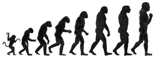
Likewise, design is a self-selecting, evolutionary act. This is readily apparent if we consider the artifacts presented during a typical design process. Artifacts are useful because they’re indicative of a greater idea. They’re not all roses. Precisely because artifacts are indicative, they’re not exhaustive. This is to say, artifacts cannot speak for themselves.
Once a deliverable is, well, delivered, the designer is encouraged to engage in a conversation around it. When discussion day (d-day) arrives, he narrates, explaining the thought process behind his recent work. As prudent as this sounds, though, it’s rarely a straightforward endeavor. Here, clients tend to ask for things that were intentionally avoided along the way:
Can we get a button or two for social media?
These conversations keep me up at night. Literally. It’s as though some clients can’t see the forest for the trees.
Their users will never know the turmoil because, importantly, users only interact with the final product of design. In the wild – in the real world – websites are expected to be “obvious,” to stand on their own two legs, and to speak for themselves. To that end, I work to turn my initial client conversations towards websites themselves.
Survival of the fittest
It’s always a good idea to consult the work of designers that came before us. After all, design is a difficult thing to do. Although the medium changes, the process (largely) remains the same.
Consider:
- The late Industrial Designer Henry Dreyfuss was always sure to include what he called survival forms in each piece that his firm designed. To Dreyfuss, a survival form was “some detail that will recall to users a similar article put to a similar use.”
- In his book Rocket Surgery Made Easy, Guerilla Testing Guru Steve Krug advocates beginning research by running a quick usability test on a competitor’s website. Not only does this help a designer compare and contrast their own work, it also helps clients understand why focusing on simple, commonly understood interactions is necessary.
What are examples of survival forms for the web? Taken into the interactive context, survival forms represent any interaction paradigms (as distinct from patterns) with which we can reasonably assume users are familiar. In light of this consideration, I’ve cataloged a fair few websites that I feel are ubiquitous. To wit:
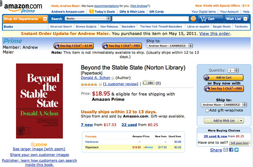
Amazon
Founded in 1994, Amazon.com brought the world product reviews, 1-click checkouts, and a collective understanding of the shopping cart metaphor. They are currently the largest online retailer in the United States.
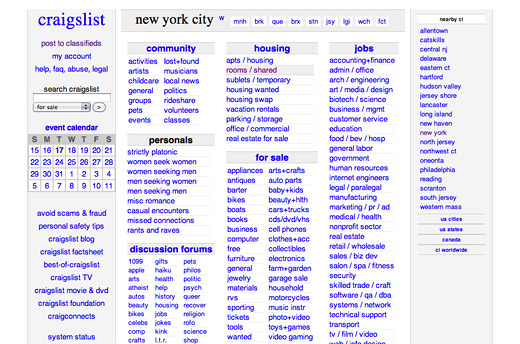
Craigslist
Despite its bare-bones aesthetic, Craigslist provides users with a digital analog of something that’s existed for decades: newspaper classifieds. With newspapers on the decline, they may be all that remain.
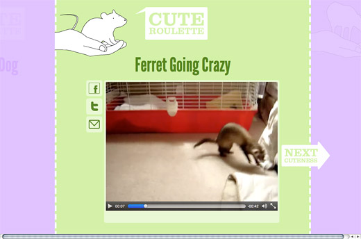
Cute Roulette
Cute Roulette is similar to a digital slot machine: every few seconds, users “pull the handle” and load in new content. The magic is in the discovery: what’s next? (See also: HotOrNot.com)
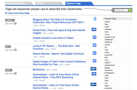
Del.icio.us & Digg
Del.icio.us introduced “social bookmarking,” a convenient way to catalog and share websites that intrigue us. Years later, Digg evolved the idea using the (then unique) concept of voting on a website’s content. Today, Facebook’s “Like” Button competes with both of them.
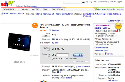
eBay
A self-described auction site, eBay defines much of what it means to buy and sell second-hand goods online. Users can literally set up shop. Ebay has also gone to great lengths to ease the more cumbersome aspects of auctioning: gauging a seller’s authenticity (by way of buyer feedback) and keeping track of multiple bids.
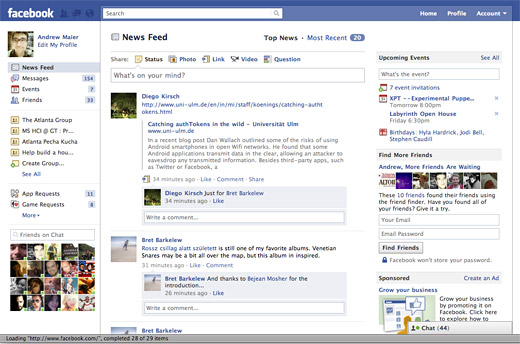
The ubiquitous social platform, Facebook defines most what it means to be a social network. Their website also serves as a great model for noded, distributed systems.
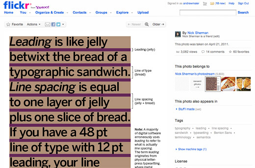
Flickr, Youtube, WordPress
The success of Yahoo’s Flickr service has proven social photography a viable idea. Similarly, Google’s YouTube gives us the concept of the viral video. Before both, WordPress allowed users to self-publish whatever content they’d like. (In other words, we’re all in publishing.)
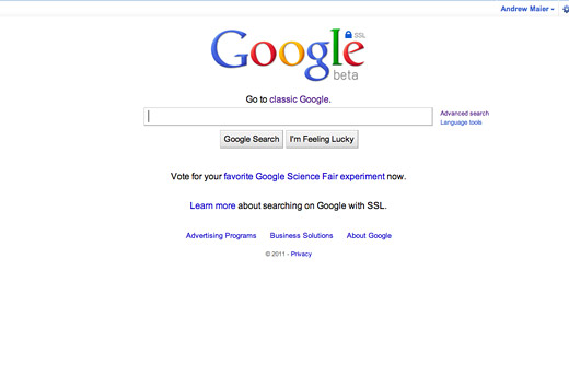
Such humble beginnings. Google‘s simple, intuitive bar sets the standard for search as we know it. Because of Google’s recent enhancements to their experience – incorporating autocompletion and instant results – users may soon expect even more.
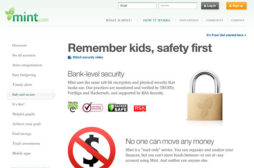
Mint
Mint has a stiff barrier to entry: users have to give this third party site access to their online bank account. Still, its users do so willingly. Mint’s use of form, color and copy teaches us how design can create a sense of security. Its users also appreciate interacting with disparate data in one convenient location.
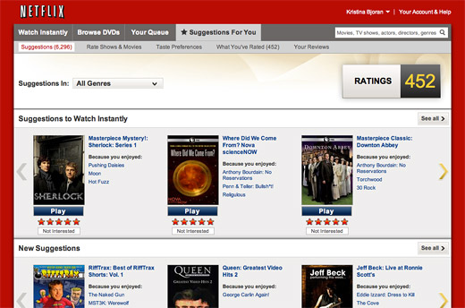
Netflix
Netflix‘s concept is simple – online movie rentals – but its interaction model is profoundly personal. Because Netflix collects information on every movie someone rents, they tailor their recommendations to a hyper-granular level.
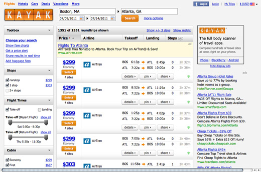
Kayak
Just as Mint.com allows users to see all of their financial accounts in one convenient location, Kayak allows users to quickly and easily compare flight & hotel costs. Their distributed search results even auto-update as users adjust their search parameters.
I could certainly go on, but I never meant for this to be a list post. My point is simple: design’s tropes, paradigms, survival forms, whathaveyou – those interactions that stand the test of time – shape our collective understanding of what it means for a website to be “usable.” As (yet another) example, if it weren’t for the iPod, the form factor of the iPhone would have been new to the world. Further still, without years of iPhone conditioning – Apple is genius at teaching people how to use their products by way of their advertising – the company would have had a tougher time getting the iPad off the ground.
That’s my theory, at least.
Returning to craft
It’s easy to get carried away with this thought process, designing solutions around the web’s biggest sites. Don’t. In borrowing from one of the many excellent points that Michael Aleo makes in his smashing post I want to be a web designer when I grow up, designers must always consider the context of the design solution we’re after. His words do this justice:
In the same vein, no company would suddenly give up its carefully crafted creative and regress to a template. Templates have been around for years, and no company with any kind of budget would use a $49 packaged solution from Monster Template if it can afford to pay someone to address its particular needs and mold a website to its content. A template doesn’t take needs or goals into account when content is pasted in. A good designer makes choices that a $49 template won’t make for you.
Although my list is far from exhaustive – and I’m curious to hear your thoughts, guys – design is most certainly a process. Whether it begins with a sketch or with a usability test isn’t the point. The final solution, the ones our users see, is invariably judged based on its own, unique merits.
Related Questions
This article is a bit broad in its scope becuase, initially, my thoughts centered around larger questions:
- Which version of Amazon sets the standard? Is it just the most recent one?
- How can we learn from the mistakes made by larger websites if they necessarily “cover their trail”?
- If interaction design is storytelling, what are its tropes?
- If Alice in Wonderland is considered a classic – its survived for over 100 years – which version does it justice: digital or analog?
