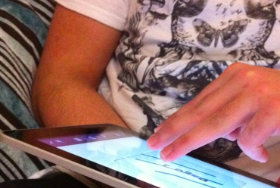
A participant during the Guessability Study
How do you come up with the right gesture for an app or a game? If there is no precedent, then you’re on your own. Here I’ll discuss a 4-step method that’ll allow you to create gestures for specific actions, with validation from end-users.
In the first part of this series, we discussed the importance of having guidelines for gestural tablet interaction. Now that we understand the need to get the interaction techniques right, we’ll learn how to create gestures for specific actions.
How to conduct a gesture creation study
The Basics
Gesture creation is a 4-step process. Each individual stage leads on and informs the proceeding step. This method can be used to discover gestures for more than one action; I used this process for 18 distinct actions during my study.

Setting up the Gesture-Meaning Association test
Guessability study
Show subjects a short, two slide animation: before-and-after screenshots that shows the outcome of the gesture. Here you can view the video I used for the zoom-in action.
Using an app that can draw multiple inputs at once such as Doodle Buddy, place the “before” screenshot as the background of the drawing app.
While recording the screen, ask the participant to draw the gesture that they feel would invoke that desired action.

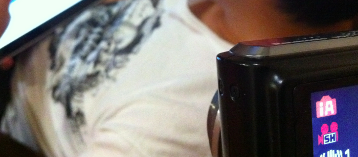
Setting up the camera to record the gesture creation.
Take a screenshot of the completed gesture and stop recording on the camera.
Ask the user to rate their created gesture based on the statement: “The gesture I picked is a good match for its intended purpose,” and rate the gesture on a 5-point likert scale from “Strongly Disagree” to “Strongly Agree.”
If you want to be able to identify similarities between participants, then you should aim to have around 10+ users for this stage.
Rating study
Now invite 3 other people to watch each gesture video and ask them to rate the effectiveness of the gesture for the intended action; use the same question that was asked in the Guessability study.
After all the raters have rated each gesture, produce an average score which will identify a consensus on whether specific gestures were a good match for the intended action.
Gesture creation
With all the information you have compiled from the previous two stages, you can identify similarities and issues from the collection of gestures created during the Guessability study.
In my study, for example, I noticed many participants were utilizing letters and symbols to represent certain actions. Therefore, these symbolic gestures were used for many of the gesture/action pairings I created.
Moreover, I noted that gestures that were used in advertising smartphones and tablet devices received high approval ratings; I therefore decided not to adapt or change gesture/action pairings that were already well-known.
For this stage in the process, the way you select gestures depends on your overall goals. For example, if you’re designing a game and you want the action to be challenging to invoke, then selecting the most popular gesture might not be the best choice for you. However, this process will provide you with all the information necessary to make these important decisions.
Gesture-meaning association test
So you have what you believe are ideal gestures for specific actions. Now it’s time to validate the gesture/action pairings you have created.
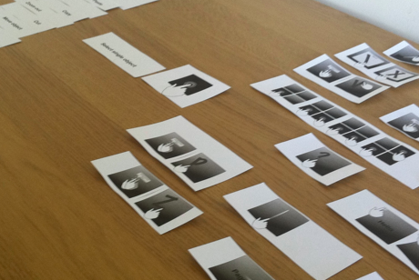
A small set of users—3 to 5 would be ideal—will be provided with several pieces of paper: half will be the names of the actions and the other half will be the actual gestures. The participants will be asked to match the gesture/action pairings that they believe are correct.

Setting up the gesture-meaning association test
This will allow you to identify the accuracy of selection, where you can discover which pairings were challenging for participants to match, and which ones were easier. Moreover, you can note the speed with which selections were made—were certain pairings selected through a process of elimination?
Final thoughts
This method can go a long way to ensure that the gesture/action pairings you are using in your apps or games are the best they can be.
There will always be actions that are challenging to depict with a gesture, yet this method allows you to identify these, providing you with opportunities to design around such constraints.
Give it a go.
Lead image for this article (on UX Booth homepage) courtesy of quinn.anya
Universal design considerations increasingly comprise a prudent approach to design and development for the web. Interaction designer Andrew Maier details some of the broader implications this has for user-centered designers.