After a long hiatus, UX Booth is rebooting monthly roundups. In these roundups, look for a broad range of (sometimes bizarre) perspectives on user experience from many different Web-based resources. We’ll try and make horizon-broadening fun.
In this month’s roundup, you’ll learn about teledildonics, find out that tossing an egg will likely cause it to break, and see an OS review that’s probably longer than the user manual (and way, way better).
Netflix’ Big Fail

Tara the Shiba Inu
UX luminary Peter Merholz of Adaptive Path shares his feelings about the recent Netflix developments on the Harvard Business Review blog. He argues that Netflix has gotten a bit carried away with its success and is officially failing the customer empathy test. Short post, but worth the read.
Search: A Biography

Wikimedia Commons
Aristotle once said that if you would understand anything, observe its beginning and its development. So that’s why we suggest you check out this post on the evolution of the Web search to see how humble search beginnings evolved into what they are today.
Telling a Story on the Web

orbitgal
As we’ve pointed out before, crafting an experience for the Web is like telling a good story. There are characters, appropriate settings, and a narrative. Thanks in part to his background in journalism and media studies, author Robert Mills discusses how designers can learn from other types of storytelling.
The Monumental Ars Lion Review

Well, it’s sort of a lion.
Emuzesto
Behold the beast that is the John Siracusa review of Lion (from Ars Technica). While the article is obsessively exhaustive in all aspects of the most recent Apple OS addition, there are great bits on new interactions and interfaces. Also, bonus points for a Game of Thrones reference on page 13 (of a whopping 19).
Instinct in UX (it’s science!)

StaraBlazkova
“If you throw a rubber ball, it will bounce. If you toss an egg, it most likely won’t,” says author Taylor Bastien, which (hopefully) seems obvious. But he makes his point early in this article that instinct and intuition is important in all experience, especially those that are designed. Bastien delves into some psychological principals behind human behavior, and it all makes for a great read.
An Unlikely Tale of Usability Triumph

Killiondude
The holy grail of HCI is to bridge interaction gaps between humans and computers—issues that experience designers face every day. Christopher Mims shares with us a short case study about a triumph in usability design through teledildonics. We’re going to let you find out for yourself what that word means (hint: it’s what it sounds like).
A Chat with Mike Kruzeniski

Jan Mehlich
Core77 interviews Mike Kruzeniski, Design Lead at the Windows Phone design studio out in Redmond. He shares his personal outlook on interaction design and usability, and ends his interview by quickly explaining the 5 things that every designer should know (spoiler: knowing the basics is important).
That Table Looks Wobbly…

Simongibbons
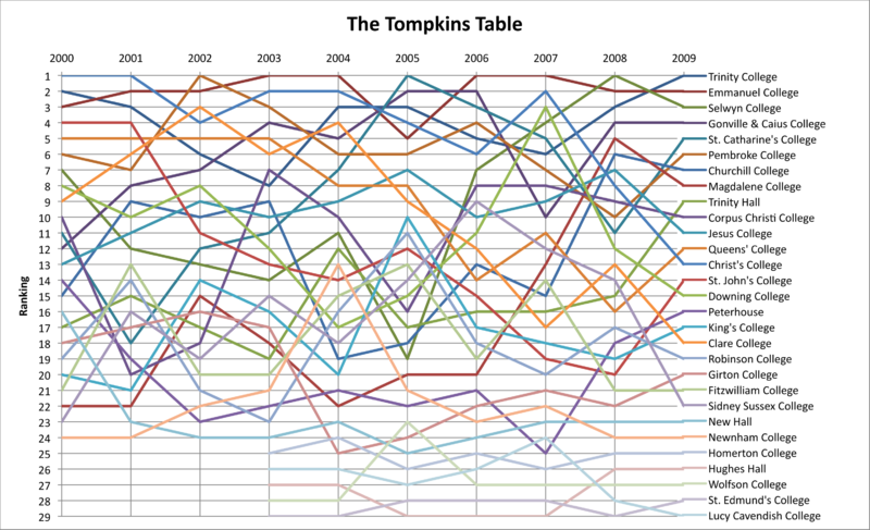
Tables are pretty much poised, by nature, to be usability troublemakers without the proper care and attention. This article takes a look at a few good practices to adopt while creating tables so that they’re not only successful sorters, but also user-friendly.
A Man’s Quest to Pinpoint Mobile Context

Mohammad Nowfal
Mobile context: what does it mean!? Though fairly weighty in theoretical discourse, this thorough post by Jason Grigsby examines where the mobile medium fits in with the greater media picture. He includes a good deal of context to his argument as well, so make sure you’ve got time to get happily lost in design conversation.
.net Usability Case Study

After running usability tests before launch, .net Magazine documented the testing process in this informative post. Author Alastair Campbell outlines how .Net used A/B testing, eye-tracking, and Google’s Website Optimizer to reach their final product.
Moving on
Do you feel slightly more enlightened? Let us know what you think in the comments section. Also, if you think we missed something really, truly amazing, let us know at our resource section. And be sure to see all the other great resources that didn’t make the spotlight cut.