Everyone has unique expectations when it comes to booking a vacation – some want to be swept away while others seek complete control. It can be a truly exhilarating experience, as long as the system facilitating it isn’t too frustrating.
In the past, a travel agent was the person who directed the booking process, taking the research stage out of the customer’s hands, but this has evolved over time. Travel reservations were made by computers since around 1963, when Trans-Canada Airlines helped develop ReserVec—a simple but fast booking program. This system had many limitations on how it stored data, but it paved the way for more complex multi-tasking booking systems that are used today.This ongoing development of computer reservation systems made the move online a natural leap, and today, every part of the booking process is closer to the user. They are finally in control of their travel plans, and online booking is now one of biggest revenue streams for the hotel and travel industry.
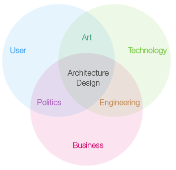
Turning user expectations into a cohesive interaction is a huge undertaking, and one I’ve enthusiastically approached while developing UK hotel chain websites. I’ve discovered that one of the more indispensible processes is what Alan Cooper describes as goal-oriented design. User goals are the primary focus in Cooper’s approach, but it also mandates that the user, the business, and the technology be considered together.

Business and technological concerns should also be taken into consideration at the beginning of a project.
This approach is ideal for a hotel booking site as it gives the designer a means of understanding how the underlying business structure (for example, how the central business organization interacts with the hotels, how rates are set up, child policies, the services offered, etc.) needs to gel with the existing reservation system to help create a smooth booking process that satisfies users and supports business objectives.
Yes, this stuff tends to get complicated. But by understanding user expectations and behaviors, we can then create a story for them. Then, when we know what the user wants we can break down all the elements—user requirements, business structure, services and objectives, and technical considerations—and start creating really specific requirements for what the site needs to do (and how we can go about doing it). I’ll go through these step by step, and then talk about the design process that I’ve found works best.
Of course, consider the user
All hotel site design begins by addressing their users’ needs and goals. It’s essential to identify the specific types of customers unique to each brand. For example, Four Seasons is a luxury brand aimed at leisure travelers—think spa retreats and weddings—whereas the hotel chain Ibis is geared towards business-savvy travelers. In other words, different users want different types of information to help them make their decision.
To be clear, that decision is booking a room, and our goal is to make that as easy as possible. Fortunately, regardless of user types, most people take very similar steps to get there. My own research indicates that users follow these thoughts and actions:

The user’s goals will lead to questions that the booking process should answer. Each of these questions and answers become part of the user story. So, let’s take a look at each stage…
The arrival
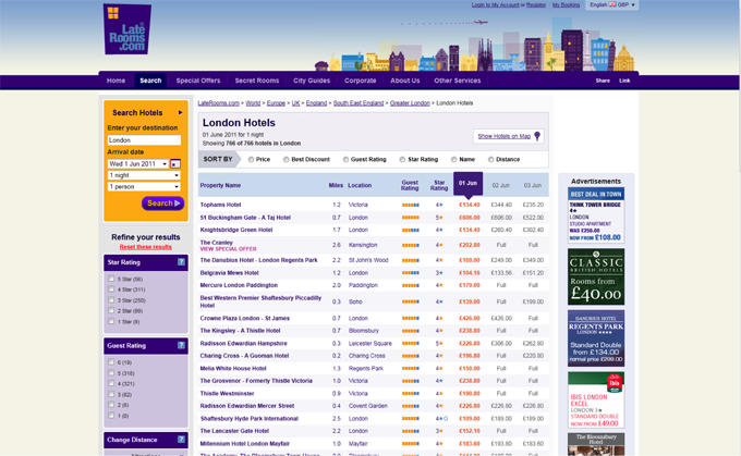
There are many different ways that a user will arrive at a hotel site. Most people I’ve spoken to will use a search engine to find hotels and destinations that suit them or an aggregator site (such as Laterooms.com) to find a good deal.

Laterooms.com is just one of many travel aggregators that have become almost ubiquitous with the booking process.
I’ve also seen site visitor statistics showing that direct visits to a hotel site are much lower than other entry points and the chains I’ve worked with often confirm that they have a low percentage of return bookers. It’s unclear as to whether this is due to user’s not returning directly to the hotel website, or due to no loyalty for hotel chains; however, every start-point of the user journey should be considered when developing the site architecture and content, and it should be clear at each point of entry how users can achieve their goals.
Checking in with easy-to-find info
According to a Toluna survey of over 2,000 UK consumers, 53% of respondents found and booked their holiday online, while 30% conducted online research first, then booked their reservations offline. This means that over 80% of users research their hotel and travel options online, making this a very important step in convincing the user to book. Never assume that users will have researched all the hotel details, such as rooms and location, before they start configuring their booking; some users will explore a site while others will dive straight into the booking processes expecting the information they want to be there. In other words, you should always be thinking about what useful information will help the user move on to the next step.

Where do I sign up?
InterContinental Hong Kong
The types of information they’ll be looking for are:
-
The emotional
The kind of information users search for is also really important to consider. Pictures are consistently shown on usability testing as one of the first things users look for—not surprising, considering the emotional impact they can have on us. The Toluna survey supports this too: 59% of respondents used photos of the destination and accommodation to help them choose a particular place to book from a travel website.
-
The rational
Users also tend to look for more rational information before making a decision, and what better source than the crowds? 39% of the users on the survey went to TripAdviser for reviews, and a Travel Zoo survey found that an astounding 81% of respondents also used hotel review sites.
Price is of course a significant deciding factor. The Travel Zoo survey found 64% of users said price was more important than the destination. Finding a good deal is also important; the Toluna survey showed that 56% said their key reason for booking online was to find lower prices. The increasing popularity of hotel and travel aggregator sites also demonstrates the importance of price, as these sites facilitate research and price comparisons.
How the user chooses
We all like things to be easy when we buy online—an online shopping experience should never make the user feel disappointed or frustrated and should always be credible and trustworthy. Booking shouldn’t be any different.
Clear information is vital, and the Toluna survey agrees: 64 percent of users would abandon their booking if hidden charges were discovered, or if pricing was generally unclear. 19 percent would drop it if they couldn’t find enough information.
Availability is the next user need that hotel sites must satisfy, but this can get quite complicated in a hotel booking process. Most online shops selling physical goods have stock—the number of items in the warehouse. There is a fixed quantity and a set price. Hotels and airlines, however, have a multi-faceted inventory – rooms categorized by type (such as double, single, deluxe), with various rates (like advanced booking rates, special offer rates or flexible rates, and availability). Hotel inventory requires much more management and has many different considerations when dealing with the display of inventory and availability. This can lead to some interesting challenges for the user interface, challenges that many hotels are still trying to get right.
Flight-aggregation service Hipmunk takes a novel approach to this problem, displaying travel data so it’s easier for the user to understand. Inventive solutions like this really improve the whole booking process, not to mention that they encourage users to recommend and reuse the site.
Book ’em
The actual booking is where the interface design really needs to work hard. To get users from Point A to that final confirmation page, the process needs to be as smooth as possible. Making the process simple and effective for the user is your task, but what makes the user interface more complex is adhering to the hotel business organisation and technical considerations that Alan Cooper’s goal oriented design process brings together.
The business challenges
Before mapping out the booking process, there are several challenges that should be considered. I’ve discovered that hotel business can become very complicated; along with multiple hotels, there could be multiple business rules, such as child policies, cancellation policies, and how room types, rates, and offers are managed. Procuring this type of information from the business is often a challenge of its own, as the details can vary across each property and may not be held in a central location. The best way around this is to ask questions (rather than assume) all throughout the project – from wireframing and prototyping to final development. This way, fewer problems will arise when the system gets tested.
The technical challenges
Hotels, as well as other travel sites, use computer reservation systems. The online booking system we create needs to hook into this existing reservation system. This means that we must thoroughly understand how the reservation system works before beginning to design the interface for our booking system. Getting as much documentation as possible beforehand and ensuring the developers are involved in the design process makes understanding the limitations and requirements of the system much easier.
Booking doesn’t need to be the end for the user journey within hotel websites. This is the fun part! Testing has shown that users respond really well to useful suggestions and information to help them plan their holiday, so think about what’s next—cross-sell more opportunities, be part of the holiday planning process, and find ways to keep the user engaged with the brand. This will only help to improve brand recognition and loyalty by keeping the hotel website in the front of the user’s mind.
Now you know…
Designing a booking process can be quite fun—it’s interesting and complicated, and overall you’re delivering something that should make people feel good. It’s great being involved creating a new process from start to finish, thinking about the user journey and how to create a better user experience. Through the 3 hotel projects I’ve been involved in where we created the full online booking process I’ve found that even though I’m getting closer to a solid framework for it, there are so many things that need to be considered for each individual business and user group.. Framework or not, this is still a challenge. Technology is advancing too, and with that, the future holds the opportunity to create much more efficient, innovative and richer experiences.
So, think of the user. Think of the business. Think of the technology. By marrying these elements, you’ll be that much closer to bringing your user interface together to make something elegant, usable and successful.
Information architecture is an often misunderstood job title. Are they designers? developers? managers? All of the above? In this article we'll discuss what information architecture is, why it's related to usability, and what are the common tools/programs used in information architecture.