The project’s scope is firmly rooted in well-considered facts. The approach has been validated with consumers and business owners to ensure that it will deliver value. The project budget is based on accurately crafted estimates created by well-informed technologists. Last but not least, the timeline has been determined by the number of resources available to do the estimated work.
I have never been on this project. From conversations I’ve had with others, it seems that projects such as these are as common as spotting a unicorn flying over a double rainbow. It’s far more likely that a few people were handed a project charter, brainstormed a list of features that got passed around and mysteriously became the project scope. Estimates are based on whatever details can be found. And the deadline was set before the project funding was even approved.

Gail Swanson
No matter the methodology used, members of the project team do the best they can with what they are given. Whether challenged by the release date, resource availability, a lack of information, or a low budget, it’s usually up to the team to establish priorities for the features in order to determine the project scope, plan releases, or plan a sprint. The team will ultimately be more successful if it considers what will make the product successful rather than narrowly focusing on a tactical plan for knocking out the to do list set before them.
I used to think that as a user experience designer my only concern should be representing the users’ interests and fighting for the features that benefit them. This approach will put you at odds with those who represent business interests and technical resources. ‘UX versus The World’ is not a recipe for success and harmony. The different skills brought together on a project all have to compromise to create the best product given the current conditions.
UX professionals are well suited to be the facilitators of this compromise. Our role requires us to communicate with many constituencies and develop empathy. We can direct the team toward the solution that delivers the most business value through the best user experience possible. Some of the best guidance to identify high priority features comes from the research you have about your users.
The more firmly you root your priorities and scope in real data and information, the better decisions you will make. You will also minimize the number of times you revisit and debate those decisions. Product decisions based on gut feelings or personal opinions are more vulnerable to fire drills and occupy hours with circular debate.
What information do you need about your users to determine feature priority? The most important details for this exercise are the ones that define the user’s goals and needs that are most closely related to the project’s goals.
Confirm that the feature will be used at all
According to the CHAOS Summary 2009 Report, “50 percent of software features are not used or wasted, while other features are sorely missed.” That adds up to a lot of unnecessarily complex software. How can you predict what people will use? Try a round of Contextual Inquiries where you watch people perform the tasks in their normal environments, their offices or homes. Do they use similar features on other websites or ignore them altogether? Do they already have a tool for that microtask that they’re happy with, one that integrates well into their workflow?
You can also test the feature with paper prototypes and gather feedback on whether the feature is desirable. Ask the participants for examples of how they might use the feature. If you are redesigning an existing application, benchmark analytics can reveal current functionality that is not being used and should be cut from the new version.
Frequency of Use
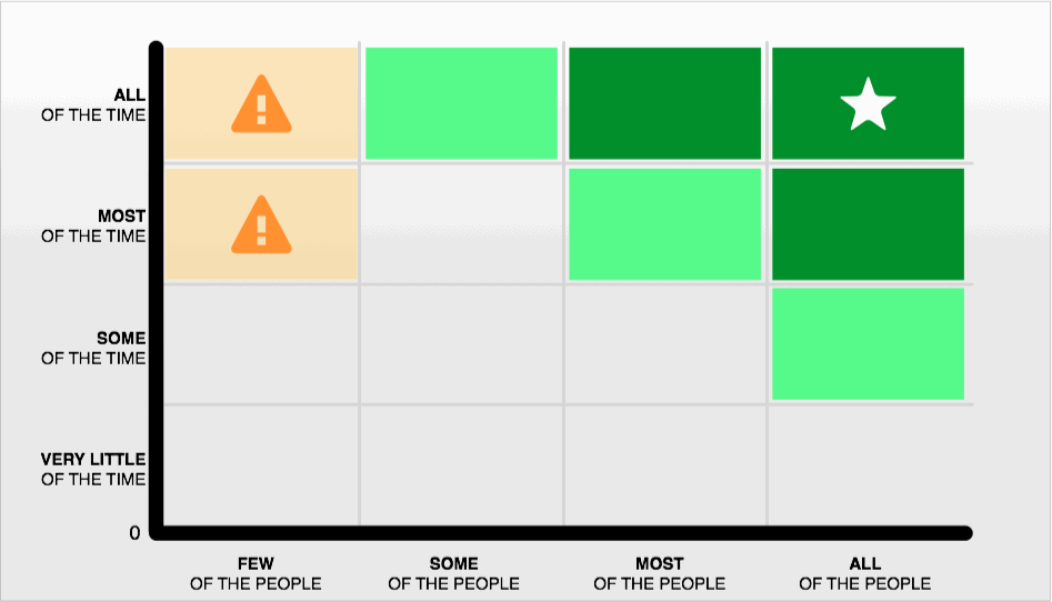
Features used frequently should be given high priority. It’s a pretty straightforward idea, but one not frequently mentioned in scope discussions. Des Traynor created a grid to evaluate features according to how often they are used and by how many people.

Image copyright @contrast. Used with permission.
“The amber sections represent danger. If you’re building features that only a small sliver of your customer base heavily depend on, your product is doing more than it should. These customers won’t be happy if you remove these features, but they’re worth very little to you.”
Holding up the functionality against your personas should give you a pretty clear picture of how often someone would be using the feature, and knowing how your personas map to your actual user population will reveal the number of users that would be exhibiting that behavior. This is a useful perspective when you need to trim scope from your project. Odds are that there is a small set of features in your product that people will use frequently. From both the user and business perspective, these features deserve the greater proportion of your attention and project budget.
Value — Forget the long tail
“5% of your website produces 25% its value.” According to Gerry McGovern, a very small portion of your website is delivering a large portion of its value.
Shift your focus from a diverse offering of content and features and hone in on the limited areas that are getting the job done. These areas tend to be the ones most frequently used by the greatest volume of users. They might also be features that are the most essential for completing the user’s goal or delivering the business value. The shopping cart may only be used by 15 percent of your site visitors, but they are the users that are putting money in your pocket.
Not every problem needs a solution
Traditionally, designers have tried to ferret out every possible scenario that could play out with their design and ensure that every pathway is accounted for. This requires a lot of effort. Plus there’s always that looming risk of finding the edge case that screws up the whole design. You add complicated features and options to your website just to make sure that something that a user is unlikely to do won’t trip them up. Before you add features that will make things more difficult for your most frequent use cases, consider the results if you did nothing.
If this is truly an unlikely scenario, is it important that the error is prevented? Will it prevent the user from purchasing your product, or will it merely require that user to undergo a few extra clicks to finish the task? What will the user experience if they go through the scenario? It may cost you more to prevent a handful of users from hurting themselves than the benefit your business will gain from satisfying them. Graceful failure may be the most appropriate route.
Cost
User research often uncovers the costs of a bad user experience. The most obvious costs are incurred directly supporting users through call centers, robust training and documentation. Costs also increase from low productivity, inaccurate data, bad sales leads, high user abandonment, and low morale when the product design does not meet the user needs. Features and design solutions that reduce these costs may warrant a high priority.
Task Priority
How important it this task to the user? Take a look at how someone currently gets this job done. Examine the current process that would be replaced by the feature.
- Is it a pivotal part of their role and the primary way that they add value?
- How painful is the current process for completing the task?
- Can the user accomplish their goal be without the feature?
Additional consideration should be given if the current process takes up a lot of the user’s time and leaves them feeling that their effort didn’t accomplish anything of value. Does the user currently have to undergo a lengthy process that includes redundant data entry in multiple applications?
Problem Severity
How bad is the problem that the feature solves? You can actually calculate the severity according to the number of users that encounter the problem, how often then encounter it, how disruptive it is, and whether a user will repeatedly experience the issue or be able to learn and adapt to it after a few encounters.
Do the user goals align with the project goal?
This can be a tough one for UX designers to accept. The feature may be important. It may be a great idea. But does it belong in this project? It’s easy to get stuck in the mindset that now is your only chance to deliver to your users. You’ve got to make sure you get all the features in with the first release. Relax…breathe. Software changes over time. We learn a lot when what we build gets in the hands of users. You may change your mind about adding that feature or find that something else will work better. Stubbornly fighting for features that don’t move you toward the goal at hand is not a good way to win friends and influence people. Place priority on making the features that align with the current business goal the best that they can be. If your users still need that other feature, campaign for a project to address it directly.
Product Adoption and Customer Retention
There are some features that users just won’t do without. Sometimes the little things are the ones send someone on a quest for similar app that does what they want a little easier. Mobile apps and shopping websites are especially vulnerable to this. If leaving out a feature, like integrating to a map application, will cause your users to walk away, it deserves a high priority.

Gail Swanson
Many designers like to begin their process with a blue-sky view rather than constraining themselves by technological constraints. Unfortunately, these designers set themselves up for arguments and frustration because the context of the project was not considered. Blue-sky designs get picked apart and implemented piecemeal. On top of that, developers have to save time by implementing less costly versions of the carefully crafted interaction design. What ships falls somewhere between a Frankenstein monster and Swiss cheese, neither of which provides much business value. It doesn’t matter that your design carefully considered your users’ needs. What matters to your users is the quality of the product that shipped.
Waterfall projects are often derailed by frequent shifts in scope. Agile teams fall prey to similar issues when user stories are prioritized according to stakeholder opinion or worse yet, political motivations. What feels like the most important feature to deliver today, is heavily influenced by the most recent fire drill and the CEO’s shifting focus. Add on what you learn during the project and it can start to feel like your target will never stop moving.
A project prioritized according to user research has solid footing. When the winds of change blow, you will have criteria established to justify staying the course or make the right adjustments.