To build a mobile site or not to build a mobile site; this is a question at the forefront of many a discussion. There is, however, another option: responsive web design. When, why, and how should you go about designing a responsive website?
With mobile internet users set to surpass desktop internet users in the US by 2015, with tablets becoming more popular, and even with TV internet usage increasing, it’s important for companies to provide a great user experience for all their visitors no matter what device they’re on. How does responsive design help us do this? Well, by allowing experts to create the best website solution similar to the ones at https://luther.tech/ that is flexible for different screen widths. It uses flexible grids and clever styles to present the same content to a user, but displays that content in a format that suits the width of the device. Check out this beginner’s guide to responsive web design for a more detailed introduction.
Why should you design a responsive site?
There are many options to consider when a client asks for a custom ecommerce web design, and the suitability of these options depend on the business requirements and budget; it’s also important to consider any existing solutions or sites they already have. Creating a responsive website isn’t a complete mobile strategy, and won’t answer every brief, but, especially if you are starting a website from scratch, you should consider it as a very serious option.
So why would you decide to create a website this way?
You’re starting from scratch
Developing a whole new website or web application is a challenging process. You won’t know if the site will be successful until it’s live and in the world, so creating a separate mobile site or a mobile app in tandem with a website project could be a big waste time and money. Beginners can build website with a builder. It’s more efficient to get your new site performing well, especially with the assistance of professionals who are adept at custom wordpress website design, before you create an additional mobile site or application.
You want to keep costs low
Solid responsive solutions require additional design and front-end development time, but doesn’t too heavily impact application development. It could take around 20-30 per cent longer to develop a responsive site, but it’s still faster than creating an additional mobile site or app. Developing a site this way also means that you only need to develop, manage, and maintain the one site, so it can reduce these costs too.
You want it to work even when new devices are released
A mobile site needs to be able to recognize the user’s device; when new devices are released, the site needs to be updated. As the responsive solution only recognizes the browser’s width, no new updates would need to be made. This means it’s much more future-proof and scalable.
The process
Let’s talk through the process of creating a responsive website using a hotel website example. This last September, Equator released the new Macdonald Hotels website. Macdonald Hotels are a UK hotel chain with 47 hotels and resorts across the UK and Spain. We created the new site for them that included a new site structure, extensive hotel content, and a new booking engine. Here are the steps we went through and also some considerations you should think about when designing a responsive website.
These are the key steps:
- Research/scoping: Understanding the additional requirements for a responsive site
- Wireframing: Grid structures and layouts for the site considering different screen widths
- Look and feel: Style considerations
- Building the site: HTML & CSS issues
Research and scoping
Research is always a very important stage in the design process so it’s worth putting a little extra consideration into the people who will be using different devices. Understanding how these different users may want to use the website on a variety of devices will help you to decide what the priorities are on the project.
-
What different goals will a user have on different devices?
Questions like this are starting to become more redundant. In the past we’ve assumed that mobile users have been task-driven, e.g. I want to get the hotel’s address; I want to book something quickly. But now people on any device are just as likely to leisurely browse the Internet as they are to need to complete a task quickly. It is worth considering though, as thinking about users’ goals in this way could help you prioritize content for the site, irrelevant of what device the visitor is using.
-
What technical considerations do we need to make for functionality and content?
Think about how any complicated functionality may work on different devices. Although a responsive site will only change the CSS depending on the width if there are complicated elements that rely heavily on JavaScript, they may not translate well on a smaller device and it could be worth hiding these.

Wireframing
The logic behind how the styles should change can be a bit hard to define and the magic of it will really come out in the build of the site, but we need a way to start defining the different width stages of the layout. We choose to look at 3 screen widths, a desktop, iPad and iPhone. We felt these covered what our requirements were, but for your project you should consider what widths are important for you to think about—you may even need to look at bigger screen widths for TV internet usage.
At this point of the project you should already the key templates that you’ll need to wireframe, but you shouldn’t need wireframes for all these templates in the different widths. The main goal here is to help define the logic behind how the CSS will change the look of the page, so focus on pages that have very different layouts. For us we looked at the home page, all the booking process pages, the hotel pages, offer pages as well as some generic layouts. Each of these covered our different column layouts, content types and key functionality.
-
Getting started
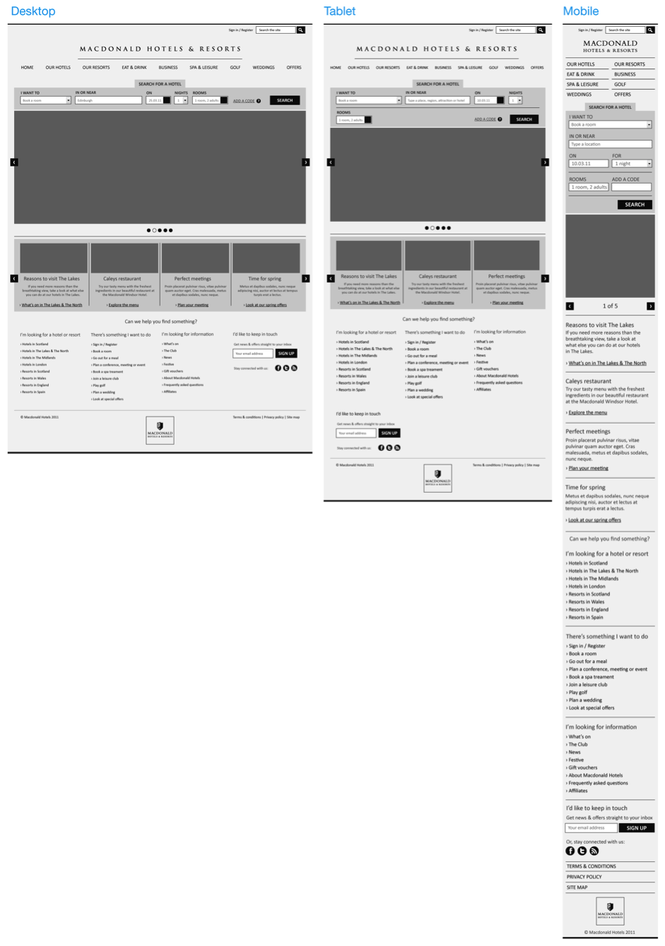
First, define the grid structure for each key width. We created 3 pages for the screen widths 1024px (Desktop), 768px (iPad portrait), 320px (iPhone portrait), then we needed to define a grid structure for each of these widths.
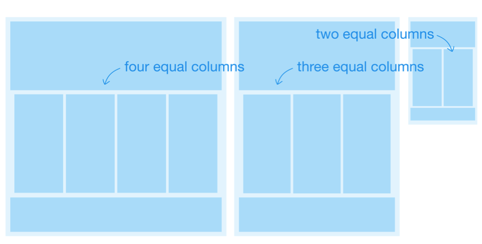
A very simple grid structure with equal column widths on each layout made it easier for us to plan for components wrapping as the width changed.
-
Creating the master template
As you create each wireframe you’ll need to think about the columns and how the components within these will adapt as the page width shrinks&mdashe.g. what happens When you have less space? If you have four columns of content? When you change to a three-column width? There should always be ongoing communication between the designer and the front end developer to answer any issues about what you can do with components visually and in the CSS.
-
Starting on the home page
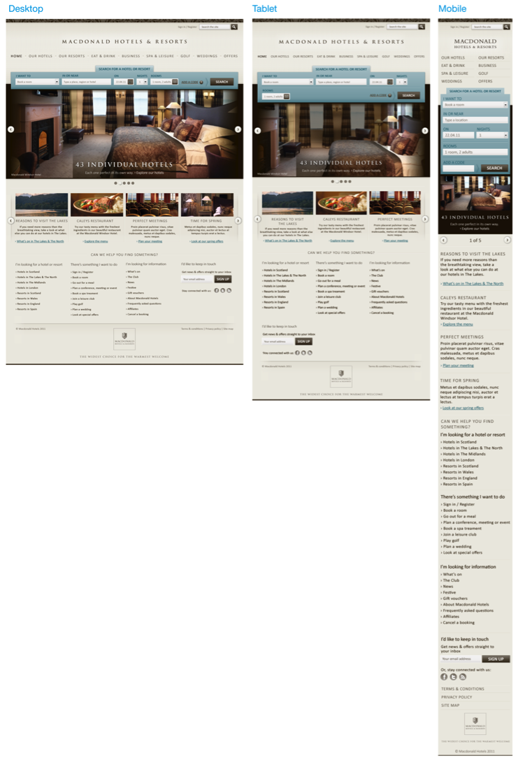
You may feel like there is another page that has a higher importance than the home page, but this was where we started. Here is our finished original wireframe. You can see the mobile page length is quite a bit larger due to the content wrapping over one column.
-
Main navigation
We created a simple horizontal top navigation that would have a fluid width to change with the screen size. As the screen reduced the menu items would get closer together, then wrap on to the next line when necessary. This works for desktop, laptop and tablet widths, but going further down we wanted to create a menu that would suit the devices better. This gave us the menu spilt over two columns for the mobile device.

Other header components are aligned right and would just shift along as the page width reduced.
Remember when you are styling the navigation to think how it will work as the screen sizes changes. Certain styles, such as using tabs, may be difficult to get to work and look good as the screen width reduces.
-
Footer
Our footer is pretty simple, just think about what content you want and how it will change as the width changes and the columns reduce—this could be as simple as components wrapping underneath each other.
-
Other components
Our simple grid structure made it easier to plan out our components. On the home page we used a horizontal scroller that had four components that would scroll across on a click. Our tablet layout let us keep this component but just amend it to only show three items, then on our phone width we removed the scrolling functionality completely and instead displayed each item vertically. Each component you design may require different behaviours, so think about how the visitor will want to use the component on different screen sizes. Phone users are more comfortable scrolling down a page than using small buttons to interact with the page.
-
Test it straight away
As soon as you have created your first wireframe test it on the relevant device straight away. It’s easy to get the image on a simple web page and take a look at how it looks and feels to scroll down. This will let you know early on if your wireframe is working. Testing in this way gave us clues really early on what was and wasn’t working. If you look at this wireframe you should quickly see our first issue.
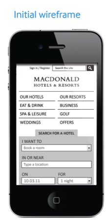
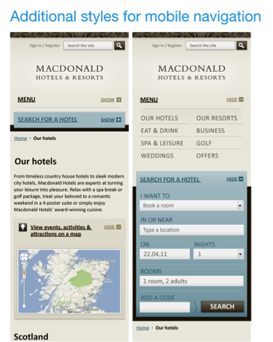
As the user navigated through the site they would only see these first two page elements&mdashthe navigation and the search panel. This means that the user may be unsure if the page has changed, as well as where they actually are on the site. This was solved simply by putting these items in show/hide panels—letting the user get into the content much faster.
Adding the tablet and mobile versions to your user testing process will give you a lot of useful feedback too. Now that your wireframes are created, tested, amended and approved it’s time to make them look good for all your screen widths.


Look and feel visuals
It isn’t necessary to create visuals for every wireframe. The main objective is to cover all the styles that will be required to create the HTML and CSS. There will be a little bit of a crossover for wireframes and visuals, some styles that will be required for the mobile where there wasn’t a need for an initial wireframe.
-
Styling the page: Think about keeping your styles simpler for your mobile version—what’s great about CSS3 is that you don’t need lots of images to get great styled effects, but these still take a bit of time to load.
-
Thinking about font: Make sure your font sizes are going to be readable on each device. They’ll have to be much larger on the mobile device to ensure readability.
Also, be prepared for your visuals to change when it gets translated into the build of the site. There always should still be balance between what looks good on a flat visual and what will work when the site is being developed. The final site isn’t too far away from our look and feel visuals, take a look here and you can compare with the live site.
Building the site
Building the HTML and CSS is a challenge all of its own, so I won’t discuss this is much detail, but here are a few things to think about.
-
The impact of image sizes: The site will need to load in the full size images even if the CSS scales them down, so try to keep image sizes as low as possible. There can be some nifty JavaScript tricks though to make the site run smoother. On this site we initially loaded in the smallest image size, and then used JavaScript to decide if a larger image was then needed.
-
Use advanced CSS:
It’s important to get the client behind the idea of using advanced CSS styles, allowing the site styles to degrade as the browser capability does. This lets you keep site loading times low. -
Constant communication is required: The project will always go smoother if the team speak to each other, so from both designer and developer it’s good to discuss problems and solutions as soon as they turn up.
It’s worth taking a look at our front end developer Jamie Boyd’s take on the front end development of the Macdonald Hotels website for responsive design.
So what does all this mean?
If you are thinking about convincing your client to have their new site designed and developed in a responsive way, firstly you should consider if it really is the right solution for them, then you’ll need to be able to persuade them of the benefits and communicate that it will add more time to the project. But, I do believe that this is how more sites will be developed in the future.
We’ve all learned so much on this project about developing a responsive website. We were lucky to have a client who was as keen as us to create something new and innovative and from that we’ve created a site we’re all proud of.
Image on UX Booth homepage from needoptic on Flickr.