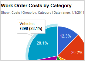
Building chart prototypes is often tedious
Ever had to create a performance dashboard for a group of stakeholders? This was precisely my task this last fall. Using Axure RP and Google Charts API, I was able to create an interactive prototype that helped our team iterate towards a more informed solution.
Most designers might sketch a static mockup and call it quits but I – like many stakeholders – suffer from a condition known as Low Fidelity Impotence (don’t worry, it’s not as bad as it sounds). People with Low fidelity impotence have difficulty understanding designs without an interactive prototype. In other words, they need to know what’s behind every link or button and they get hung up on the lack of ‘sexiness’ in the prototype.
In my case I needed to build a prototype of a performance dashboard portal for our flagship application. Stakeholders needed this dashboard to:
- Display pie, line, column (clustered and stacked) charts.
- Display mouse-over hints on chart elements.
- Provide a method to change chart metrics.
- Provide a method to change the chart type where practical.
We also work at breakneck speeds, which meant that I needed to get to realistic ‘sexy charts and graphs’ as fast as possible.
Research
I could accomplish this in a number of ways, however, first I always find it important to consider how this prototype will get used. I knew we’d use it in design meetings and to communicate functional requirements to developers as is usually the case. As well, because this is a charting tool, we desparately need to test the viability of the design on real life data. Beyond that we’ll also use it to further refine the sales pitch, value prop and leverage it in marketing teasers to get the customer base excited.
To build something like this in a condensed timeframe is a tall order. I’m lucky enough to be in a position where I have a keen sense of what the market needs, what works for our typical customer data, as well as the limitations of our development budget and skill set. I thought it prudent to take this opportunity to evaluate a charting/graphing technology that we might use when we get to the development stage.
Our application currently uses SSRS (SQL Server Reporting Services) for on demand reporting, so I knew enough about SSRS to rule it out as not being sexy or responsive enough for a dashboard like this. I really wanted the visuals of Highcharts JS but I wasn’t really sure where to start as a non-coder. I’d been reading recently about improvements to Google Charting and Visualization API so I decided to take a look. I eventually chose it because:
- It’s free. You can’t beat that.
- It’s publicly accessible.
- It’s well documented.
- It can easily connect to google docs data sources (important for building data-bound prototypes).
- It has a ton of charting options The ChartWrapper class was helpful for a non-coder (hack) like me.
- If it was eventually chosen for development of production application, leveraging the ever evolving and improving google ecosystem is probably a good move.
Putting the Pieces Together
After reading up on the API and spending some time browsing though their playground, I formulated a rough stategy on how I would use this, along with Axure RP to do my bidding.
A Quick Note About Axure RP
For those unfamiliar with Axure RP, it is a robust software prototyping tool capable of web, desktop and mobile prototyping of any level of sophistication and fidelity. I consider Axure RP a tool for non-coders. If you are skilled with html, javascript, and css, I wouldn’t bother learning Axure unless it is a job requirement. Often, after struggling to force Axure to emulate a common web interaction I often think ‘Why don’t I just learn to f#$%ing code!?!?” Basic application functionality is a snap in Axure, but it becomes increasingly difficult the more dynamic the requirements or your app, such as drag and drop, self healing lists, expandable and collapsible panels etc. All of the modern ‘ajaxy’ web interface stuff is possible with a large upfront time investment, and subsequent prototypes will benefit from the reusable widgets you can create. Any graphic resources that you’ve built in Photoshop or Illustrator are easily imported into Axure, however, from what I can tell, Axure RP creates no reusable code. I gravitate to Axure whenever static wireframes will not do justice to the concept, when the actual interaction with the application is the most important part of the design.
Now lets move on to the rest of the steps in creating this prototype.

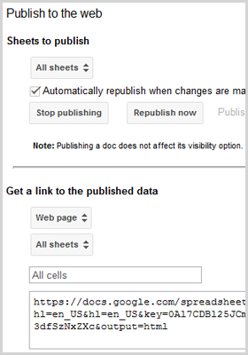
Publish Google Docs spreadsheets
Creating Google Spreadsheet Data
Being able to create live data in a standard google docs spreadsheet was critical for testing the google charts applicablity within the context of our software prototype. While browsing the google charts api, I knew a chart could use a spreadsheet, sub-sheets and cell ranges as a data source so long as it was published. I created the spreadsheet, with smartly named sub-sheets with each sub-sheet representing a variation on the chart widget data. Some sheets were to analyse costs, some were for labor time, some contained monthly trend data etc.
Chartwrapper with Remote Data
Now that I had my data, I could use the tools available in the google code playground to generate html code to render these charts. My assumption was that each sub-sheet in my google spreasheet would require a separate HTML file to render the chart in an Axure Dynamic Panel State. I got to creating my html files with names matching my google docs sheet names.

Configure your html files to connect to the published spreadsheet data
Creating Axure Dynamic Panel States and Inline Frames
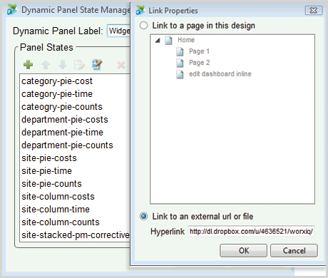
Axure uses something called Dynamic Panels to which you can add items, states and assign properties. In web development terms, a dynamic panel would typically be a div. I built each of my dashboard widgets as a separate dynamic panel, with a panel state representing each chart variation I wished to emulate. For ease of maintenance, I ensured these state names matched my HTML file names mentioned above, as well as the sub-sheet names in my google spreadsheet.
Now, each panel state needed to contain an Inline Frame (iframe) referencing my external html files. I was able to use some of the On-Click Case logic in Axure to define pick list values that would immediately trigger the chart to change as though it were a working application.

Axure panel states contain iframes referencing the chart embedded html
The Build Out and The Pay Off
I’m a religious time tracker, using a tool called Grindstone 2 to help me understand where my time goes during each day. I broke this prototype into the logical sections inside Grindstone, and here’s the breakdown:
- Research: 4 hrs – this included researching charting apis, learning about the capabilities of googles api and learning how to hook this up to spreadsheet data.
- Building Chart Data: 1.5 hrs
- Creating Basic Prototype: 6 hrs
- Creating Dynamic Events to Update Charts: 4.5 hrs
- Fine Tuning/Revising Prototype: 4 hrs
At about 20 hours to research and build, the end result, turned into a reasonably high fidelity, scalable, data bound prototype which serves countless purposes for our team of stakeholders. Using this prototype we were able to refine the design by identifying ways to streamline much of the interaction. We’ve since moved the date range picker to a 3 part toggle type button containing the most common date ranges – 1 month, 3 months and 6 months – rather than having the user pop-up a modal window to modify that.
Because of the realism provided by this prototype, we’ve been able work with clients to elicit their perspective on our value proposition for sales and marketing, and most importantly we could easily express the required behavior to our development team.
The biggest problem with this prototype is the need to constantly remind our internal team that “This is still fake software, remember?”
Axure RP Prototype Using Google Charts & Visualization API