User-centered designers commit their careers to helping people. We challenge the status quo everyday…but are we challenging it enough? Without a story behind them, common deliverables – personas, sitemaps, user-flows and wireframes – have a habit of getting in the way.
It’s no secret: user experience designers speak their own language. From personas to user journeys, card sorts to wireframes, there’s a certain vernacular to our profession. It’s something that we learn over the years but that our clientele must overcome immediately.
Frustrated with the conventional deliverables used to communicate our work, I began to reconsider their presentation. What resulted is certainly not “conventional,” but – taken together – they are arguably more usable.
Personas are like resumés
Personas come in all shapes and sizes. Contrary to what they’re designed to do, however, rarely do they convey a good sense of the user. Most look like resumés: sterile and lacking in personality.
When was the last time you hired someone based on their resumé alone? Even with a resumé you still need to conduct an interview in order effectively gauge a prospect. Seeing someone and listening to their words reveals their personality – the key element missing from most personas.
So I started a searching for a better way. The first thing I did was move my deliverables online. This allowed me to link them together so that clients could click between them. For desktop projects I use Axure and for mobile and tablet I use Proto.io. Both of them are great tools as they create clickable, HTML-based output.
Next, I searched high and low for inspiration. This persona, created by User Insight, is definitely different. Therein, the user (Tina) does not consist of mere bullet points; she comes off as a real person. Jason Travis’s personas are infinitely more visual. Being picture-based, though, they lack any descriptive text whatsoever.
Inspired by these (plus adding my ideas and style) I tried to put together a new version of the traditional persona.
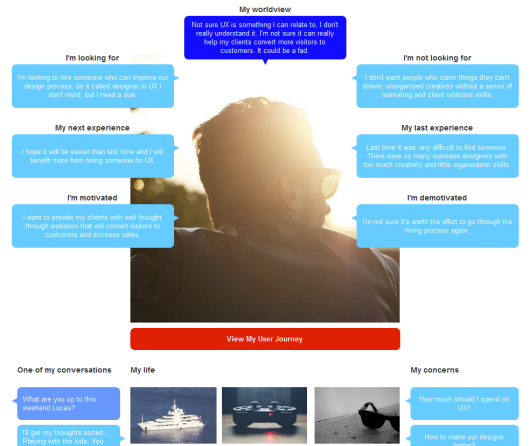
This approach paints a much more holistic picture of a person. Not only does it include their goals, it includes important, ancillary information such as their worldview, what they are looking for and their motivation. Further, the overheard conversation adds just the right amount of insight into his/her life. The “questions” section helps identify the areas the target user is unsure of and the “life pieces” section makes the persona human-like with feelings and desires.
Sitemaps are like spiderwebs
Sitemaps are (as most of you know) used to “map” the major components of a website to a rather sparse-looking diagram. Because they’re so sparse, they also tend leave a lot to the imagination. This gives rise to common retort: “What’s this page do, again?” “Can you change this page to that?” “How about we scrap that page”
You know the routine. Because clients come to us for the visual thinking they often can’t turn these sparse diagrams into anything “useful” on their own.
This got me thinking: why not just put the thinking alongside the map?
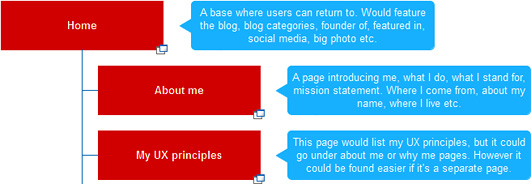
You can view a demo here.
Even though it’s just a small difference, this approach pays off. It helps our clients understand the internal monologue that drives the narrative. Knowing the reasoning behind your decisions helps others understand (and agree) with your perspective.
User journeys are like electric panel diagrams
User journeys map the steps of a user, correlating goals (explained in Personas) with a site map to better illustrate how users will get things done. As a result, designers can make informed suggestions to the site’s information architecture.
The problem is that most user-flows are very dry. It is difficult to feel empathy with a user and their journey if all you see are boxes and arrows (similar to electric panel diagrams).
After scouring the internet looking for something better I found a couple of good approaches.
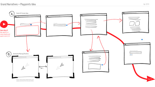
Jakub Linowski’s Grand Narratives & Play Points diagram offers a compelling yet easy-to–understand presentation based on wireframes.
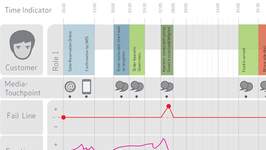
Blueprint+ (Service Design Visual) is great because it includes the persona and a timeline.
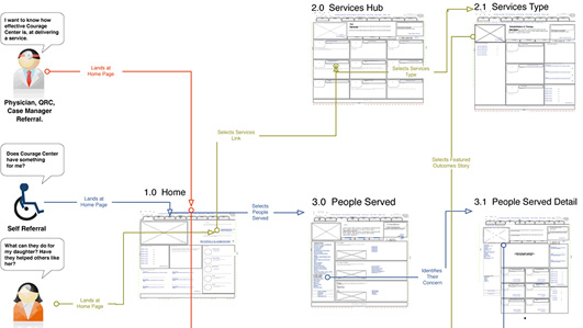
Carlos Abler’s Multiuser WireFlows combines the two former ideas.
All of these are good but they all seemed to be missing something.
I’ve been always fan of recycling, so I thought there has to be a way to re-use the sitemap and display the user-flow on it. I also wanted to re-use my personas in order to create empathy for the user’s journey. This led me to the following presentation:
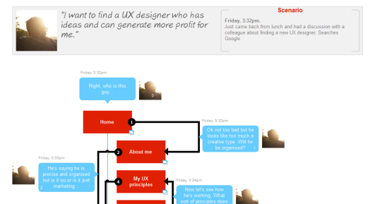
You can also view a demo here.
As you can see, I simply re-used my sitemap and added one of my persona with speech bubbles. In the speech bubbles I added the thoughts of the persona at every stage of their journey. This adds a human touch. The thoughts of the persona can explain to clients the reasons for the journey taken and the scenario puts these thoughts into context. It is simple but visually understandable way to show your user-flow.
Clients that already understand your sitemaps and personas will have no trouble seeing the two work together.
Prototypes/wireframes are like abandoned houses
Wireframes created in the absence of personas are broken. Yet we do this all the time. Why do we create personas if we don’t use them?
Looking for a better way, I saw a picture in the essay of Rósa Gudjónsdóttir:
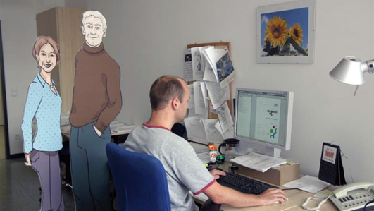
I was fascinated by the idea of having my personas around me. I started to print my personas and stick them to the wall in front of me. It helped, however, the screen and the wall are two different worlds, analog and digital. No good.
I eventually placed my personas in the margin of my prototype to serve as a constant reminder of who my users are:
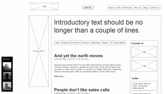
You can also view a demo here.
Not only does this help us to not design for ourselves, our clients and stakeholders are now constantly reminded who will use our design. The time and effort we put into establishing our personas is never lost.
Never stop learning
As I mentioned earlier, these ideas have helped me better convey my work to my clientele. They are not perfect, of course, nor were they intended to be. I am certain that it is possible to tweak them or in fact come up with even better presentations that work for you.
Are you also frustrated with common UX processes or deliverables? Don’t let the status quo get you. Always try to make things better, iterate and optimize. Surprise your users – err, clients – with something new and innovative as this is the way forward. If you’ve tried your hand at something different, be sure to share your result in the comments below!