Comics, cartoons, sequential art. Each of these words implies the same thing: stories told with words and pictures. Much has been written about about how storytelling affects the user experience, but little has been written about how visual storytellers craft that experience. Today, I’m going to share the tricks of the trade that comickers use to lead a reader’s eyes across a page. You can use these techniques to tell stories, sell widgets, promote an idea, help users find what they’re searching for – the possibilities are endless! (And I promise there will be lots of fun comics.)
Note: In this article, I will use “reader” when referring to people who would read comics and/or visit web sites, and I will use “user” to refer only to people in the context of visiting web sites.
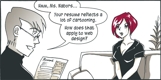
Long before I was a web designer, I was “Rachel the Great,” known in high schools around the world for my weekly comic adventures at gURL.com. (I even won an industry award for my work!) When comics could no longer pay the bills, I used my talents to jumpstart a career in web design.
What the flip do comics have to do with web sites? Quite a bit actually. Comics and websites both start as wireframes.
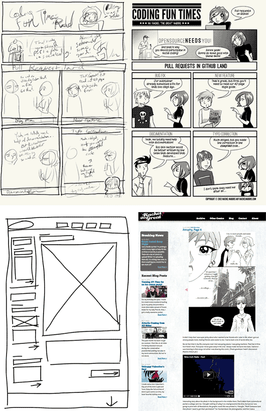
Both mediums tell stories and convey ideas using words and pictures. People will scan boring or confusing sites as well as comics. In both mediums, you have to either pull readers into a narrative or immediately offer up the meatiest part of the content, lest readers skip to the next page.
Because they have so much in common, many basic comic techniques apply equally as well to web pages. Let’s go over them!
Techniques and theory
There is a saying among equestrians: “Control the head, and you control the horse.” A reader’s eye is like a horse: both will roam if left on their own. The reader’s eye wants to gallop madly across the room and look at that shiny thing over there or that iPhone in your hand. Like the Red Queen in Through the Looking Glass, as creators we have to run twice as fast just to keep our readers in one place!
A good comic doesn’t lay itself out. It doesn’t magically fall from the artist’s pen fully-formed onto the Bristol board. There are scripts (content), layouts (wireframes), pencils (mockups), and inks (final designs) to do before the words are finally married to the pictures.
But the difference between a good comic and a great comic can be found in the place between the script and the pencils. Everything else is icing.
Panels: temporal snapshots
Generally speaking, a comic’s panel and frames act as a mini corral for the eye. Readers process each panel individually. Further, we know that everything inside takes place at the same time and at the same place.
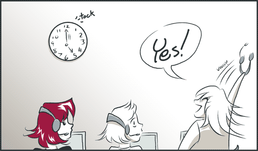
Panels also work as a grouping device. Everything within a panel is related to each other, whether they be characters in a scene or random objects.
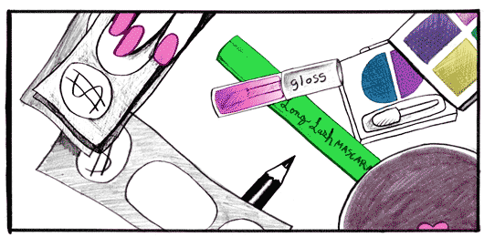
Excerpt from Beauty Is as Beauty Does, a comic I made for gURL.com
Proximity
Things close to each other seem more related than things farther apart.
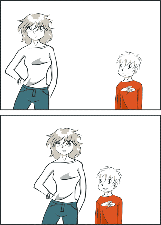
Notice how the first panel is a picture of a woman and a boy. In the second panel, they’re a sister and brother or mother and son. The characters are exactly the same in each panel. The only thing that has changed is the distance between them. Your mind naturally infers a relationship based on proximity.
The same goes for panels. The eye naturally “jumps” to the next closest panel, even if it’s not in a “conventional” location or direction, even if the things in the panels don’t seem immediately related. Your brain fills in the gaps and makes inferences about those relationships.
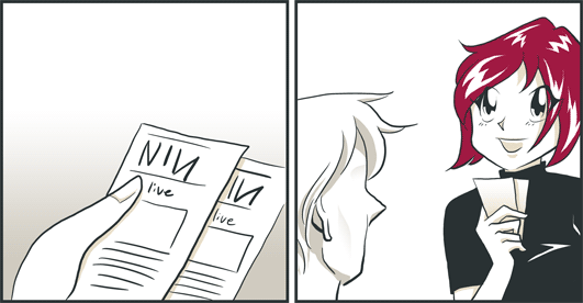
For instance, in the first panel here we see a pair of Nine Inch Nails tickets. In the next panel, we see someone holding two slips of paper. We assume that those aren’t menus or bookmarks or business cards: we assume they’re the tickets!
Spacetime, whitespace, and pacing
As in the universe, so in the comic: time and space are irrevocably linked. Panels set the rhythm and pace of a page.
A comic with panels of equal size at regular intervals “sounds” like a metronome.
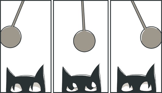
Tick tock, tick tock. The pace is neither fast nor slow. It’s like watching a sitcom as compared to a drama or an action film.
You can actually “slow” time in a comic by increasing the distances between elements.
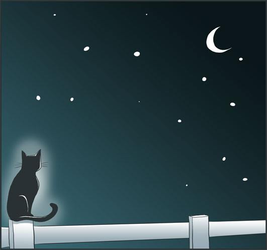
A big splash of whitespace gives the impression of slowed time.
Likewise, many tightly spaced panels give the impression of quickly passing time.
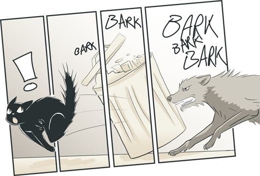
Strong diagonals also give a sense of frenetic energy or an off-kilter situation.
Balancing words and pictures
A common comicker admonition is “show the story, don’t tell the story.” While it is possible to have a comic that consists entirely of pictures, a comic cannot consist solely of words. That would be a novel.
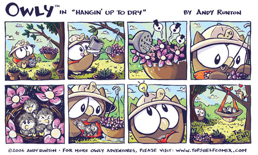
Andy Runton’s “Owly” is an all-ages comic devoid of dialog and text.
A good comicker works to balance words and pictures. Sometimes it makes sense to let words do the heavy lifting, especially when it comes to concepts that are difficult to explain with images, like facts and figures (although infographic artists show us that visuals can help with those, too!). However, when it comes to emotions and abstract concepts, pictures often can convey complex information much more succinctly.
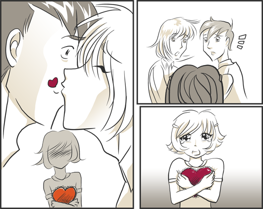
There’s a lot going on in this short comic. A good author could put this scene into words, but it would take much longer for the reader to read and process the scene, whereas with pure visuals, you can digest what’s happening in a few seconds.
A good writer knows what an artist can show for them and leaves them room to do so. Likewise, a good copywriter knows the abilities of their designers and collaborates with them. Would an infographic say this better than a list of numbers? Would a video of the product in use be a good supplement to a step-by-step instruction guide?
Next up: flow and content
Each of these techniques is useful enough on its own, by when you combine them they become downright powerful. In the second, final article of this series we’ll combine these approaches to achieve better flow and more compelling content. See you soon!