Workflows stuffed-up? Wireframes inflamed? As User Experience designers, it’s our job to juggle lots of inputs, but overindulging any one set of needs can result in a bloated product. If you find yourself flailing just to keep everyone happy, it might be time to rediscover your project’s digital center. Here’s just the model to help.
User Experience is all about storytelling, so let’s begin with one:
A Hunter set out a net near a lake and caught a number of birds. The birds were large, and they raised the net and flew away with it. The Hunter ran after them. A Peasant saw the Hunter running, and said: “Where are you running? How can you catch up with the birds while you are on foot?” The Hunter said: “If it were one bird, I should not catch them, but now I shall.” And so it happened. When evening came, the birds began to pull for the night each in a different direction: one to the woods, another to the swamp, a third to the field; and all fell with the net to the ground, and the Hunter caught them.
Hindu Fables, National Storytellers League
A scattered sort
To the User Experience designer, this tale is not foreign: we encounter clients and brands with great potential, only to see them caught up by internal strife. Indeed, a large part of UX time is spent playing the role of interpreter – relating needs between users, business, designers, and developers. It’s a job that requires a great deal of empathy.
But while we may pride ourselves on our ability to understand clients, we can sometimes fall short in helping them understand themselves. Specifically, two things can have unintentional side effects:
- The language we use to describe the parts of a project can be unintentionally polarizing, when we should instead focus on “the system.”
- The way we frame projects can sometimes be too linear when we should instead emphasize an evolving process.
To help reframe things, I’d like to propose a new way of modelling our design space: one that reflects both the core components of any good design effort and their overall alignment on an ongoing basis. The goal of the model is to improve learning and understanding throughout the journey. It’s not necessarily a replacement for contemporary methods, but simply a different way of looking at things.
The UX Chakra Model
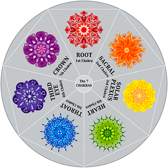
Chakras (meaning “wheels”) are energy centers in the body that figure into both Hindu and Buddhist traditions. “At the inner core of each one of us spin seven wheel-like energy centers,” writes spiritual teacher Anodea Judith Ph.D. “Together they form a profound formula for wholeness that integrates mind, body and spirit.” In the same way there are competing energies in the body (the heart, the throat, the brow) there are competing forces at work on any digital project. Our challenge is to keep them in balance.1

(Note: At the risk of this sounding like a bad yoga studio, I’ll be the first to admit that I’m using a Western interpretation of Chakra – read: oversimplification. However, I think the term is understood widely enough to be useful.)
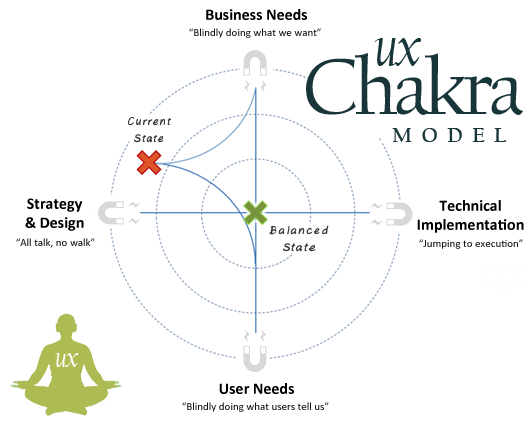
For the sake of simplicity, let’s map our project energies to the four cardinal directions (see chart, below). The Y axis represents requirements: Business Needs up north and User Needs down south. The X axis is our implementation approach: to the west lies Strategy / Design and to the east Technical considerations. These four directions represent extremes of each force. Think of them as magnets pulling perpetually toward themselves.

So, if a project were guided solely in one direction, it could be described in one of four ways:
- Business Needs Extreme – Blindly doing what the client/CEO wants.
- User Needs Extreme – Blindly doing what users tell us.
- Strategy / Design Extreme – All talk, no walk.
- Technical Extreme – Jumping to execution.
The very center of the model is the ideal end-state – the perfect balance of strategy and technology, business and user goals. For any given project in motion, the actual state lies off-center until forces equalize to hold it in place (keep reading to see if this is actually possible).
If you were to start a project with a company that had zero digital presence, they wouldn’t appear on the map at all. But in virtually all projects, there is some starting point – for example, the old site built back in 1997, some survey data that was collected but never used, etc. Even having one, great kickoff meeting would be enough to put you at the Business / Strategy extreme. So the first thing this model helps you do is figure out where you are today.
Seeking balance
Now, here’s the fun part: As a project progresses, your involvement controls its position. Conducting a contextual inquiry or user workshop might move you south on the chart, for example. Completing an assessment of your current-state systems architecture might pull you east. In some cases this might be a gentle nudge (you ran a usability test), in some cases things might swing wildly to a different quadrant (client bought a new CMS).
Does this mean that you must be perfectly “centered” before you can implement? Not at all. In fact, you could argue it’s the rare project these days that is perfectly in sync. What’s more important is that you have a good framework for dealing with changes as they occur; that you and the client maintain a holistic point of view.
Project time: linear vs. circular
Many of the artifacts necessitated by project planning – roadmaps, timelines, launch dates – implicitly tell clients that their project is a move from “bad to good,” from chaos to order. While this is good, it’s also misleading: No digital effort ever really starts and stops.
The UX Chakra model helps us to think of projects less in terms of a linear progression, and more of a give-and-take between basic, core components. By completing a task or deliverable, you are taking a step toward perfection in one sense, but you are also creating a tension that needs to be countered elsewhere.2
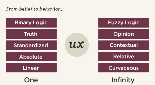
Devdutt Pattanaik explores the cultural implications of linear vs. cyclical thinking in his TED talk, East vs. West – The Myths that Mystify. He tells the story of a frustrated German CEO who asked his Indian business partner if they would hit a target delivery date. His colleague’s reply? “Maybe.” Pattanaik traces such tension to ancient cultural and mythological roots: Western cultures desire order while Eastern cultures tend to embrace change. There is no right or wrong, just a different outlook on how the world works, each with advantages and disadvantages.
A key strength of the User Experience person is the ability to help balance these realities: requirements with creativity, the designer Ying with the developer Yang. The UX Chakra Model helps contextualize this role. You might envision yourself as UX Yogi, helping clients reconcile truth and opinion, behavior and belief. What’s more, you can teach how to manage changes in the “truth” over time; just as one project phase reaches its logical conclusion, another is born anew.

Original Slide Image Credit: Devdutt Pattanaik
So what can I do with this?
As with any model, the UX Chakra model is a communication shorthand – a way to get everyone on your team aligned about the state of a project. It’s not designed to replace traditional methods of project planning and assessment, but rather manifest some commonly overlooked aspects of the process. Consider referencing the UX Chakra Model with your team when:
- You want to reflect an organization with moving parts. The image of Chakras as spinning wheels is an useful metaphor for the parts of any client organization – always changing, always in flux.
- You want to empower stakeholders. Everyone wants to feel valued for what they bring to the project; UX Chakras respect this fact by positioning stakeholders as centers of energy which can be harnessed for good or bad, depending on how they play with others.
- You want to position Digital as an ongoing process. As opposed to traditional “bad to good” project thinking, UX Chakras reflect the “give and take” nature between project forces. Misalignments are inevitable, but represent opportunities, not shortcomings.
- You want to get your client team on the “same page.” Miscommunication feeds misrepresentation. A shared model can align thinking. Try having representatives from various parts of the business independently mark where they think you are on the model, then jointly compare results.
- You need a benchmarking tool. For those of us who consult on multiple projects, Chakra Modeling can be a good “first step” in determining the state of things, and what we’ve just walked into. Likewise, use it as a tool to “check-in” throughout the project life-cycle.
As a final note, it’s worth pointing out that the UX Chakra Model does not promise quick fixes, but rather harmony realized over time. Just like the hunter pursuing the birds, the role of the UX practitioner requires not only intuition, but patience. The forces at play in creating great digital work these days are increasingly complex – but also, when properly aligned, increasingly potent.
- Interesting point for those of you who, like me, are skeptical of things you cannot see: physiologically, the seven chakras have been shown to correlate to seven nerve clusters which connect up and down the spinal column; for example cerebral cortex, carotid plexus, pharyngeal plexus, etc. Source: Wheels of Life by Anodea Judith, 10th Edition 2006
- At a basic level, the notion of “Circular” project time might seem similar to the differences between Agile and waterfall approaches to development, but I think it goes beyond this – largely due the nature of UX as an “afterthought” in Agile development. See: Agile is Wrong for UX by Lis Hubert.