User Experience Design calls for us to write words on buttons all the time – but how do we know whether we’re choosing the right ones? Linguistics may provide a clue. What follows is a simple test to check whether your calls to action “work” linguistically as well as a guide to consider the grammar of your experience elements.
We all shudder a little when we look back on the days of “Click here to…” calls to action. But if someone challenged you, could you suggest a general formulation to explain what is – and isn’t – the correct form of words to use on a button?

We had a situation recently at the Guardian where we were debating the form of words on a call-to-action button. I quickly realised we were all talking around the issue – “No, it should say this!” – rather than grappling with the mechanic itself. Could we apply a generalized principle to chose a grammatically correct form of words?
It turns out there’s a real value to exploring the grammar of “button wording.” Not only does it allow us to feel more confident about choosing our words, it helps to explain why some sites seem able to align their wishes so elegantly with those of their users.
They’re not doing anything magical; they’re just choosing the right words.
It starts with a verb
Lots of articles advise on button language. One of the best-worded actually appeared on these pages back in 2009:
Buttons are for actions, like “Get a quote,” “Download,” “Open an account,” “Go to checkout.” The text on the button should begin with a verb. Otherwise it’s not a call-to-action, just a button with some text on it. “More information” for example, is not a call-to-action.
David Hamill
Think about what your user would say if you asked him what he was trying to do. If he would say, “I want to compare the price,” then “Compare the price” is what you write on the button. These are what Jared Spool calls “trigger words.”
The author begins with some firm, grammatical advice: “text should begin with a verb.” But it’s this formulation that’s really worth unpacking: “Think about what your user would say if you asked him what he was trying to do.”
Here the author hits on a linguistic condrundum: how can we contrive a form of words that can be both what a user would say, but also what we’re asking him or her to do? The answer matters because buttons have a dual function: they are both calls to action – the publisher expressing an opportunity to a user – as well as the mediums by user express their decision.
So… what form of English grammar is up to that challenge?
Setting the mood
Many languages have a grammatical concept called “mood.” The easiest way to think of grammatical mood is as an “attitude” that the speaker takes in relation to what they wish to say: “I am stating a fact” vs. “I am suggesting this might be true” vs. “I am commanding you to do something” etc. Specifically:
- The conditional mood expresses conditional logic: “He would return to his basket if…”
- The subjunctive expresses possibility: “If it were a basket, he might return to it…”
- The imperative is used for commands: “Return to your basket!,” and
- The interrogative, for questions: “Is he returning to his basket?“
What all moods have in common is that it is clear who the speaker is; “who” is doing the talking.
The web is different. The publisher, the creator of the website, writes the words – they create the invitation to act – but it’s the user who actually clicks. The user triggers the next part of their journey.
So the words on our buttons must make sense in the context of not one “speaker,” but two: the publisher and the user. A classic expression of this conundrum is in whether to use the possessive adjective “my” or the possessive adjective “your” on a button. Microsoft’s Style Guide suggests that both have their place, catering to different speakers at different times:
Use the second person (you, your) to tell users what to do.
Example: Choose the pictures you want to print.
Use the first person (I, me, my) to let users tell the program what to do.
Example: Print the photos on my camera.
This distinction seems arbitrary, though. Is there any meaningful difference between “telling users what to do” and “letting them tell ‘the program’ what to do?” A form of words that works no matter who is speaking?
Wilty Wilt
Taking linguistics as its guide, one practical solution is to say that the words on a button must make sense after both the interrogative “Would you like to…?” (where the publisher speaks) as well as the conditional “I would like to…” (where the user speaks). I call this the “Would you like to? / I would like to” test, or WYLTIWLT (pronounced “wilty-wilt” – a bit like WYSIWYG) for short.
In theory the WYLTIWLT test provides a way of evaluating every button you see, or might create.

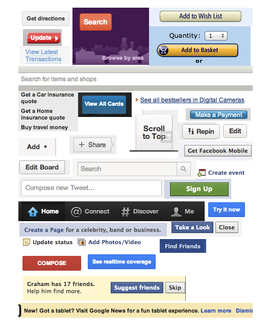
How do the buttons on the world’s popular sites fare when put to this test? Pretty well, in fact. (Facebook is worth a special mention: I couldn’t find a single button on Facebook that didn’t pass. Twitter and Google slip up occasionally.) Above are some examples of “buttons that pass the WYLTIWLT test” – from all over the web.
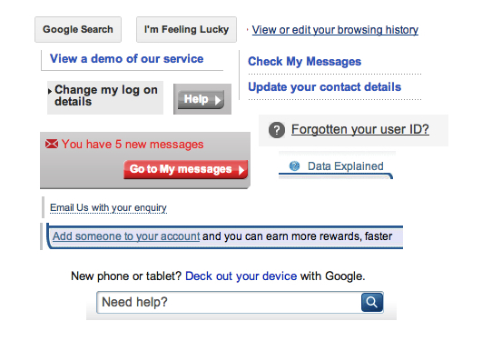
There are plenty of failures, too. Here’re just a few.

It’s interesting to note that by far the most frequent mistake (at least, according to this logic) is the use of possessive adjectives (“my” / “your”) in buttons:
What’s more
Using WYLTIWLT as a guide, here are a couple of principles to help you create a ‘grammatically correct’ site. Consider:
Functionality first
When it comes to expressing personality, it’s tempting to be verbose. Don’t. Instad, consider using more direct messaging: “Keep out!”, “Stop”, “Give way.” This verbage is highly effective, so don’t shy away from being terse. Pinterest manages to be perfectly friendly despite using direct (and concise, helpful) forms of words like ‘Invite friends” and “Find friends” on its buttons.
Retain the human touch
At the same time, don’t have to give up on personality. Just remember to obey the rules of grammar when you do go out on a limb. Smug Mug, the photo-sharing site, is a case in point. Their “Camera Awesome” app for iPhone has an Instagram-like function where you can add effects to photos. The call to action is “Awesomize”. It’s a cute, made-up word, of course, but it’s clear what it means, and it’s a verb, meaning that it fits the WYLTIWLT test. (“Would you like to Awesomize?” “I would like to Awesomize!”) Even though it’s contrived, it works elegantly as the publisher’s invitation and the expression of the user’s will.
Use design in conjunction with language
If you’re struggling with how to avoid using the second person on a button – “Your messages” etc. – see if design can help. Instead of writing “your” or “my” on the button, make it clear – perhaps in the header of a drop-down menu – to which person a particular set of actions or destinations relates. Pinterest exemplifies this in the way it directs the signed-in user to “messages’, “pins’, “likes’. They don’t use the possessive “Your’ and yet it’s perfectly clear where a click will take you to your pins because of the way the menu is designed.
Exceptions prove the rule
Just because there are rules doesn’t mean you can’t break them. Some of the best web companies don’t adhere to grammatical rules when designing their buttons. “I’m feeling lucky,” for instance, is possibly one of the worst-worded buttons ever, and yet the Google home page would look strange without it. The important thing is to use simple, effectively-worded buttons most of the time – and then you can afford to go off-piste every once in a while.
Getting moody
Buttons aren’t the only form of language you have to worry about on your site, but they do create some of the most important messaging on your site, and the language you choose will determine how successful that messaging is. The WYLTIWLT test can help you choose a form of words that is both concise and which, by virtue of grammar, helps to align your wishes with those of your user, creating an altogether more harmonious experience on your site.
Ready to get real about your website's content? In this article, we'll take a look at Content Strategy; that amalgamation of strategic thinking, digital publishing, information architecture and editorial process. Readers will learn where and when to apply strategy, and how to start asking a lot of important questions.