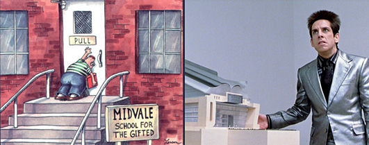
Like countless others, I initially perceived user experience design through the lens of usability: as a “science,” devoid of the subjectivity of “users.” If a door equipped with a push bar actually required me to pull on it in order to open it, I became upset. I considered it a bad experience. And while this does describe a bad experience due to poor usability, my viewpoint was also incredibly myopic.

Unusable or inaccessible, what’s the difference?
As many within our community have pointed out, the things we might normally think of as well designed are often only “well designed” within a certain context. People with limited use of their arms, for example, might find a standard keyboard difficult to employ. Ditto those using browsers that might lack support for web standards. They often incur barriers when accessing the web.
Obviously, this is less than ideal. Design shouldn’t serve merely a subset of its audience – it should serve everyone, equally. Doing that, however, requires thoughtful conversations before, during, and after development begins.
Ready? Let’s get started.
What is universal design?
Universal design describes a set of considerations made to ensure that a product, service, and/or environment is usable by everyone, to the greatest extent possible, without the need for adaptation or specialized design. Accessibility is only slightly different, describing the degree to which a product, service, and/or environment is made available to everyone. So whereas the former is a design methodology (similar to user-centered design), the latter is its most commonly associated metric.
Colloquially, accessibility refers to the degree to which a design functions for people with disabilities – those who can’t see, can’t hear, can’t use a keyboard or mouse, or those who have a cognitive or speech disability. Although these people have historically experienced a marginalized web, the times appear to be changing. The recent rise in popularity of mobile devices has forced organizations to finally give due consideration to the idea of dynamic context: usage in a variety of environments under a variety of conditions. This, in turn, blurs the lines between “people” and people with disabilities. Product designer and mobile strategist Luke Wroblewski has taken to describing his target audience as having “one eyeball and one thumb.”
Both universal design (in general) and mobile-first design (as a case in point) make products and services more accessible, paving the way for what the web community calls “one web.” One web is an increasingly pragmatic vision of a browser- and device-agnostic future which, many believe, is the only future-friendly way forward.
What does universal design “look” like?
All this abstract talk about universal design has probably got you thinking: what does this stuff actually look like? Let’s start by looking at universal design in the real world.

During California State University at Northridge’s annual CSUN conference, accessibility champion Wendy Chisholm pointed out that “stairs make the building inaccessible, not a wheelchair.”
Sloped sidewalks are a design detail accompanying contemporary pedestrian walkways. Physically, they’re nothing more than ramps that are added to sidewalks to make things easier for people using a wheelchair; but their actual utility runs far deeper. By addressing the need for people who use wheelchairs, designers have also made life easier for moms with strollers, people with handtrucks, etc. This is a good example of how designing for the “extreme” case makes the experience better for everyone.
The digital equivalent of sloped sidewalks is progressive enhancement. Web designers and developers (smartly) assume nothing about their target audience and initially deliver a barebones, semantic website. After the page loads, we use feature detection to determine whether or not a richer experience can supersede it.
Like most universal design considerations, progressive enhancement (when done well) isn’t “visible” unless you know how to look for it. Nevertheless, understanding the thinking that goes into universal design for the web makes all the difference with regards to our approach.
What things shape a universal approach?
Many people have given thought as to what constitutes universal design: Alan Cooper mentions some considerations in his book, About Face 3, and NC State hosts a set of principles on their website. Here, I’ll briefly cover some of the aspects I’ve found useful.
Accessibility begins with content. Accessible content is defined as content that’s perceivable (visible or otherwise), operable (usable), understandable (learnable, logically sound), and robust (well described, available in multiple formats). It is, likewise, made available via an accessible service. Accessible services deliver content to people, browsers, and other applications via a user interface (UI) and/or an application interface (API).
Designing content and services so that they meet these criteria isn’t easy. Instead of the normal, user-centered approach with which readers here are likely familiar, universal designers take an opportunistic point of view, asking who are the people/systems that could possibly use this content or service, and what are the barriers that could possibly stand in their way? I’ve found that this breaks down into a few, key activities: building the business case, measuring accessibility, understanding content, understanding code, and, finally, sharing skills. To be sure, all of these revolve around learning about, developing, and adhering to “best” practices.
Building the business case
To build the business case for universal design, user-centered designers might first measure the content or service’s accessibility (see below) and, second, convince stakeholders that it’s a worthwhile investment. Some experts like Andy Defrancesco advise that the arguments should include:
- Accessible content is more findable (SEO benefits) and more shareable (social media benefits).
- Because they’re standards-based, accessible services are comprised of more interchangeable parts (making for more efficient collaboration).
- Governments legislate against inaccessible products.
- For some customers / organizations, accessibility directly drives their purchasing decisions.
Measuring accessibility
Universal design is measured by way of accessibility. Designers can begin to understand this link by developing a working knowledge of the accessibility testing tools available and then using them to evaluate the content or service under question. Finally, they might define an accessibility testing heuristic to ensure consistent measurement.
Accessibility testing tools include – but are certainly not limited to – device labs, screenreaders (such as Chromevox), and disability simulators (such as Etre’s colorblindness simulator). These are just the tip of the iceberg, though. I recommend working with stakeholders to determine the range of disabilities that might apply to their target audience.
After determining which accessibility testing tools provide a useful assessment of their content or service, designers can develop a set of testing heuristics to ensure their consistent use. These could be as simple as checklists or step-by-step guides; they could be as complex as a set of video tutorials.
Understanding content
To improve the accessibility of content, designers must first understand what’s wrong from an accessibility standpoint – if anything – with an organization’s content strategy: how content is planned for, created, published, and maintained. Instead of testing for compliance after the fact, they can embed accessibility considerations into the editorial process from the beginning.

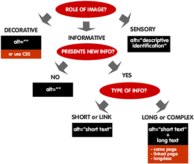
This flowchart shows how determining the content of an image’s alt text requires a bit of thought.
Understanding code
To improve our code we must first understand it. After measuring our service’s accessibility, designers should pair with developers (see below) to better understand – and eventually improve – their development lifecycle. Some organizations do this by creating more modular designs, maintaining pattern libraries. Others adhere to standard application architectures, providing RESTful APIs. Still others use developer frameworks such as Quail.js to ensure that their front-end code is accessible.
Sharing skills
Accessible patterns and company-wide conventions are usually developed ad hoc. While creating an instructive CMS or a set of design/development patterns goes a long way towards ensuring things are accessible, documentation alone is no panacea.
As Julie Dirksen points out in her book, Design for How People Learn, facts are learned differently than skills. Because accessibility problems are potentially introduced whenever content is created – whenever code is written – it’s imperative that team members engage in pair programming or pair writing sessions to share their knowledge.
Go forth
So there you have it. Although it feels like we’ve covered a lot, we’ve actually only scratched the surface. I’ve intentionally left many parts out of this article, parts that are much better covered by entire books written on this subject. If you’re interested in learning more, I recommend giving them a read or perusing the related resource list, below.
Note: Thanks to both Matt May and Derek Featherstone who provided feedback on earlier drafts of this article.
Related Resources
- The Web Accessibility Initiative and their accessible-content creation guidelines.
- Knowability: a nonprofit organization whose mission is to support the independence of children and adults with disabilities by promoting the use and improving the availability of accessible information technology.
- The Accessibility Project: A set of resources to help make web accessibility easier.
- A Web for Everyone – Designing Accessible User Experiences: a forthcoming book from authors Sarah Horton and Whitney Quesenbery to be published by Rosenfeld Media
- 4Syllables Articles: A fantastic collection of articles and resources for more accessible web content. I recommend starting with part 1 of their series.
- HTML Codesniffer: A tool to programmatically determine compliance with the W3C’s Web Content Accessibility Guidelines as well as U.S. Section 508’s legislation.
- Accessibility Priority Tool: Useful for helping newcomers diagnose accessibility issues
- AudioAccessibility.com: A fantastic wealth of information for audio accessibility.
- Amara: The easiest way to caption and translate any video.
- QuailJS: a jQuery plugin for checking content against accessibility guidelines.
- Userium’s Web Checklist
- The Anatomy of a Perfect Web Page – Hitreach.co.uk
- Web Aim, Creating accessible forms
- “Translation is UX” by Antione Lefeuvre on A List Apart
- “The Accessibility of WAI-ARIA” by Detlev Fischer on A List Apart
- “ARIA and Progressive Enhancement” by Derek Featherstone on A List Apart
- “Things I learned by pretending to be blind for a week” by David Ball on Silktide
- “The Ten Principles of Inclusive Web Design” by Sandi Wassmer
- “Building a webpage with accessibility and interoperability in mind: part 1” by Alistair Duggin