As a direct response to platform capabilities, the first mobile sites were an exercise in ‘compromise’ rather than ‘craft’. Today’s more full-featured devices, however, give us the opportunity to create more visually appealing designs that can not only inspire and attract users, but also increase the usability of the experience. However, along with this opportunity there are also new challenges.
In Part 1: Information Architecture we explored what makes mobile different from desktop in terms of physicality and specifications; how, where, and when we use mobile devices; and how we behave and feel when using these devices. Then, in Part 2: Interaction Design we looked at the impact these differences have when developing the structure and functionality. These two articles provided the foundations for good design on mobile and tablet. Now we’ll conclude the 3-part study of designing for mobile by exploring visual design solutions and the associated best practices necessary to produce beautiful, usable applications.
First we’ll look at designing for the physical constraints of mobile, including best practice guidelines, and then we’ll look at designing for communication: using visual design to support the content on mobile sites and applications.
Designing for the physical constraints
The physical form and touch screen interface of mobile and tablet devices provide us with some basic usability considerations. Where a desktop user can scan across a wider area of content or hover over elements for further information, mobile users are focused on a smaller area and must deduce interactions in a different way. By keeping in mind the details that define a mobile layout and mobile-specific interactions,we can create an intuitive mobile experience.
Usable layouts
The limited space available on a mobile screen provides an interesting constraint in how to best display content and interactions. Specifically, the layout needs to be both streamlined and focused.
- Structure of the layout – To provide a strong foundation for the design we need to consider how best to use the available screen space. A grid system helps designers to achieve this: the structure of evenly spaced vertical lines acts as a guide for arranging content. The grid identifies event spaces, making it easier for designers to determine the most effective placement for buttons, headlines, or images. Placing these components along a grid helps to lead users on their journey, while simultaneously creating a clean and aesthetically pleasing visual.
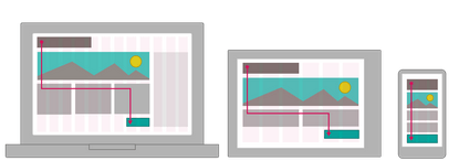
- Space to scroll and swipe – It is essential that users can explore content without committing to an action that they didn’t intend, and without activating an item when they were attempting to scroll. In other words, the spacing between elements must be sufficient to allow a user to easily navigate through these elements.
User-friendly interactions
The touch screen interface on a mobile device also means the visual design must reinforce the interactions; in other words, sizing and placement of elements should ensure ease of use, and indicate the importance and correlation between actions.
- Button hit areas – As we discussed in Part 2: Interaction Design, adequate sizes and spacing of buttons will ensure they can be easily activated. Ideally, buttons should be between 44px and 57px on a standard screen and 88px to 114px on a high-density (retina) screen. This allows enough area for the average fingertip to easily activate a button.
-
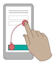
Reachable and noticeable controls – If related interactive items are within easy reach of each other it will allow the user to more quickly transition between them. This will help reduce any confusion the user may have around how the interactions are connected, and speed up more complex processes.
Designing for communication
The physical constraints are only half of the challenge we face when designing for mobile. The other half is in communicating information. The “mobile first”. philosophy reminds us that mobile users should get the same value from sites as their desktop counterparts. With this in mind, designing for mobile communication impacts the way all designers need to approach the messages they are communicating.
In order to enhance communication, we need to make the best use of how we understand and decipher information. The human brain interprets visual information much faster than words, meaning it can be incredibly valuable to use visuals and imagery to enhance communication. Good visual styling will add value, support the purpose of the content or interactions, and improve the overall user experience (for mobile and desktop).
Vertical rhythm
The first enhancement for communication we’ll consider is the use of vertical rhythm. Information architecture creates a sensible flow of content, however visual design can then be used to create further clarity within the visual hierarchy of the content. Sensible usage of size and spacing between content sections will create a good vertical rhythm that supports the communication of the content hierarchy.
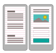
In addition to the vertical grid system mentioned earlier, a baseline grid can help to create a good vertical rhythm, making reading and understanding content easier. Specifically, baseline grids create a structure though the specification of line heights. This provides clear horizontal rules for defining typography leading and sizing, but is also useful in defining spacing between content groups. Following these rules will ensure that paragraph copy is legible and that the user can clearly differentiate between sections and feature groups. Baseline grids can be difficult to implement accurately in HTML and CSS, but do provide useful guidance when developing sizing and spacing in the design process.
Using color
Color is another incredibly valuable tool for communication, and can be used in multiple ways to support the content and interactions.
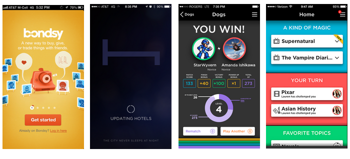
- Convey a tone or style — Color in design is very subjective, and dependent on personal experience and culture. However using specific tones and shades can help convey an overall impression of the purpose. Bright and bold colors create a sense of fun, darker tones create a sense of elegance or atmosphere while softer hues with more greys can create a vintage feel. Learning more about color theory helps us to select colors that best suit the design objectives.
- Differentiating between sections — Color can be used to give prominence to content items, to demonstrate how items are connected, or to support the structure of content e.g. how content is separated.
-
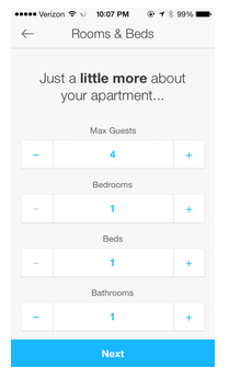
Differentiating between static items and interactive functionality — Using strong contrasts will help communicate the difference in purpose or connection between content or functionality. Using a mix of neutral and bright colors, or colors at opposing ends of the color wheel will ensure that specific items stand out to the user. Creating consistent color usage, for example across static, active and inactive items, throughout a design will also demonstrate the difference between content and functionality much more clearly.
- Communicating status changes — Colors can be used intelligently to highlight messages, notifications and errors after a user has interacted with an element. For example, many sites use green for success messages and red for error messages in lieu of longer, more involved copy. This helps improve the usability of a design around the quick conveyance of new information through the use of consistent color conventions.
Using metaphor
Lastly, metaphors can be a very powerful solution when communicating through visual design. Metaphors allow users to quickly understand content and functionality, by invoking an already-familiar element or visual object. Skeuomorphism is the most extreme use of visual metaphor within the digital space, where interface elements are designed to look exactly like their real world counterparts mimic real world objects. And, although this has been given a bad reputation lately with both Windows 8 and iOS7 moving further away from it, these operating systems and other mobile sites and apps continue to use simpler metaphors throughout the user interface, such as a trash can for delete, real life camera for the webcam and envelopes for email.
Metaphor can be used in different ways to support communicating a message or theme.
- Support an underlying theme — Metaphors can be used to extend beyond a single design element, to instead become a key theme of the design or functionality. Within the Flipboard app, the flip transition is an integral part of the user interactions, and the smooth implementation of this was a factor in the app’s success. Using a metaphor in this way can allow the quick communication of the concept to a user, as well as help an app have a unique proposition.
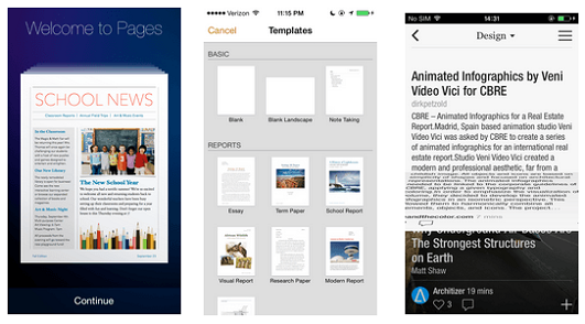
- Buttons and interactions — Using simple skeuomorphism when designing buttons can be an easy way to simulate real life interactive elements and make the functionality clear and obvious. However, it is worth noting that if flatter styles are required to fit within the brand or style guidelines then these can be effective if the the color and styling can be clearly differentiated from static items. Wunderlist uses buttons with realistic styling
- Iconography — Icons can be useful when designing for mobile, as the limited screen space allows for quick communication of complex concepts. Using visual metaphors for icons — particularly icons that have become online standards, such as the delete, webcam, and email icons we mentioned — means they can often work without label, while understandable at a glance. Designing simple, yet clear icons can be a challenging task, so it is important to understand how icons affect the clarity of your design.
The future of mobile
A clear understanding of the constraints and standards, such as this series describes, is valuable for any mobile designer. However, only once we have mastered these, can we then have the ability to go beyond the guidelines; breaking rules and pushing boundaries of creativity to create something brilliant and unique. This, along with a constant consideration of the user, allows us to create the ideal balance of functionality and aesthetics.
Designing for mobile has some really exciting challenges and big opportunities ahead of it. The fast development of technology and the constant changing of user contexts means that today’s constraints may not exist in the next few years. Innovative thinking and creativity will help us explore new ways of looking at these challenges, and allow us to continue to find new, beautiful and usable solutions to the design problems in front of us.