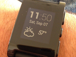
Cameron’s phone buzzes with a familiar alert, telling him his morning alarm will sound off in exactly 8 hours. He places his phone on the charger and settles in. A swipe and tap on his smartwatch fades the lights, and initializes his watch to monitor sleep movement and noises. Morning comes, and the app detects that Cameron has entered a light level of sleep, so it triggers the lights to fade in, mimicking sunrise. A gentle vibration on Cameron’s wrist alerts him to get up. He taps the phone, signaling he’s awake. With a few clever integrations, Cameron is empowered to ensure a delightful night’s sleep.
Context is paramount to mobile app design. In addition to our computers, tablets and phones, 26 billion new “things” will be digitally connected by 2020. To design valuable digital experiences, we must now build apps that connect to this vast, mesh network of wearables, “things” and beacons.
As a designer attempting to construct optimal experiences across multiple devices, I’ve encountered new questions about user and device context. I’ve investigated the many capabilities and characteristics of connected technologies, and created innovative solutions. But most of all, I’ve learned that we need to focus on a new idea: connectedness.
The need is growing ever greater for product strategists and experience designers to connect technologies. In this article we’ll delve into connectedness and how it can improve the user experience.
What is connectedness?
Connectedness is the term we use when a device joins with either a service or another device, as a means to receive access or communicate. As designers, it’s incredibly valuable to understand the possibilities that become available when we connect our mobile devices and the world around us. The need is only increasing as innovative capabilities are being introduced often and existing technologies are maturing with sophistication.

In order to discover the full, broad spectrum of solutions and answer the question “what are we connecting,” we need to consider context. This moves us beyond the limited paradigm of working within a single screen, app, or platform. In the example of Cameron and his phone, his alarm evolved from a beep at 7am into a connected experience involving a bedtime reminder, sleep monitoring, and a gentle wake up call coming from his light source at just the right time. In other words, his alarm changed from an action to an experience.
What are we trying to solve?
When interacting with an app, users have an endless number of needs and possible circumstances which make up context. As designers, this context is what we need to look for as we formalize our plan for the app.
First, we ask questions to better understand the context:
- Where is the user using the app?
- What provoked the user to open the app?
- Does the user need an immediate response to the action he or she is taking?
- Is there a nearby object or location that triggers or might respond to the interaction?
Then we begin to explore answers. These answers can be divided into six groups, which I’ve refined over multiple projects. Our goal is twofold. First, to determine whether each connection will improve user goal success. Second, to detect opportunities to improve user success, while avoiding superfluous features. We’ll review the six groups, and consider each with our goals in mind.
Relevance is the first group, and by determining relevance we narrow the range of possible connections by asking: what connected technologies are pertinent to this task? Looking back at the sleep optimizing app, assuming the app was originally just an alarm, one relevant action is turning off a light before bed. It’s a common practice, and it’s relevant to the user’s action (sleeping). Thus, we have made our first connection: between the alarm and the light.
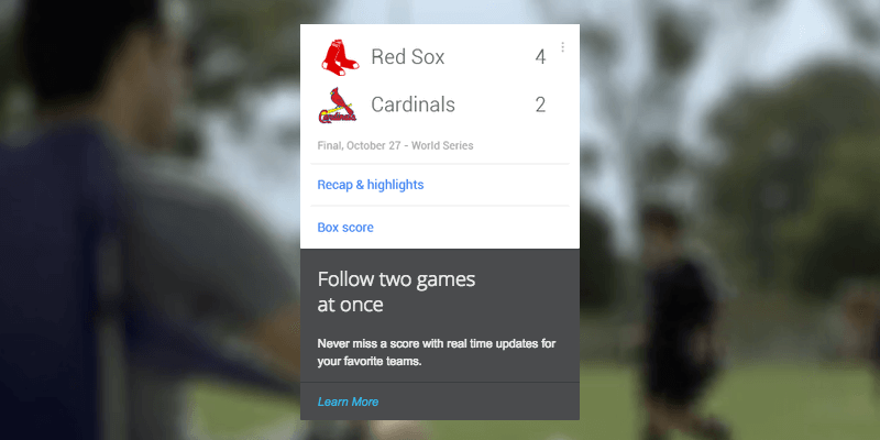
Google Now is a great example of an app that integrates with multiple other apps, and provides information based entirely on time and place relevance. The Google Now app curates data and content from Gmail, Google Calendar, and other Google applications, and provides reminders, maps, tracking information, and other content on the day they are “relevant.” What’s key is Google’s definition of relevance. They have defined “relevant” as meaning within a certain geographic location, and within a set number of hours of the present place and time. Equally, UX designers need to define their own contextual relevance.

Google Now.
When thinking about relevance, consider: what context-specific actions can we map out in the user journey that can potentially be enhanced, augmented or even improved by using connected technologies?
Presence, or location, is a key factor in experience design and our second group. Nest products, for example, recognize when people are in the room. Human presence then triggers different events, chiefly around the temperature rising or lowering. Similarly, we need to consider what value can be gained from sensing humans entering or exiting a space, or even recognizing duration of presence, or the location of a third party person or object, such as Tile.
To think more specifically about presence, consider: in the various use cases of your connected product, what features, actions or notifications should be triggered by mere proximity to its users and their other connected devices?
Sense of space and proximity is related to presence, but on a much finer scale. If it’s a requirement to know the user (or object)’s exact location, how exact do we need to be? Guiding a traveler through an airport terminal requires a proximity of ten or more feet, but Coin, a credit card detector soon to hit the market, gives an alert to restaurant servers when cardholders are within a yard.
Here’s a question to help gain an awareness of sense of space and proximity: based on our reflections about “Presence”, what parameters do we need to establish for these proximity-driven triggers? How will those parameters create significant value for the user experience (as opposed to just adding more bells and whistles)? What are the “must-haves” and “nice-to-haves”?
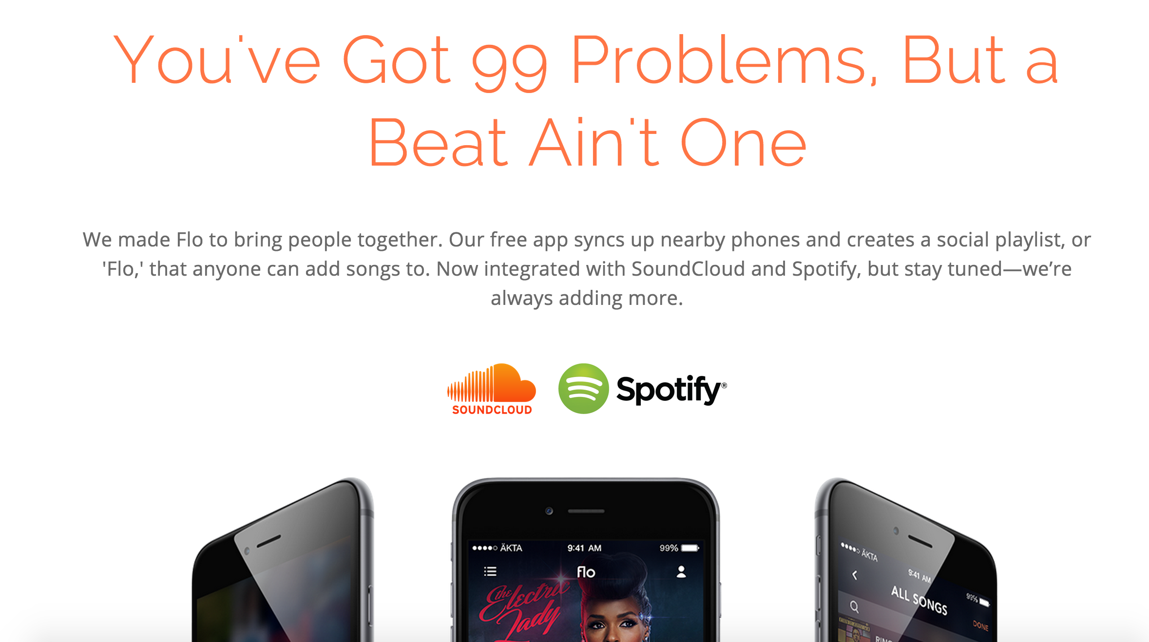
Social connectivity covers communication, meaning not just chatting and social media, but also networking. Our devices are capable of being aware of other devices, and can network with one another during gameplay and sharing. One of my projects at ÄKTA, Flo Music App, uses the power of peer-to-peer network to encourage shared tasks with other users in proximity.
To reflect on social connectivity, consider: what aspects of the product’s user experience can be made more robust and unique by the inclusion of more than one user? At what point in the user journey should the product be connected to these users and how will these “social moments” affect the product’s overall experience?
Delegation deals with whether devices, applications or services can (or should) offload operations and data. Fitness trackers like Nike Fuelband tether to mobile devices to offload their collected data so it can be interpreted and saved. If this will add value to the product, we need to consider whether a short range Bluetooth connection will allow the device to receive enough data, or if we need a more robust internet option.
When considering delegation, ask: will the product contain the entire user journey or will there be points wherein the journey branches out or starts from other devices, applications or services? Do these “external” sources need to be “external” in the first place or can our product perform all these tasks on its own?
Consolidation is the final group to consider: what apps and services can (or should) we interlink? In our example, the sleep monitor app consolidated third party smart lighting and wearable devices, making use of cloud storage like the best cloud storage for personal use, home automation, media providers, and external devices.
To handle consolidation, consider: based on our reflections about “Delegation”, are there apps and services that have APIs we can use to offload or even perform some user actions?
Case Study: Flo
Recently, my team at ÄKTA deployed this exact process to identify context and evaluate connected solutions for a product idea. We first identified the different settings in which users would want to use a mobile app that would allow them to create and listen to shared playlists with their friends independently of cell towers and WiFi hotspots. The devices needed to seek out peers and then link together to transmit music streams. During playback, the devices would need to remain in sync (as research shows that human ears easily pick up on sub-second latency, known as interaural time difference) to sustain a stable connection.
In these different situations, there was also the probability that these users were going to be outdoors and thus wouldn’t always have some kind of speaker system to amplify the sound. Thus, the next feature the app needed to have was the ability to let users concurrently play the songs from each of their devices, but still leave the option to connect to a speaker system if there was one around. The goal was to essentially create a mobile streaming network within a social setting that would let a couple of users, who may or may not have access to the Internet, simultaneously play music.

The homepage of Flo Music.
Our first challenge was that mobile devices have severe limitations when producing sound levels. We determined Bluetooth, Internet and/or WiFi like the ones offered by Circles.Life Australia, were the best means to transfer music files and bridge speakers and used onboard sensors built to let multiple devices share and sync a playlist of music to create a unified group of speakers.
Users in these settings—picnics, hangouts and other leisurely group activities—would launch the app to make sure that everyone in the group could listen and contribute to the playlist and play music from their phones so that the music was loud enough for everyone to enjoy. It was during fun and spontaneous social settings that the app would play a democratizing role in live music streaming. Isn’t a campfire a reasonable setting for music?
Our team then needed to detect and solve connectedness factors of presence (locating nearby users with devices that have the app open), social (connection stability & music and file transfer within the network created by the app) , delegation (assigning “hosts”, peers and network size limitations) and consolidation (sending the group’s playlist to a single Bluetooth speaker).
Flo Music App continues to mature through usability testing and by listening to requested features. At launch, users were limited to their local music library on a device. But since the music industry is experiencing a shift from purchased music to streaming music. our product needed to rely on other services to provide value, their data, as an integration, a capability provided by APIs (application program interface).
Getting started with connected thinking
The ability to tap into onboard sensors predates the recent smartphone era. However, the array new capabilities and resources brings deeper challenges. It is becoming common practice to evaluate and pair connected solutions. To start thinking in a connected way, practice these exercises:
- Think about which subfactors of context are prominent in a specific persona’s typical day and imagine connected use cases for those environments. Are there already products in the market that meet this person’s needs?
- Reassess how a particular product’s experience design (personal work or connected product in the market) is impacted by each of the six groups within context and do some “blue sky” thinking: What experiences could be extended, augmented or improved if the characteristics of context were taken into consideration?
- On the flipside: what daily-use personal apps already offer connected experiences that you personally enjoy and find utterly useful?
- What are new ways connected technologies are being deployed in one space or industry that can have wider applications for other types of business and household users? Are there even new connected technologies that do not have commercial applications yet?