When it comes to technology it often seems that there’s only thing we can agree on: in the words of Louis C.K., everything’s amazing and nobody’s happy. So it is with a little bit of surprise that I noticed the iPhone 6s and 6s Plus have a feature that is getting consistently good press: 3D Touch. Most of the iPhone reviews that came out in the days after the launch mentions the productivity gains and excellent implementation of the feature, as well as an eagerness to see what developers will do with it.
The sense I have after research and playing with 3D Touch is that we’re in a similar place as when Today Widgets first came out in iOS 7. We seem to sense instinctively that this could be a useful feature, but we don’t quite know how to make it so, until we start pushing on the boundaries a little bit. Of course, sometimes we push too far, such as when Apple rejected calculator widgets when they first came out (luckily they’re not doing that any more). But that’s necessary too if we want to get the best out of something.
So what is the future of 3D Touch? That’s what this article is about. I want to spend a little time on some of the better implementations we’ve seen so far, and then think about different directions we might be able to take it.
Where we are
Let’s start at the beginning. 3D Touch is a new feature introduced with the iPhone 6s and iPhone 6s Plus, which senses how much pressure you apply to the display. The amount of pressure needed to activate the feature can be customized through a Light, Medium, or Firm setting. 3D Touch allows for some new interactions, which Apple defines in two main buckets:
- Quick Actions allow apps to deep link and/or perform specific app actions from the home screen.
- Peek and Pop allow apps to let users preview content and perform related actions within the app, before deciding if they want to view the full content.
Apple’s Human Interface Guidelines have a pretty broad take on what these actions should be used for: there’s easy access to “high-value tasks,” and live previews of content. There’s a lot of room for interpretation in those statements. In general, Quick Actions refer to actions from the home screen, and Peek and Pop refer to actions that happen in an app. Early on in my research I realized that it could be useful to look at these actions across an additional dimension. Identifying the primary purpose of the action helps us come up with some innovative ideas for where 3D Touch could go.
With that in mind, I believe we can divide 3D Touch actions into two additional camps, related to how the amount of pressure on the display is being measured: shortcut actions, and dynamic actions.
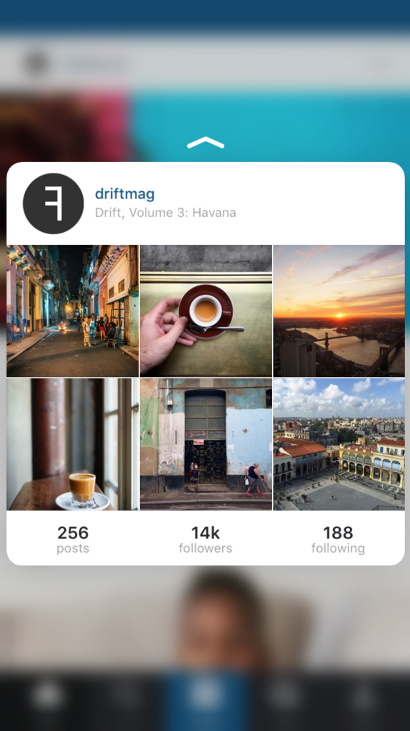
Shortcut Actions use 3D Touch as an alternative type of “click” (like right click on a mouse) to let users skip a few steps, or avoid unnecessary steps in a process. In Instagram, a peek on a username shows a preview of that person, and allows the user to follow them from that view. Dropbox lets users preview a file and then quickly share a public link or make the file available for offline viewing. From the home screen, Tweetbot lets users tweet the last photo they took, while the Messages app lets them jump straight into a message thread with one of their most recent contacts.

Peeking into an Instagram profile
There are other ways to use these shortcuts too. A 3D Touch on the iOS keyboard changes it to a track pad, and 3D Touch in Mobile Safari lets users select text more easily. These actions are all great time-savers, and it feels like the shortcuts are, for the most part, obvious—and will become standard in all apps over time.
Dynamic Actions require a bit more thought, but could also be much more useful in the future than simple shortcuts. The main difference is that these types of actions rely on the amount of pressure applied to signal a variety of actions.
3rd party apps have already started to implement dynamic actions. Magic Piano uses the pressure of a touch to dictate how loud a note should be. In the children’s game Endless Alphabet letters behave differently depending on how hard you press. An interesting concept from Topp shows how dynamic actions could be used for actions like changing volume, among other things.
Synaptics demo – Designing for Force Touch from Topp on Vimeo.
These are early days, but this is the area where I think we’ll see the most innovation in the coming weeks and months.
Where we’re going
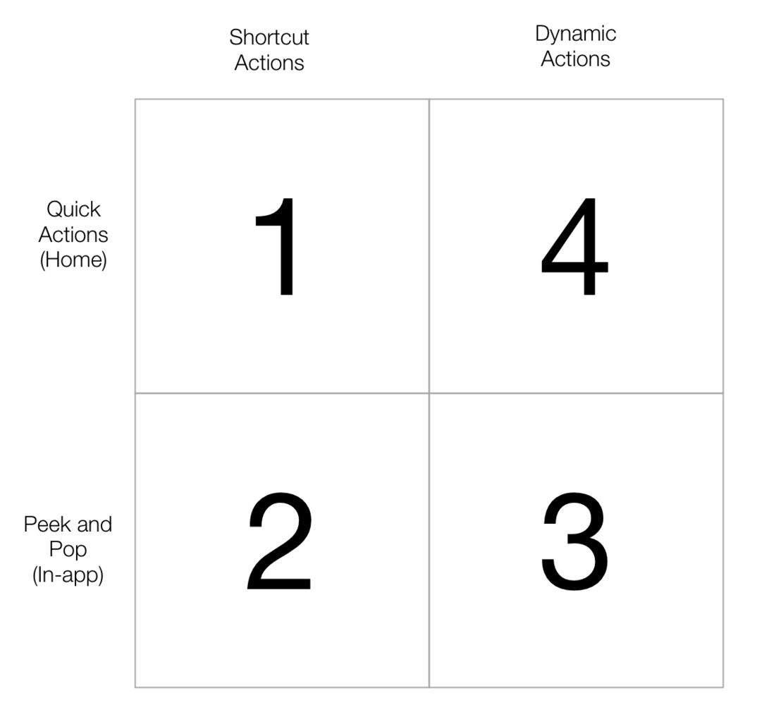
So now that we’ve talked about where we are, let’s talk about where we’re going. Of course I’m not the first person to think about this. There have been some very interesting ideas for 3D Touch already—mostly in the Shortcut Actions category, and I’ll link to some of them in this section. But the future starts to get really interesting when we try to map out the different 3D Touch dimensions:

Once we break it down like this, it gets easier to see how we might take 3D Touch from merely interesting actions to incredibly useful improvements in user experience.
1. Home Shortcut Actions
One proposal that I’ve seen in quite a few places is for quick actions in the Control Center on iOS. Ran Avni put together a really nice prototype of how that might work. His concept shows how a 3D Touch on the WiFi icon or Bluetooth icon brings up additional options to connect easily to a network or a device.
And on Twitter, Brenden Mulligan takes orientation lock a bit further to include a tongue-in-cheek feature I’m sure we’d all appreciate: the ability to stop the device from changing orientation when you’re watching a video.
Force touch orientation lock button in iOS 10 and… #dreams pic.twitter.com/l5FcFy5CZv
— Brenden Mulligan (@mulligan) October 8, 2015
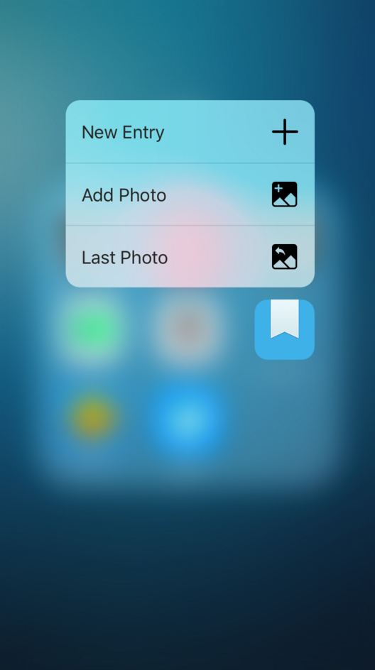
The real power of this feature goes beyond a mere link to a specific screen inside the app, however, to an action that takes data from elsewhere in the OS and feeds it into an a standard app action like composing a new post. This has the potential to save users a lot of time by skipping several additional taps inside an app. A current example is Day One’s “Last Photo” action that creates a new diary entry based on the last photo the user took (see screenshot below). From there we can extrapolate to all sorts of things: “Tweet the text in my clipboard”, “Create a meeting at the last Maps location I viewed”, etc.
2. In-app Shortcut Actions

This appears to be the most obvious and straight-forward quadrant. That said, these types of actions are incredibly useful for productivity purposes. The ability to peek into a link or address or name without having to tap all the way through is a brilliant feature, and will likely continue to be the main way 3D Touch is applied inside apps.
As with home shortcut actions, it’s in the ability to feed data into the peek where the real utility will start to emerge. The best current example I’ve seen is inside the iOS Mail app, where peeking into a time/date reference shows a snippet of the user’s calendar, and allows them to add a meeting from there. This could evolve into so many more actions, such as doing a Google search on a highlighted word, emailing an image to a favorite contact, etc.
3. In-app Dynamic Actions
I’ve seen much less speculation in the area of dynamic actions, but this is where things get really interesting. The most promising practical implementation so far comes from Victor Baro, who wrote about measuring the pressure applied on a touch in 3D Force Touch: beyond peek & pop. The idea I find most intriguing is his concept for using the amount of pressure applied to a photo to zoom into it.
It’s also worth noting that Ryan McLeod almost managed to turn the iPhone into a kitchen scale. The app was rejected by Apple, but there is still hope—you can sign up for updates at http://www.gravity-scale.com/.
Using dynamic actions inside apps can get really interesting as we start to think about the different ways it can adjust levels. In short, anything that can have a “slider” element in a traditional UI could potentially be adjusted with a Dynamic Action touch: volume, number of passengers on a flight, the radius of a circle (think of dynamic search areas inside Foursquare or Yelp), and many more.
4. Dynamic Home Actions: 3D Touch as main UI
The most interesting quadrant in the diagram above is the top right one, which I’ll call Dynamic Home Actions. This is where the real magic happens, because it relates to a tangential topic we’ve seen some discussion about recently: feature unbundling and the disappearance of traditional UIs (see, for example, Notification: the push and the pull and Mobile is not a neutral platform).
So what would happen if 3D Touch became an app’s main UI? What could happen if we created apps solely comprised of shortcut actions and dynamic actions— and nothing else? Some ideas to fill that quadrant with, off the top of my head:
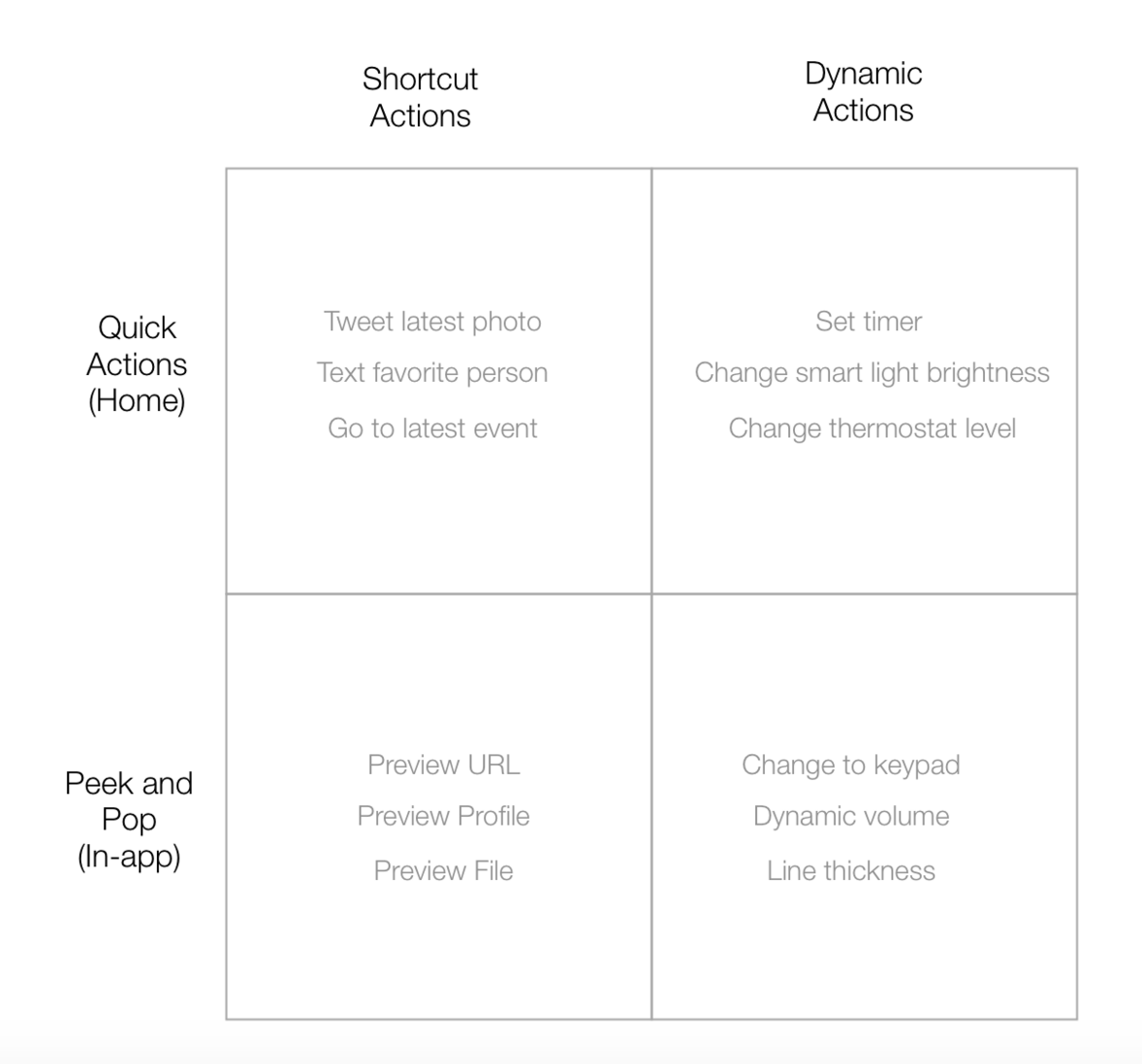
- Instead of tapping into the Clock app to set a timer from there, a user could set a timer from the Clock app’s home screen icon by using varying levels of pressure to select the amount of time to count down from.
- Instead of using the Hue app to change the brightness of its smart lights, a user could change the brightness by applying pressure to the app’s home screen icon.
- Instead of going into the Nest app, a user could change the temperature on their thermostat with pressure applied to the app’s home screen icon.
There is enormous potential hidden inside what appears on the surface to be an incredibly simple feature. We can now fill out my proposed quadrant with some exciting possibilities for the future:

In short, I can’t wait to see what we come up with next. Do you have any ideas on innovative ways 3D Touch could be applied? Share them in the comments below. And for further reading, I recommend the following articles:
- A Touch of Brilliance: Why 3D Touch Matters by Christian Saylor
- Initial thoughts on 3D Touch by Joshua Porter
- Apple’s 3D Touch Is the Start of a New Interface Revolution by David Pierce