This past week, we launched a new look and feel for UX Booth. Tomorrow, we’ll resume our regular posting schedule, but today we wanted to give you a quick look at some of the things that have changed in the latest iteration here at UX Booth.

What’s New
Fresh New Look
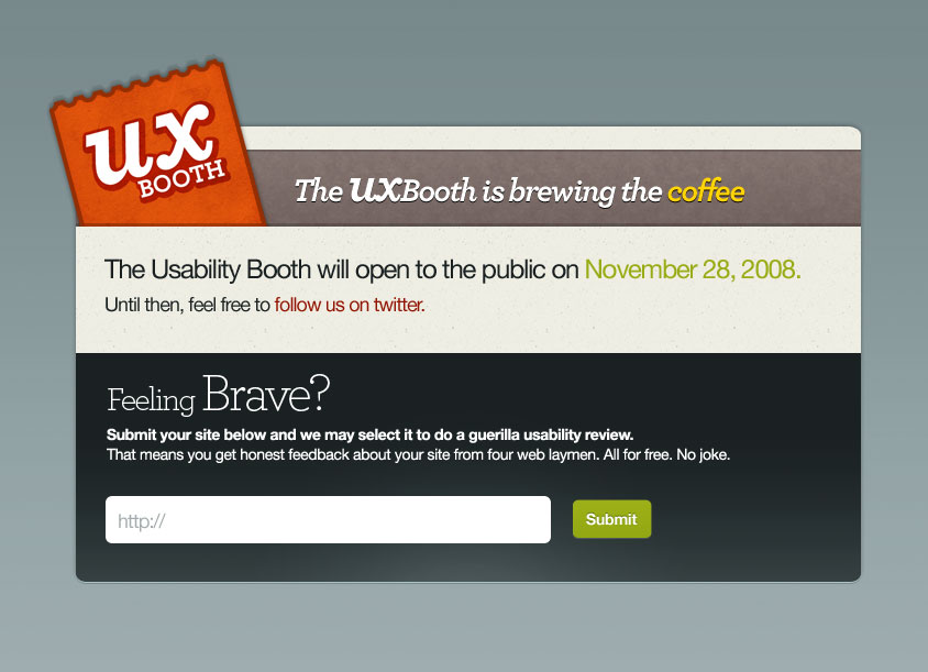
Over the past seven years, UX Booth has seen three major designs (four if you count the latest iteration). While our look may not have always been the same, publishing high quality UX content has always been our primary focus.

Previous front page designs of UX Booth
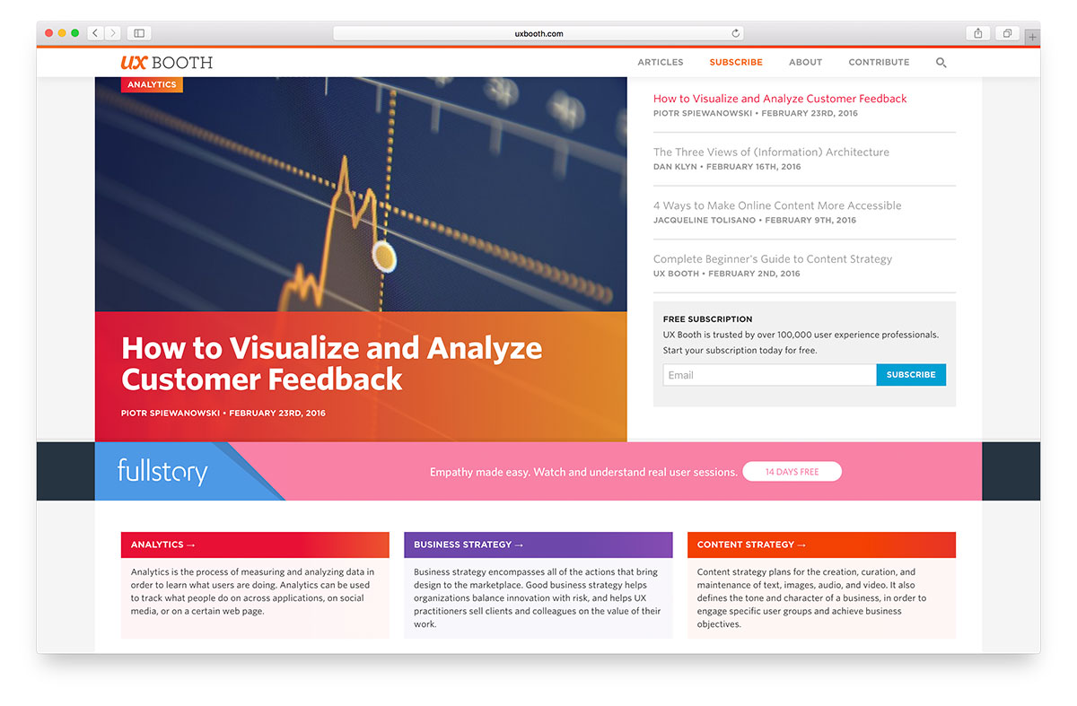
Our latest design builds upon the foundation of nearly 400 articles we’ve published since 2008. Today, UX Booth is a publication for UX professionals, dedicated to providing fresh ideas, insightful perspectives, and valuable resources in order to help us all solve real-world problems. The design is just the face of the publication though—it’s our amazing editorial team that continues to make UX Booth the website we keep coming back to.

The new UX Booth front page
We anticipate that our new design will continue to evolve over time, and have made an effort to make our code base easier to maintain and extend. We hope that you find the new design facilitates your experience on UX Booth, and we’re eager to listen to your feedback if there are areas in which you think we can improve.
Improved Mobile Design
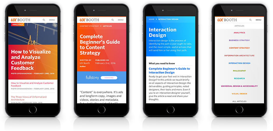
Making UX Booth more accessible across mobile devices was one of our top priorities with the redesign. While our previous was somewhat responsive in nature, it left a lot to be desired.
Our new site puts just as much emphasis on mobile as it does on desktop. It has never been easier to read and browse UX Booth on a phone, tablet, desktop or other device.

Perhaps the most noticeable improvement on all devices is our new Masthead. No matter where you are on a page, a quick swipe/scroll up will reveal a navigation menu, search feature, and a link back to our frontpage. Scrolling down again will hide the Masthead providing optimal reading space on whatever device you’re using.
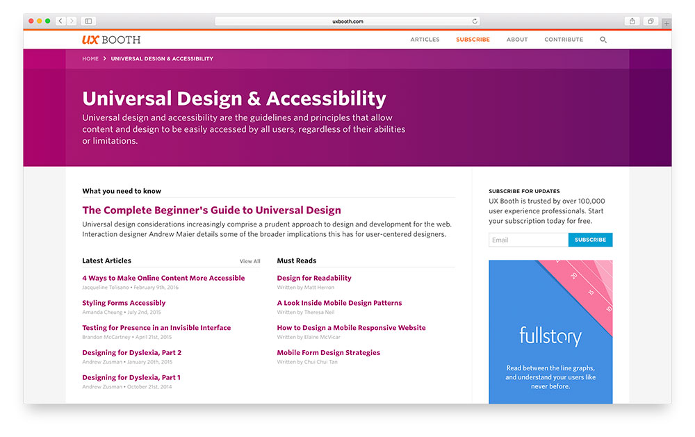
Reimagined Category Page
In the past, our home page and category pages served as a chronological stream of articles. This often led to first-time visitors missing out on some of our favorite articles.

One of the first steps we’ve taken to highlighting our top articles comes in the form of a redesigned Article Category page. The new design features both the old timeline of posts as well as new areas where UX Booth can feature the “greatest hits” of any specific category.
Disqus
We’ve made the switch from our own comment system to Disqus. If you’re not already familiar with Disqus, it’s a great discussion platform that allows users to stay plugged into the conversation across millions of websites on their own terms.
Frankly speaking, Disqus does a better job of allowing users to have meaninful conversations than we ever could on our own. With their focus on discussions, we can keep our focus locked on what we want to be best at—delievering the best UX content possible to our readers.
Better Ads
You may have not been expecting us to call attention to advertisements in this post, but ads fund our business and as such were given careful consideration during the redesign of our site.
A lot of work has gone into designing and developing custom ads that fit seamlessly into our design in a way that (hopefully) doesn’t slow down and annoy our readers. We won’t try to tell you that the advertisements on UX Booth improve the experience (though we certainly wouldn’t be around without them), but we like to think that we’re doing the best we can balancing our business needs with our user experience.
Improved Performance
Some serious strides have been made in regards to performance with the new UX Booth. Our backend code has been overhauled with a more thoughtful approach to how data is cached, while our frontend has been optimized so that fewer requests need to be made per page load.
Performance is something we’re looking to improve even more in the coming weeks, but we hope the improvement is noticeable to our regular visitors!
What’s Next
It’s a bit too early for us to talk in detail about new features coming to UX Booth, but we can tell you that we have never had bigger plans for the site before. We’re incredibly excited about the future and look forward to sharing what’s next with you soon.
Ready to get your feet wet in Interaction Design? In this article we touch briefly on all aspects of Interaction Design: the deliverables, guiding principles, noted designers, their tools and more. Even if you're an interaction designer yourself, give the article a read and share your thoughts.