Many practical user experience projects rely on very loose processes, which are not explicitly defined. That might be ok for an informal usability test, but we should have a more reliable approach for larger UX projects. Just imagine how people would react if the automotive industry created cars without having repeatable and robust standards within the industry as a whole! Our digital experiences deserve just as much attention.
Standards and best practices have long been considered beneficial, as they stop us from designing based solely on personal opinion or experiences. To that end, the International Organization for Standardization (ISO) has created a set of common standards, called ISO 9241, which cover the Ergonomics of Human System Interaction. These standards have been developed by industry leaders through validated research, and are intended to help designers use the best methods to generate findings we can rely on.
The International Organization for Standardization is composed of representatives from various national standards organizations. It is the world’s largest creator of voluntary international standards, with 164 member countries. ISO 9241 is one overarching standard, which provides a detailed explanation for covering ergonomics of human-computer interaction.
In this two-part article series, we will review three of the usability and UX standards within ISO 9241, and show how to use these standards to improve and simplify usability testing. For the purposes of this article, we’ll focus specifically on improving usability testing. Let’s begin!

Observation room of the UX Lab of the HNU with an eye tracker on the left.
Part 11: Guidance on Usability
Part 11 is a good place to start since it focuses on usability, which touches every aspect of UX. The standard, titled “Guidance on Usability,” defines usability as:
[the] extent to which a system, product or service can be used by specified users to achieve specified goals with effectiveness, efficiency and satisfaction in a specified context of use.
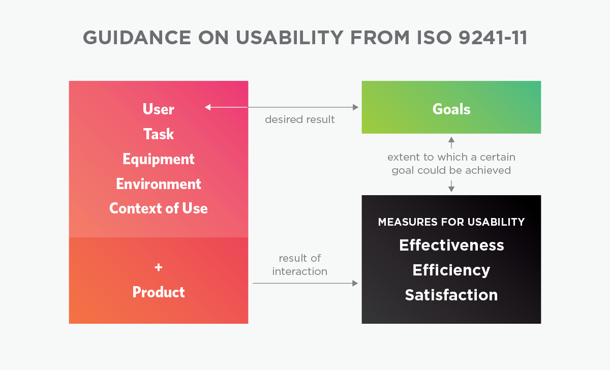
Therefore, (the standard states), these three measures affect usability:
- Effectiveness—accuracy and completeness with which users achieve specified goals
- Efficiency—resources expended in relation to the accuracy and completeness with which users achieve goals
- Satisfaction—freedom from discomfort and positive attitudes towards the use of the product

Source: Adapted from DIN EN ISO 9241-11, 1998, p. 6.
Effectiveness can be described as the degree or extent to which a user could achieve certain goals or, in other words, the degree of task completion by users. Efficiency complements that by measuring the resources that were needed to achieve these goals. Satisfaction can be assessed by users in term of their experience during the use. That would typically be measured during or after a user has interacted with a product through observation or a questionnaire that is in line with ISO 9241 recommendations.
Here’s a non-digital example of effectiveness, efficiency and satisfaction: let’s say a soccer club wants to win the Champions League and also the Premier League this year (or Bundesliga or Primera División etc.). If they win both, the club was very effective. Their effectiveness is the degree to which their objectives could be reached. If the club didn’t have to buy new players and maybe even sold a player and brought in cash, they have been really efficient. If they had to buy new players and spend cash instead, and then won as a result, they were effective, but not efficient. Lastly, if players, fans, media, and investors love how the club behaved, the satisfaction rate is very high. If, on the other hand, most of the fans now hate the club because they sold their favorite player and ticket prices in the stadium went up, the satisfaction rate is potentially low.
In other words, for the soccer club:
- Effectiveness could be measured by winning matches,
- Efficiency could be measured by being profitable, and
- Satisfaction could be measured by the happiness of players and supporters.
Part 110: Dialogue Principles, and Part 12: Presentation of Information
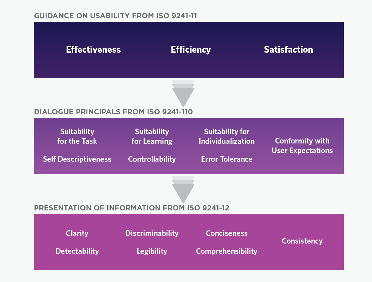
Part 110 and Part 12 are also great resources of ISO 9241, particularly when used in tandem. Part 110, Dialogue Principles, helps to evaluate interactive systems for their efficiency. It deals with general ergonomic principles for designing dialogues between humans and information systems. Part 110 covers the following aspects:
- Suitability for the task: remove any functionality that is unnecessary for the task
- Suitability for learning: minimize the learning time required for the user
- Suitability for individualization: customize the dialogue to suit the user’s context and workstyle
- Conformity with user expectations: adapt to the user’s mental model and skill level
- Self-descriptiveness: provide help text and feedback to clarify the user’s steps
- Controllability: the user should be able to control the pace and sequence of the interaction
- Error tolerance: allow the user to correct errors
Part 12, Presentation of Information, also connects to design evaluations. Part 12 specifies that it “contains specific recommendations for presenting and representing information on visual displays. It includes guidance on ways of representing complex information using alphanumeric and graphical/symbolic codes, screen layout, and design.” The recommendations are based on seven guiding principles:
- Clarity: information should be conveyed quickly and accurately
- Discriminability: it should be possible to distinguish information accurately
- Conciseness: provide only the information necessary to complete the task
- Consistency: present the same information in the same way throughout the application
- Detectability: direct the user’s attention to the information required
- Legibility: information should be easy to read
- Comprehensibility: the meaning should be easily understandable

The relationship between ISO 9241-11, ISO 9241-110 and ISO 9241-12.
A design should support all of these principles and recommendations. If a UX problem is discovered during usability testing, it can be categorized into one of these areas, which will help designers to find a solution for the problem.
One simple example is the checkout process on a website. Let’s start when the user has entered their address, and then clicked on a button to continue on to payment methods. There, the user realized they mistyped their address and want to go back to fix it, but there is no button or path to take the user back to the previous page. This violates the dialogue principle controllability, which states “the user should be able to control the pace and sequence of the interaction.”
If a mistake like this is found in a usability test, we can easily categorize it as a controllability problem. Categorizing it makes it easier to make design recommendations for improvement.
Putting Standards to Use
At the HNU—Neu-Ulm University of Applied Sciences, where we work, we used all of these standards when we tested our university’s website. We used Parts 110 and 12 in particular, to identify areas for improvement. In our test-scenario, students looked for all the courses the university offers. On the homepage there were two paths they could use.
- They could click on “Studies” in the main navigation
- They could use the quick access area with specific links on the left side of the main teaser.
We assumed that the quick access would be really helpful when we designed the site, but during our test few users paid attention to it; most used the main navigation. Heatmap data supported that users didn’t even see the quick access. The problem fell under the category of self-descriptiveness. Our users didn’t understand the quick access area, so they didn’t use it. Normally we would have to rethink the wording and design of the area because users didn’t use it as it is. But since we found that the scenario is already well covered through the main menu, we in this case decided to not optimize this redundant area. Instead, in the next responsive update of the site, we will make better use of that space and rather use it for important news from the university.
Final Thoughts and Next Steps
This brief overview should provide a basic understanding of some of the most important ISO standards, to include in any UX work. In Part 2, we’ll continue, looking at one more area of ISO 9241-210 and how it impacts usability testing, and the user experience in general.

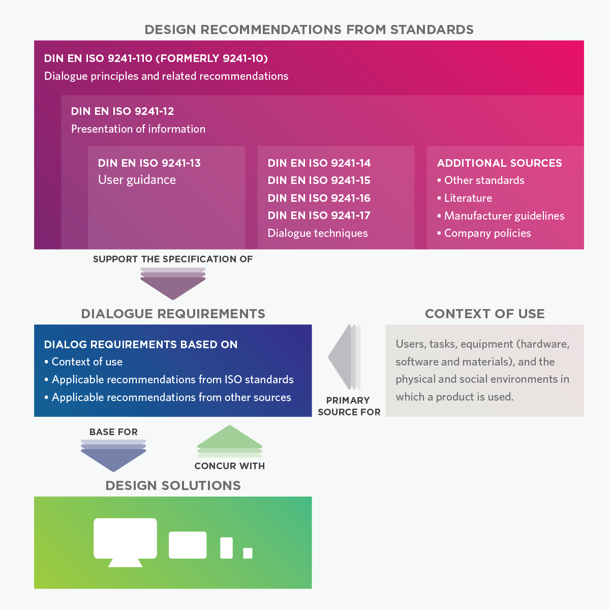
Source: Adapted from Schneider, W.: Ergonomische Gestaltung von Benutzungsschnittstellen, Kommentar zur DIN EN ISO 9241-110, Berlin: Beuth publishing house, 2006, p. 142.
To learn more about the standard, and how to use it to improve the user experience, please refer to the resources below:
- The HNU—Neu-Ulm University of Applied Sciences, and the HNU Usability Laboratory
- There are several institutions that provide training on UX standards, such as HCD Institute
- More information on Guidance on usability ISO 9241-11:1998
- More information on Dialogue principles ISO 9241-110:2006
- More information on Presentation of information ISO 9241-12:1998
- More information on Human-centered design for interactive systems ISO 9241-210:2010
UX research - or as it’s sometimes called, design research - informs our work, improves our understanding, and validates our decisions in the design process. In this Complete Beginner's Guide, readers will get a head start on how to use design research techniques in their work, and improve experiences for all users.