When it comes to navigating a website by browsing (menus) or searching (search bar), it turns out that the two strategies are not created equal. But that doesn’t mean we should ditch one. Shockingly, this is a situation where the lesser-used item is still as valuable as the more popular choice.
The menu and search bar are the two go-tos for navigating most web content. But who’s going to reach for the menu, and who’s going to reach for the search bar? And once we figure that out, how can we design user interfaces that care well for the needs of these users?
This leads to a related question: What makes a user a browser, someone who’s mouse migrates to the menu? Alternatively, what makes someone a searcher, preferring to head straight to the search bar to find one specific thing? To create a solid experience, we need to understand the circumstances that might make most of your users want to browse, or most of your users want to search.
To understand the difference between browsers and searchers, consider the professors we all had in college. Most of us have had a professor who got straight to the point, clearly and systematically lectured in a way that was easy to outline. Most of us have also had a professor who wandered out on tangents, would pause the entire lesson to focus on a new idea, or preferred storytelling over summarizing. Perhaps the first professor was dry and boring, perhaps she was refreshingly efficient and articulate. Perhaps the second professor was inspiring and spellbinding, perhaps he was exhausting and impossible to follow.
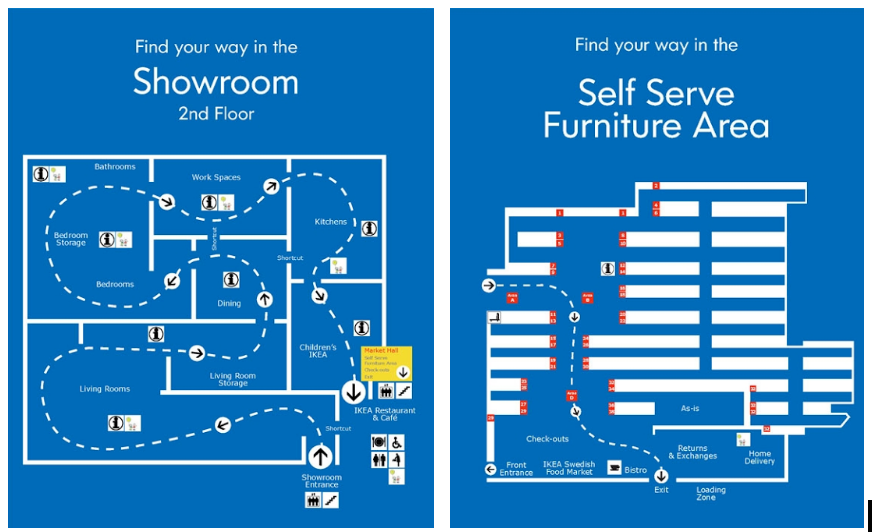
Or imagine a shopping experience at home furnishing mega-store Ikea. The first half of the journey is 10,000 square feet of fake bedrooms, kitchens, living rooms, and entire micro-apartments, all organized into a meandering trail that zig zags slowly through the entire store. Inspiration, new ideas, getting hopelessly lost, and breaking down sobbing are all possible outcomes. But the second half of the journey is a warehouse with systematic rows of boxes. That white-stained HEMNES bookshelf system you found in the cute faux living room three hours ago? Aisle 29, bin 18.

We can think of it as Type A personality’s propensity for achievement and organization being contrasted with Type B personality’s preference for exploration and reflection. We can think of it as the hunter’s preference to keep her eye on the prey and ignore distractions as contrasted with the gatherer’s need to constantly survey her surroundings for more mushrooms, berries, or nuts.
Whatever reference point we want to take, it’s clear that there are a variety of ways that humans navigate their world, and we all move around the spectrum to varying degrees. What the empathy of user experience design invites us to do is to consider what all of those users experiences feel like, remembering that people very different from us will be navigating content very differently than we do.
The Browsers
Most of us browse. Zoltán Gócza, Head of UX at Centralway, explains that:
People are better at recognizing things than recalling them from memory. It’s much easier and faster to click on a link than to enter a search term: you don’t have to spontaneously come up with the proper search expression, or worry about synonyms and spelling.
—UX Myths
Contrary to much popular wisdom, we like clicking around, so long as we can make meaningful choices. Whether your website is an end unto itself (content), or a gateway to services or products, users clicking is a good thing, so long as those clicks reward the user. The problem arises not when a user has made “too many” clicks, but when a user has made too many clicks that didn’t deliver what they wanted.
One of the limits of relying solely on information architecture and red routes that are solely fixated on efficiency is that we forget that, for many users, the journey is as important as the destination. For these users, navigating a well-designed website evokes anticipation, interest, and even happiness. Ross Johnson’s excellent article, The Emotional Aspects of Usability, highlights the reality that we all cite frustration as the result of poor UX, but rarely cite pleasure as the result of quality UX experience.
Clear, thoughtfully structured content and navigation, is, without a doubt, immensely valuable. And there are certainly scenarios where we want users to be able to accomplish a quick, important task, and then move on. But not all users are in a rush, and not all tasks are best accomplished in one click.
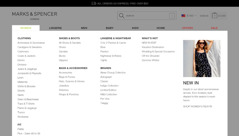
For example, one way to help a user avoid “too many clicks” could be to have a mega menu with every possible destination on your site. But even though it requires only one click, mega menus are paralyzing to many users. A better solution is to provide a clear path, with a few obvious clicks.

How many options are too many?
Glen Lipka Head of PM/UX at Engagio notes on CommaDot that “one common mistake is when people think ‘Browsers’ want to see every possible link on one big giant JavaScript menu. Browsers HATE this because it gives them too many choices. They would rather make several simple choices than one big honking one.”
Which points us to the key to taking care of browsers: simple, meaningful choices.
Reducing options is one way to do that. If the website is for a tech company, “Are you here for support with software or hardware” might be a great opening question. “Are you here for support for a laptop, desktop, or mobile device?” follows up, further filtering the possible end-goals. This is vastly preferable to listing all 37 devices and 78 programs your company sells in an alphabetical list on the support page.
Another way to care for browsers is to offer clean, minimal websites that amplify the simplicity of their choices. Websites that offer clean typography, color palettes, with plenty of negative space and predictable layouts make choosing more intuitive.
A third factor to consider with browsers is the size of clickable options. Fitts’ law states that the time required to rapidly move to a target area is a function of the distance to the target and the size of the target. This doesn’t just mean big buttons. It means large menu items, and expanding clickable areas beyond the literal target area.
Browsers are participating in the ancient human tradition of hunting and gathering, scanning the landscape with our eyes (or ears or touch in the case of some users), making a decision about a goal, then advancing towards it. So long as we’re making progress, we’re likely to keep at it.
The Searchers
Searchers are more rare. The research at the Nielsen Norman Group indicates that most people just aren’t very good at searching. Els Aerts, co-founder and managing partner of AGConsult found that only about 5% of her users were using search. And while some studies find higher numbers, everyone seems to agree that searchers are in the minority.
One of the skills needed to be a successful searcher is to know what questions are likely to elicit the answer you’re searching for. Searchers have to have a clearer picture of their destination than browsers do. It takes intuition to know what terms to type into the search bar.
In this way, searching requires recall, rather than recognition. Recognition, as used by browsers, is simply determining that a link is the correct path forward. Recall, which is needed for searching, requires digging into your memory to find words that describe what you want. Raluca Budiu, Director of Research with Nielsen Norman Group, explains the struggle in her excellent article Memory Recognition and Recall in User Interfaces:
Think of meeting a person on the street. You can often tell quite easily if you have seen her before, but coming up with her name (if the person is familiar) is a lot harder. The first process is recognition (you recognize the person as familiar); the second involves recall. Recognition refers to our ability to “recognize” an event or piece of information as being familiar, while recall designates the retrieval of related details from memory.
—Memory Recognition and Recall in User Interfaces
So, given the challenges to searching, why do we have search bars on our websites at all? It turns out that there are plenty of good reasons. Joshua Jeffryes, Lead UI at OB1, points out in a Stack Exchange discussion that:
No matter how perfect your site hierarchy and navigation is, some users won’t understand it. Or they don’t want to learn it. For those users, a search box is paramount, because that’s the primary way they use the web. To them search is navigation. Rather than exclude those users from your site, leave in the search box. It doesn’t hurt the usability or appeal of the site for people that don’t use it.
Simply put, there are users who prefer search, and there’s almost nothing to lose by including it. More importantly, by letting the search-first minority of your users have their tool you’ll provide an escape hatch when navigation fails. It serves as a safety net for well-planned navigation, even among users who prefer browsing.
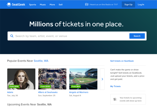
While Derek Halpern of Media Triggers argues that smaller websites are better without search, search becomes increasingly central as websites grow in size and complexity. Can you imagine finding a bird feeder on Amazon without using the search bar? In large, intricate e-commerce websites, search bars move out of the header and take on a central role in the UI.

As a site’s complexity goes up, its reliance on a search bar goes up.
Perhaps even more important though, is the user data that gets generated by searches. Mike Hill, Senior UX Designer at GEICO points out that “every time someone types a single thing into that search box, they are giving you insight into how they see and think about your site.”
Search data can teach you about more than searcher’s agendas. Search data can also play an important role in improving site navigation. Depesh Mandalia, Head of Conversion & Product at ticket.com, points that “it’s important to know which pages (aside from the homepage) customers are searching from since it may indicate a poor UX or that we’re not catering for customers as well as we should.”
Take Away
In the end, the important take away is that both navigation and search have a vital role to play in web navigation. Aneta Chodor-Kjeldsen, Lead Frontend Developer at Cludo ApS points out on the Cludo blog that “web owners very often underestimate the power of the search box or, on the other hand, think that placing a search box on their page will solve all UX navigation issues and challenges.” It’s important that we, instead, understand the strengths and weaknesses of both.
For searchers:
- Make sure you can easily search from any page on the website
- Predictive input reduces your likelihood of every performing a search with no results
- Make use of autocomplete to speed up search results
- Be gentle with spelling errors
- Take the time to study your search data and make changes accordingly
For browsers:
- Limit the use of “hamburger menus”
- Keep your menu in a standard location (read: the top of the screen)
- Sticky menus are 22% quicker to navigate and are preferred by 100% of users
- And make sure to optimize your menu order
Ready to get your feet wet in Interaction Design? In this article we touch briefly on all aspects of Interaction Design: the deliverables, guiding principles, noted designers, their tools and more. Even if you're an interaction designer yourself, give the article a read and share your thoughts.