Usability is is an assessment of how easy user interfaces are to use. It’s about asking the question: “How easily can users understand and use my product’s UI to achieve their goals?”
There are multiple ways to evaluate interfaces and identify areas of improvement, one being usability heuristics, or design principles. Nielsen Norman’s 10 Usability Heuristics (published in 1995) are by far the most popular set, and are widely used. However there are alternatives, albeit much less known.
One of them covers Cognitive Dimensions: they were created more than 20 years ago and have a special focus in programming languages, but are incredibly relevant to design today: its principles (as you’ll see below) can still be applied to all digital products that we interact with, and help to create better, more usable interfaces.
The Cognitive Dimensions Framework was first introduced by Thomas Green (University of Leeds) in 1989/1991. A few years later in 1996, Thomas Green and Marian Petre developed a lenghtier analysis of programming languages using the Cognitive Dimensions, which explored in more depth how each Dimension worked and should be used.
Until recently, however, this framework remained mostly within the domain of academic papers, and attempts to explain the dimensions and their applicability to the product design process were few and far between. The goal of this article is to introduce UX practitioners to each dimension and its applicability to the design process.
The 14 Cognitive Dimensions of Notations
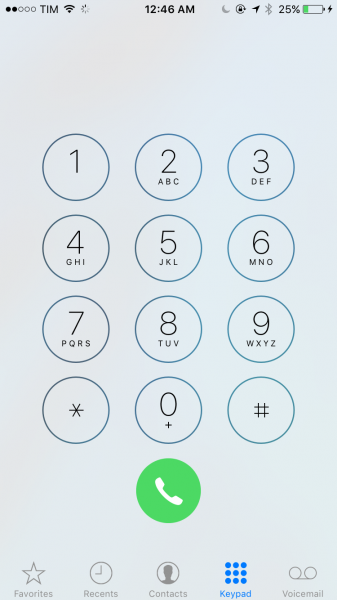
There are 14 different Cognitive Dimensions of Notations. Before jumping into what they are, it’s important to define what a notation is in the first place: A notation consists of an interface element—or a group of elements—with which the user will interact with in order to effect a change in the system. Multiple notations can be nested in the same screen. For example, if you consider iOS’ Phone App, the keypad with multiple keys is a notation by itself—responsible for composing the number that will be dialed, and for interacting with that number; calling, adding as a contact etc. But the tab bar buttons are also notations themselves—which would then take the user to another screen.
1. Viscosity
For fluids, viscosity measures its resistance to local change. For information structures, the viscosity is the amount of work the user has to put in, to effect a small change. A system that is highly viscous will require the user to take many steps to accomplish their goal. When evaluating systems, each user goal is going to have a level of viscosity—and that level should be as low as possible.
2. Visibility
Visibility is a measure of how easily users can locate the elements necessary to accomplish their goals. It’s important that the system doesn’t bury information or encapsulate elements, because the less cognitive work that goes into accessing an interface element or content, the better. The longer the search trail necessary in order to find something, the less visible, and thus the less satisfactory the experience.
3. Premature Commitment
Premature commitment is a “yes/no” measurement. The user should never have to make a decision before the information required for him to make that decision is available. If the user is asked to make a decision prematurely, it may be because the order of doing things is inappropriate and wasn’t thoughtfully constructed. In the same way that we wouldn’t ask someone to select cutlery before choosing their food, we shouldn’t ask a user to choose whether to make a purchase before telling them how much it will cost.
4. Hidden Dependencies
This is another yes/no. Whenever parts of a system are dependent on each other, that dependency should not be hidden.
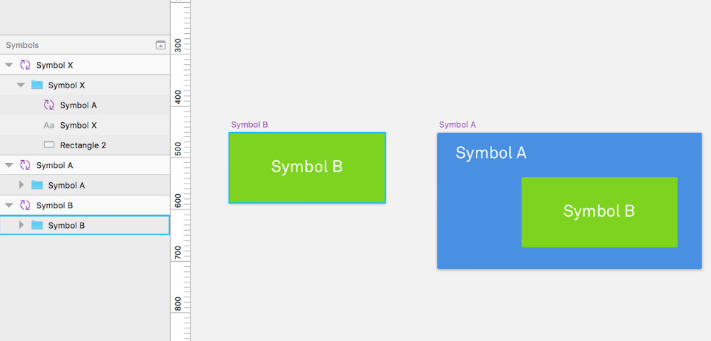
One good example is Sketch App’s Symbol feature. When you create a Symbol, it becomes an element that you can reuse throughout your design—and whenever you make changes to the original, it will affect all the other ones.
You can nest Symbols, too—and that’s where it gets tricky.
If you nest Symbol B under Symbol A, then nest Symbol A under Symbol X (Making X dependant on A, which in turn is dependant on B), then making changes to the Symbol B will result in effects hard to observe or predict without a search of all symbols associated.
5. Role-Expressiveness
The purpose of an element in a system should either be obvious or readily and easily inferred by the user. Two elements with different purposes should not look the same, and the user shouldn’t be confused by their presentation. Consistency is key, and can be measured for the experience as a whole on a sliding scale.
6. Error-Proneness
The terms and symbols that we use in an application will determine how error-prone the end-user is. It’s important to make sure that the user notations we use will help the user avoid making mistakes or slips. A poor dialogue box that doesn’t clarify what a user should do next has a high level of error-proneness, where a green button that says Go! Has a low level of error-proneness.
7. Abstraction
An abstraction is a number of elements grouped together that are meant to be treated as one entity either to lower the viscosity or to help the user understand that UI element. The abstraction barrier is the number of abstractions a user needs to master before he’s able to use the system. The lower the abstraction barrier, the better.
An abstraction also changes its underlying interaction. It usually expands it. For example, the UI elements used to dial a number in the iOS’ phone app are the digits 0-9. However, since the app also has a “favorites” feature, there is now more than just one way of calling somebody—the concept of making a phone call was expanded.
8. Secondary Notation
Secondary notations are any extra information used to supplement a UI element and to convey extra information to the users. They are not a part of element, and they do not change its meaning in any way, just make it easier to comprehend.
Some good examples of this are programming languages that allow the use of comments, or even products with well-designed icons. The more secondary notations, the smoother the experience tends to be.
9. Closeness Of Mapping
“Closeness of mapping” refers to how interface elements describe their results, much like an affordance. If the button “Add to Cart” sends an item to the wish list instead of to the cart, that element is very far from the result it is describing.
If the interface elements clearly describe their results, the user will have fewer new concepts to learn in order to use the system, which in turn, improves usability.
10. Consistency
Using consistent patterns allows users to recognize familiar symbols as they move through a system. For example, if similar information is presented in different ways, learnability and usability will be compromised as a result of increased mental load.
This goes from buttons with similar functionalities but that look different, to menus that lack consistency.
11. Diffuseness
Diffuseness is the verbosity of language, which is the number of symbols or entities required to express a meaning. The less space used to convey a message, the better.
Some notations can be too long-winded or occupy too much valuable real-estate in an interface. For example, unnecessarily large icons or copy often hurt usability by making it harder for users to scan a page.
12. Hard Mental Operations
This refers to any operations with a high demand for the user’s cognitive resources. A notation can make things unnecessarily complex for the user if it makes excessive demands on working memory: it’s a bad sign if the user needs to use a notepad to make annotations in order continue using the system.
A good example of a hard mental operation is Wolfram|Alpha’s minimal interface, which requires users to enter syntactically-complex queries. The user must either remember the syntax necessary, keep notes, or consult the wiki.
The less the demand for cognitive resources, the better. Low cognitive demand improves usability and allows users to achieve their goals faster.
13. Provisionality
Pencils are used by architects, typographers and other designers to make faint, blurry provisional markers, meaning “something more or less like this goes more or less here”. Provisionality allows users to make indicative selections before making definitive choices. It reduces premature commitment, which improves usability in the system.
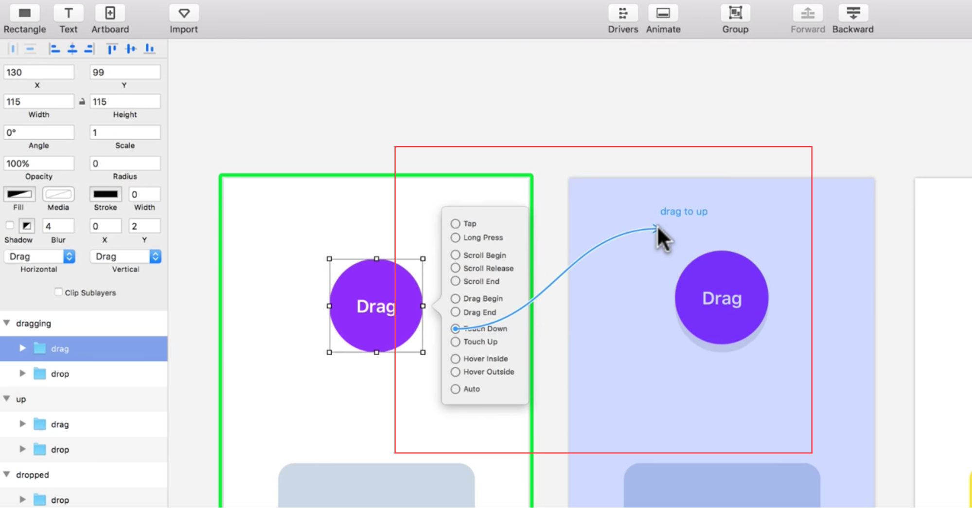
For example: Referring to Principle again, when you are creating a new event, you are able to see—before making a definitive choice—what artboard will be linked to that event simply by dragging the mouse over it.
14. Progressive Evaluation
While this applies more to programming languages than to design, it’s still worth visiting, as it is the final cognitive dimension in the set. Progressive evaluation answers the question: can a partially-complete program be executed to obtain feedback on “How am I doing?
Beginners, when using a system, tend to evaluate their own progress at frequent intervals. “Progressive Evaluation” helps them do that, which in turn, increases odds of users achieving their goals. A great example is (yet again!) , the prototyping software for Mac, which has a “preview” window that allows users to test their prototypes in real time, while they are being built.
Real World Application
Now that we’ve covered the theory, let’s talk about practical uses and real world examples.
The Cognitive Dimensions framework is used to provide insights as to how users interact with products. It’s not a list to “check-off,” instead, it’s way of empowering UX practitioners and others to make better design decisions.
I recently evaluated a very popular web app—InVision, the prototyping tool—to determine why it was successful, and where the app could use improvement. I reviewed the app according to the 14 dimensions, and I found that it typically scored very highly. It had good visibility, a low number of abstractions, plenty of secondary notations, and was very consistent.
Let’s take a closer look:
Good Visibility
Remember: The longer the search trail necessary in order to find something, the less satisfactory the experience.
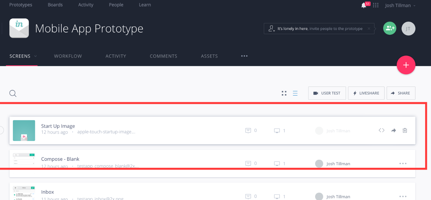
Inside a prototype, you can see a list of all screens. All informations regarding that screen are available without the need to visit a different page. On mouse hover, all the possible interactions are readily available, including less-common interactions such as sharing or deleting that screen.
Abstractions
Remember: An abstraction is a number of elements treated as one entity. to help the user understand the interaction.
An abstraction changes its underlying notation. It usually expands it. For example, the notation used to dial a number in the iOS’ phone app are the digits 0-9. However, since the app also has a “favorites” feature, there is now more than just one way of calling somebody—the notation was expanded.”
The standard way of linking two screens together is creating a clickable box and then selecting the screen it will link to. However, with the “Templates” feature, you can group multiple boxes in a “Template”, then apply that template to multiple screens—effectively expanding the previous notation, so now it’s possible to link screens together simply by applying a template.
In the screen below, the blue clickable boxes were created manually, while the green ones are from the template that’s being applied:
Secondary Notations
Remember:Secondary notations are any extra information used to convey extra information to the users.
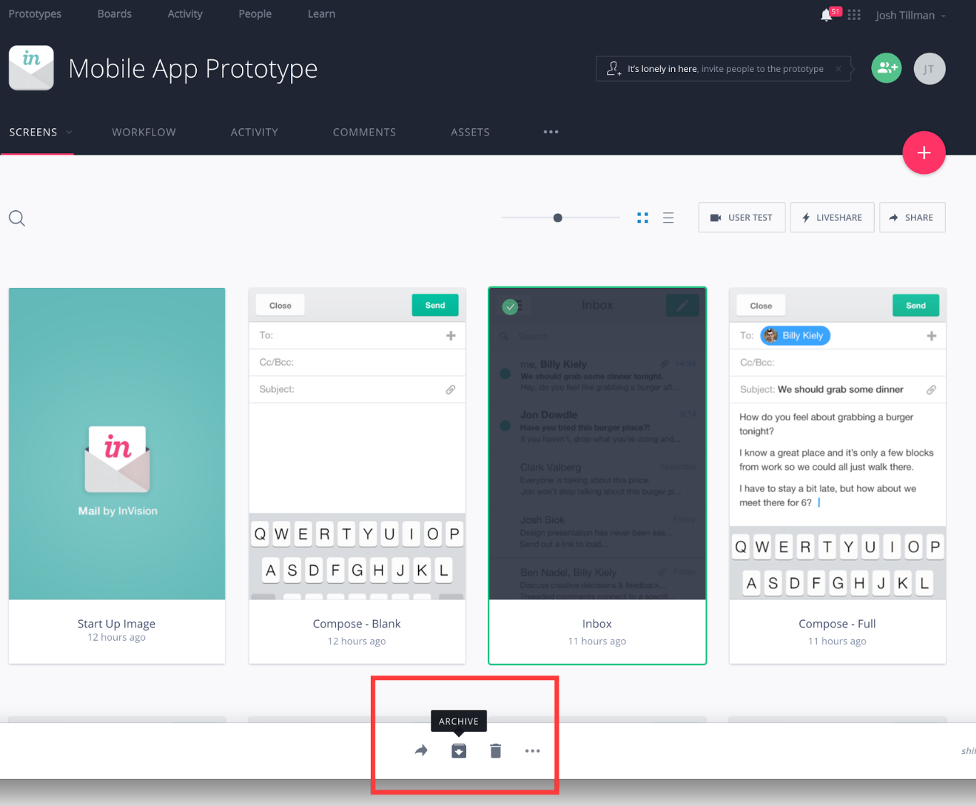
The small dialogue boxes that pop up on mouse hover make it easier for the users to comprehend what an icon means, and what the resulting action will be. This is the type of secondary notation that rates very highly.
Consistency
Remember: Using consistent patterns allows users to recognize familiar symbols
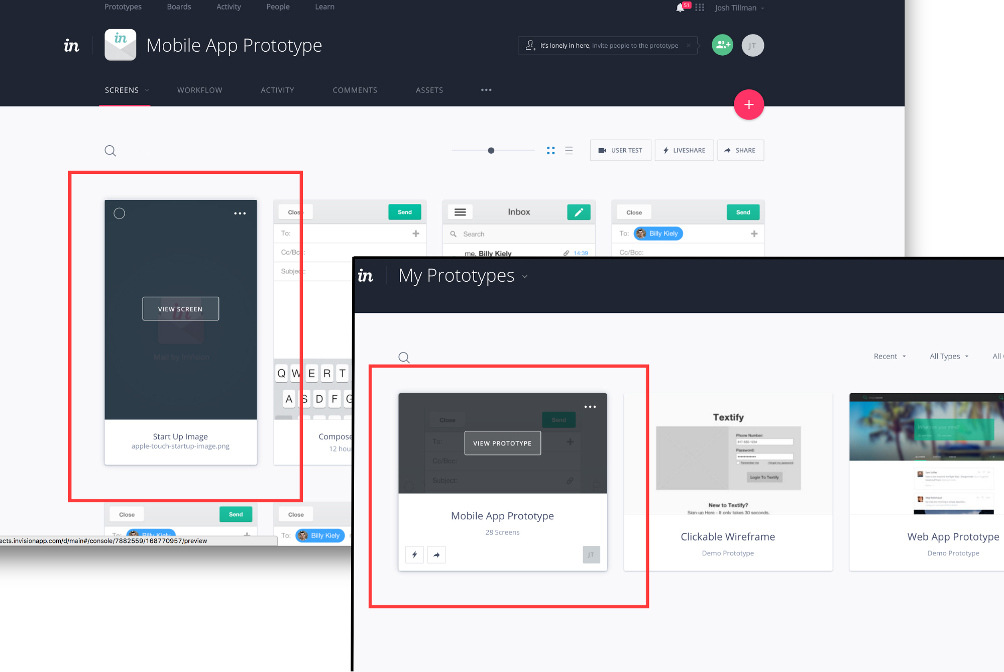
The result of a mouse hover in a card is consistent through the application. It becomes clear to the users that a hover equals further information, a way of opening that card, or the ability to select multiple cards.
Progressive Evaluation
Remember: Progressive evaluation answers the question: can a partially-complete program be executed to obtain feedback on “How am I doing?”
This is a major area for improvement on InVision. When you are linking screens together in the app, there is no way to assess your progress—you can’t know if there are fifty screens left to be linked or just two, for example. Not only does that make it really hard to locate yourself, but also hard to estimate how long you will take to finish it up. There is no indication as to what screens already have links when you are linking them, nor when you are looking at the screen listing.
Closing Thoughts
This wraps up our guide to the Cognitive Dimensions. If you enjoyed the subject and want to dive deeper—which I highly recommend, given how useful it is to understand the concept—then it’s worth taking a look at Usability Analysis of Visual Programming Environment: A “Cognitive Dimensions” Framework, the original paper from Marian Petre and Thomas Green that we based this post on.
Lastly, Cognitive Dimensions of Information Artefacts: A Tutorial is follow-up tutorial by Thomas Green and Alan Blackwell for the BC HCI Conference of 1998 that includes examples of practical applications and that I also recommend checking out.