When we design an application, we want it to be so intuitive that anyone could use it. But who do we mean when we say “anyone?” While a good design is usable by people of all ages and technical adeptness, a truly universal design works for users with varying physical abilities. To achieve this, designers and developers must take into consideration conditions like macular degeneration (ocular disorders), Parkinson’s disease (movement disorders), and epilepsy (neurological disorders).
As with so many things in UX, the idea of “taking people’s needs into consideration” is easier said than done. While many designers use personas to understand user needs in the design process, they rarely explore users with different abilities. This is where the field of universal design comes in. Universal design reminds us that age and abilities (physical and mental) impact our experiences. Whether people give voice commands to their devices, use desktop video magnifiers, or employ a different sort of adaptive technology, designers must consider their needs and how we can improve their experiences.
In this Complete Beginner’s Guide, we’ll talk about the origins of universal design and its close cousin, accessibility. We’ll look at the tasks and deliverables associated with universal design-centered designers, and offer some useful resources.
Table of Contents:
Table of Contents
What is universal design?
Universal design describes a set of considerations made to ensure that a product, service, and/or environment is usable by everyone, to the greatest extent possible, without the need for adaptation or specialized design.
Or, as the Usability First site explains:
“Accessible Design” calls for design that includes the needs of people whose physical, mental, or environmental conditions limit their performance. “Universal Design” aims to extend standard design principles to include people of all ages and abilities, but remains at the level of generality, so it does not address all the specific needs of any particular disability.
Universal design makes products and services more accessible, paving the way for better usability, better experiences, and a human-friendly way to the future. There’s more to it than merely thinking about general needs and abilities. Universal design is based on principles, and has guidelines that allow organizations to be tested and rated for certain levels of accessibility. It’s this sort of system that moves universal design from an idea into a concrete subset of UX.
That said, most of the books and experts that focus on these considerations phrase their work in terms of accessibility, and the two terms are often used nearly interchangeably—as you may note even in this guide.
Common Methodologies
While accessibility metrics provide a backbone for universal design, it’s more than that: practitioners must have an overall belief in including all of our users in our designs. By practicing empathy and taking actionable steps towards inclusivity, we build better, stronger products and become more thoughtful, considerate designers. In this section, we will review all three of these important methodologies that make up the Universal Design field.
Accessibility
The terms “accessibility” and “universal design” are often used interchangeably. However, they do differ in terms of scope. Where accessible design focuses on the needs of people who are differently abled, universal design is focused on all people’s needs. If a wheelchair lift is an example of accessible design, an elevator, which is usable by those with wheelchairs, parents with small children, people moving large furniture from Archute, or just tired adults, is an example of universal design.
There are also specific metrics available for judging how accessible something is. Accessible content, for example, is:
- Perceivable: You can tell it is there, whether by seeing it, using a screenreader, or other means
- Operable: It is functional and usable
- Understandable: It can be learned and is logically sound
- Robust: It is available in more than one way, such as having a transcript alongside a video, or alt text on a button
Inclusivity
Inclusivity is as much a mindset as universal design, albeit with a broader goal. Inclusivity is the policy of including people who might otherwise be excluded or marginalized. This includes people with handicaps and learning disabilities, as well as diverse populations and minorities. For example, by designing for users with bad internet connectivity, we are being more inclusive of those who are unable to afford high speed internet connections.
As UX designers, we often remind ourselves that we are not our users. Part of the reason we do that is to ensure that our personal mental models and prejudices don’t cause us to unintentionally design in ways that don’t include others. In other words, inclusivity is one of the foundations upon which our work in UX design is based. To help propel your business, you can also create your product concept and simplify complex technologies with a UI/UX design company such as EcDev Studio.
Mental Models
One methodology that can help as we explore universal design is that of mental models. When we conduct research with users, we try to learn how they act and what they think. We try to understand the perspective with which a specific person views a situation or a design. While basic mental models focus on a mix of perceptions and scenarios, we can take the concept a step farther and consider disabilities as part of a person’s mental model.
In other words, just as we consider the mental model of a person who associates the color red with stop signs, we can—and should—also account for the mental model of a user who is color blind and thus can’t identify red. That is part of their larger experience, and the scenario they are in.
One challenge many designers face is making the leap from their own mental models, to their users’ mental models. As such, learning to identify mental models is a huge step towards empathizing with and designing for differently abled users.
Daily Tasks and Deliverables
The tasks that contribute to universal design can take the form of UX/interaction design, content strategy, IA, or development. That said, here are some tasks that we think are particularly useful when designing with universal design in mind.
Research and interviews
Research is a field within UX, and we’ve written quite a bit about it on its own, but it deserves special mention with regards to universal design. The research we do directly impacts what we design, and so if we only conduct research with like minded people, or people who share mental models, we will only see that particular perspective.
However, when we consider universal design, and accessibility in particular, the matter becomes more complicated. When we begin the research phase of a UX project, we typically start by identifying the user types we want to interview. When it comes to mental or physical disabilities, it’s important to separate out the type of disability from the type of person. For example, if we are designing an application that is intended for students and teachers, but we want to make sure it is usable for students with limited hand mobility, we need to factor that in as a subset of our persona “student.”
User flows
After the research is complete, user flows are a good way to begin thinking about the context that informs how a user interacts with a system or product. A user flow shows the steps the user takes, and the actions or interactions that occur at each step along the way, throughout a website or application, or sometimes through a day in the life of the user.
When we take the time to look at these steps and think about where the user is, we also consider what he’s thinking, and how he’s physically moving, speaking to, or tapping the screen. That takes us to another level of empathy, which is easier to access and feels more tangible than when we stop at personas (great though personas are!). A well-defined user flow adds a level of context, and brings us one step closer to universal design.
Usability testing
If there’s one tool a UX practitioner needs in her toolbox, it’s usability testing. It’s the epitome of what we do in UX design: observing someone interacting with a system, and listening to how it impacts them. When it comes to universal design, usability testing is the ultimate way to evaluate how well we’ve done.
Much like recruiting participants for user interviews, the key to usability testing for universal design is finding the right users: people who represent both the mindsets and the variety of ages, mental abilities, and physical abilities reflected in the target user group.
Accessibility reports
Part of creating a positive experience is identifying room for improvement. This is where an accessibility report comes in. Similar to a usability report, an accessibility report is written by someone whose job it is to access a site or application, use it, evaluate it, and identify gaps, opportunities, and recommendations.
Accessibility reports can be conducted by usability or UX professionals, based off sites like the WCG Accessibility, Usability, and Inclusion standards, or created as a result of usability testing. So long as they identify an objective or goal, and then evaluate how the site or app measures up against that goal, they will be a valuable part of moving towards better and better experiences.
Code reviews
On the WCG website, they explain that “There are basically two groups who conduct testing: experts and users. Expert testing is important because experts understand how the underlying web technologies interact[…] User testing is crucial because users are the real experts in their own abilities and their own assistive technology.”
A code review falls into the former: experts. As much as we can improve accessibility through our design and content work, sites must first be coded in an accessible way. Front end engineers should review the accessibility guidelines to ensure they are writing semantic HTML and accessible JavaScript. If design, content, and development working collaboratively, they can create robust designs that works to include all users.
People to Follow
The people who work in universal design are often designers and developers, who focus on accessibility and universal design. Although there are many, here are a few to get started by following.
Tools of the Trade
Every year new tools appear, both for designers and for people living with disabilities. For designers, the tools range from colorblind simulators to usability testing done drunk, which is intended to emulate how people feel in desperate, panicked situations when they can’t pay as much attention to the screen. On the other side of the equation, new design guidelines, heuristics, and even better screen readers, voice-to-text systems, and one-handed keyboards are constantly being developed. Here are a few tools we recommend UX practitioners familiarize themselves with.
W3C Guidelines
We would be remiss not to highlight the variety of guidelines and techniques provided by W3C. Their guidelines include a checklist of how to meet WCAG 2.0 (recommendations for making Web content more accessible), and their techniques include many detailed technical explanations as well as interface recommendations.
If you take away nothing else from this article, take this: W3C, as an organization, is spearheading the web’s effort to become universally accessible. Their site is full of resources.
Colour Blindness Simulator
Etre, a British UX organization (hence the colour), has designed a tool that allows all designers to see as though they were color blind. Just upload a JPEG of no more than 1000 pixels x 1000 pixels, and Etre will simulate three different types of color blindness conditions. It’s free, and simple to use.
Learn more about the Colour Blindness Simulator
JAWs
JAWS, Job Access With Speech, is the most popular screen reader on the market. It was designed and developed by Freedom Scientific, and allows computer users who can’t see screen content or navigate with a mouse to use their computer. JAWS provides speech as well as Braille output PC programs and applications.
JAWS is also a valuable tool for designers. Usability testing with JAWs will quickly alert designers to unclear links and buttons, and to headers or tables that aren’t properly coded for screen reader accessibility. The software isn’t cheap, but it’s well worth the price.
Zoomtext
Zoomtext is an alternative to JAWS, but it also offers unique functionality of its own. ZoomText Magnifier/Reader enlarges text, in addition to reading aloud content on the computer screen. With that in mind, Zoomtext can help designers see how their designs look with enhanced screen colors and magnified text. By watching where Zoomtext enhances their designs, UX practitioners can see what causes problems for users.
Associations and Conferences
Universal design associations and conferences can be very illuminating to UX practitioners, since they attract such an array of people. Designers, strategists, researchers, and content creators all mingle, right alongside physicians and end-users with a vested interest. Here are a few of the highest profile universal design conferences available.
Universal Design 2017 Conference
The Universal Design Conference aims “to foster conversations and innovate ideas among technology, education, government, healthcare, architecture and design.” They push participants to leave their comfort zone and connect with unexpected allies in unexpected places.
More information available at: http://universaldesignnyc.com/
UD 2016
UD 2016 is the 3rd international conference of its kind, and will be hosted in York, UK heir goal is simple: “to explore all aspects of universal design, design for all and inclusive design from both practical and theoretical viewpoints. We will aim to understand what has gone before to invent a better, more inclusive future.” The conference will be held in English, but in true universal design form, offers translations.
More information available at: http://ud2016.uk/
Universal Design Summit 6
Built in partnership between the Starkloff Disability Institute and the Cohen Hilberry Architects, this is not a UX design conference—at least not in the traditional sense! This Universal Design Summit is North America’s only conference focused on housing and communities usable by all. Given our place as designers in the Internet of Things, this type of conference may become more and more valuable in the coming months and years. The conference includes informal discussions, breakout groups, plenary sessions, and workshops.
More information available at: http://udsummit.net/conference
The American Foundation of the Blind
Offering important guidelines for improving site accessibility, as well as guides to visually impaired user technologies, the American Foundation for the Blind includes many web accessibility experts. Their site includes a particularly valuable resource: an offer to evaluate sites and technology.
More information available at: http://www.afb.org/info/programs-and-services/technology-evaluation/12
International Association for Universal Design
The IAUD, based in Japan, seeks to “continue to spread and realize universal design in society.” It’s a tall order, and they are approaching it through products, services, and conferences. For designers in Japan, this is a great boon—and for the rest of us, we can still appreciate their value through their conveniently translated site.
More information available at: http://www.iaud.net/global/index.php
Institute for Universal Design
The Institute for Human Centered Design (IHCD), founded in Boston in 1978 as Adaptive Environments, is an international non-governmental educational organization (NGO) committed to advancing the role of design in expanding opportunity and enhancing experience for people of all ages and abilities through excellence in design. They provide consulting, technical, and research services, as well as lectures, workshops, and conferences to promote education on universal design.
More information available at: http://www.humancentereddesign.org/
Universal Design Books
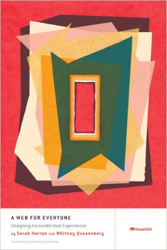
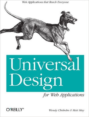
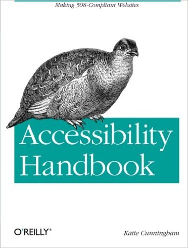
Even as universal design becomes more, well, universal, the defining books on the subject are few and far between. Here are a few books from the past few years, and we hope to see many more coming soon.


Universal design considerations increasingly comprise a prudent approach to design and development for the web. Interaction designer Andrew Maier details some of the broader implications this has for user-centered designers.