Question: What do the animal kingdom and large complicated websites have in common?
Answer: They’re both ordered with taxonomies.
Taxonomy building might not be the first thing that aspiring UX designers think about when launching their careers, but maybe it should be! After all, a well-organized website can have a huge impact on how the audience searches, finds products, and generally experiences the site.
This article will explore what taxonomies are, how to gather the information for them and visually display them, and how they’re useful for digital products.
What is a taxonomy?
Taxonomies are systems used to classify and organize things. So yes, when we talk about taxonomies in the animal kingdom (remember Kings Play Chess On Fine Glass Stools?), we are talking about the same type of taxonomy that gets used to organize a digital property.
A taxonomy—generally speaking—aims to understand a set of subject-specific concepts, and creates a vocabulary for those concepts, in order to ultimately organize the “physical things” related to those concepts and make them easier to find or interact with. This works well for subjects such as biology, where we organize species of plants and animals into categories based on their physical and genetic similarities/differences. House cats and lions are physically similar, and through science, we’ve determined that they’re related enough to be grouped together in the same animal family. However, lions and housecats are still their own species—a category that is specific within the family of all cats and helps to differentiate the two.
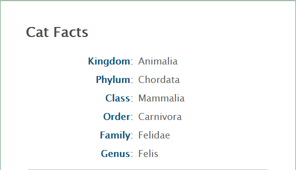
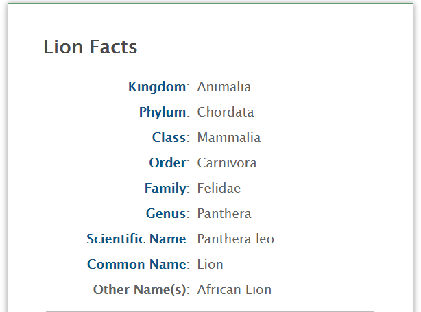
Lions and cats are classified very similarly, but their features dictate that they be separated into different species entirely.
Taxonomies for websites and digital products function in the same way — helping to organize and classify information and features based on the similarities and differences of the concepts behind those features. This may then appear as categories within a blog or news page, or sections within a website, or metadata tags to improve search.
Of course, as UX practitioners we don’t necessarily get to organize things in the way we want. Instead, we look at how users interpret and search for content on our site and sites like ours. Users of different ages, incomes, education levels, and backgrounds will use these products differently.
This is still quite a broad definition of taxonomy. So I’ll also explain what a taxonomy is not:
- A sitemap: Sitemaps can be the end result of a taxonomy exercise, but sitemaps don’t deal with definitions of words or how certain features are related to others. That being said, a good taxonomy can inform a good sitemap and ensure easy navigation for any digital product.
- A content inventory: Content inventory typically lists all the physical content that is present on a site. A taxonomy, on the other hand, organizes content, which may help determine what content is important, but taxonomies don’t have to deal with every single little piece of content.
- A list of keywords: Taxonomies can help find keywords that actually resonate with the desired user base, but keywords and search ranking are just one part of the benefits of creating a taxonomy. Keywords alone won’t help identify the relationships between different site areas and features, while a full taxonomy exercise aims to do just that.
Designers might need to do some digging to really understand what users are thinking of and looking for before creating a taxonomy. User input is one of the most informing things about a taxonomy, and it informs how we create a good taxonomy.
What do you need for a good taxonomy?
A good taxonomy is typically a collaboration between UX designers, content strategists, information architects, marketing, and development folks. Marketers might know quite a bit more about site keywords and SEO rankings, and a content strategist can help define and categorize terms and might have special insight into how users interpret content. Developers often have a different thought process and can even help with card sorting exercises, explained in the next section.
The steps to complete a taxonomy are simple: first, gather information. Then, document it!
Gather Information
The first thing you need for a good taxonomy is to know what is being classified, which may take the form of a content inventory. Next, it’s important to learn how users are accomplishing tasks on the site—but how do we learn what those tasks are?
Interviews: User interviews are a great setting to ask users how they find products, and listen for what vocabulary and terminology they use. Users may refer to features in different ways, and have very different ways of finding those features. Pay special attention to terms that interviewees use to describe the subject matter—for example, a customer on an e-commerce site might refer to their shopping cart as a cart, a shopping bag, or “my checkout.” Make a note of these variation, as it will impact the terms used in the taxonomy.
Sitemap: A sitemap will help create a holistic view of the website or app. By mapping out each page in a site’s navigation, you can begin to see subpages that don’t belong within their sections, which is a sign of a site navigation that isn’t following a clear taxonomy. If someone has already created a sitemap, they may have a taxonomy in mind, or justifications for why sections were organized the way they were. Learning all this early on decreases the likelihood of accidentally reinventing the wheel.
Content inventory: A content inventory typically appears as a spreadsheet, listing out every page on a website. Each page gets its own line—and sometimes every content element does as well, including headers, body text, articles, buttons, search, navigation bars, and interactive elements. Each type of content may then get additional notes including metadata, a “usefulness” score, alternative terms for the item, etc.
Competitive Analysis: How does the competition organize or do things, and how does it work (or not work) for their given mission or end goals? Remember that someone else’s successful site structure might not be directly applicable to your own, but can still offer insight.
Card sorts: This is one of the best ways to learn how end-users might identify and create categories. Take up to 30 index cards and write down on each one a term, topic, phrase, or content item. Then ask end-users (or other team members, such as developers or marketers) sort these into categories that they come up with. In my experience, even just five participants will start to help identify key patterns and categories. Larger organizations might do upwards of 75 to get statistically significant results, but it will depend on the size and scope of the product. I recommend OptimalSort or Trello, or even good old pen and paper for initial card sorts.
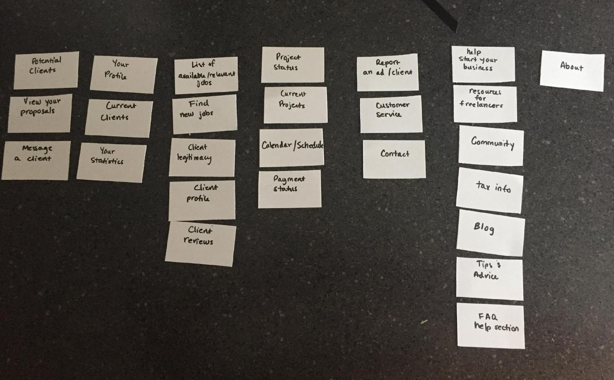
TA card sort I conducted during a redesign of a popular freelancing platform.
Create a visualization
Now that we’ve gathered data from multiple sources, it’s time to organize it all in order to easily see what elements are related. Since audiences vary so widely across the digital sphere, there are many different forms a taxonomy for a digital product can take. The right taxonomy depends a lot on how the design team, stakeholders, and target audience understand the information and terminology. Each type of taxonomy display is useful for a different sort of organization.
Flat Taxonomy
Flat hierarchies are only useful for the simplest of taxonomies. They show top-level terms spread out horizontally, showing a broad range of subjects, but not much depth for any one subject. This works well for sites that have distinct, recognizable categories that don’t have much overlap in terms of meaning. When creating sitemaps for web redesigns, flat taxonomies also usually translate into simple navigation.

Image source: MarketingLand.
Pinterest is one example of a site that balances site organization and user experience using a flat taxonomy. All of Pinterest’s 30 categories are top-level topics that users can search through depending on their interests. We can reverse-engineer this by first noting that users like to search Pinterest in many different ways — they might choose a specific topic, or browse most popular or recent uploads. Pinterest also lets users assign topics to uncategorized uploads, meaning that users can participate in the addition of that new upload to the current taxonomy.
Hierarchical Taxonomy
A hierarchical taxonomy is a flat taxonomy with added subsections and sub-categories. Hierarchical taxonomies are probably the most common and show the depth at which the subjects go. Again, this typically translates well to a site navigation—for example, if we were creating a website based on the classification of species in the animal kingdom.
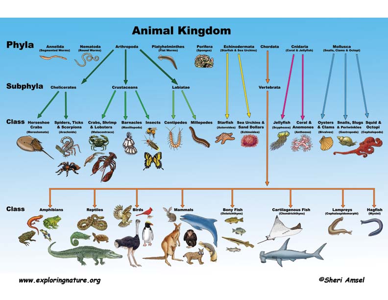
The entire animal kingdom encompasses nine different Phyla, which is the first subgroup that narrows down and classifies animals by their characteristics. Each subgroup branches off the first and gets narrower in scope. In this example, the taxonomy is organized hierarchically all the way down to the individual species, like a housecat or a lion. Because each subgroup only lives within one larger group, a hierarchical taxonomy is perfect for representing these relationships.
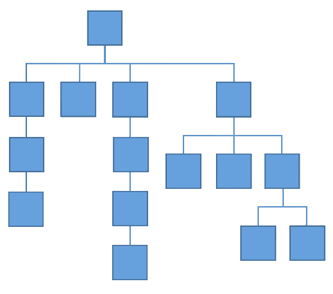
Image source: MarketingLand
Network Taxonomy
When terms are separate, but still connected to each other on some level, we want to draw lines between those terms to create networks. A network taxonomy can represent the way that users think and relate to associated topics, and may turn into a metadata tagging system. This can also inform more intuitive navigation elements, such as adding a call to action on a page that directs to another site area.
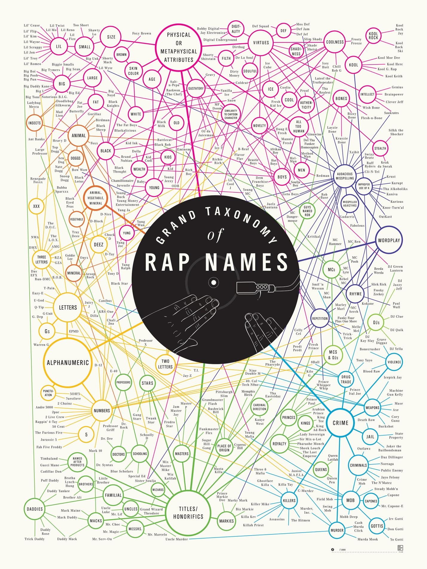
The Taxonomy of Rap Names is a network taxonomy that shows a way to group names based on what they have in common. The taxonomy uses the large bubbles that show attributes of these names, and the actual names in small font linked around them. Some names are linked more than once, since they connect to more than one other attribute.
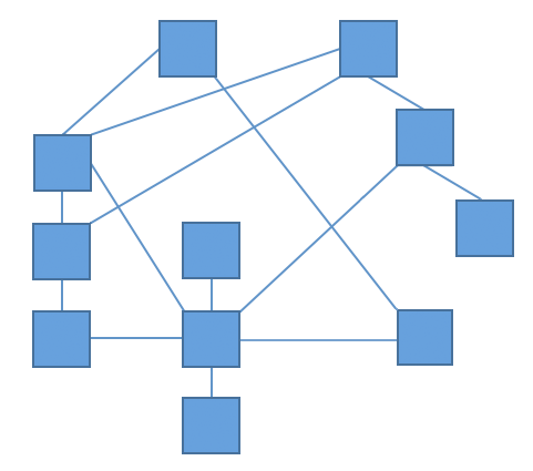
Image source: MarketingLand
Facet Taxonomy
A facet, or spiderweb taxonomy shows a term or item at the center of a web, with associated taxonomies drawn around it. An example of this would be how a site like Yelp works; every restaurant on Yelp has certain attributes, such as price, rating, and food type, which can then be turned into filters.
A combination of network and facet taxonomies were used in this great presentation from Alberta Soranzo, who designs experiences at UCLA’s Center for Health Policy research. Soranzo goes through a case study to reorganize six large research websites in order to make finding research articles easier and more relevant, with a special emphasis on taxonomy. The site, where researchers and others can look up a multitude of research studies, was not always indexing search results properly based on categories, and comprehensive overhaul was needed to determine what categories would allow for the most intuitive way to find articles as well as balance the breadth and depth of searching.
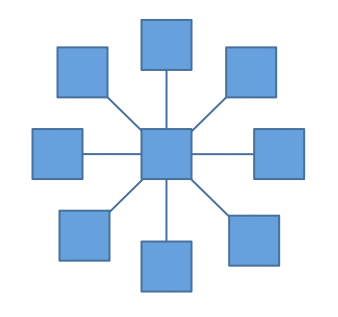
Image source: MarketingLand
Iterate and Improve
Company goals change over time. Thus so do websites and audiences. It follows that regularly incorporating taxonomies into redesigns, overhauls, or even minor tweaks to interaction, can ensure that as a designer, you’re on the right path to intuitive and user-centered design.
A taxonomy is a living document, and needs to be re-tested and updated on a regular basis. It takes time and effort to keep it up to date, but it’s invaluable when it is.
Read More:
