The struggle to present qualitative data findings is one that can easily vex even the best user researchers. This is largely due to how difficult it is to turn participants’ open responses into quantitative data. Some researchers resort to the archaic “word cloud” approach, which adds visual clarity without actually providing valuable information. However, there is another more effective technique that can assist in the visualization of qualitative data: the Sentiment Score Chart.
Savvy user researchers employ a diverse set of methods in project data collection, such as surveys, user tests, task analyses, opportunity workshops, contextual inquiries, and in-field observation. The ideal combination includes both quantitative and qualitative techniques, so that a researcher can attack data with a multi-pronged approach and achieve a higher level of convergent validity. But, walking the line between quantitative and qualitative data use sometimes invokes questions of weighting where a researcher has to assess how much credence to give to qualitative responses over hard data.
Quantitative data are often easier to understand and convey to product teams – especially when it comes to creating visuals and more concrete data graphs. Also, quantitative messages are more easily received by product managers and engineers, who often gravitate toward numbers and concrete findings. However, overlooking or minimizing the use of qualitative data is like forgetting to order girl scout cookies: huge mistake. Qualitative data provides a rich picture of sentiment and opinion, which numbers can’t always convey. If quantitative data are the bones of the structure, qualitative data are the voice and the spirit.
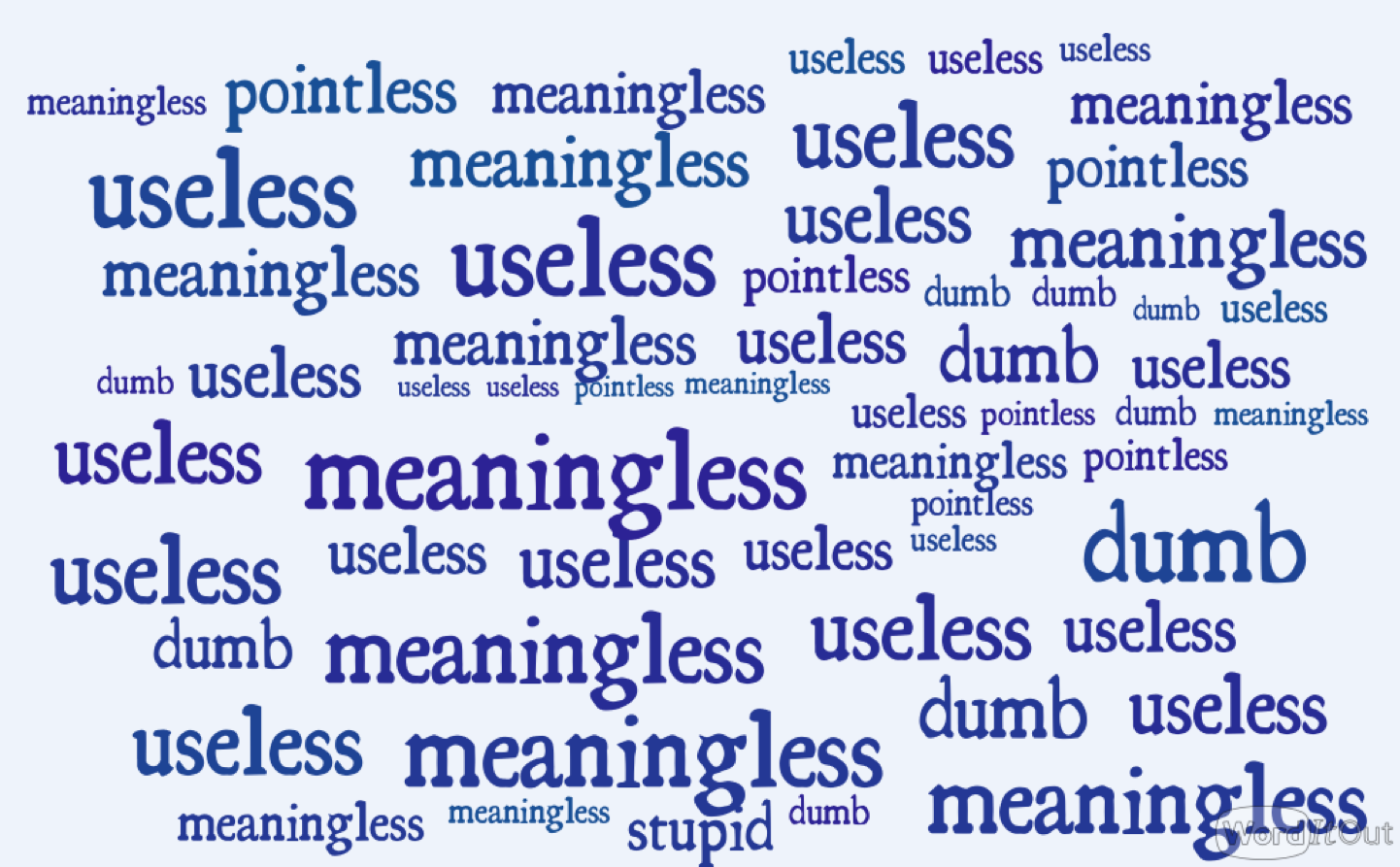
That doesn’t change the fact that qualitative data can be difficult to interpret and visualize. Researchers struggle to translate facts that do not come in a clean Likert scale or task success metric due to a lack of consensus in the standards for how qualitative data should be judged. Equally as important, how can a standalone deliverable visually convey feedback when there is no researcher to talk through the bullet points of a user feedback session? Not through a word cloud, which Jeffrey Zeldman has called the “mullet of the internet” (fun to look at but of little value). Word clouds are essentially parlor tricks, designed to wow a viewer while not providing meaningful data. Yet, for too long, researchers have been relegated to word cloud use because an appropriate alternative has been lacking.

Here are a bunch of words in different sizes—make adjustments to your product accordingly! (WordClouds created with WordItOut.com)
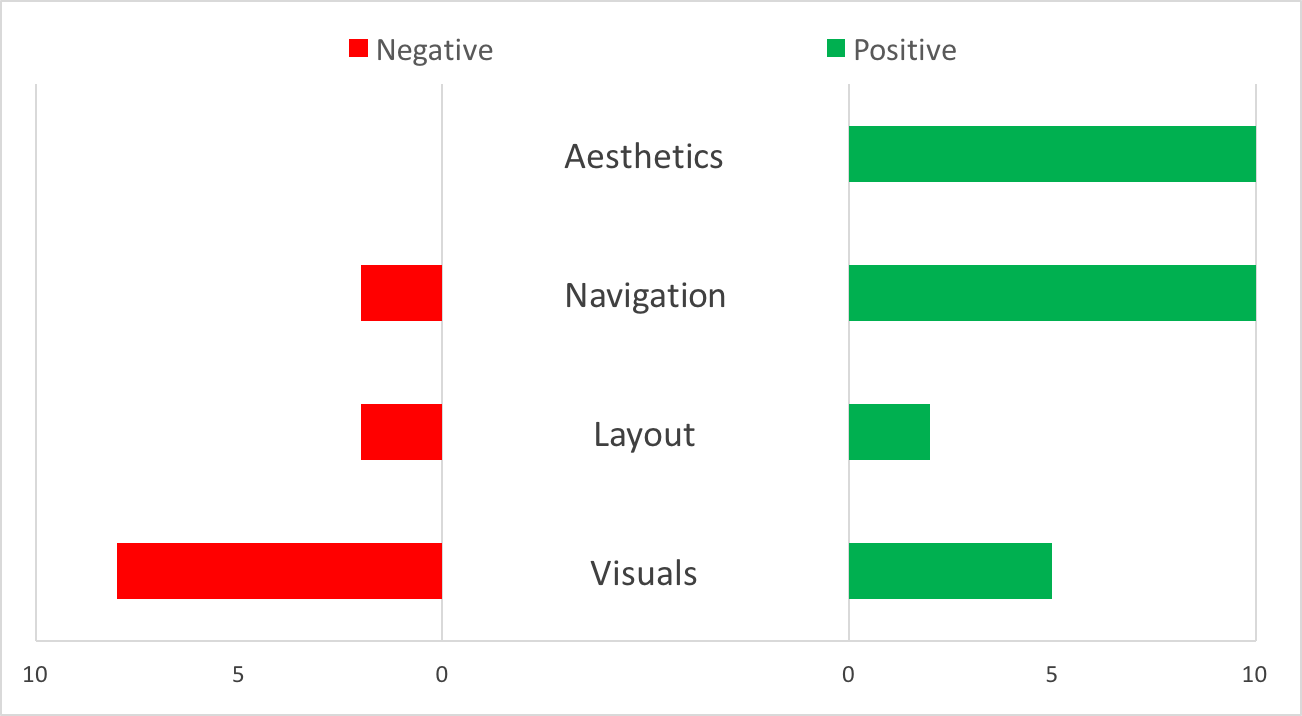
One technique in the fight against “the mullet” is the Sentiment Score Chart. A Sentiment Score Chart is an approach to quantify and visualize qualitative data. It provides a means to understand the emotions users shared during qualitative feedback sessions, or open-ended responses on a survey. By segmenting out these areas in a polarized histogram, team members can more easily identify the positive and negative portions of their product.

Example Sentiment Score Chart
How it Works
Creating a useful Sentiment Score Chart for qualitative analysis requires four steps of data analysis:
- Transcription
- Categorization
- Synthesis
- Visualization
Transcription
In general, all qualitative questions during a user feedback session should be transcribed. The key is to avoid abridged notes or general assessments, but instead to literally transcribe sessions word-for-word. Beyond inhibiting a game of telephone that can dilute through the product team, full transcription is also a good practice as it makes the notes from feedback sessions much more useful and searchable. We leave the analysis for later.
For those cringing at the thought of transcribing heaps of interviews and open-responses, try investing in transcription shortcuts such as talk-to-text transcription applications, a transcription service, or the age-old technique of conscripting interns to do the transcription. At my company, we simply use transcription software that allows the transcribers to slow audio speed and transcribe as we go along. But before handing it off to an intern, do give it a try—taking word-for-word notes is an interesting experience, and can help researchers practice active listening when they’re not the one conducting the interview.
Categorization
When interview transcriptions are complete, it’s time for a researcher to go through the transcription notes and start distilling the topics discussed with the goal of identifying global themes and patterns within the feedback. Using the transcriptions from the previous step, the researcher needs to segment out each conversational area in the user test and categorize them, either by product or feature area, interaction, or site section, depending on the goals of the research. Here the researcher should be looking holistically at the conversational areas, not just at keywords or text fragments, which is why this work can’t be done by a computer or AI (yet!).
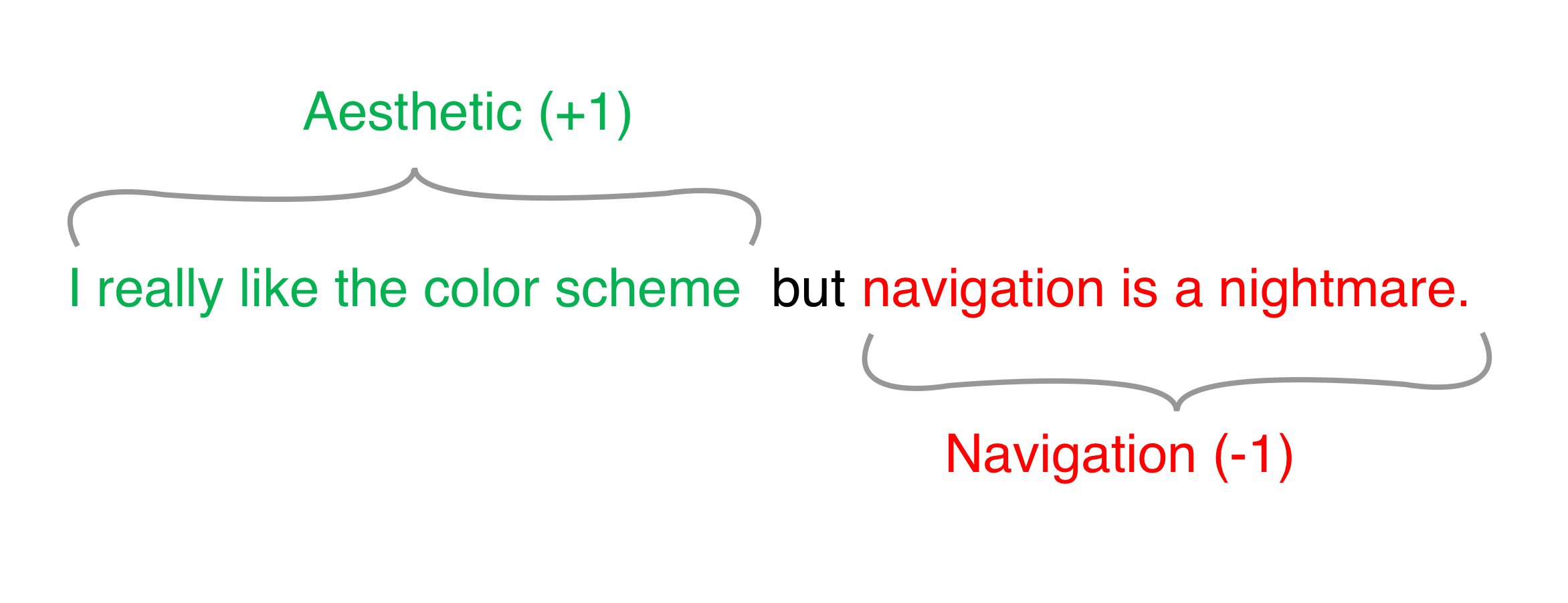
Once statements from the feedback are grouped by topic, the researcher should assign a polarity to the statement by classifying the statement or topic as “positive” or “negative.” While it sounds easy enough, there is some art to the approach. The researcher needs to be perceptive of the same topic running across multiple sentences, savvy enough to break apart statements that span multiple areas, and aware of statements that might fit more than one category. A statement such as “I really like the color scheme but navigation is a nightmare” would actually encompass two statements: one positive about aesthetics (“I really like the color scheme”) and one negative about navigation (“navigation is a nightmare”).

It is helpful to establish what the categories will be before beginning to categorize statements, but tweaks to the coding scheme might be required as transcriptions are analyzed. It can be helpful to divide the statements into parent categories (for example “Overall” and “Features”). Comments that fit within the “Overall” parent category typically reference product areas that are omnipresent and general in nature. Within the parent category of “Overall” we use children sub-categories such as Aesthetics, Navigation, and Layout. Comments that fall into a “Features” parent category typically describe specific features of one’s product (e.g. Button X, Product Page Y, Copy on Page Z). The parent category “Features” will typically have more sub-categories (e.g. Product Page X, Button Y, Modal Z). Comments generally fall into one parent category, but a measure of flexibility is sometimes required for expansive statements that can apply to multiple areas. It’s important to maintain flexibility during this step as revisions to categories are sometimes required.
Data Synthesis
The data should be in a more manageable state now that it has been categorized. At this point, it’s merely a matter of aggregating the data by topic area and sentiment polarity. To do this, the researcher should set up a table with each of the categories and count the number of positive and negative comments for each topic area.
The number of tables that are created will mirror the number of parent categories established during the categorization step. In other words, if there are established parent categories for “Overall” and “Features,” then create two tables (one for each parent category) to make two separate Sentiment Score Charts. The number of rows in those tables will depend on the number of children sub-categories established for that parent category. For example, the table below has been created for the “Overall” parent category and will be used to show the number of statements offered by participants for each of the children categories: Visuals, Layout, Navigation, and Aesthetics. Discrete tables should be made for each parent category. The aggregated numbers in this table will drive the visualization of the statements in the next step.

Visualization
For data nerds that love excel and charts this is easily the best part. A strong visualization can tremendously enhance the data that has been distilled from your transcriptions, especially when conveying user sentiment with a product team. A Sentiment Score Chart excels where word clouds fail not only because of its ability to convey comparative positive or negative emotion, but also because of its ability to visually communicate the magnitude of user response. This ultimately helps researchers identify the more provocative areas of their product.
To formulate the Sentiment Score Chart our research shop uses the table created in the Data Synthesis step to generate the Sentiment Score Chart in Microsoft Excel. This approach is very similar to the construction of a butterfly chart. When creating the chart, the researcher should use the topic areas for the rows and the frequency of sentiment polarity for the columns (negative and positive). It is important to remember that individual charts will need to be customized by choosing specific padding values and axes values (explained further in the tutorial links above), but a little trial and error will eventually lead the visualization down the right path and create insightful visualizations like the one below.
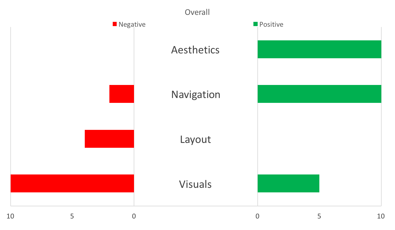
Using the Sentiment Score Chart below as an example, our product team was able to understand user sentiment with more specificity applied to specific areas. In the example, one can see that users responded unanimously positive with 10 comments regarding the aesthetics of the product, navigation was majorly positive (10 positive comments) with some negative dissention (2 negative comments), layout was negatively reviewed in 4 comments, and thirteen comments were made regarding visuals with the majority of them being negative (10 negative and 5 positive).

Using this scorecard, the product team was able to apply direction and magnitude to user feedback for specific areas of the product. Which direction the scales tilt for each area informs the researcher of the overall polarity of comments, but the magnitude of the comments also paints a picture of user sentiment that allows a product team to plan future work and resources with regard to area improvements. For instance, although layout was unanimously reviewed negatively in all comments, visuals stimulated the most comments with the majority of them being negative. A product manager can use this information to determine that while layout is problematic, the most provocative area of the product were the visuals. Therefore, future work in visual design, such as iconography or photography, should be prioritized.
Next Steps
Ultimately the Sentiment Score Chart helps qualitative research by transforming qualitative data into a quantitative visualization. This approach will help any team understand how separate areas of the product are affecting the end user and which areas are provoking the largest reactions.
Looking for more? Anne K. Emery outlines other approaches for visualizing qualitative data that may prove useful for the conveyance of user sentiment. The Sentiment Score Chart is an approach that can serve as a tool for the product team to identify future work, plans, and designs by providing a meaningful visualization technique for qualitative data.
UX research - or as it’s sometimes called, design research - informs our work, improves our understanding, and validates our decisions in the design process. In this Complete Beginner's Guide, readers will get a head start on how to use design research techniques in their work, and improve experiences for all users.