Despite being a staple of web design, poor search usability is something I encounter all the time. Recognising the impact of failed searches (and having a plan for them) could help prevent lost revenue.
A customer walks into a brick and mortar store, asking after a product the staff don’t recognise. The staff shrug, offering nothing but an apology (and perhaps not even that). The customer leaves dissatisfied with the whole exchange, and heads to the nearest competitor instead.
As the owners of this hypothetical business, we’d be pretty cheesed off with our staff. They weren’t helpful, and didn’t even attempt to salvage the interaction. The behavior of many websites and apps is no different.
Visitors being stumped by unhelpful ‘no results found’ screens is one of the most common issues I encounter when user testing. I find it astounding how little emphasis some teams put on this critical scenario.
If we’re designing a site with search, we must give consideration to ‘no results found’ scenarios as well. When the unexpected happens, we’ve got to give the user more than just an apology.
Making the case for good search
On larger sites, visitors can have literally thousands of choices for content. With e-commerce in particular, a user’s ability to find specific products can directly affect profits in a big way.
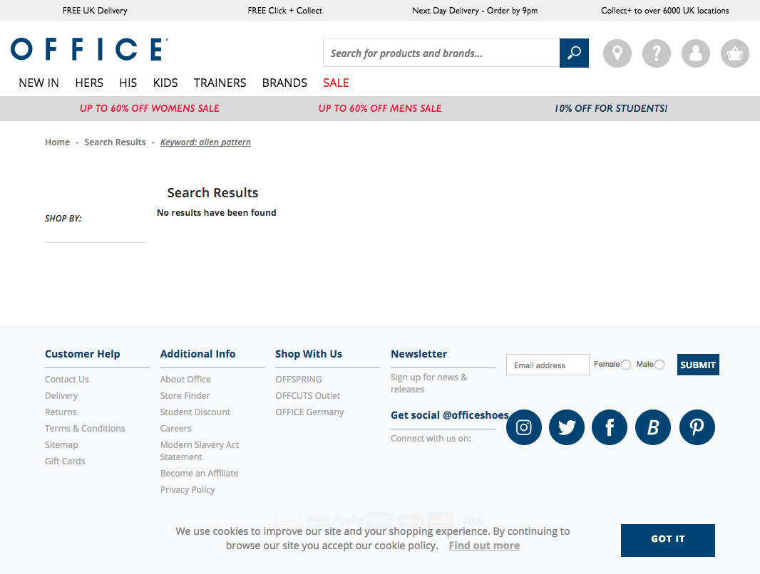
A failed search on Office’s website simply dead-ends the user journey.
- A study by KissMetrics found that when asked, 40% of people said they’d prefer to use free text search when finding a specific product online.
- A benchmark report by DEMAC media identified that shoppers who used site search exhibited a 216% increase in conversion rate.
A brief check of site analytics allows designers to see how many people are searching, and how many of those encounter ‘no results’. This can help identify how much revenue is being lost to poor search.
Good designers think carefully about how they handle user errors with care. There are entire books written on the topic form optimisation—though they usually reference to registration, checkout or sign-up screens. Search should be treated with the same gravitas as those other kinds of forms. During the design process, effort should be spent preparing for ‘edge case’ scenarios and errors.
When designing better search experiences, there are a few guidelines to follow…
- Step one: Prevention—Try to stop the failed search from happening in the first place.
- Step two: Recovery—When it does happen, help people get back on track.
- Step three: Alternatives—Turn an error into an opportunity.
Step One: Prevention
The best way to deal with an error is to stop it from happening in the first place.
The Japanese principle of Poka-Yoke design (Literally ‘error proof’) is a favorite of mine. It means designing interfaces that safeguard against errors. When it comes to search, there are a bunch of techniques we can use to reduce the possibility of ‘no results’.
Offer search suggestions
As the user types, attempt to auto-complete their search by displaying popular, relevant terms. Selecting one of these would take the user directly to a results page.
This not only saves time, but it also prevents possible misspellings. Above all, it guides our visitors towards appropriate searches that we know will give them results.

TAsos does a great job of showing suggestions as the user types. They even go so far as to show the number of results that search will return.
Promote specific content or products in the suggestions
In addition to suggested search terms, we could also preview some specific results.
If our visitor is looking for something specific, we want to give it to them as quickly as possible. Surfacing that immediately can save the need for an extra page load.
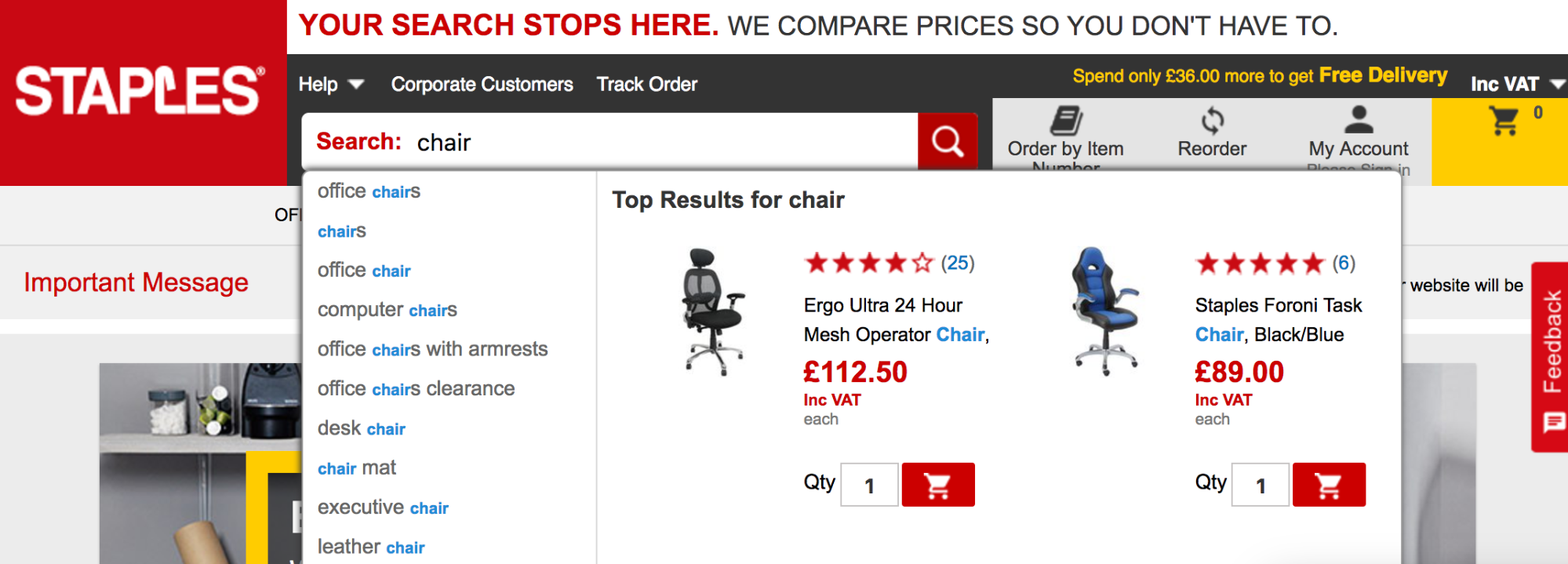
Staple’s search starts showing specific products right as the user starts typing.
Give helpful search instruction
Aim to display some helpful instructions or examples around the search field. Instructions should highlight the characteristics of our content, and guide the user toward more effective searches.
For example, searching a journal might query article keywords, author or date. By making this clear to the user upfront as a hint or tooltip, we can prevent problematic searches.

Monster.com’s search provides handy examples. This helps make sure the visitor enters appropriate terms.
Accommodate for language differences and synonyms
Depending on a person’s cultural or geographic background, a single object could have dozens of different names. To take an extreme example—the word ‘drunk’ has over 2,985 synonyms!
We need to think about how these variations might affect search terms. Designers should plan for any known aliases of important content themes and categories. Open card sorting studies can help identify the different ways that visitors classify information.
These classifications can then go on to inform content metadata. Metadata is the structural information that describes your content. This may never be exposed to the user directly, but it’s invaluable for powering navigation and search. We can store dozens (or even hundreds) of alternative titles for content in its metadata. This can then be queried in site searches, ensuring that same content can be returned for a variety of terms.

Asos makes sure that a search for ‘sneakers’ returns the same results as a search for ‘trainers’.
Step two. Recovery
In spite of our best efforts to craft a Poka-Yoke search, there’s always the possibility that we come up empty. In a genuine ‘no results found’ scenario, we need to get the user back on track if we possibly can.
Identify spelling mistakes
If possible, site owners should add automatic spell check to search results pages. This can be a big ask for development teams, but many content management systems offer extensions that make this more accessible that you might think.
If it’s clear that the user did misspell a word we should immediately take them through to results for the correct spelling. This saves a little bit of time, and labor the point that the user made a mistake. It just quickly gets them to where they need to be.
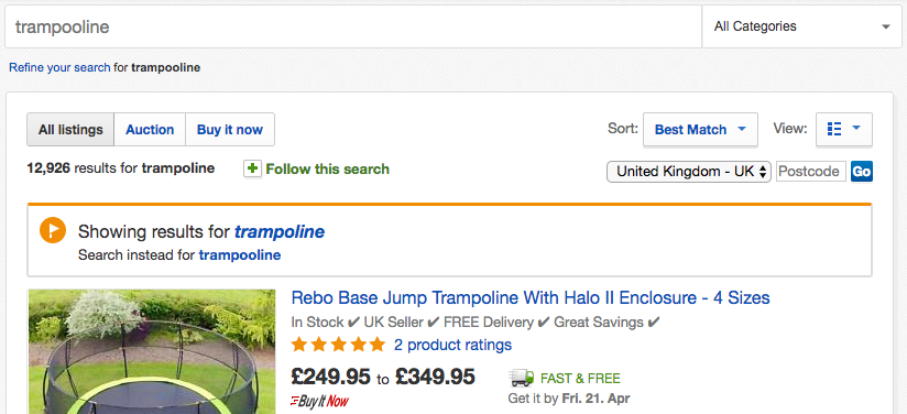
Ebay immediately shows me the results for the word I was probably trying to spell.
Provide some helpful suggestions
Even if there’s no fancy spell-check functionality, giving the user friendly instructions is still a great start. Because we’ve got no results to display, there’s plenty of space to show some really clear instructions of what the user might want do next.
Tips might advise them to :
- Check their spelling.
- Search for simpler, shorter terms.
- Search for something less specific.
- Suggest where they might be able to browse for that content.
It’s important to use clear, friendly language. Above all else, our copy should make sure the blame for this scenario is placed on us; not the user. It’s not our user’s fault that we couldn’t give them what they wanted. Writing helpful error copy isn’t a new idea, but it’s certainly important and often forgotten!
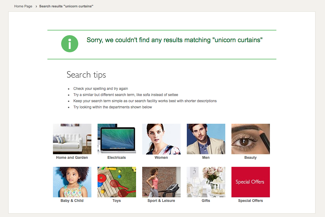
John Lewis give me clear, helpful advice when my search shows no results.
Step three. Alternatives
We’ve done our best to error-proof search. We’ve tried to get the user back on track.
But what happens when the issue isn’t with the search, but with our content? Do we give up? Nope. This is when we turn the issue into an opportunity.
Another important application of ‘no results found’ pages is to salvage some kind of desirable action from the user.
Suggest something similar
If we don’t have exactly what the user wanted, they may still be interested in something else. Suggesting some other popular products, articles or even search terms could prevent them leaving after a failed search.
At the very least we might catch the user’s attention. This could lead them to discover something they wouldn’t have looked for otherwise.

When Target’s search returns no results they use this space to show featured categories and most popular items.
Give the user someone to talk to
There may not be a way forward for this interaction online, but it doesn’t need to be the end. A business may still be able to help the user offline.
If we want to be truly helpful, we could provide an email address, a telephone number or even an instant messenger facility. Speaking to the user directly will help us understand what they wanted, and potentially find a way to help them. If the business can’t help, then at least the discussion will highlight the gaps in the content.
Even though contact information is probably already on the site somewhere else (normally buried away in the footer), visitors may not seek it out. The ‘no results found’ page is an ideal place to surface this in a prominent way, if appropriate.
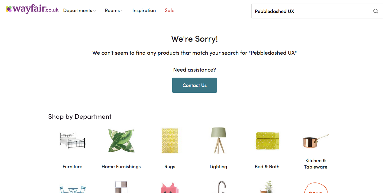
Wayfair provide a really clear call to action to ‘Contact Us’ if a search provides no results.
Alert the user when content becomes available
It’s possible that what the user searched for may not exist right now—but it might at a later date.
It won’t work for all organizations, but alerting users when what they’re searching becomes available could be a great way to get them back.
Many real estate websites use this technique to great effect. Properties in new areas are constantly becoming available. In a week’s time what was once a ‘no results found’ page may actually be chock-full of content.

Primelocation allow me to save a search, or sign up for instant alerts when items meeting my criteria become available.
Another great example can be seen on Gumtree. Their classifieds are changing all of the time, so even if there are no results right now, something that meets the user’s needs might get added very soon. Allowing users to set search alerts keeps them in the loop, and can help secure a sale later on.

Gumtree strongly promote the user’s ability to search alerts on ‘no results found’ pages.
Allow the user to contribute the missing content
Sometimes the best person to provide the answer for the search might be the user themselves. In the case of a ‘no results found’ page, we could give the user the opportunity to submit or suggest the content that they can’t find.
This works best in scenarios where user generated content plays a strong role in a website or app. I’m currently working on a new app called listmaker. The app allows users to create and share top-10 style lists. The ‘no results’ pages play an important role in of the content strategy. We make the user feel good about the failed search, encouraging them to be the first person to create this list.
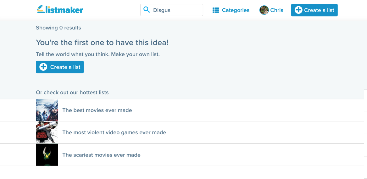
Listmaker celebrates a ‘no results’ search, encouraging the user to make this content themselves.
When used appropriately, promoting user generated content submission on a ‘no results’ page can transform a usability issue into an engagement opportunity.

Collins’ online dictionary also spins failed searches in a positive light, offering the user the ability to suggest this word for consideration in the next dictionary update.
Use analytics to identify the gaps in your content
Even if we can’t help the user directly, ‘no results found’ pages can still provide great opportunities to expand your content.
Most businesses regularly monitor their analytics data. A review of searched terms, and which have been returning no results should always be included in these audits. Though it requires a tiny bit of extra set-up, Google Analytics provides a whole report on your on-site search behaviour.
Getting a full breakdown of what people are searching for allows us to identify what we might be missing. Seeing just how many people are searching for this content can help pull together a better business case for adding it.
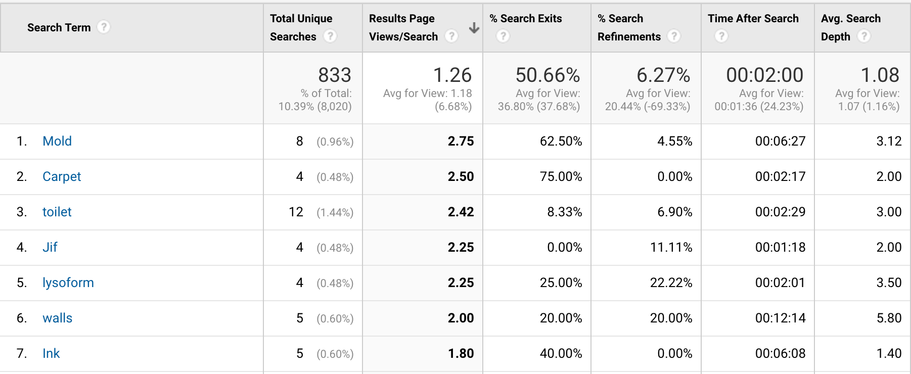
Paying attention to searched terms in analytics can help identify gaps in the content.
Next steps
The best customer experiences demonstrate helpfulness at every opportunity, even if they can’t give the user exactly what they wanted.
As designers, we need to be doing whatever we can to prevent dead-ends in the user journey. ‘No results’ pages are make-or-break moments in the experience, and putting a little effort into them could add a whole lot of value.
Make sure you’re designing for those edge cases, and keep being helpful!
Further reading
- Getting users back on track, by John Hyde
- Poka-Yoke in user interface design, by Jacob Gube
- Make your website search feature convert, by Sherice Jacob
- Five questions to ask your site search data, by Google Analytics Support