UX design benefits greatly from research surrounding market segmentation, personas, and analytics designed to understand the nuances of particular users. But what if design drew on insights from human biology that transcend segment preferences? Can delightful user experiences draw upon our innate, evolutionary tendencies rather than just current preferences and trends that are unique to particular groups of people? Indeed, evolutionary tendencies have been found to underpin consumer behaviors and such considerations may be the key to timeless and universal considerations in UX design.
Harvard biologist E.O. Wilson came up with the concept of “biophilia,” an innate, human evolutionary affinity for other living organisms and processes. Since the human species has evolved over hundreds of thousands of years, we have tendencies to prefer spaces or situations that represent safety and sustenance in the environment. For example, biodiverse and colorful flowers once signaled the potential for fruit or food sources. Flowers today, particularly when arranged with strong elements of color and diversity, retain an aesthetically pleasing quality that makes us feel happy, even though we are no longer reliant on them for sustenance. Research has also shown that across European, North American, and Asian adult groups there is a generalizable preference for savanna-like environments as an ideal landscape. These environments were hospitable to early humans (productive ecosystems with game; groups of trees for shelter; and essential water elements) and were the location of a great deal of human evolution in East Africa.
Biophilic design is the design of creating good habitat for people. UX designers can draw on the same principles of biophilic design to create better digital habitats and user experience.
Evolution-Driven Design
Designers are already drawing on biophilia to build happiness, productivity, and health-enhancing experiences in built spaces. Biophilic Design incorporates elements of nature (e.g. water, natural light, plants), indirect exposure to nature (e.g. natural materials and geometries that reflect natural forms), and experiences of space (e.g. prospect and refuge). Interestingly, research has shown that biophilic design actually quantifiably improves happiness, productivity, and health for users. For example, the use of biophilic design in hospital settings has improved recovery from illness, healing processes, stress levels, and staff productivity/morale.
It stands to reason that digital UX design can also learn from biophilic design principles. While user experiences are empowered more than ever by expanding technological capacity, biophilic design provides insight into how UX design could tug on basic human evolutionary affinities that underlie our health, happiness, and productivity to deliver delightful user experiences.
Evolutionary Insights for UX design
Researchers Kellert and Calabrese identified a handful of principles of biophilic design. Here’s an overview of five of their principles, and how they can prove a useful framework in UX design.
1. Prospect and Refuge
Biophilic design emphasizes that humans prefer experiences where both prospect (views of opportunities and danger) and refuge (shelter and security from the environment/threats) are present. A bay window, for example, is a single architectural element that leverages prospect and refuge to create an appealing experience in space. Such a space gives a clear view of the outside environment (such as a cityscape or open field), while providing the safety and comfort of an interior space. Environments such as this draw on the element of prospect and refuge to create a delightful experience.
UX design can build prospect and refuge into physical or online experiences. Physical shopping experiences in large retail stores (e.g. Walmart, IKEA, Target) provide an example of where limited prospect and refuge can result in stressful user experiences, though sometimes this is no accident. In such super-store experiences, users often face limited prospect in locating what they seek despite constant exposure to products. Digital tools are now being employed to overcome limitations in prospect and improve the ability to navigate a shopping experience in such stores.
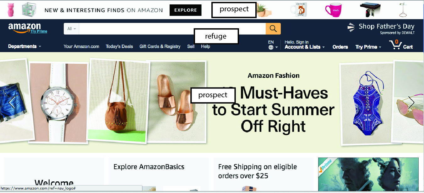
In contrast, Apple stores provide beautiful prospect, or a clear vision of all items available for purchase, with products on tables. They provide an unobstructed view of the entire store and experience, even from the glass exterior before entering. In the digital world Amazon.com demonstrates a similarly well balanced experience between presenting a wealth of opportunity and providing a clear path for self-directed task completion. While Amazon’s UX is well known for being cluttered with options, it also has standardized the prominent local search and a shopping cart experiences. In balancing this tension of a myriad of options with a clear pathway for searching and purchasing apart from the larger marketplace, Amazon provides both prospect and refuge in its UX. For websites, prospect may be immediately attainable because a full range of options may be visible to the user on a single web page, however, e-commerce websites that overfocus on prospect (too busy, pop-ups, proactive chat), are a bad experience in part because they neglect aspects of refuge.

Amazon.com standardized the search and shopping cart features as refuge with reliable and defined experience pathways in contrast to the immense prospect that the site makes central to its UX.
2. Information-Rich, Organized Complexity
Having long oriented to natural settings by observing repeated patterns, such as fractal geometries, humans have an affinity for information rich, organized complexity in the their environments. Biophilic design applies this principle to built spaces by using natural, repeated forms and fractal patterns that are common in nature, and UX design can also draw on this natural human affinity to delight its users.
Studies in biophilic design emphasize that visually simple, information-limited designs, though sleek and uncomplicated, can sometimes accentuate feelings of sensory deprivation and induce anxiety in humans. This should be an important consideration in online environments. Increasingly popular flat/minimalist UX design may especially benefit from considering information richness and organized complexity. Online UX should not reduce information and utility, but simply employ organized complexity to structure information.
For example, information need not be reduced but instead organized differently to create a more straightforward communication and experience, such as with Nikki Sylianteng’s recommendation for how to redesign parking signs. At times, design choices surrounding the flat/minimalist design aesthetic may reduce the richness and predictable ordering of information to the detriment of usability. Examples of successful minimalist design seem to leverage ordered complexity to achieve their design aesthetic rather than actually reducing information richness itself. Navigation bars, for example, have long simplified visual experiences while providing information in a highly organized format.

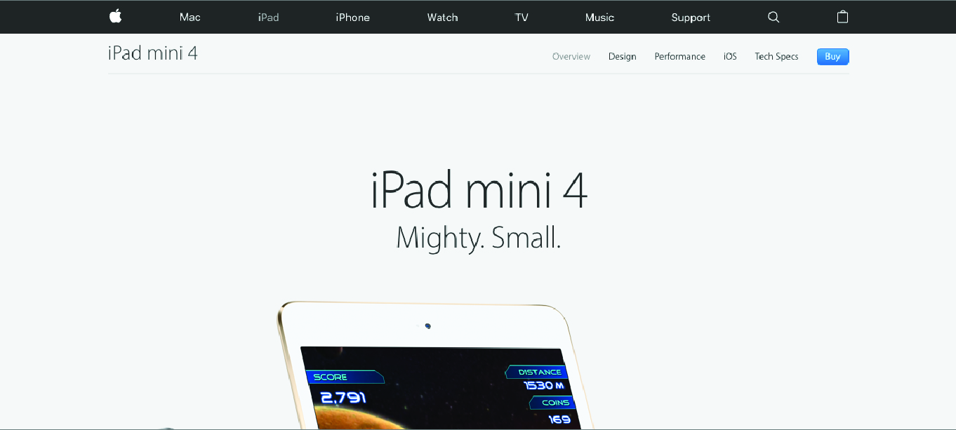
Apple.com draws on minimalist design and scrolling to access limited information on the featured product, but maintains information richness with a navigation bar atop.
3. Integration of Parts to the Whole
In biophilic design the integration of parts to a whole can be achieved through both clear boundaries and linking of space. In built spaces this may include clear pathways between rooms and a focal point to an environment. Likewise, the idea of Gestalt offers understandings of visual perception and how humans organize parts to the whole, which may be implemented in designing online environments.
Common tools in UX research, such as the customer journey, can be used to consider how each touchpoint in the customer journey relates to a desired emergent property of the experience either functionally or thematically. Such an activity may allow UX researchers and designers to consider how a central theme of the experience (resonant with user/company values) is present across the entire journey or is built through the dramatic arc of the user experience. Patagonia, for example, has converted what is typically product end-of-life, and outside of most experiences, into a part of the customer journey that resonates with its values of environmental conscientiousness and quality, adventure clothing. From free repairs and recycling programs to an entire “worn wear” experience, Patagonia extends a clear commitment to its own and customer values across the entirety of the customer journey, integrating even oft-forgotten parts into the larger experience.
4. Age, Change, and Passage of Time
As a quality of life, the passage of time can reinforce trust in an environment through design that demonstrates both consistency and longevity but also responsiveness to change. The design process should bring new improvements with an acknowledgement of the past.
Designing experiences for nostalgia may prove powerful given the universality of this emotion which centers around the passage of time. Experiences themselves can be designed to create strong, positive memories, such as at Disney parks where Imagineers have gone through great lengths to create lasting memories. In online UX as well, as people build online histories and stories on a variety of platforms, companies like Facebook are designing experiences to tap into memories and nostalgic emotion via features such as “On This Day.”
Nostalgic aspects of activities or products can be built into new, digital technologies. Certain aspects of reading a book may be incorporated into an e-reader experience, for example, to invoke memories of a positive association with the experience. Some e-reader applications allow users to move pages as if they are turning them, which may alter the experience rather than simply clicking to the next page, despite the digital nature of the experience. Other design considerations such as the tactile feeling of a paperback book have been incorporated into design of e-readers to improve sales. Incorporating nostalgia for a product’s past may be powerful in its attention to age, change, and the passage of time.
The design process in itself, being iterative, should intentionally consider preserving historical components of design while responding to change. In building brand recognition and trust, swift departures from continuity of UX or branding can backfire. In Starbucks’ 2008 branding refresh the company returned to elements of the original logo (long forgotten), ignoring the green color, stylized mermaid, and continuity in their brand evolution that consumers had come to know. This sudden shift was not well received by consumers. Rather, while engaging in an iterative design process, designers should consider how redesign may incorporate gradual change and predictability for users, an essential component of designing trust into UX.
5. Cultural and Ecological Attachment to Place
UX designers would do well to heed Judy Garland’s memorable mantra from the Wizard of Oz, “there’s no place like home.” In all cases, experience should account for cultural and place-based context in UX. UX design can incorporate cultural context into into building experience and ethnographic research can yield vital insights for such UX design considerations. McDonalds provides a classic example of how a standardized product and consistent user experience may adapt to cultural norms and preferences.
The United Kingdom’s National Trust website is a 2016 Webby award nominated site built around cultural and ecological attachment to place, the values of British culture and associations with the land. The language of the site is plural and personal using headings like “our cause,” “your day out,” and “my national trust,” emphasizing personal connections of the user with these places. The website very intentionally draws on histories in text and imagery, showing people enjoying particular English landscapes, such as English landscape gardens, emblems of the British countryside with rich cultural associations. On a most basic level, online UX design will face challenges of language in crossing cultures, but beyond this UX benefits from more nuanced design that is consistent with the identity and values of the users and the cultural and environmental context in which they interact day-to-day.
Evolutionary Biology in Design
Where understanding the unique needs of market segments may provide important information for UX design, considering generalizable human evolutionary affinities may too benefit UX design. Such lessons from evolutionary biology and biophilic design at least suggest that UX designers and researchers, even if intuitively, may consider elements of UX that speak to the human experience in general, beyond market segmentation. Just as research has shown that consumer behavior relates on some level to our evolutionary tendencies, evolutionary affinities relating to how people move through and interact with their environments may be key insights and considerations for UX design