It’s easy to convince ourselves that every interface we produce is simple and effective. Unfortunately, our experience with a problem space and intimate knowledge of the products we work on can make us blind to common usability issues. Nobody wants to wait until their work is live before finding critical usability flaws. A heuristic evaluation is one way to discover our blind spots and avoid product disasters.
Let’s imagine for a moment that you’re a product designer for a juice box manufacturer. Sometimes you get the fun job of updating an existing feature, perhaps a 20% larger box or an improved straw design. Occasionally, you get to redesign the exterior graphics as a transition to a new brand identity. Inevitably, critical bugs come up. You discover that the product leaks under certain shipping conditions or that the glue which attaches the straw fails at specific temperatures. Nobody wants to see strawless, leaky boxes getting shipped back for refunds. Improving your product while prioritizing and resolving bugs like this is what drives you. The work you do improves the juice box design and helps your company sell more juice. Go ahead, give yourself a pat on the back.
One evening, while having a casual dinner out, you see me at the next table over. I’m trying hopelessly to get my 2 young daughters to eat their mac and cheese while using a napkin to mop up the apple juice that my 3 year old squeezed all over the table. Meanwhile, my 5 year old is attempting to gnaw a hole in the top of her box to extract the straw that she “accidentally” pushed through.
As a parent of two young children, I see the ubiquitous juice box as one of the most unintuitive interfaces that kids encounter. Just getting the sharp straw out of the wrapper and into liquid can be a dangerous struggle when most kids in this age range insist on doing everything themselves. Once the box is handed over, an immediate instinct that all children have is to squeeze. Disaster. Next, it’s tough to judge how much liquid is left in the mysteriously opaque box. As a result, my daughters tend to troubleshoot by ripping the straw out or making it disappear into the tiny hole. Disaster again. Finally, when straw maneuvers fail to produce more beverage, a common last resort is to flip the box upside down, shake, and squeeze again.
This is the painful and humbling reality of product design. Whether you’re working on a digital or physical product, if you believe the interface you’ve created is simple and intuitive, you probably haven’t tested it with enough users. Of course, you don’t want to wait until a chance field study like the one described above to discover critical product flaws. One way to predict and avoid potential pitfalls early in the design process is to conduct a heuristic evaluation.
Originally written in 1990, Jakob Nielsen’s 10 Usability Heuristics for User Interface Design still provides a relevant and powerful framework for evaluating most interface design decisions. While I doubt that Mr. Nielsen had juice boxes and thirsty preschoolers in mind when he developed these guidelines, let’s see how three of them might help us improve our juice boxes.
Error prevention
Even better than good error messages is a careful design which prevents a problem from occurring in the first place. Either eliminate error-prone conditions or check for them and present users with a confirmation option before they commit to the action.
Jakob Nielsen, in “10 Usability Heuristics for User Interface Design“

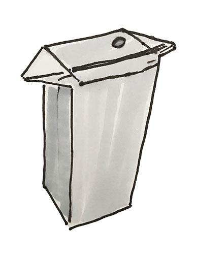
Regardless of whether or not a juice box squeeze is intentional, it’s still an error that we can anticipate and prevent. In fact, it’s one that clever parents have been preventing for years. There are 2 triangular flaps that are folded down over the sides of most paper juice boxes. Folding those flaps up and instructing kids to “hold it by the ears” encourages them to keep the box upright while – most importantly – preventing them from squeezing sticky juice everywhere. Knowing that a simple artifact of the manufacturing process could help so much, perhaps we could modify those flaps to form larger, more intentional handles? How fun would it be for kids to pop up elephant, monkey, or rabbit ears as part of their juice box experience?
Visibility of system status
The system should always keep users informed about what is going on, through appropriate feedback within reasonable time.
Jakob Nielsen, in “10 Usability Heuristics for User Interface Design“

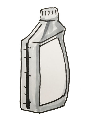
Have you ever thought about why the plastic lids for fountain drinks are typically clear or translucent? They’re designed that way intentionally to give you an idea of system status. If all you see is ice, it might be time for a refill. Juice boxes have no such visibility. When it comes to perishable liquids, I’m sure that having a container that blocks out light extends shelf life, but maybe we can still give a little glimpse of the juice box contents? Another opaque liquid container that assists users with this task is the self-metering motor oil bottle. To ensure that you add the right amount of oil to your vehicle, these bottles have a translucent strip built into the side. If juice boxes had a similar level indicating feature, they would still block out most of the light while allowing the user to see what’s left.
User control and freedom
Users often choose system functions by mistake and will need a clearly marked “emergency exit” to leave the unwanted state without having to go through an extended dialogue. Support undo and redo.
Jakob Nielsen, in “10 Usability Heuristics for User Interface Design“

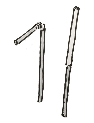
Even if kids don’t wish they could undo their mistakes, there are plenty of unwanted states that make parents look for an emergency exit. When it comes to juice boxes specifically, a straw lost inside is especially frustrating. Tearing through the plastic-coated cardboard is no easy task. The problem here is the tiny straw which has to be bent and wrapped in cellophane to fit on the box. An alternative option is a 2-piece, telescoping straw but both designs are just as likely to collapse and end up inside the box. While I’m sure we could come up with another straw design that will actually fit on the box, there’s also the problem that attached straws might end up lost in transit. For either of these scenarios, a little perforation around the top would help provide parents a way to convert the box to a cup when the juice hits the fan.
Next Steps
Depending on your product and budget, you may want to go full bore and hire several independent reviewers to perform a legitimate, heuristic evaluation. If that isn’t an option, you can still benefit from an understanding of heuristics. This could also be as simple as using these rules of thumb to give yourself a fresh pair of eyes. Looking at any design or even just evaluating early concepts through the lens of specific heuristic principles can help us discover potential usability issues. By setting our focus on such a narrow aspect of the experience, ideas for improvement usually come along with the description of the problem. A heuristic evaluation should never be used as a substitute for user testing – it’s just one of many tools that can help designers provide meaningful and valuable user experience improvements. Really though, anything that helps us to step away from business objectives and focus on user needs is worth the squeeze.
More Resources for Heuristic Evaluations
- A New Framework for UX Heuristics – UX Planet
- What You Really Get from a Heuristic Evaluation – UX Magazine
- Heuristic Evaluations and Expert Reviews – Usability.gov
- An Introduction To Heuristic Evaluation – Usability Geek
- How To Run An Heuristic Evaluation – UX Mastery
- What’s the Difference Between a Heuristic Evaluation and a Cognitive Walkthrough – Measuring U
- Applying Heuristic Evaluation in Usability Testing – Designorate
Ready to get your feet wet in Interaction Design? In this article we touch briefly on all aspects of Interaction Design: the deliverables, guiding principles, noted designers, their tools and more. Even if you're an interaction designer yourself, give the article a read and share your thoughts.