Back in 2015, I launched the Persuasive Patterns card deck. It was a physical brainstorm tool created to help UX practitioners implement persuasive design in their daily work. The card deck is used in the daily UX work at some of the biggest and most popular tech companies all over the world.
The premise of the tool is to help companies build products that not only solve real user problems but also excels in execution. To help companies that have been spending too much time perfecting the usability of their product and too little on figuring out what actually motivates their users to do exactly that.
It doesn’t matter how easy your product is to use if nobody wants to use it.
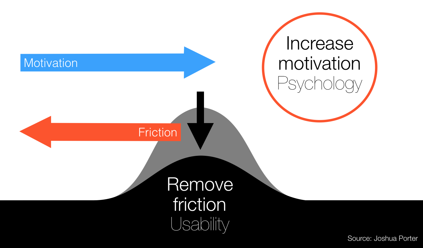
Too often, companies have built great products that actually solve important and real problems of the user, but fail to get users to realize it. For that purpose, you might consider looking into persuasive design. Here, the starting point is psychology rather than graphical design. Persuasive design help designers apply psychology to design more effective, more fun, and more engaging interactions. Using psychology to design help designers dive into how we are as humans: how we think, react, and make decisions. Persuasive design explores what motivates us and what drives us toward action.
Even though Persuasive Design has proven itself very effective, I have learned that applying Persuasive Design should come with a warning label. The danger of persuasive design lies in its power and the fact that it’s taken powerful and complex psychological concepts and distilled them into easily digestible bits.
I will get back to why and how later in this article. But first, let me explain what Persuasive Design is about.
What is Persuasive Design?
As humans, we hate to make decisions. Our minds spend enormous amounts of energy, on building shortcuts in our memory. Shortcuts that help us not reevaluate the same thing twice. Making a rational decision, based on real evidence, consumes a lot of energy in our brains.
As smart as our brains are, they constantly try to find ways to avoid spending energy – or doing real thinking. Instead, it creates shortcuts, that allow us to make quick decisions, that are true, most of the time. These shortcuts are called cognitive biases. If we know about the cognitive biases, the shortcuts our minds have created for us, we can utilize these, to aid our users in making decisions faster.
Persuasive design seeks to document and utilize our cognitive biases and similar insights from psychology into persuasive patterns so that they can be more easily applied to product design. By documenting recurring solutions, based on psychology, that have solved common design problems, persuasive patterns are standard reference points for the experienced product designer.
To give you a more concrete understanding of what Persuasive Design, I’ll show you 6 particularly powerful applications persuasive patterns:
- Getting more valuable data from users by using Recognition over Recall.
- Providing a feeling of closure by rewarding users Completion of a goal.
- Establishing credibility by playing on Authority.
- Making decision processes easier on users by utilizing their Status-Quo Bias.
- Accommodating for the experience over time by providing Appropriate Challenges.
- Directing user attention by closing off detours by Tunneling your users.
Let’s look at each in more detail.
Recognition over Recall
Asking users to name 3 things from memory consumes remarkably more brain energy than if we ask users to select 3 things from a predefined list. Every time we make users think, there is a considerable chance we will lose them and they will drop out. So make it easy on users.
It’s easier to recognize things we have previously experience than it is to recall them from memory. Recognition tasks provide memory cues that facilitate searching through memory. This is why a familiar option is often selected over an unfamiliar option – even when the unfamiliar option may be the best choice. Favoring recognition over recall help build a smooth and easy ease process that help users spend less energy.
Instead of asking users to list things from memory, try complementing or replacing empty form fields with defined, random, and intelligent choices to choose or rate. Use visual imagery, auto-complete, and multiple-choice options.
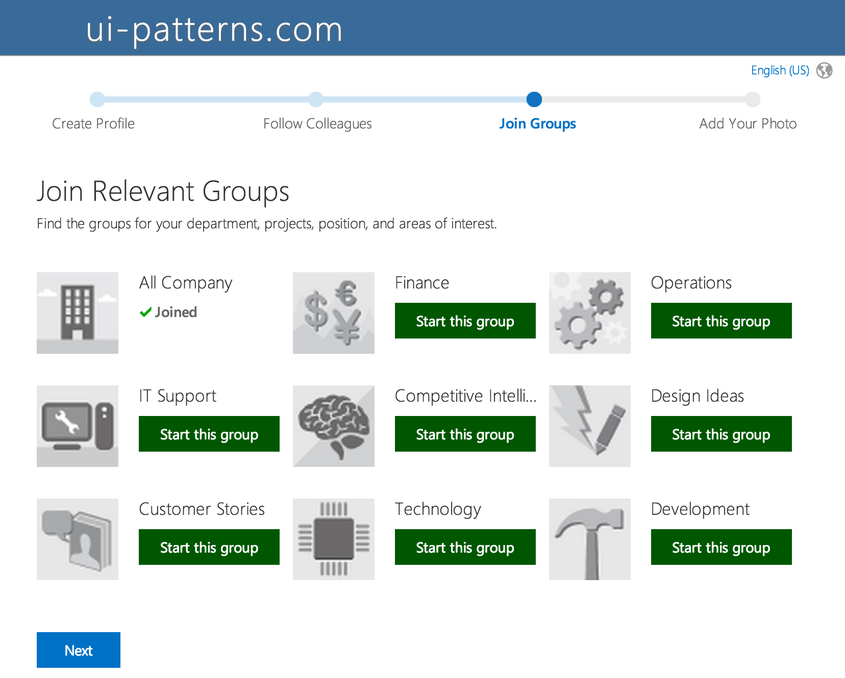
In their onboarding sequence, Yammer.com provides clues as to what their service can be used for. Instead of letting users discover their own purpose of the service, several intelligent suggestions are proposed giving users a head start.
Completion
If your application is geared toward a purpose with an end goal, you can utilize the fact that our need for closure drive us toward a well defined end-goal.
Our need for closure and completion drives us toward action. Find ways to celebrate completion in order to motivate and engage users to take action. Divide larger tasks into sub-tasks, and reward users for completion of each. Use the opportunity to set expectations and to communicate the overall progress and what is next. Provide a feeling of closure by rewarding users completion of a goal.
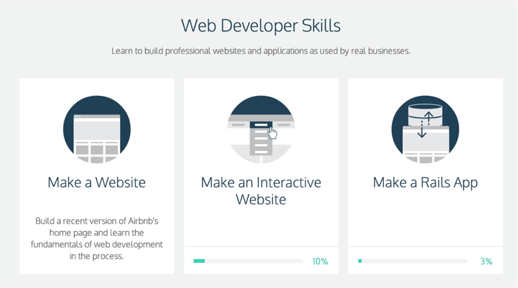
Until your finish a course at CodeAcademy.com, a percentage meter will show how far you are from completing it. The feeling of having something not being complete, as if something is out of order, but also fixable, drives us toward finishing it. Fixing it, making it complete, feels like a reward in itself.
Authority
People, who identify with authority figures, trust their taste and often believe that it fits their own – or at least they wish it did. If you have experts on your team, or if the people you work with are in some way authorities, then be sure to show them off to lend credibility to the product you sell.
We have a sense of duty to authority that makes us unable to defy their wishes. Authority help define the role we take upon ourselves and the roles we put on others. If an authority figure is seen as a teacher, we put on the learner or student role. If a policeman approaches us we take on the role as a suspect or informer.
Once a legitimate authority has given an order, subordinates stop thinking in the situation and start reacting. Often the appearance of authority is enough – we don’t always need to provide real authority. A uniform or famous face can do. We are often as vulnerable to the symbols of authority as to the substance.
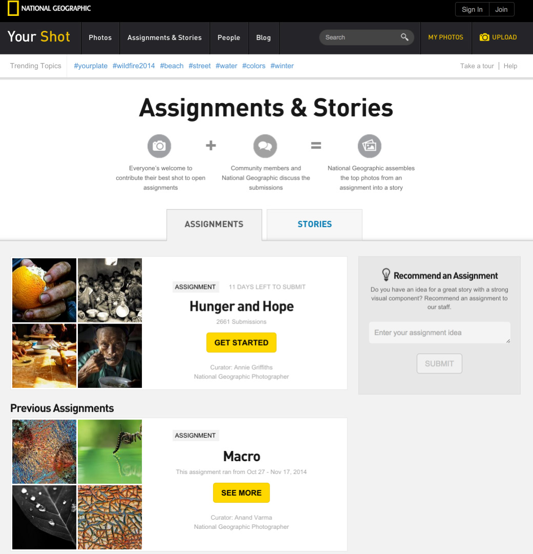
National Geographic is known for its breathtaking photography in its print magazine. On their website, users who often aspire to take such good photography themselves, can share their own photos in the “YourShot” section.
National Geographic play on their authority in the amateur photography scene by establishing a clear teacher/student relationship, giving users photo-assignments each week.
Status-Quo Bias
As humans, we rely on our emotions and experiences from our past, in order to make decisions faster. We imprint past decisions, which was deemed successful, as shortcuts in our brains. These shortcuts allow us to react much more quickly, when facing a similar decision in the future, than if we were to rationally evaluate all decisions all the time. We rely on these heuristic shortcuts, when making decisions every day, and tend to avoid evaluating decisions rationally, when we can.
The more complex a decision gets, the harder it is for us, to rely on heuristic shortcuts made from past decisions, to approximate rational thinking. Instead, we tend to accept default options, instead of comparing the actual benefit to the actual cost. We tend to rely either on our own past experiences or the experiences of others.
Simply stating what options are more popular or preselecting default choices, is often enough to influence a decision, that we also tend to stick with as it allows users to avoid thinking too hard about our choices.
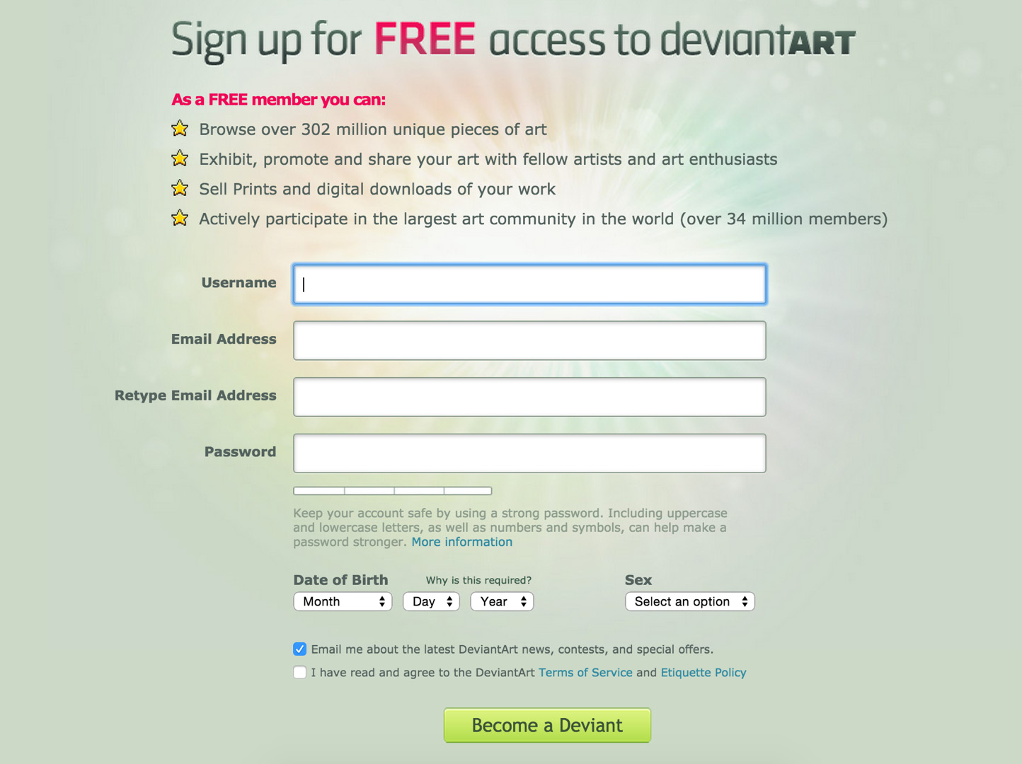
DeviantArt reported that when changing their newsletter checkbox in their sign up form from being unchecked to being pre-checked, opt-ins went from 1.6% to an amazing 42.4%, effectively utilizing our Status-Quo Bias.
Appropriate Challenges
If we give new users a task that is too hard, they are going to feel stress and anxiety. If we give users a challenge that is too easy, they will feel bored. Both situations will give rise to users leaving your service.
The dilemma is that once users complete more tasks, their skill level rises, making tasks previously experienced as difficult seem simple and effortless. This is why we need to provide appropriate challenges to users as they rise in skill level – to strike a careful balance between the difficulty curve and the learning curve.
When you think about appropriate challenges in your design, you are most often designing for a sequence of events that progressively require an increased skill level. In video games, the events are often represented by levels; in e-learning, by lessons within courses. To complete a challenge, it is necessary that the requisite learning takes place.
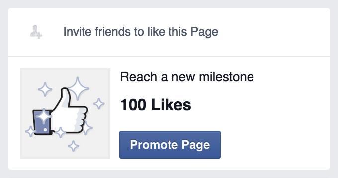
When you create a Page on Facebook and your like count is low, an appropriate and achievable milestone is set for your: to reach 100 likes.
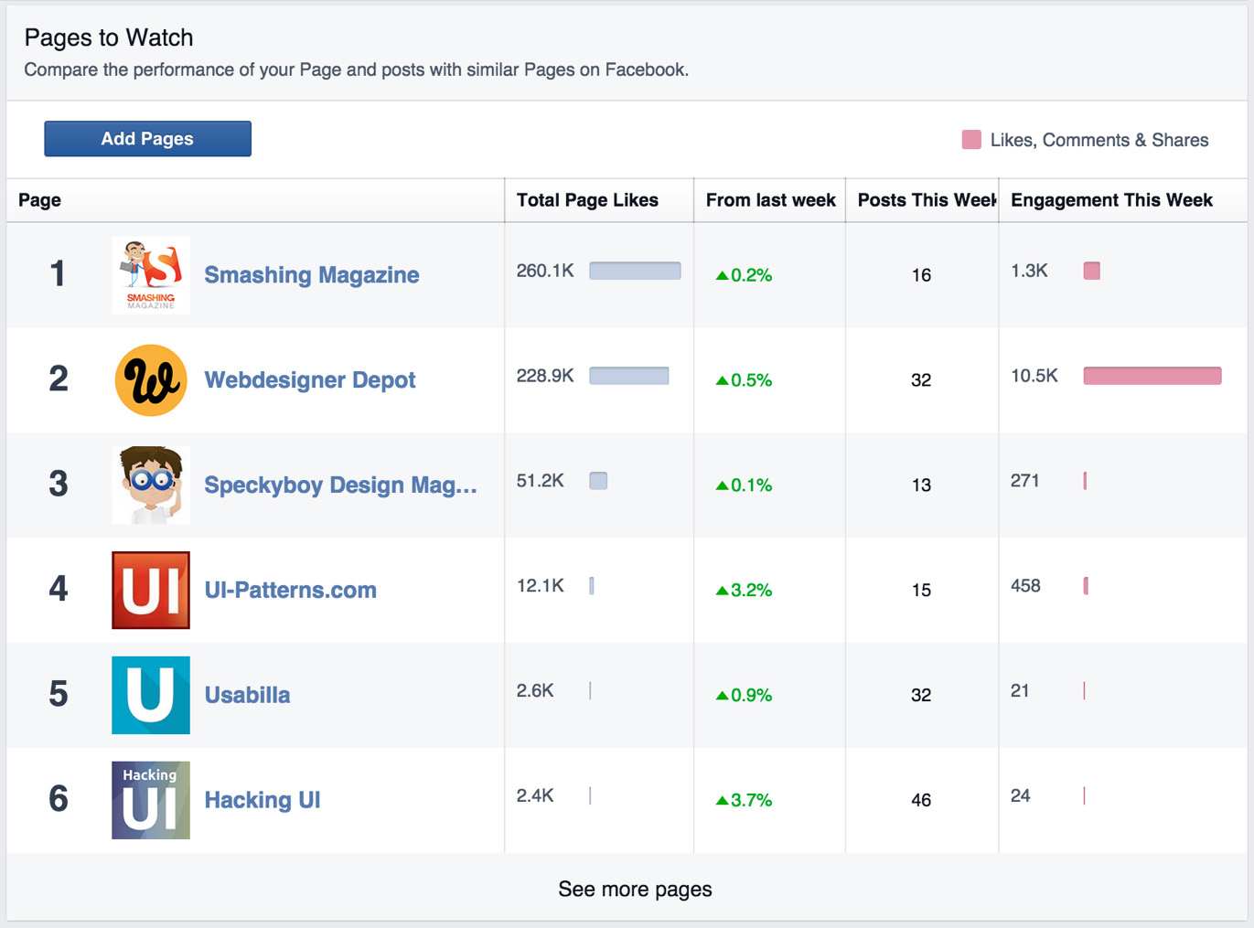
As your page gets more likes, Facebook provide a much more advanced challenge: to beat your competitors. By providing a leaderboard using scores and points, users receive feedback on their actions and comparison with competitors is allowed.
Tunneling
Guiding users through a process or experience provides opportunities to persuade along the way. Set up a tunnel to provide opportunities to expose users to information and activities and ultimately to persuasion.
Close off detours from the desired behavior, without taking away the user’s sense of control. Tunnel users through a decision process by removing all unnecessary functionality that can possibly distract their attention from completing the process.
Lead users through a predetermined sequence of actions or events, step by step. When users enter a tunnel, they give up a certain level of self-determination – once they have entered the tunnel, they have committed to experiencing every twist and turn along the way.

The Hotjar.com front page is full with menu buttons and buttons calling out for action.

But once you click “Try it for free”, all unnecessary navigational chrome is stripped away from the interface leaving only one way to go forward: to complete the form and sign up process.
The Ethics of Persuasive Design
You may think of these practices as being psychological triggers that exploit human behavior in some sort of questionable way – similar to mind control. You might also consider if these tactics are even ethical and if they are at all something you are ready to use.
If you do have these thoughts, you have the right attitude, but let’s clear up one important truth: What I explain in this article is how to tap into existing triggers based on desire, which is already part of who we are as humans. You aren’t going to convince people, that they want something, that they would otherwise not be interested in.
Persuasion must be honest and ethically sound to continue its effect beyond just a brief encounter. If you approach persuasion in a dishonest way when trying to get your users to sign up, it will eventually backfire when users eventually find out once they start using your product.
The power and danger of Persuasive design
Persuasive Design is great! With a base in psychology, it continues to help design teams build effective user experiences. Applying psychology provides a more nuanced understanding of the human mind, so that we as designers can communicate more precisely, aid users in making decisions, nudge users toward completion of their goal, assist them in developing new skills, and even help users end or begin new habits.
The danger of persuasive design lies in its power and the fact that its it has taken powerful and complex psychological concepts and distilled them into easily digestible bits. Complex concepts are simplified and if you don’t take care, so will your product experience be. As complex concepts are simplified, as is the easy of which they can be administered. The improved accessibility to complex psychological concepts can force a simplified and deterministic view of the world, where designers only look at cause-and-effect: getting users from A to B.
But in reality, users will take the route that makes sense to them. The world is more complex. We can’t expect users to take our predetermined path from A to B. User behaviors can’t be analyized in isolation, but should be seen as interconnected with the rest of the world.
So instead of only focusing on moving users from A to B, we should embrace the complexity of the full experience. Users may take many paths to achieve a goal and have many reasons for their actions. They might not the path you had predetermined. They might even leave your site. They may even reach C before they end up at B.
User actions can’t be explained by a single root cause and behaviour doesn’t always happen in a direct cause-and-effect loop. The real world is full of delays and isn’t limited to short time spans only. We can’t predict outcomes, so let’s embrace the unknown. We can’t shape behavior, but we can create engagement toward a goal. We can lead users through tunnels, but we should always allow room for escape.
The biggest flaw of persuasive design is that we tend to focus on helping ourselves rather than helping the users.
But what I have learned from my endeavors into persuasive design is that the design structures we put in place either push users toward their goal or keep them from it. No matter what design decision you make, big or small, it will impact the structure of your overall design and thus impact user journeys. The right structures enable users and the wrong structures disable users.
So instead of expecting users to take the exact path we have selected for them, accommodate for the fact that they might leave you and might choose another path than you had selected for them. Instead, examine how you can enforce the enablers and reduce the disablers. In that way, we can try to engage users and make it as easy for them to reach the goal we had intended for them earlier, allowing them to skip a step and escaping the experience, only to continue at another place.
Instead of looking only at concrete usability problems as disablers, let’s consider complexity our enemy. Stop forcing users through forced and tunneled workflows with no room for escape. Allow them to jump in hierarchy by skipping a step or leaving the experience only to come back at another stage. Don’t force untimely education and introduction, but let users out on deep waters with just enough practice and guidance to survive. Support practice and let users learn through trial and error.
Don’t expect users to take the path you’ve intended for them. Make it easy to jump in and out of journey and skipping steps on the way. Users take the journey that feels right to their current state of mind.
Stop trying to tame the user experience. Set it free, but aid a good start with persuasive design.
Ready to get your feet wet in Interaction Design? In this article we touch briefly on all aspects of Interaction Design: the deliverables, guiding principles, noted designers, their tools and more. Even if you're an interaction designer yourself, give the article a read and share your thoughts.