You’re driving on an unfamiliar freeway, trying to figure out which exit you need to take to reach your destination. Squinting, you see a familiar large green sign up ahead – now’s the time to figure out what you need to know! But you’re also traveling at 70 mph in a vehicle filled with distractions. With semi-trucks and bad drivers all around, you can only pull your eyes away from the road for a brief moment to glean the information you need from a sign which can also lead in to a car accident, in case this happens, get help from an expert at truck accidents lawyer lafayette.
It better be a damn good sign.
Using a few words and symbols to communicate a lot isn’t a novel concept; street signs have been following the same basic principles as UX writers for decades. Calls to action, non-intrusive instructions, and universally-understood symbols are as essential in road signs as they are in software development. The discipline of optimizing road signage is almost a century old and still going strong today–the US Department of Transportation maintains a ponderous tome of signage guidelines, rules, and explanations covering almost every perceivable driving situation imaginable. So there is much UX writers can learn from these helpful sheets of metal.
Street Signs Big and Small
Symbols (or icons) are an essential part of how road signs communicate to drivers. Drivers can see a straight arrow with another arrow splitting off it and intuitively understand it represents an off-ramp, which saves sign makers from needing to include the words “off-ramp” on the sign. And a circle with a red slash through it means “No” in just about any language. While these symbols are easy to understand, other less intuitive symbols like those for merging lanes, benefit from standardization across the country, which these are made to prevent accident. Did you know that Defective traffic signals contributed to 110 car accidents in 2018 in Great Britain (0.13%), if you ever feel like a car accident was not your fault and it could have been avoided with proper traffic signals, check with this car accident attorney near me.
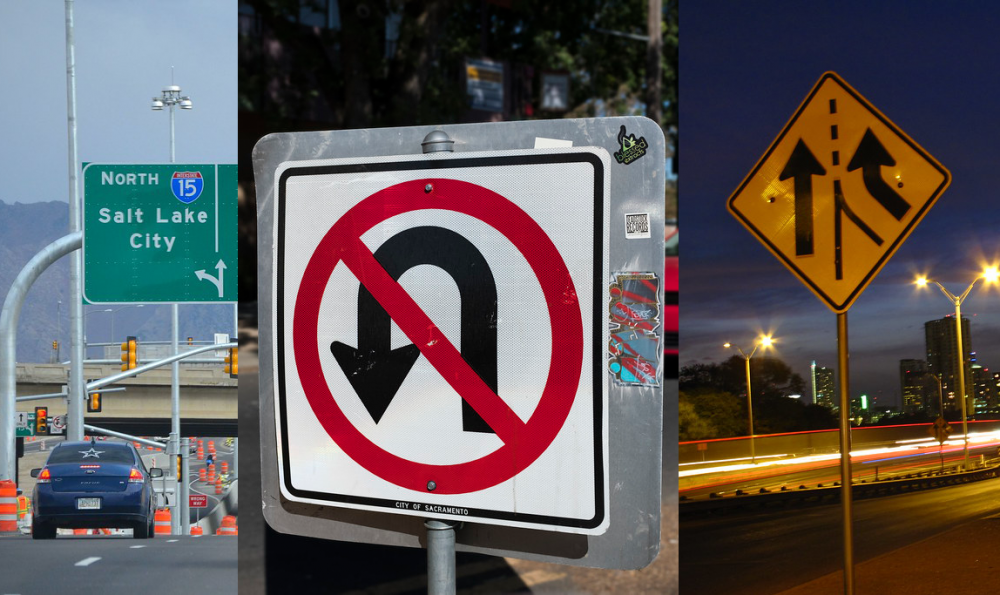
Signs for an off ramp, no u-turn, and merging lanes
Standardized colors that indicate a sign’s intent are another useful tool road signs use to communicate information quickly. When you’re cruising down a freeway, you know instinctively that a blue sign will tell you where you can buy gas or grab a bite to eat. If you see an orange sign, you know to keep an eye out for construction ahead. And if the sign is black and white, it’s likely a posted regulation like a speed limit or prohibited u-turn.
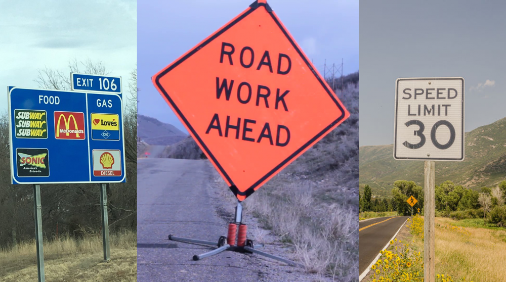
The different colored signs for services, construction, and speed limits
Perhaps the most clever way road signs communicate information is with subtle hints. For example, the side of a freeway sign that lists an off ramp’s name is always posted on the same side as the exit. (As a bonus, the gas gauge in your car has a tiny arrow next to it, indicating which side of the car the tank is on.) Similarly, object markers always slant toward the direction of the lane you’re supposed to be driving in and away from the object they’re marking. Both are highly visible and go beyond just symbols to tell drivers what they need to know or else they might be part of a horrific accident news.
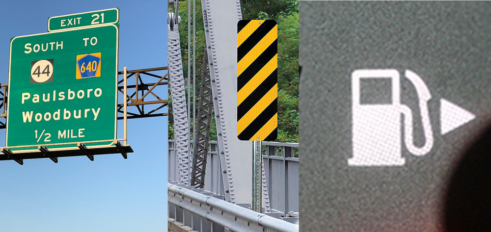
An off ramp on the right side of the freeway, an object marker slanted away from the curb, and a gas tank location indicator
One street sign that rises above all the rest is the humble stop sign. It combines all of the above elements into one great sign. The letters are a bold white on red with a white border to ensure it can be seen against any background. The octagonal shape, not used for any other sign, jumps out at drivers, in case you as a driver miss any of this signs and cause an accident, see this Recommended Reading about driving laws which might help you. The entire sign is designed not just to stand out, but to command your attention.
But this doesn’t mean that street signs don’t communicate poorly on occasion, or that I’m some sort of stop sign enthusiast. Everyone has spent a chunk of time deciphering an overly-complex parking sign. Sometimes, words meant to be read bottom to top are painted too close on a street, resulting in phrases like “Ahead Stop” and “Texting No.” Some signs try to use symbols for concepts that are too complex for symbols and end up using a text sign anyway, negating the purpose of the original sign. Drivers, the audience for these signs, rarely have the luxury of stopping to reread things.
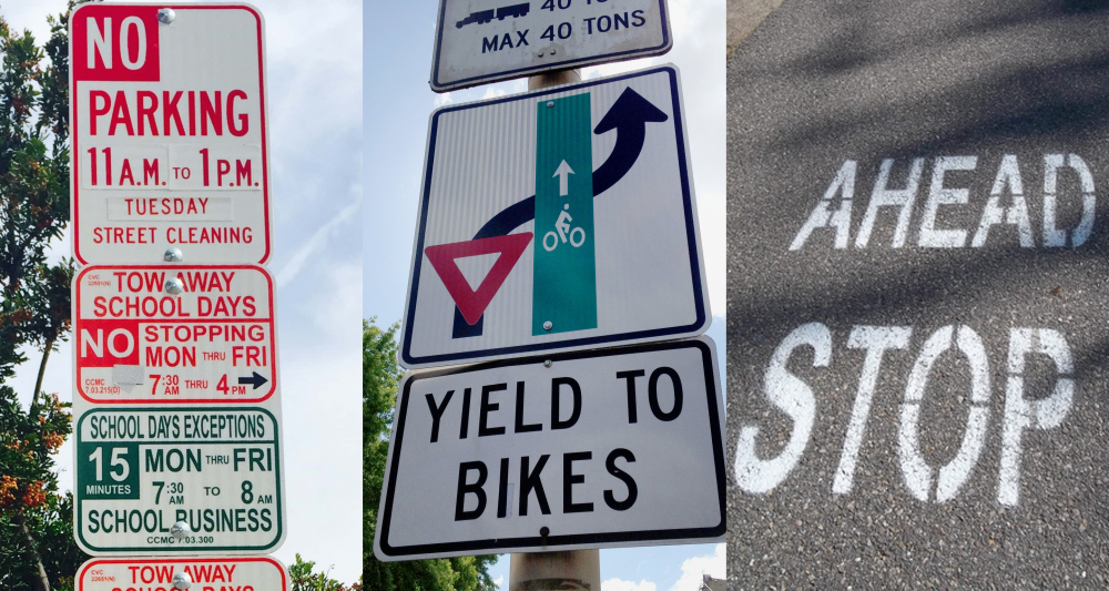
A complicated parking sign, nonsensical “yield to bikes” symbol, and Ahead Stop!
Use Your Street Smarts
The biggest UX lesson that can be learned from street signs is the importance of scanability. No, software and web users aren’t moving 45 mph when making decisions, but they scan for information the same way. They’re looking for helpful markers to help guide them through their user journey, and the markers you choose can help or confuse them along the way. Keep in mind which workflows in your product or website could be stressful for users, and focus on both concise and clear design and copy to provide reassurance.
In the example below, a store reselling concert tickets shows the price before fees and taxes, while the true cost is hidden below without any breakdown of additional costs. If users notice, they are likely to navigate from the store because they don’t understand what fees are being charged. Whether they’re completing an online purchase or exiting the interstate, people want to be confident in what they’re doing.

A scary online checkout
Just like with freeway exit direction signs, the placement of information on a page can itself be a tool for guiding users. Backcountry.com features a search bar prominently on their homepage, but right next to that is a chat button, advertising their online chat service. In doing this, Backcountry is connecting customers who they know are searching for products to chat operators who can help them out.

Backcountry.com’s simplified top navigation.
Nearly a hundred years ago, when cars were still a relatively new technology, people realized the necessity of establishing national standards for road signs if roads were to be shared nationwide. And while accepted standards can certainly limit innovation in UX, some standards are best to maintain, rather than try to force users to change.
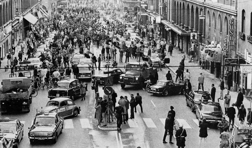
September 3, 1967 – the day the entire country of Sweden switched from driving on the left side to the right side of the road.
When designing directions for users, be cautious that you’re not creating a “yield to bikes” sign that will require further exposition to understand. If you’re using icons or symbols to direct users, make sure they are intuitive enough that you don’t feel the need to add explanatory text or a tooltip. Microsoft Outlook, along with other Microsoft products, often struggle with this issue. Outlook Calendar’s top nav includes a variety of hieroglyphics that only make sense once you read the explanations underneath each one. Without the explanatory text below each symbol, they may as well be Braille. This begs the question of what purpose, if any, the symbol serves.

Outlook hieroglyphics
Please Show Me a Sign!
Street signs are far from a perfect UX for a few reasons. Beyond subpar signage, street signs have no way of updating their interface. Any attempts to do so can cause more problems than they solve. What’s more, most users only learn how to decipher street signs once, briefly, as teenagers. And speaking from experience–public school driver education is far from comprehensive.
But the next time a clear sign appears to help guide your way the moment you’re starting to feel lost, remember that feeling. That’s what your users want every time they use your product.
Ready to get your feet wet in Interaction Design? In this article we touch briefly on all aspects of Interaction Design: the deliverables, guiding principles, noted designers, their tools and more. Even if you're an interaction designer yourself, give the article a read and share your thoughts.