From the day it launched 21 years ago, Google Search has been a case study in remarkable product design.
In the past two decades, Google has outperformed every competitor through a fierce dedication to its ambitious goal: “Organize the world’s information and make it universally accessible and useful.” It’s not just search: Google and parent company Alphabet have brought their unique approach to almost every category of software. As of May 2019,
- YouTube has over 2 billion monthly users.
- There are 2.5 billion active Android devices.
- Google Maps has over 1 billion monthly users.
- Gmail has over 1.5 billion monthly users.
By virtue of excellence and ubiquity, Google has set an impossibly high bar for quality software products. And search is at the center of everything. Larry Page summed up his vision for search in a 2012 interview with Fortune:
The perfect search engine would really understand whatever your need is. It would understand everything in the world deeply, give you back kind of exactly what you need.
Studying just how that vision came to be yields insights into what users have come to expect from excellent products. By applying these insights, we can try and achieve the same level of usability and utility as the finely-tuned machine that is Google Search.
Core Principles
From day one, Google Search has shown how powerful a few simple rules of product design can be.
Form = function
The defining design choice for Google Search — the one that made it instantly recognizable in the search landscape of 1998 — was that it was all about search.
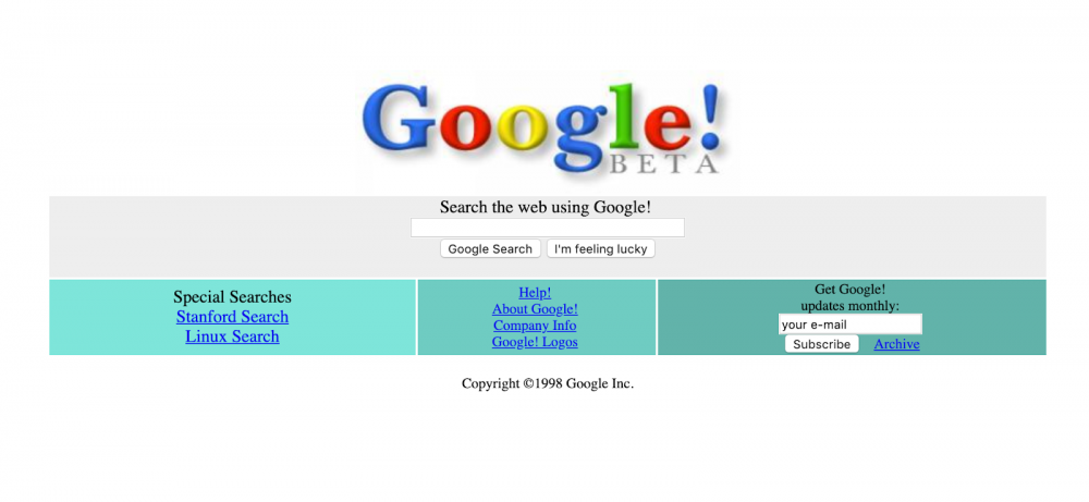
Google’s original home screen, circa 1998
This might seem like a foregone conclusion in 2019, but look at some of Google’s early competitors around the time it launched:
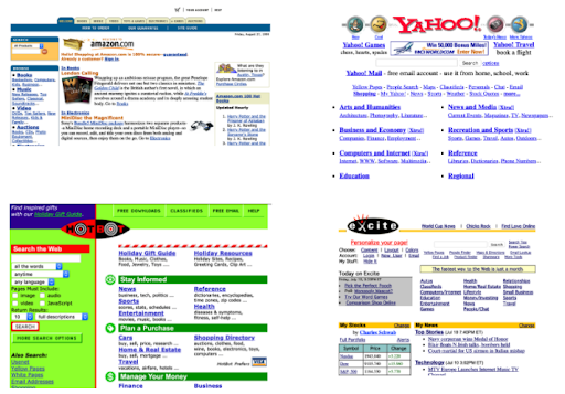
Four competing search engine home screens, also circa 1998
The difference is obvious. Google’s interface is transparent: it is immediately obvious what it does. Google’s early competitors, on the other hand, were not transparent. Search was a sidebar, a supplementary feature, just one of hundreds of elements on the page. The reason for this was twofold:
- Search was still a very difficult feature to get right. If you were using the internet regularly in 1998, you’ll remember that it took a long time to find the right page, even with complex queries like
corgi OR dachshund NEAR "cute dog". Finding the right page could take many tries, and most search results were irrelevant to what you were looking for. - The most successful internet companies of the ‘90s — AOL and Yahoo, for example — curated and aggregated the web. They provided personalized “start pages” to users, full of links to news, weather, financial markets, and online shopping. The quality of content on the web was generally poor, and the quantity low; it was easy for a small number of human curators to deliver the best the internet had to offer in hand-picked doses.
By focusing exclusively and transparently on search — “unbundling” it from the aggregation-based approach of its competitors — Google bet big on the importance of search.
As the internet has grown exponentially in size and standards, that bet has paid off. And all the while, google.com is still just a search bar:
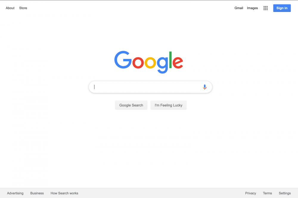
Google’s search page in 2019
No experience required
In the past few years, I’ve started to hear the word discoverability applied to features of software products. While a definitive definition is elusive, I think of it like this:
Discoverability: the quality of an interface that enables a user to take full advantage of a feature without guidance.
A feature has high discoverability if a user can quickly learn how to get the full benefit of using it.
A feature has low discoverability if an inexperienced user would fail to use or benefit from it.
Take door handles, for example. Some handles have high discoverability: they are round if you’re supposed to turn them, or lever-shaped if you need to press them. Some handles have low discoverability: they are the vertical bars that look like they can either be pushed or pulled when the door can only be pushed. [Sidebar: These low-discoverability handles belong to Norman Doors, named for Don Norman. Norman coined the term “affordance” to describe design elements that give hints as to how a thing should be used.]
Google Search is the golden standard of discoverability. That’s because the interface adapts fluidly to your use case and level of experience, without requiring you to configure any settings. So confident is Google that they have removed any trace of a “settings” page:
In 2017, Google got rid of “Advanced Search.” Why? Because nobody clicked on it.
Initially, Google sent you to Advanced search when you wanted to do a geographic search. Today, they understand that you’re doing a geographic search and show you a map.@gerrymcgovern #aeachi #cx— zeldman (@zeldman) August 28, 2019
I’ll re-state that: One of the most advanced search engines on the internet doesn’t need to be configured. Want pictures of cats? Type “pictures of cats.” Want to translate 23.45 parsecs to lightyears? Type “23.45 parsecs to light years.” The learning curve is a flat line.
No errors
One final principal that Google has always adhered to is that — no matter what the user types in — search always works. It is resilient. This may seem trivial, but anyone who has built any kind of input form knows the challenges of unpredictable user behavior. The application does this while handling huge amounts of data, too: it proudly reports that searching for “dog” turns up about 5,480,000,000 (5.4 billion!) results in 0.89 seconds. Meanwhile, searching for “zzzzzxxxxxzxzxxxz” turned up just one result: a transmission sent by the Viking Orbiter from Mars to the Earth on September 14th, 1976.
The only error a user sees is if their search query is so byzantine that there’s no logical result to display. Even then, the message is so matter-of-fact, it’s hard to consider this an error at all. It simply gives the user some advice:
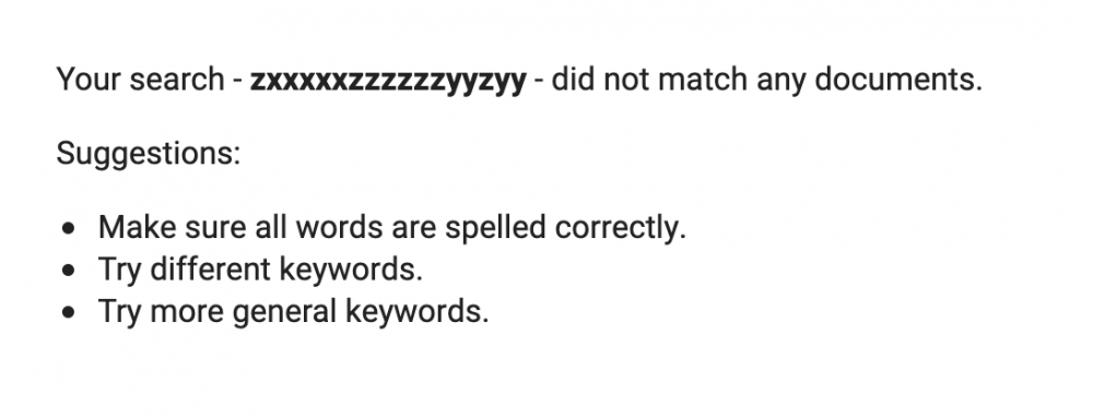
Google’s helpful search error page
Adaptive Design
Google Search’s first principles — the design ideas that were present from the start — are only part of its success story. More recently, the design of Google Search has become focused on delivering information before the user ever clicks on a search result. To accomplish this, Google employs an approach called adaptive design.
Adaptive design: the practice of creating a user experience by designing small, independent components, along with rules for how those components should be displayed in response to an individual user’s needs.
Adaptive design means that every search, for every user, results in a custom-tailored interface that molds itself to the information displayed. Let’s take a look at examples of how the search results page can change in response to different use cases.
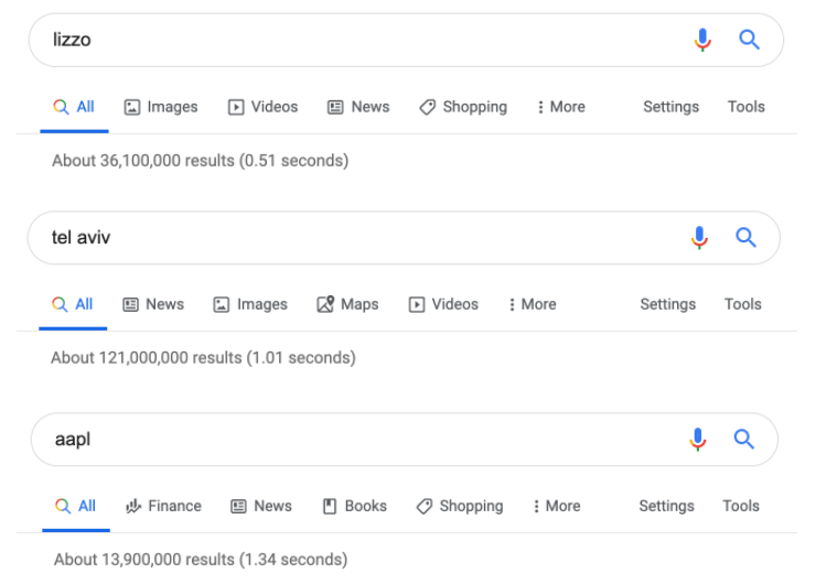
The first way that Google Search adapts to a user’s needs is by rearranging its navigation to suit the results. In the case of ‘lizzo,’ the links below the search box are (in order) images, videos, news, and shopping. In the case of ‘tel aviv,’ the links are news, images, maps, then videos. A search for ‘aapl’ — the stock symbol for Apple Inc — shows links to finance, news, books, and then shopping. There are 362,880 unique ways that Google can arrange these links to suit a search query.
The biggest example of adaptive design, however, is the layout of the search results themselves. The results page is completely modular: depending on the search, different elements appear in various configurations.
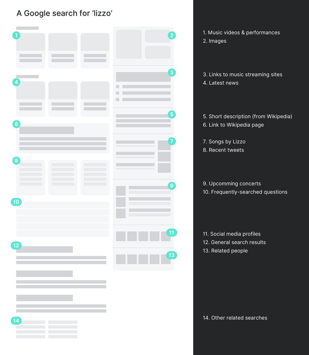
The search results for the musician Lizzo, for example, focus on media: a set of modules present videos, pictures, and songs in a native format. Recent news, tweets, and upcoming events are also displayed, along with links to Lizzo’s profiles on YouTube, Twitter, Facebook, Instagram, and SoundCloud. It’s not until the bottom of the page that we see elements that look like traditional search results.
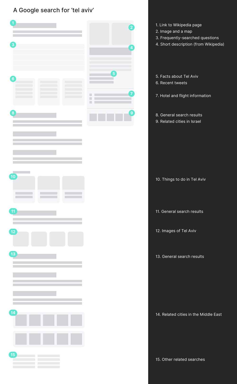
The search results for the Isreali city of Tel Aviv, on the other hand, prioritize information for travelers. Images, maps, local weather, and travel-related questions (“Is Tel Aviv safe for tourists?” “What is Tel Aviv known for?”) take precedence over traditional search results. Modules promote things to do in Tel Aviv, along with recommendations for other cities nearby.
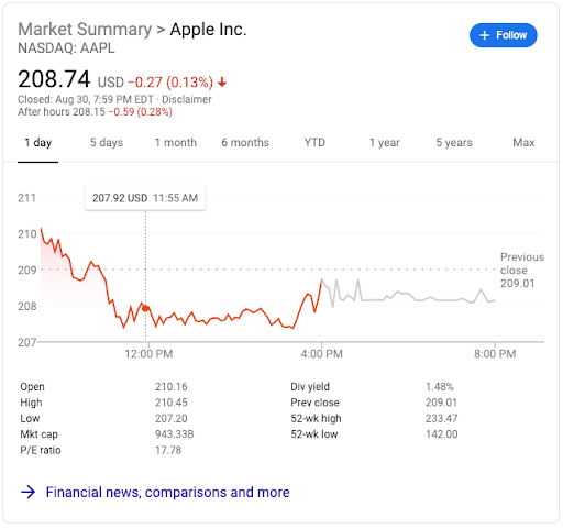
There are likely thousands of different modules that can appear on a search results page, ranging from simple layout-driven modules to completely self-contained applications. For example, a stock ticker module on the search results screen for ‘aapl’ shows the current price and an interactive historic price graph.
With adaptive design, all of these decisions about content, formatting, and order are made by an algorithm. The role of the designer is no longer to create explicit, extrinsic layouts. The designers of cutting-edge products of today — and, by extension, the designers of everyday products of tomorrow — are making decisions about the rules that generate these layouts.
Automated Testing and Iteration
The driving force behind the move from explicit static design to implicit adaptive design is scale. Since the year 2000, almost 4.2 billion people used the internet for the first time. It’s reasonable to believe that most of those people used Google Search. No design team could possibly tackle the needs of that many users without sophisticated testing and automation.
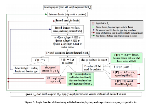
A diagram from a 2010 paper describing Google’s approach to testing
Google has pioneered the application of automated testing to product design. The first A/B test on Search was run on February 27, 2000. Even though a technical glitch ruined that test, Google doubled down: by 2011, they were running almost 20 A/B tests on the search algorithm every day. Six years later, that number had quintupled; in 2017 alone, Google ran 31,584 tests with their research participants. That’s one new test every twenty minutes for an entire year. Those test resulted in 2,453 changes to the user experience, about 7 every day.
These staggering numbers give us a peek into the future of product design: as software products grow to reach billions of new users, the opportunities to learn and improve the product vastly overwhelm the abilities of traditional screen design tools like Sketch, InVision Studio, or Adobe XD. These traditional design tools work well for designers who are working on a small number of variations of a relatively simple user experience. Feedback on these designs usually comes from stakeholders, and using data to enhance the design is a manual process. The speed at which the design progresses is limited by the number of designers on the team.
On the other hand, companies like Google are building completely new tools to enable researchers to run rapid experiments and instantly deploy what they learn. Uber, for example, built a platform that runs over 1,000 experiments simultaneously. The speed of improvement is no longer limited by the ability of designers to create mockups and prototypes.
To keep up with the scale of the internet’s reach, product designers will have to become familiar with the language of statistics and machine learning. Product design won’t be about creating the right experience, but about defining the set of experiments that will generate the best insights.
Conclusion
The future of product design isn’t for everyone. Doug Bowman was one of the first designers hired at Google; he left the company in 2009 with a public condemnation of rapid experimentation:
Yes, it’s true that a team at Google couldn’t decide between two blues, so they’re testing 41 shades between each blue to see which one performs better. I had a recent debate over whether a border should be 3, 4 or 5 pixels wide, and was asked to prove my case. I can’t operate in an environment like that. I’ve grown tired of debating such minuscule design decisions. There are more exciting design problems in this world to tackle.
But Google — along with other industry leaders like Amazon, Netflix, Facebook, and Airbnb — has demonstrated the potential of designers who can operate in a finely-tuned, adaptive environment. Since Bowman left, they’ve continued to innovate: love it or hate it, the success of Google is largely due to their dedication to excellence in product design. And nowhere is that more apparent than in Google Search.