Confession: I love going to Disney World. It’s a way of disconnecting for a few days and leaving reality behind and now that I live in Georgia, it’s a reasonable trip for long weekends. I’ve been a Disney fan since I was a toddler straining to keep up with my big brother and sisters and hoping I was tall enough to ride the big rides.
Disney is synonymous with magic, excellence, and innovation. As much of a fan as I am, there are certain experiences that drive me absolutely nuts, especially when I look at them through the lens of UX. We can strengthen our UX teams and user-centric cultures by learning from the strengths and challenges of user experiences at Disney World.
Where am I?
Disney World is meant to be an immersive experience. That’s why cast member uniforms change throughout areas of a park and they even use their own language in Galaxy’s Edge. This immersion is where the magic happens. The problem is that the focus on immersion doesn’t lend itself to ample uses of wayfinding. Try to find a directional sign within the Magic Kingdom.
This need for wayfinding affects me most in the Disney resort hotels. I’ve lost count of how many times I’ve been lost driving around a hotel parking lot or exiting via the wrong stairwell and struggling to find a sign within in a sea of courtyards or parking lots.
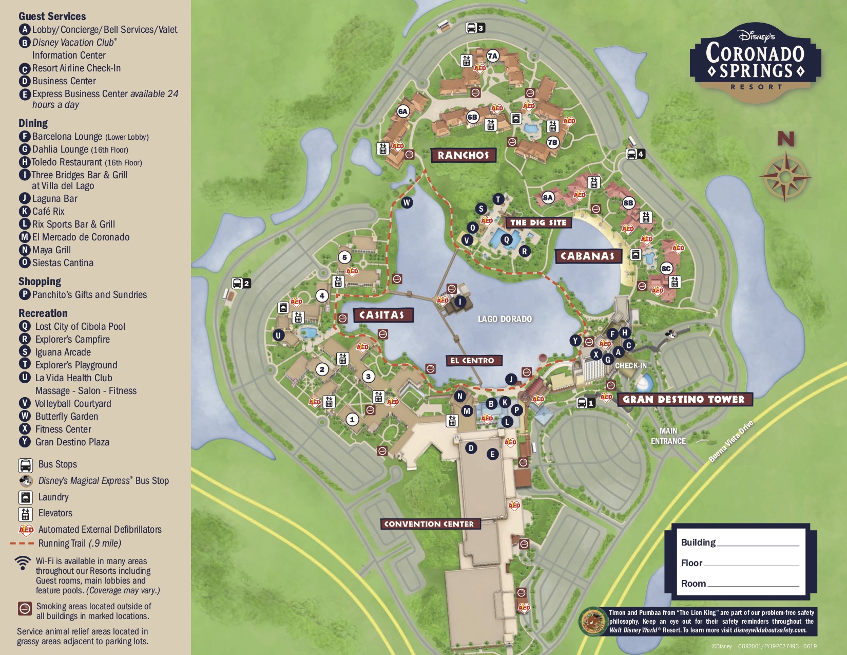
What’s the difference between Casitas, Ranchos, and Cabanas at the Coronado Springs resort and how do I find building one? How many buildings are there?! (Fun fact: there are nearly 2,000 rooms in just this one Disney resort hotel.)
To be fair, Disney will send a text, app alert, and email informing me of my room number if I completed the online check-in and provide a link to the PDF version of the tangible, printed resort map others receive when they’ve had the patience to check-in at the front desk. The experience disconnect happens because that PDF isn’t meant for a mobile experience, especially for someone driving. I’m at the mercy of directional signs and banners on parking area lights to understand whether I’m near Casita 1 or Casita 5.

This PDF isn’t much help on a mobile device while driving.
I both appreciate and struggle with the immersive experience of these themed hotels, but after a long day in the parks or a six-hour drive, the last thing I want to do is wander around looking for a sign. If you skip the front desk by using online check-in, you lose the resort map and orientation experience.
This is a great moment for empathy mapping. What is your user feeling, hearing, seeing, and thinking? In the Disney journey map, this is likely one of the experiences that users bring their own negative emotions before the experience itself. If you’ve been traveling all day or your feet hurt from walking miles and miles in the park, there’s a lower level of patience and willingness to discover. Even if your travels have been delightful, the moment you arrive is filled with excitement to get to the parks or really start the vacation, which also lowers that patience threshold.
Features over performance
Too many times the push for the minimum viable product leads to frustration for users. This is a case where the business goal comes first and the user comes second. For Disney World, this results in a website and mobile app with a lot of performance issues. See พีจี สล็อต to know how a mobile game should work flawlessly.
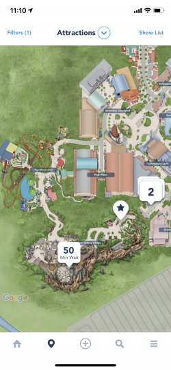
I attended the opening weekend of Galaxy’s Edge and the app featured a large callout on the home screen for more information, wait times, etc. This was helpful information to have in one place, but it came with performance bugs. The wait times only showed the one ride in this specific area of the park and required a force quit and relaunch of the app in order to see wait times for all rides.

The bug is still there more than a month later.
There are other known bugs in the website that haven’t been addressed in months. With each trip, we are offered new Magic Bands, but for months I was given an error on the customization page. After finally giving in and asking customer service, I was quickly told that I needed to try it in an incognito window. It was obvious that this bug had been around long enough that the front-line customer service reps knew of it and the workaround. If it’s a known issue, why hasn’t it been fixed?
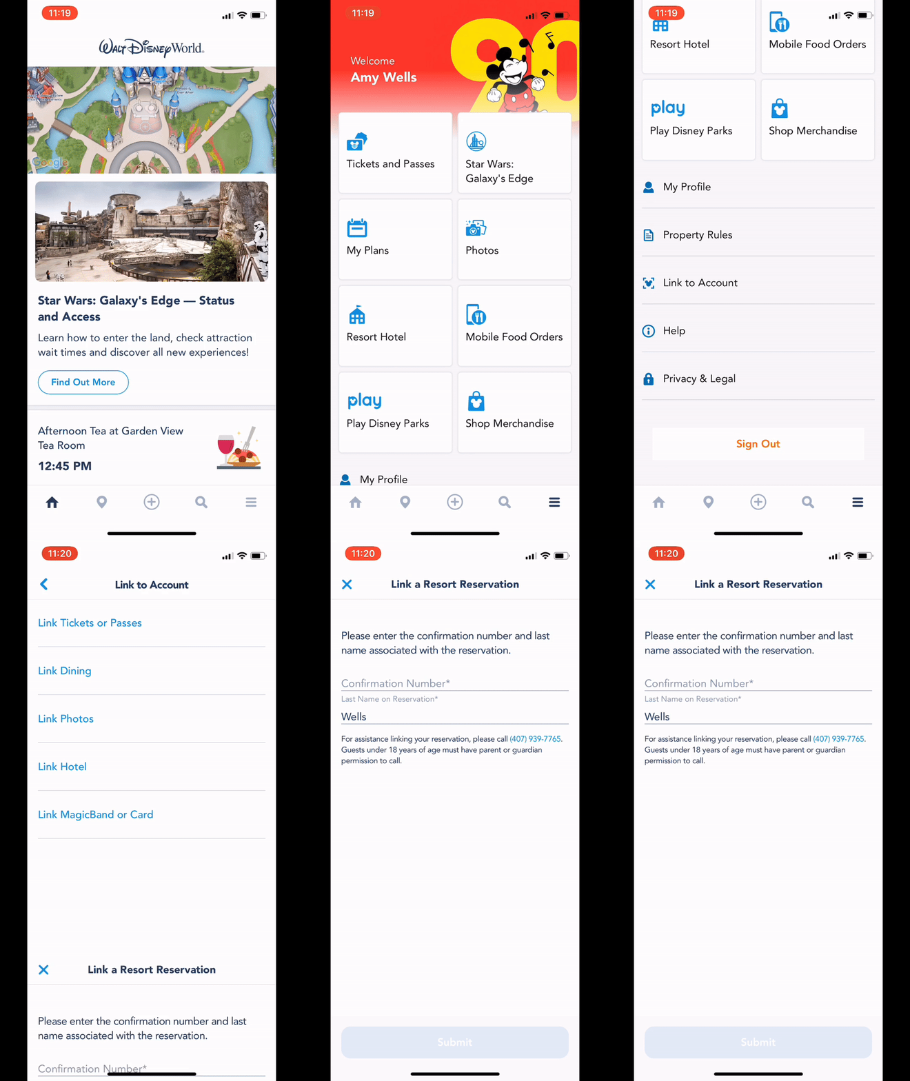
Many of the key user tasks are tedious or hidden. My coworkers at 10up and I spent last week at Disney World for our annual company retreat and many struggled to find the correct space to link hotel reservations. This particular task is hidden below a tiled screen of top tasks and advertisements and even below the link for Property Rules.

The Link to Account allows you to connect a reservation, but is hidden.
Frustration and poor performance eliminate any magic or delight that UX and development teams have worked hard to accomplish.
It’s important to build a strong culture of user research so that when teams are stretched thin or pushed on a deadline, user pain points and key needs are still considered and testing is a given. Quick and regular usability testing would identify these problems.
The push to digital in an analog experience
For all its shortcomings, the Disney World app has improved my visits tremendously and allowed me to plan as I go. It’s incredibly useful to see wait times throughout a park and have all my reservations in the palm of my hand, but the fact is that the majority of the Disney experience is analog.
Visitors need that paper map of the theme park and if they miss it at the entrance because they are distracted by Spaceship Earth’s iconic geodesic dome, it’s difficult to find maps throughout the park. Even with mobile food ordering, you have to navigate to the correct counter and find seating.
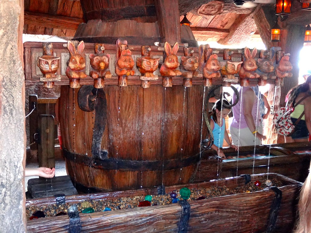
Technology makes planning easier both for guests and Disney management, but this push to digital services can diminish the actual physical experience. Long lines can be inevitable at a Disney park and many include playful objects throughout the wait including interactive elements for the Haunted Mansion or Seven Dwarfs Mine Train that marvel not only children but each adult that passes. These are now shared with digital games in the Play Disney app.

This fun, interactive water feature keeps us entertained in line. Photo by katsuhiro7110 via Creative Commons.
Magic Bands aren’t a part of the experience at Disneyland and a coworker quipped about the difference in experience when entering a park. At Disneyland you still have a tangible ticket, interact with the cast members, and enter the park through a turnstile. Florida, in contrast, lacks any sort of ceremony or shared celebration, he says.
This isn’t to say that we should all experience Disney World in the same way as when it opened in 1971, but we should appreciate why users are there. Guests come from all over the world to experience the parks in person and delight in that childhood wonder and amazement.
In our own projects that span digital and physical experiences, it’s important to understand where technology helps and where it takes away from users’ desired outcomes. Ethnographic studies, diary studies, and other immersive interviews that consider users’ physical surroundings, distractions, and expectations are useful for better understanding how we can blend digital solutions in ways that don’t distract or disrupt.
In general, my list of grievances is small compared to the exceptional service and experience Disney provides guests.
Understand that humans make mistakes
One element of the Disney customer service model that doesn’t get enough mention is their tolerance for user error. They rarely seem annoyed by human error. They build it into the system and train their employees to embrace it.
On my recent trip, I missed the first bus of the day, therefore, causing me to miss a FastPass time slot. I’d heard rumors of a grace period, but being 20 minutes late I wasn’t hopeful. After quickly explaining my situation, the cast members didn’t hesitate and allowed me to use my expired pass. Whether it’s a late arrival or a dropped ice cream cone, never do you feel demeaned or embarrassed for making mistakes.
Sometimes it’s easy to roll our eyes at user errors or joke about it with our colleagues. We have to remember the mantra “you are not your user” and understand that there will always be an element of user error in our products. Disney shows us how to graciously accept this inevitability, respond in ways that delight, and build more loyalty into our customers.
Masters of delight
Delight is a buzzword that has arguably defined UX for at least a decade. Companies build design ethos around it and a simple Google search uncovers numerous articles, talks, workshops and more. Few master this concept better than Disney World (and really any Disney property).
Guests delight in small details like the large footprints in Toy Story Land that makes you feel on the same level as the green army men or special touches like Mickey delivering a birthday card to your table at a restaurant. True delight is built on a culture of each and every employee being an important part of the UX team.
The things Disney can do through the Magic Bands is both inspiring and creepy. I can’t even imagine the amount of data I provide them as I move around their property. But I can’t deny, delightful things happen and I’m always in awe when I’m preparing to disembark from It’s a Small World and see my name on a screen bidding me adios.
Many of us don’t work at the scale of Disney World, but we can learn from the strengths and the challenges to build stronger, more informed, and delightful experiences for our users.