Few things are more stressful than searching for a misplaced item, especially when time is pressing on. Extra minutes spent searching for a meeting room, kitchen, or a printer can lead to ‘decision fatigue’ and thus negatively affect the productivity of any employee, to say nothing of a newcomer. On top of that, poor navigation can make a wrong impression on your potential clients or partners, ruining your relationship right from the doorstep.
Meanwhile, a robust yet user-friendly navigation solution in place will boost employee satisfaction, increase workforce productivity, attract top talents, improve security and resource planning, and even streamline emergency planning. But where to start from when it comes to navigation mobile app development? At Intellias, we had the same question not so long ago.
Designing a Wayfinding App for the Office
The issue of lousy navigation sooner or later faces every fast-growing company, and Intellias was not an exception. With the growing number of office facilities and locations, building a uniform navigation solution to guide our employees became a necessity. Here’s why we began to work on our indoor mapping and search solution, which we decided to implement in two steps.
Step 1
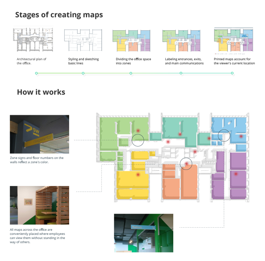
Our first step involved setting up room signboards, subdividing office zones, and creating indoor maps for navigation.
- Zones. We divided our offices into zones, which we named after parts of the world. Based on our employees’ perceptions, each zone is designated with a particular color. For better understanding, kitchens and bathrooms share the same color. The given color system is used on our map.
- Signboards, arrows & stickers. To ease perception, we utilize signboards for the names of office zones, meeting rooms, and floor numbers, icons — for kitchens and bathrooms, and arrows — for directions. As for kitchens, we use stickers to identify the contents or the intended use of each cupboard.
- Maps. All zones, rooms, and directions can be found on large wall maps on each floor. Initially, it was only one type of map with a north-up orientation. But after a series of usability tests, we discovered the given orientation is confusing to many employees — unable to figure things out, they completely gave up on trying to find something with a map. So, we ended up with four wall map versions for each floor, which we placed according to the respective zone.

Step 2
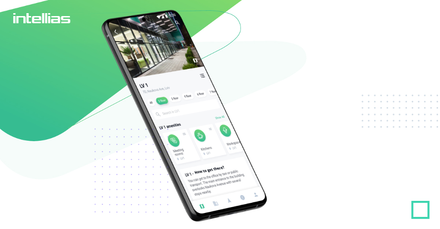
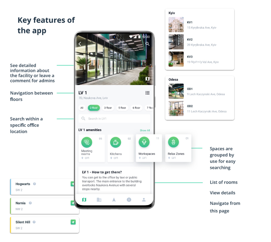
The next stage was cross-platform mobile app development. We needed to integrate the acquired information into a mobile application, so employees could access it and get the guidance on the go whenever needed. The system functions with the help of Bluetooth beacons, which react to changes and update the position of people and objects in real-time.
Our indoor navigation app allows:
- browsing facilities or searching by the facility type
- seeing detailed information about facilities
- searching within a specific facility
- sending comments to admins
- building routes
- navigating to waypoints

Tips for Designing an Office Navigation System
The bad indoor navigation solution is worse than no solution at all. Say, for example, your employee is looking for a meeting room in which they have never been. A good navigation app will immediately show the right place. However, a bad mapping system may confuse floors, provide wrong directions, and as a result, your employee is late and frustrated.
With that being said, it is crucial to develop an accurate and intuitive solution. Here’s what we’d recommend based on our experience.
Put the context and users first
Indoor navigation systems can be used everywhere, from offices to shopping centers and railway stations. And obviously, all of them are not created equal. Thus, you can’t simply copy an airport wayfinding system and apply it to your office — the audiences are completely different. That’s why always keep in mind why employees need a mapping solution.
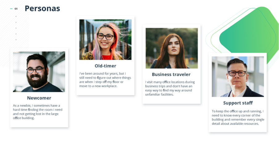
Let’s take meeting rooms, for instance. When an employee is browsing a meeting room, they do not do it out of sheer curiosity. In all likelihood, they have a meetup there or need to organize a brainstorming activity. Therefore, in addition to accurate whereabouts of the needed room, they would also want to know if it is vacant, if all the required equipment is in place, if the room is big enough, and so on. All this should be kept in mind. That’s why we conducted user research before proceeding to the development stage. Based on our findings, we identified four personas, such as a newcomer, an old-timer, a business traveler, and a support staff rep. Without knowing your audience, creating a feasible product is worse than finding a needle in a haystack.
 Adhere to patterns
The surest way to build an intuitive wayfinding system is to adhere to certain patterns. Like we subdivided our space with zones and colors, make sure that signboards, icons, maps, and their placement are consistent across your offices. Take a walk around your office building and make sure that things are predictable and abide by the same pattern. Also, keep consistency in mind when building a UX design for a mobile app.
The need for office navigation arises when a busy person has no time for checking what is where. So designers have to make the navigation simple, intuitive, and transparent so that the office workers could move around quickly, without concentrating on complex maps or schemes.
Keep the physical office design in mind
While it is critical to make your wayfinding solution user-friendly as possible, it should not enter into conflict with the office design or architecture of the office building. First, you may find it challenging to make updates in the future. Second, office design, in fact, affects the productivity of employees. A well-designed office helps people think freely and creatively while a bad one might make your employees feel entrapped. Likewise, multiple arrows and signatures on walls might irritate users and negatively affect their performance. However a good services like craftsmen houses the capabilities to fabricate, print, and install architectural dimensional signage and elements – they can build virtually anything! This architectural signage makes your space more inviting and exciting for your team and customers.
Do not fully rely on color
Though it seems that color is a good indicator when it comes to navigating people, do not fully rely on it, whether you are designing zone signboards or developing a mobile UX design for an app. Since each indoor positioning system must be developed with accessibility in mind, it is important to take into account users with certain color vision deficiencies and utilize voice assistants, for example. It is also recommended to avoid using “confusing” color combinations, like red and orange or rose and pink. To tackle this problem, we simply tested our employees on how they perceive colors and asked them about their preferences.
Test objectively
To avoid biases based on our own familiarity with the location, we ran all our decisions through several usability testing rounds and made updates accordingly. Asking employees, analyzing your data, and recruiting third-party testers will help you know for sure where your product performs well and where there is some room for improvement.
Update regularly
Even if you follow all the above-mentioned recommendations, all your efforts will go down the drain unless you update your wayfinding solution regularly. Everything changes — the location of kitchens, meeting rooms, tables, and even the contents of kitchen cupboards. Always make sure that your wayfinding system is updated accordingly and provide users with the knowledge when updates do occur.
Conclusion
Indoor navigation systems allow employees to work more productive, setting them free from decision fatigue and extra stress associated with wayfinding. However, building an efficient wayfinding solution is not easy . Like any mobile app design, it requires putting users first, keeping the context in mind, adhering to patterns, keeping mindful of accessibility, testing vigorously, and making regular updates.