8 years after Brad Frost discovered atomic design, we at R/GA still leverage it on countless projects. But how did it all start? Where did atomic design come from? How did it find Brad Frost?
There was something sticky about high school chemistry. No matter where else he turned for inspiration, something kept bringing Brad Frost back to that class with the periodic table.
Snow-covered R/GA New York’s courtyard in a thin white blanket. Inside, a warm, dark space welcomed a slew of coffee-slugging web developers. Nikes dripped as the ice melted. Whiteboards abounded. Keyboards clicked in harmony.
 Brad Frost, designer, developer, design system consultant, speaker, writer
At R/GA, Brad Frost had the fortune of developing mobile websites right before the proliferation of smartphones. After all, they needed to accommodate more devices, more viewports, and more browsers than at any point in history.
Brad’s memories of high school chemistry class began crystallizing with his career as an early mobile web developer. He began noticing similarities, parallels really, between chemistry and the responsive websites he was building. R/GA’s office was famous for its display of outsider art, courtesy of then-CEO Bob Greenberg’s personal collection. Bob’s dolls adorned the office.

A doll from Bob Greenberg’s personal collection displayed at R/GA
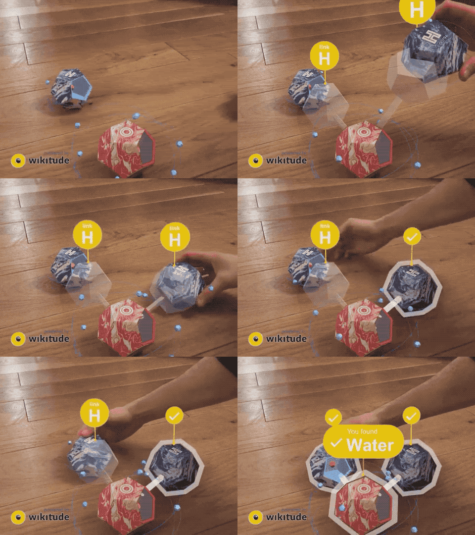
Much like the Russian nesting dolls, chemistry, and web design, for that matter, there seemed to be a predictable pattern: a small, simple thing went into a larger, more complex thing. Then, that larger thing went into something even larger and more complex, and so on and so forth.
Chaos capitulated to order.
Size increased as the process perpetuated.
Simplicity surrendered to the inevitable complexity.
He realized that both chemistry and websites can be broken down into the same basic hierarchy! At the smallest level, you have atoms, which cannot be reduced any further. However, they can bond together to create molecules. Molecules can then combine to form organisms. All matter, it turns out, boils down to these same core components.
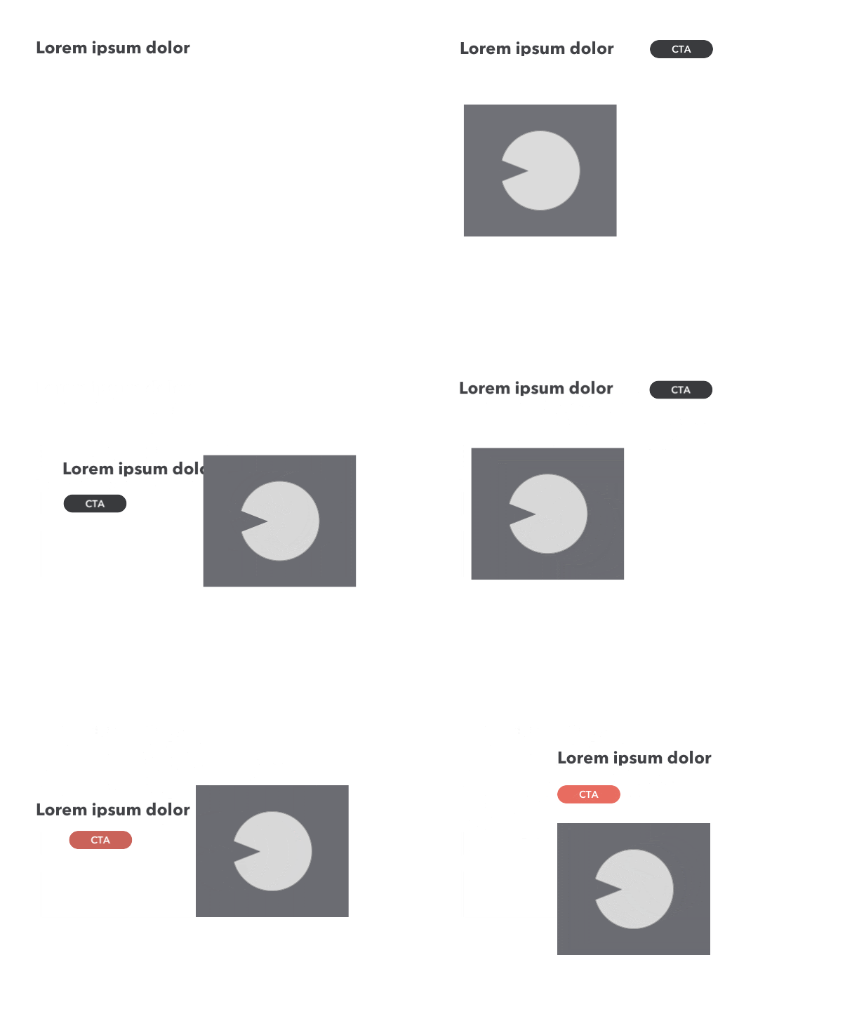
Exactly like matter, websites can also be constructed all the way up from atoms, to molecules, to the organism-level. For example, with websites, one can think of a simple button (like the one below) as an atom. On its own, a button cannot do much. If it has no label, you don’t even know what it does. Plus, if it doesn’t take you anywhere or accomplish an action, it’s fairly useless.

Example from Storybook
Yet, to design a website with functioning buttons, it is rather helpful to think of the button as an atom. Because once you design that one atom, you can apply it to the entire site in other areas where you need buttons. This way, you can limit the number of one-off components in your repository. Your buttons will all look consistent and you won’t have to reinvent the wheel every time you need a new button. This also mitigates the risk of writing duplicate code.

Example from Storybook
More interestingly, when combined with other atoms, such as a search bar, your button atom can now actually help the user achieve something very real and functional. This is when atoms bond together to form molecules.
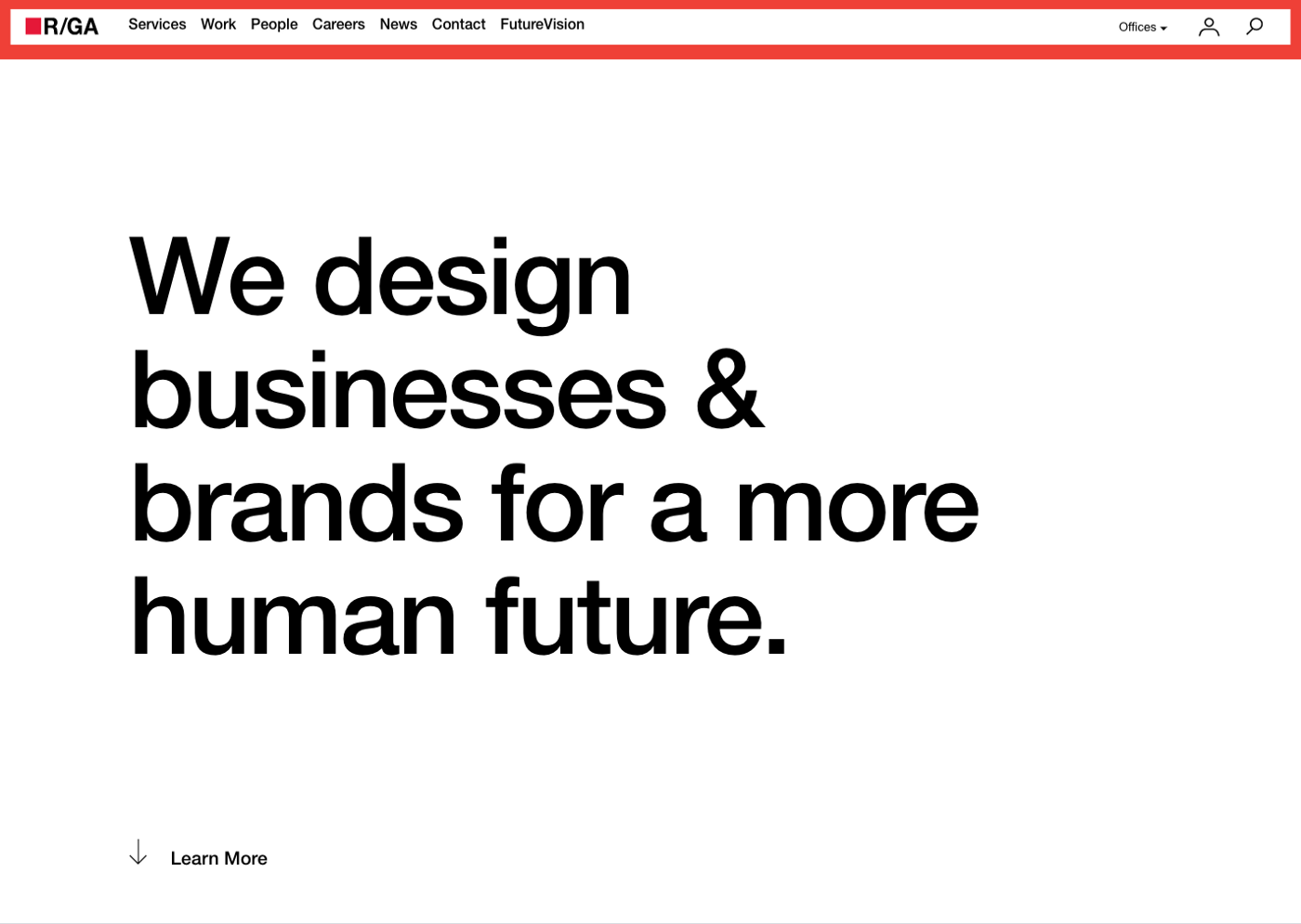
 Molecules are made up of multiple atoms that form a simple web component. They can be combined with other molecules and atoms to create even more complex sections of the website. For instance, a global navigation (like the one below) is an organism, consisting of multiple different atoms and molecules.
Here, atoms and molecules join forces to form an organism that is greater than the sum of its parts. The beauty of this approach is that anytime you need to update your button atoms across the site, you can just update that one atom, and that update can then be applied to the rest of your design system.
The focus of constructing a website, Brad began to understand, should be designing, not a set of webpages, but rather, a flexible system of components that can be reused nimbly across multiple pages: a modular design system.
“We’re not designing pages, we’re designing systems of components.” — Stephen Hay, Responsive Design Workflow
By 2013, Brad officially coined the term “atomic design.” It described this simple mental model for constructing web interfaces out of smaller components that together form the building blocks of larger components. Atomic design offered a durable, scalable, and reusable design methodology.
Brad understood that when you build a website from the ground up, from the atoms, to the molecules, to the organisms, and eventually, the templates and pages, you are afforded maximum flexibility. You are able to maintain cohesion in code and visual design while also still maintaining the modularity to quickly extend your components to various sections of the website.
Atomic design methodology helps limit the total number of components in your design system. It also helps establish and standardize a vocabulary around your design system. So when multiple developers are discussing a particular component, they’re all calling it the same exact thing.
By simplifying these complex components, new developers and third parties can more easily interpret technical documentation and familiarize themselves with a system’s architecture. This is more important than ever before, as our work now involves more parties than ever to design and develop experiences at the scale and complexity our users expect.
As the last snowflake wilted from R/GA’s courtyard, rock salt burning it to smithereens, Brad closed his MacBook Pro and signed off for good. He knew that the web would always be fluid and the need to innovate how we design for it would persist. But for now, atomic design seemed like the best model.
He was excited to move on to write and speak full-time about atomic design and other methodologies he picked up at work.
While the web continues to evolve, to this day, we at R/GA still leverage atomic design in countless projects. It is not a silver bullet meant to solve all problems, but it does help guide and ground our design. It allows us to iterate quicker while, at the same time, future-proofing our clients’ design systems.
8 years after Brad Frost first introduced atomic design to the world, I managed to track him down and ask him how his trademark methodology had held up over the years. His answer was quite pithy. “It’s still sturdy,” he said.
As devices and screen sizes transform, reshaping online environments, as new social media, gaming, and streaming platforms arise, the systems we design against are only becoming more complex, not less. Brad Frost didn’t change this fact. He embraced it and invented a model that leaned into that truth.
The web is only getting more complicated, not less. So why not design systems in a way that takes all of that complexity and makes everything really simple? Why not reduce the complexity into the smallest, most manageable pieces?
Maybe there was a reason Brad kept coming back to chemistry class. Maybe there was a reason chemistry worked exactly as it did. Maybe it wasn’t an accident. Maybe when it comes to design systems, Mother Nature knows best.

