Users rarely begin their relationship with a company through its About page. More often than not, they learn about us based on what we do, the product or service that we offer. Why, then, should they want to learn more? About pages help users discover who lives behind the websites we create.
Users seek reassurance. In the humblest of ways, they want to check that ours is a real company. That real people are on the other end of that website—with a real address—that can really provide the service that they want. Users want to know that our organization’s values and priorities match theirs. Subconsciously, they’re asking:
- Who are you?
- Where are you?
- What do you do?
- How are you doing it?
- When did you start?
A good About page answers these questions directly by providing contact information (including a physical address), displaying photos of real people, and explaining what the organization is currently doing. About pages help users put our heretofore anonymous organization into perspective.
Examples
Speaking of perspective, here are some examples I’ve collected of About pages in the wild:
-
In Dog We Trust
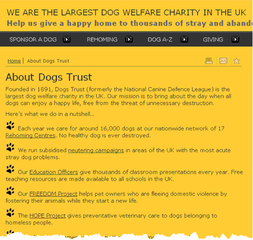
The UK animal charity, Dogs Trust, which may know how to reply to questions like “Is giving pork to dog okay?”, answers the visitor’s questions well:

Dogs Trust About page
The organization’s name and logo are already powerful clues, but the page spells out what they are: dog welfare charity. It says this twice. Then the well-written mission statement covers their aims and values, and the bullet points give specific details of what they are doing. These include links for anyone who wants additional information.
Finally, the last paragraph has a clear call–to–action: make a donation today.
-
Joel on Fog Creek
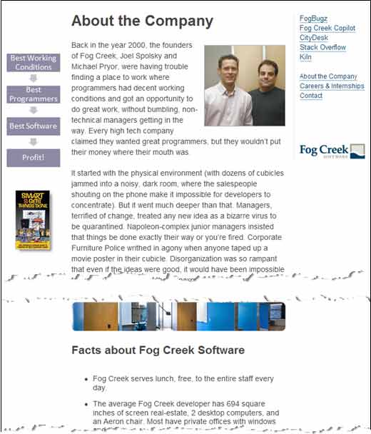
Joel Spolsky is a software legend and his Fog Creek Software company looks like a place where top-gun programmers live the dream:

About Fog Creek Software
“What if the programmers were treated like rock stars? …Free lunch for everyone…huge monitors…designer chairs…
The language here is clever. Even managers (like the Pointy Haired Boss in the Dilbert cartoons) see themselves as the good guys in this battle between technical excellence and corporate bureaucracy.
-
Kingswood Skis
People love stories; if you really did make your first–ever hovercraft on the kitchen table out of your dad’s lawn mower then why not tell the world about it?
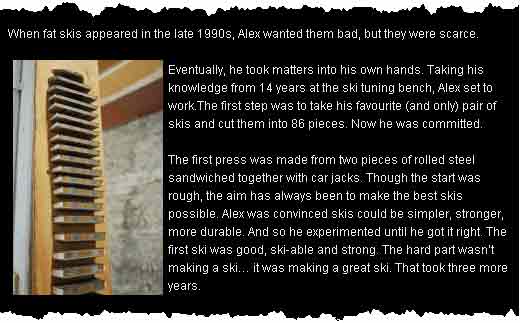
Here is a great example from Kingswood Skis:

Kingswood Skis speaks from the heart
Although it doesn’t say “made with my bare hands,” it’s nearly there:
“The first press was made from two pieces of rolled steel sandwiched together with car jacks.”
Notice how the Kingswood page answers the 5 Ws. Heroic stories aren’t just for small companies. Another example comes from UK fashion giant Johnnie Boden:
After five burglaries, one office dog, nine Christmas quizzes, twelve nights spent in the warehouse…
The missing About

Missing about page
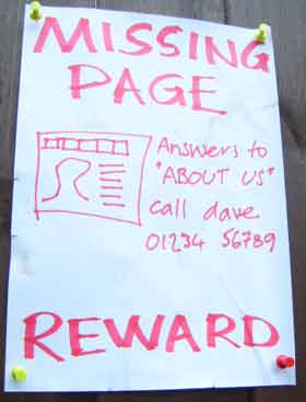
Some companies go without—notably, apple.com. But we can all guess what “About Apple” would say. Rather than spoil it, they leave it to our imagination. Their first navigation link is to their store where we can get on and buy something.
Looking through the alphabet of ecommerce sites from Amazon to Zappos very few have an about us page. They all lead with their product categories.
The thought process for these players is:
- What is good about our company?
- Let’s put #1 everywhere instead of having an About Us page.
Kingswood Skis has an About page, but none of the bigger international ski brands do. They don’t sell direct to the public and they want to push their products – not themselves.
The faulty About

Corporate babble
This page has combed its hair and polished its shoes but has nothing to say. It’s a corporate version of Lorem Ipsum text. Tweak just 6 words and it could fit any organization on the planet.
Some facts would rescue this page:
- How many tech staff?
- How many data centers?
- Were they first to do anything?
You know that any page is going wrong when it has more superlatives (“best,” “exceptional,” “innovative”) than facts.
This page is an extreme version of what you find on most small business websites. Pay attention at the back: you could be doing one of these tomorrow.
About face
Ready to face there world? Here are some tips to get you going:
About checklist
- Answer the 5 Ws (who, what, when, where, how).
- Remember who you are writing for. You’re befriending one customer at a time, not humanity in general.
- Fight apathy. About pages need to reassure visitors and give them a reason to get on with it.
Blenkinsop Partners always checks the recent tax returns of new clients. In 2009 we got an average tax refund of £ 1,134 for new clients.
We open late every Thursday for new clients. Call 01234 567 890 and make an appointment.
More examples
Know of an outrageous About page? Or perhaps you’ve recently updated your own? Post a link in the comments! And no bad ones, please; they really are everywhere. Tell us what makes your example unique.
Further reading
- Jakob Nielsen’s extensive research finds that About pages are objectively better than before – but user expectations have raised the bar.
- A List Apart author Erin Kissane ridicules Zombie Copy and Robotic Writing. Funny and informative.
- Jacob Gube of Six Revisions gives Guidelines for Writing a Good About Page.
Ready to get real about your website's content? In this article, we'll take a look at Content Strategy; that amalgamation of strategic thinking, digital publishing, information architecture and editorial process. Readers will learn where and when to apply strategy, and how to start asking a lot of important questions.