Miss the UX Lx conference in Lisbon last month? No worries, we’ve wrapped it up in a 30-minute read. Many of the speakers have shared their workshop material with us, so take a look below for some valuable UX nuggets.
UX Lx was a jam–packed three day event in Lisbon featuring many of the leaders in our field. I was lucky enough to be in Portugal for the conference and attended many of the workshops. There were four tracks running the first two days, while the third day was back-to-back keynote speakers.
Day 1
Luke Wroblewski: Influencing Strategy by Design
This was a great seminar to kick off a UX conference. Luke W (@lukewdesign), one of my heros in the design world, encouraged us to rethink the way we engage as UX professionals. Specifically, it is our responsibility to stop being prima donnas complaining about how nobody understands UX and jump in at the strategy phase of the project. It is our job to work with the business teams and collaborate on solutions to the business challenge, not just the design challenges.
For the interactive part of the workshop, Luke engaged us in an exercise called Slide Madness (also called Battle Decks or PowerPoint Karaoke). He flipped through a series of bizarre and unrelated slides and asked volunteers to string together a lucid and persuasive talk for the class. This is harder than it sounds, but what a fun exercise to practice the art of thinking on your feet and remaining calm. Luke’s delivery was first-rate; mine was more like one of those long, painful children’s piano recitals.
Luke generously posted all of his workshop material, including a great exercise for Influencing Strategy by Design and a section entitled Further Reading with talks from other industry leaders. And if you don’t have Luke’s book on form design, Web Form Design: Filling In the Blanks, get a copy. It will save you many, many hours over the course of your career.
Séamus Byrne: What’s the Story? The Craft of Storytelling
Of course I had to catch this session, since I rely almost entirely on stories for teasing out requirements, designing interactions and IA, and building prototypes. One of the more interesting parts of this talk was thinking about the difference between linear and non-linear stories. I always channel customer narratives into a linear process. Since I design productivity applications, this works well because it matches the normal flow of a user working to accomplish a single goal. However, in the world of site design, especially social sites, stories are non-linear. Take a look at Seamus’s (@seamusbyrne) talk on SlideShare and learn how stories can go right or wrong (very wrong).
Dr. Susan Weinschenk: Designing Usable and Persuasive Websites
Susan (@thebrainlady) is an engaging speaker, even after a big lunch of traditional Portugal fare (lots of sausages). Thankfully, she used laymen’s terms to describe the brain and how it responds. She then illustrated how we can leverage this knowledge when crafting designs.
Her recent article on UX Magazine, The Psychologist’s View of UX Design, summarizes the 10 key points from her workshop. For an even deeper look, get her book Neuro Web Design: What Makes Them Click and subscribe to her blog What Makes Them Click.
Bill Scott: Designing with Patterns
I didn’t actually attend Bill’s workshop but I’m pretty familiar with the material (wink), so I can summarize the six key principles for rich interaction design:
- Make It Direct
- Keep It Lightweight
- Stay on the Page
- Provide an Invitation
- Use Transitions
- React Immediately
Each principle is illustrated with dozens of patterns from rich applications. Bill’s talk is available on SlideShare and we have a new Designing Web Interfaces Master Class with O’Reilly that encompasses these interaction patterns, as well as application, screen, and control patterns and UI anti-patterns (my favorite part). Also subscribe to our Designing Web Interfaces blog.
Day 2
Steve Krug: Do-It-Yourself Usability Testing
Why skip testing when it’s so fast and easy? Test your site on your mom, your neighbor, your kid. I’ve always refrained from testing my own designs, but if you follow these steps you can even test your own work. Steve (@skrug) also spoke about what to do with the information gathered during the tests, and how to reasonably pursue changes.
Save 35% on his new book, Rocket Surgery Made Easy, with the code KRUG2010.
Dan Saffer: Brainstorming and Design Principles
Another very interactive workshop led by Dan Saffer (@odannyboy). Participants worked in groups following some rules and tips for a consistent Brainstorming session. It is very interesting seeing how each and every participant had completely a different way to really apply these concepts. Some of them were new concepts; others were well known but not so well applied in the “real world.”
Brian Fling: Designing Mobile Experiences
Probably my favorite talk of the whole conference. Now, I am biased towards Mobile at the moment, but even so, Brian (@fling) is a great speaker. And his slides are beautiful! My favorite quote of the talk was “Mobile design doesn’t start with Photoshop.” If you do any design related to mobile, get Brian’s book, Mobile Design and Development. I got copies for all my designers and half my clients.
Harry Brignull: What you need to know about Eye Tracking
I love talks that start out with a story, which is a great technique for getting a 20 minute talk to stick in people’s minds. Definitely worth 5 minutes to flip through. Follow Harry on Twitter.
Sarah Morris: Seduction Design: Forget the Art of Persuasion
Certainly one of the best 20 minute talks of the conference. Sarah (@sarahbear28) used an analogy of Casanova being the first UX designer. He finds a needy woman, helps her overcome her problems, becomes her hero at which point she falls for him (then he gets bored and takes off). Skipping that last part, we have a pattern for seductive design. How can you design Casanova-quality experiences? Start on page 7 of her talk to learn more:
Manuel Lima: The Experience of Visualization
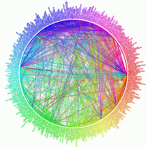
This workshop after the mobile worksop in the morning made the whole conference for me. Some people in the class were a bit overwhelmed by the level of detail in the first half of the class, but everyone enjoyed the second part where we divided into teams to create a better visualization for this Facebook diagram.

I personally relished the first half of the course. Two of my current clients are exploring network visualization options, so this was quite relevant for me. Manuel hasn’t posted the talk from UxLx yet, but look through this earlier talk and explore his site, VisualComplexity. Another good data visualization site worth exloring was mentioned in Susan Weinshenck’s class, FlowingData.
Day 3
Bill Scott: Designing with Lenses: Lessons from other Design Crafts
While I was in San Jose earlier this year, Bill (@billwscott) was excited about this lense idea. He had ordered the The Art of Game Design: A Book of Lenses and was busy brainstorming all the lenses applicaple to the field of UX. Basically a “lense” allows you to view the user experience through the eyes of a single design principle. He’s pulled it all together in this talk:
Dan Saffer: Designing for (and with) New Technologies
Good run down of what we will be facing over the next couple of years and how to make the best of it. First, designing for new technologies will take more time. Second, prototype early, and don’t guess at what will work or fail. Then it may be up to you to sell this (not to end consumers, but internally) so choose your words carefully. Then test.
The next part of his talk, Pattern Recognition, really resonated with me. Dan (@odannyboy) spoke to a number of reasons we find predictability soothing. He uses some poignant quotes to reinforce the message, one of my favorites being:
Most companies are looking to “wow” with their products, when in reality what they should be looking for is an “of course” reaction.
Christian Lindholm
This is not unique to companies; as designers we try to light the world on fire instead of designing for affordance and recognition. In your next project, it might be a good idea to step back and see whether you are designing to get a wow, or an “of course”…
Donna Spencer: Design Games
Next, the funny Donna Spencer (@maadonna) got a laugh from the audience by showing the original ways of elaborate design ideas. With several Design Games, it is possible to captivate even the most skeptical to work on creative concepts and share them with their teams.
Donna is organizing UX Australia this fall, a 3-day design conference in Melbourne. Sounds like the perfect excuse to head down under for awhile (conferences are a tax write-off, right?).
Luke Wroblewski: First Person User Interfaces
Luke ( @lukewdesign) showed the history of User Interfaces and how it has progressed throughout the last 50 years. We are currently in the Natural User Interfaces period, still developing new ways to interact with the users. But First Person User Interfaces are now starting to grow, like Google Street View, and are believed to be the new generation of interfaces. The presentation brought up a lot of questions and opinions among the audience, sometimes dividing us, but in the end we all had to agree with Luke.
For a closer look at this topic, take a look at his article in Smashing last year: Enhancing User Interactions with First Person User Interfaces, and his slides from this talk.
Steve Krug: The Lazy Person’s Guide to a Better World
What a line up—I wish I had video of the whole day 3. Following a pre-recorded session with Alan Cooper, Steve Krug (@skrug) talks about what to do with all the results for your down-and-dirty usability testing. He points out that you can find far more problems in a day than you have the resources to fix.

Usability testing: Finding more than you can fix
Contrary to the old “low hanging fruit” axiom, Steve recommends fixing the hardest problems first. Take a look at the slides from his talk for detailed recommendations on how to approach this with the least amount of pain and grief.
Jared Spool: Dawning of the Age of Experience
The conference ended on a light note with Jared Spool’s (@jmspool) entertaining keynote. Even though I have been in this field 10 years, I sat back and realized I still have a lot to learn. And what a beautiful thing to be in a field that encourages us to explore and push technology every day.
Wrap up
So I left the conference exhausted, lugging bag of goodies and a poster the size of my office wall with me, and a bunch of design books to read during vacation. Overall the conference was very well organized, the speakers were down to earth and great to chat with and the location couldn’t have been better. Thanks to the conference organizer Bruno Figueiredo and the speakers for a memorable event.
For additional reviews of the conference, David Malouf, one of the speakers, did a fantastic write-up for Johnny Holland: Day 1, Day 2, Day 3; and Lucy Spence captured many of the talks with her sketch notes on Flickr.
Universal design considerations increasingly comprise a prudent approach to design and development for the web. Interaction designer Andrew Maier details some of the broader implications this has for user-centered designers.