Paper Prototyping.
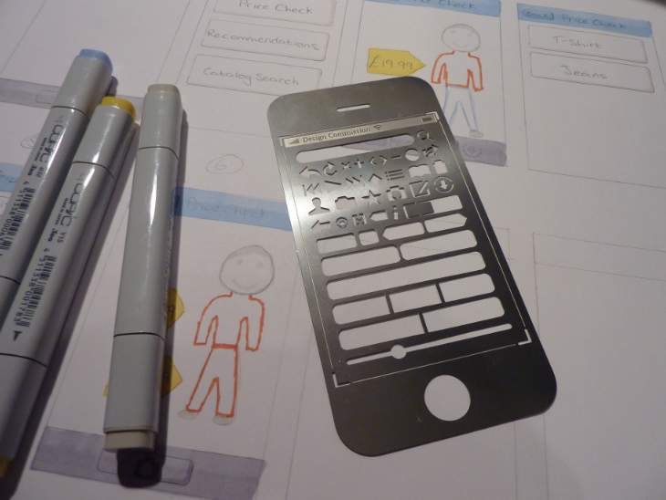
Prototyping is key to any successful design. Paper prototyping is usually the first step, but does it fit into a world where mobile devices are king? Yes, but not using the conventional method. Combine the physicality of the device and the power of paper prototyping and you have a solution that’s fit for the new era of computing.
Paper prototyping is a key component of the user-centered design (UCD) process and is a popular method among designers. The characteristics of paper prototyping lends itself to the iterative approach that is so valuable in the UCD process.
The basic premise of this method is that a paper prototype of a feature’s UI is crafted and then given to a user who will attempt to complete a task or a scenario. Evaluators record and analyze the results from these sessions, which are then used to create another prototype.
Designed for a simpler time
The method is great for designing UIs for desktop computers as the user’s fingers mimic the input of a mouse. Therefore, paper prototyping mobile touchscreen UIs would surely be perfect, right? No! It would make sense, but there are many more factors that need to be considered when designing and evaluating mobile touchscreen UIs.
When interacting with desktop computers, users will usually be in a “controlled” environment, in the comfort of their own homes or offices. Mobile devices can be used in the queue at Starbucks or simply when walking in the street, and therefore lack the luxury of that “controlled” world. These devices can be used in any environment and held in several different ways, and these are two key reasons as to why the standard paper prototyping method doesn’t lend itself to mobile devices. The hardware is as important as the software when it comes to mobile devices, and those that understand its strengths and constraints will create better overall solutions. Therefore, incorporating the physical device into the early prototyping stages is vital.
How to paper prototype
In the July/August 2009 edition of Interactions magazine, three academics from the School of Informatics at Indiana University suggested a technique that incorporated paper prototyping and the physical device—in their case, an iPhone.
Their method had several stages:
- Create the paper prototype.
- Digitize each screen by photographing or scanning.
- After importing, resize each image to fit the device’s screen.
- Save the resized images in a file format supported by the mobile device.
- Organize all the screen images into the correct order for the scenario.
- Upload the images to the mobile device.
- Explain to the user how to navigate through the scenario. In their case, swiping through the set of images on the iPhone.
The “Paper in Screen” method was a success for the Indiana University academics as it not only raised “issues on interface labels, content organization, and affordance,” but also facilitated “discussion on the overall utility of the application for realistic mobile scenarios of usage.”
During a recent academic assignment, I decided to implement the ‘Paper in Screen’ method, but chose to add an additional step to increase interactivity as well as return different types of issues.

Using iWeb to create the links
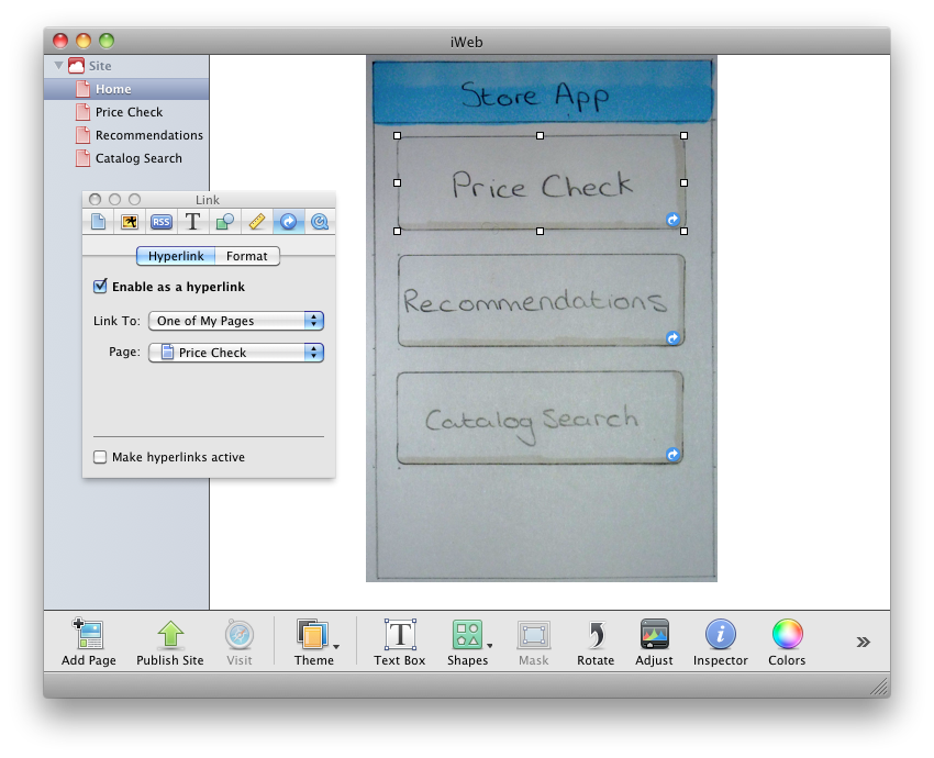
After importing and resizing the images, I opened up Apple’s iWeb application. I set the webpage size to the iPhone’s resolution and then gave each image a separate page. Following this, I placed links on top of the buttons on my paper prototype which when clicked would send the user to another page. I then uploaded this to the Internet, and downloaded one of the many full-screen browsers for the iPhone. This allowed me to hide all the browser’s chrome and show only the prototype images. During this assignment, I was unable to find a solution that would store the HTML files locally and act correctly as a prototype. Due to this issue, this method requires an Internet connection, preferably Wi-Fi, however a decent 3G connection was more than satisfactory.
Final thoughts

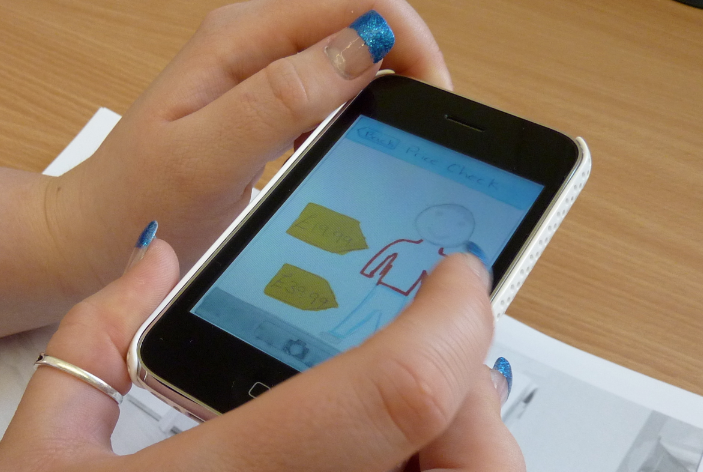
A user working through the scenario using the prototype in a full-screen browser.
This method allowed the user to interact with the prototype like they would with any other iPhone app—minus the animation—and me to test the prototype in real world environments. Conventional paper prototypes restrict users, requiring them to follow the specific order of screens set out by the designer. By making the prototype more interactive, you allow the user to deviate and make mistakes without requiring intervention from the designer. No intervention means the user will feel in control and relaxed, hopefully yielding more realistic results.
Merely adding one additional step to this method can change the types of evaluations and results you receive from paper prototyping yet still retain the inherent advantages found with the technique such as no coding involved, fast and cheap to mockup interfaces, as well as encouraging creativity from other designers and more importantly, the users.
Ready to get your feet wet in Interaction Design? In this article we touch briefly on all aspects of Interaction Design: the deliverables, guiding principles, noted designers, their tools and more. Even if you're an interaction designer yourself, give the article a read and share your thoughts.