Many sites provide an array of methods to interact with their offerings, but excesses in decision-making pressure can render less empowered visitors into a cyclone of stress from the barrage of questions being asked. As an industry, we place a great deal of emphasis on getting visitors to make decisions, but are we turning a straightforward path into a labyrinth with our need to know?
A fear of the unknown
Despite our best wishes, we often provide a maintained level of choice and interaction that places unnecessary pressures and burdens on the end user. The most common reason that issuing choices fails to balance the need for maintaining control and highlighting flexibility comes from the lack of education as to the result such choices will incur. As such, a fear of the unknown arises where end users feel that whilst they are responsible for their actions, they don’t feel in a position to make important decisions (which results in a breakdown of function).

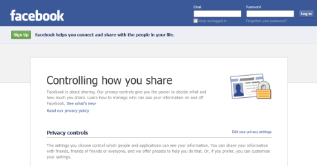
Facebook’s privacy choice selection is quite comprehensive.
Most sites have to deal with choice in some form, and it’s important that when we offer such variety, we ensure it is done tastefully without overloading or confusing the end user. With the rise of social networks and interactivity (where anything from friendship to money could be on the line), we need to begin evolving our models of how we help users decide what’s right for them. This is not only because many users don’t understand what the choices will result in, but also because constant questioning can highlight flaws regarding how people scan content.
When sociological breakdowns occur between the visitor who uses the service and those who are responsible for maintaining it, the dangers of why such issues have come into being need to be investigated carefully. Offering choices (of varying levels of complexity) can be a good thing for those who understand the consequences for which making decisions will entail, but every so often we ask our end users to decide on how events should play out when they are either uneducated (and susceptible to poor choice) or reduced to calling for support.
Consequences of choice
While how many choices to give the end user is something that can’t be fully answered unless the relevant variables relating to the audience (such as technical levels) are known, the respected methodology of only providing (or asking for) details when they are required becomes apparent as an obvious solution. Choice is not something to be taken lightly and the consequences of poor choice can be detrimental to not only your business but also to the level of trust maintained between you and your end users. Therefore, a balance needs to be drawn.

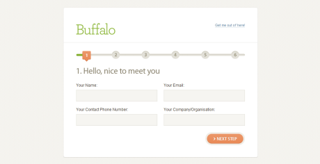
Simplifying information requests can improve usability.
Many services place a lot of demands on the end user (to the extent of filling out a survey) in requiring decisions to be made—decisions that could otherwise be left until the need arises. Such a need to express freedom and the ability to maintain your information often gives end users a psychological feeling of control and empowerment, but as the saying goes, with great power comes great responsibility. This is a worry as many sites request details in a manner which demands “on the spot” choices that result in unenlightened decision making, false responses, or guesswork.
We can establish that too many choices (in a time-frame or session) will confuse end users, resulting in negativity toward participation, and that a fear of unforeseen consequences can be counter-productive, making future decision making more difficult. This highlights that whatever you use to try and encourage the freedom of choice (and how you present those choices), it needs to be done with some level of restraint. This way, you ensure that such decisions are made only when the end user understands and approves of the action occurring.
Subconscious subjectivity
Try to think back at decisions you have made. Some decisions have more weight and importance than others, and those should reflect identically when being implemented online. A fault that seems to go unnoticed by many professionals is that when the need for decisions is established, little thought goes into the importance of that request, not to mention how it should reflect upon the barriers in place to ensure the decision is not made lightly (by just clicking a single button). The context of how the decision is being made should be important.

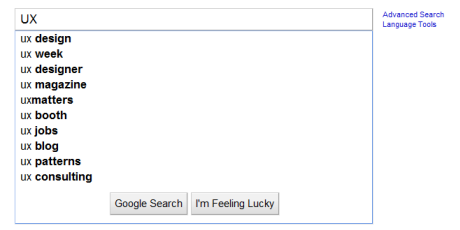
Google makes search recommendations to reduce complexity.
Decisions that require complex answers should not be restricted to single entry (otherwise lost) fields without having a save progress function in place to allow the end user to reflect upon his answers carefully. This is especially important if the information is of such complexity that he requires to outsource his request for information to gain what he needs to complete the steps. Unless there is a very good reason (such as the need to complete payment before accessing the goods), it’s also not a good idea to restrict user navigation until demands on their time are met.
We all subconsciously make split-second decisions as to how we shall respond, such as which links we navigate too, which files we download, or which privacy settings we use on social networking sites. It’s important that zombie browsing be addressed in respect to how those actions are automated. While complexity may be a cause for concern in usability, the need to ensure that empowered choices are made appropriately requires a greater level of instruction on behalf of those who offer such choices (with concern as to how their implemented).
The nature of the beast
If there’s one thing we have learned from the rise in privacy related issues, the need to sanction and relate choice appropriately is of great importance to the user experience. It’s quite easy to blame end user decisions upon the person who instigates the action (by clicking a button they shouldn’t or agreeing to a contract without reading it), but the truth of the matter is that we as experts need to hold more responsibility in underlining the importance of good decision making, if only to ensure that the users of our services remain in safe hands.
We cannot control the end user (as much as we’d like too), and it goes without saying that trying to manipulate our consumers unfairly can result in a breakdown of trust. But ensuring that you document choices properly (by providing education), only offer choices when they’re necessary (by providing simplicity), highlight the results of choices made (providing understanding), and don’t punish end-users for mistakes (by allowing bad choices or errors to be resolved), you’ll have an equilibrium which will better streamline the flow of user interaction.
Information architecture is an often misunderstood job title. Are they designers? developers? managers? All of the above? In this article we'll discuss what information architecture is, why it's related to usability, and what are the common tools/programs used in information architecture.