Mobile applications and websites are hugely popular right now. Limitations of the mobile hardware has meant that certain design conventions need to be used to make them a success. Could some of these mobile conventions be used to improve your website design?
The smartphone market is massive, with an estimated 54 million handsets sold as of May 2010 (Gartner, May 2010) and is growing every day. The new capabilities of these smartphones means that there’s a huge audience out there who have the capability of being online anywhere, at anytime of the day.
Website owners are beginning to realize the growing importance of mobile and commissioning mobile-friendly versions of their websites or mobile-specific applications. So what is it that characterizes a good mobile app/website? Simplicity—the most successful mobile solutions involve ruthlessly reducing the amount of features, and focusing on the core functions its users are visiting it for.
There are a number of reasons why simplicity is essential when creating a mobile app (for the purpose of this post, I will use “mobile app” to mean both applications and mobile websites), and most of them have something to do with the UX issues of using a mobile device.
Hardware limitations
The ever-controversial Jakob Nielsen has published two excellent articles entitled Mobile Usability and iPhone Apps Need Low Starting Hurdles, where he discusses the results of numerous user-testing sessions.
The main points of this research are:
The phrase “mobile usability” is pretty much an oxymoron. It’s neither easy nor pleasant to use the web on mobile devices.
Small screens mean fewer visible options at any given time, requiring users to rely on their short-term memory to build an understanding of an online information space. This makes almost all interactions harder.
…menus, buttons, hypertext links, and scrolling all take longer time and are more error-prone…Text entry is particularly slow and littered with typos, even on devices with dedicated mini-keyboards.
Nielsen, 2009
Using a mobile device also brings with it some inherent issues relating to the way in which that specific audience interacts with your app. People are often on the move when using their smartphones, and are likely using an app or visiting a website with a particular task in mind. Taking this into account, users want to complete the task as quickly as possible and don’t want to navigate through pages of content to get to it.
This means your mobile solution has to be designed so it’s easy to use when your audience is walking along. Interaction areas—such as buttons—need to be easy to hit, and any important copy should be large enough to read from arms’ length.
Slower connections like 3G mean you have to also think of design solutions that will work effectively on slow networks. This tends to mean graphically lighter designs.
Smaller screens means less real estate to design for. Normal websites load with very small interaction areas and require zooming and scrolling from the end user. If you can design a web app that is optimized for a smartphone screen resolution, then you will be providing a much nicer experience to your audience.
So, there are many reasons why mobile apps differ from the full web browser experience, but can websites learn a thing or two from their mobile counterparts?
Focus on core offerings
One of the best (and worst) things about a website is that it can constantly evolve. This means websites can grow organically over time, and as website owners find new things to offer their audience, new features and pages will be added. If this isn”t implemented carefully, it can lead to a bloated website with numerous features fighting for people”s attention. However, it seems that when a mobile app is being created, the stakeholders really think about the “key” things their (mobile) audience will want and take everything else out. I can think of a whole host of websites that could benefit from this kind of thinking.
For example, the IMDB mobile site is effectively just a search bar. It features a clear search function that serves up swift results. There are no other distractions to take the user’s attention away from the task they are likely to use the app for.
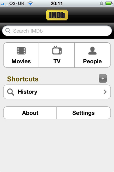
The IMDB mobile site is effectively just a search bar.
On the full website, however, there are many distractions. They present latest trailers, featured movie photos and many more subsidiary articles. People using the IMDB website may have time to browse the site and could very well be interested in finding out which star was born today; however, the majority of the people visiting the site are most likely looking to make a search query. The search bar isn”t particularly prominent in the IMDB design and should probably be getting much more attention drawn to it.
If IMDB took a little time to re-focus their design on exactly what their audience wants (just like they have in the mobile app), they could very well be even more successful.

The search bar isn”t particularly prominent in the IMDB design.
Big interaction areas
As I mentioned earlier, the better mobile UIs feature large buttons, as using your finger is far less accurate than using a mouse pointer. The Last.fm app is a great example of this, where the buttons span the width of the screen and are larger than the tip of the average finger. This makes interacting with these buttons a breeze and allows its users to be comfortable using its UI on a mobile handset.
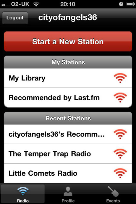
The Last.fm iPhone app features some great big buttons that are very easy to press without mistake.
It would be great if their website would take note of this and provide bigger buttons in places. Some of the buttons on the Last.fm site are nice and big and easy to find and interact with. However, this is not the case with all of them. For example, the small “play” buttons next to the track titles in the example below make it just that little bit harder to click them, increasing the chances for error.
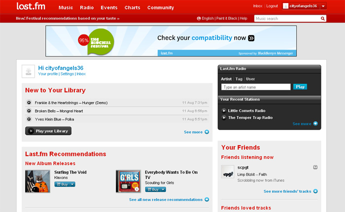
The small “play” buttons next to the track titles make it a bit harder to click them, increasing the chance for error.
So if you are designing an interface that you want people to use regularly, think about the buttons people will be using most often and be sure to make them large enough to be easily hit every time.
Optimizing for screen resolution
Mobile apps are designed for a specific screen resolution in mind. This means they are designed with careful thought about how big to make everything, to ensure users can play with it with ease.
Most websites however, are viewed on various screen sizes making it impossible for the designer how every specific user will see their site. This tends to lead most websites to display well at a minimum of 1024px x 768px. However, screen sizes vary so much these days that it could be time to start designing with “media queries” in mind.

This is the beautiful dConstruct 2010 site in all its glory on a large screen.
“Media queries” allow different stylesheets to be deployed depending on the user’s screen resolution. This means someone viewing a website on a 1024px x 768px screen could see a different layout than someone viewing the same site on a much larger resolution. Media queries open up new possibilities to designers, allowing you to reward people with larger screens by creating, for example, larger graphics for them to interact with, and using the extra space to increase padding where needed.

The dConstruct site also shrinks nicely when seen on an iPhone because they have chosen to use ‘Media queries’.
Minimal copy
Mobile applications use very little copy—the designers realize their audience is in a hurry and they don’t want to slow them down by presenting paragraphs of information. If the interaction needs a description to understand how to use it, then perhaps it should be redesigned.
This rule should be taken note of by web designers. I was recently asked to review a “how to find us” page for a local business. The page’s main function was to direct the audience to their various locations, using maps and directions.
However, before displaying any maps or directions, the business thought it would be a good idea to take a few paragraphs to describe each location individually. This meant that the contact page had a vast amount of copy on it that was conflicting with the basic purpose of the page.
Before adding content to your site, ask yourself: “Is this adding to the overall aim of the page?” and “Do we really need this?” If either answer is no, don’t add the content.
Wrapping up: What we should learn from mobile development
- Ensure that you are focusing on presenting your core values/strengths.
- Design your interactions areas so they are easily hit from anywhere on the screen.
- Optimize your website to look its best at multiple resolutions.
- Have a content review and keep only the copy that is helping you achieve your aims.
Resources
- Designing For The Modern Day Mobile Market
- Web design inspiration for the iPhone
- Mobile Web Design: Best Practices
- Creating a Mobile Version of Your Site
Universal design considerations increasingly comprise a prudent approach to design and development for the web. Interaction designer Andrew Maier details some of the broader implications this has for user-centered designers.
