If you’re new to the field of user experience design, welcome! There’s plenty to see and do around here. And although many brilliant contributors have come before us, there’s actually not too much to catch up on—if you know where to look. Because pictures are worth so much, illustrated diagrams have served a critical role in our community.
Our community is filled with thought leaders, those among us that conjure up entirely new ways to look at difficult design problems. Unfortunately, their perspectives are only useful insomuch as they can be communicated to other practitioners; what good is a design process if it’s done in a vacuum? Diagrams are of great use because they cut to the heart of the matter, taking away the ambiguity of words and visually depicting abstract concepts.
In this post, I’ll share eight diagrams essential to the understanding of user experience design. If you’re extra curious, be sure to check out the accompanying links. Also, if you’re in search of something more comprehensive, check out Luke Wroblewski’s ongoing catalog of UX Diagrams over at his site.
The diagrams
-
The UX Honeycomb
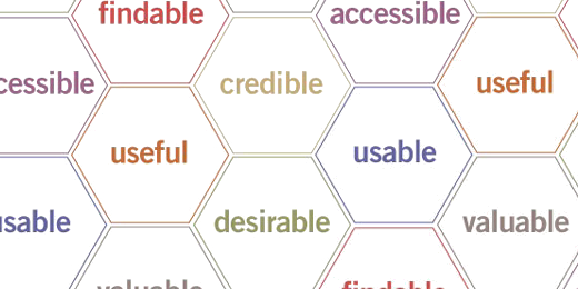
Despite its age (2004!), the UX Honeycomb by Peter Morville is still as relevant as ever. Unlike other diagrams featured in this list, however, the UX Honeycomb makes no claims with regards to process. Instead, it outlines the subjective considerations motivating our work. Peter explains:
When I broadened my interest from IA to UX, I found the need for a new diagram to illustrate the facets of user experience—especially to help clients understand why they must move beyond usability—and so with a little help from my friends developed the user experience honeycomb.
Peter Morville
-
The UX Wheel
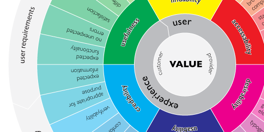
Even on first glance it’s fairly obvious that Magnus Revang, the creator of The UX Wheel, took a cue from Peter Morville’s UX Honeycomb. The significant difference here is that the UX Wheel does identify a design process, associating common deliverables with each subjective consideration. Magnus explains his diagram from the position of discovering a client’s value proposition outward:
Value is what we want to accomplish—for customers and providers, positive user experience is a win-win situation—to achieve this we work backwards, starting and ending with search engine strategy, and going through and making a choice about each of the factors.
Magnus Revang
I personally find Magnus’ work inspiring. It’s a common difficulty to tell which deliverable will help a client best. This diagram helps novice-to-intermediate practitioners simultaneously place their client’s malady and recommend the an appropriate design solution.
-
The UX Treasure Map
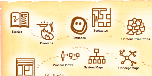
Another gem from Peter Morville, the UX Treasure Map is a concise representation of the common deliverables found in his design process. A basic knowledge of each deliverable—as well as their relationship to one another— helps any UX designer navigate their way inside of a project environment. Lest we find the treasure map prescriptive, though, Peter cautions us that simply knowing our deliverables isn’t enough:
…for each project, we must strive for the optimal mix. Since our deliverables resist a taxonomy, asking questions may help derive their folksonomy. [Questions the UX Designer must ask themselves:] Audience. Who must you reach? Content. What is the message? Context. Where is the conversation? Process. When is the message? Problem. Why are you communicating?
Peter Morville
-
The Elements of User Experience
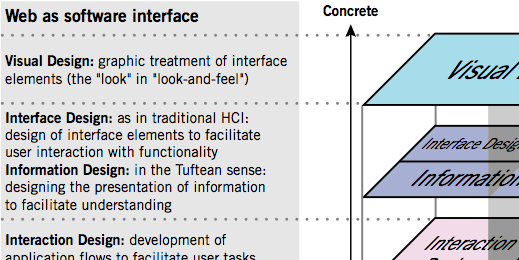
Created by Jesse James Garrett, The Elements of User Experience diagram has had one of the most succinct descriptions of our entire field (as it applies to the web) for a long time. Jesse describes it thus:
The Web was originally conceived as a hypertextual information space; but the development of increasingly sophisticated front- and back-end technologies has fostered its use as a remote software interface. This dual nature has led to much confusion, as user experience practitioners have attempted to adapt their terminology to cases beyond the scope of its original application. The goal of this document is to define some of these terms within their appropriate contexts, and to clarify the underlying relationships among these various elements.
Jesse James Garrett
-
The Importance of User Experience
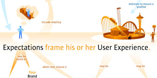
This diagram is the result of close collaboration between Interaction Designer Bryce Glass and Usability Professional Frank Spillers. Users were interviewed, and previous posters noted in order to create what amounts to a better experience design diagram. Today, The Importance of User Experience diagram requires little explanation.
As designers we almost universally understand what experience design must be. That’s because if a user walks away due to a bad experience, it affects an entire organization’s ability to meet its business goals. But this knowledge is far from universal, making the sharing of it essential. As luck would have it, The Important of User Experience is available as a poster—in case you want to spread the good word in a not–so–subtle fashion.
-
The Fundamentals of Experience Design
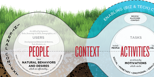
Like many UXers, design consultant Stephen Anderson believes that the best solutions lie at the intersection of “People, their Activities, and the Context of those activities”—what he deems The Fundamentals of Experience Design. Stephen’s diagram is almost a “thinking outloud” exercise, exploring the implications of this approach. Loaded with analytical thinking and insightful observations, Stephen’s diagram gives viewers a unique perspective on a commonly misunderstood design axiom.
-
Web Design Process Guide — 2003
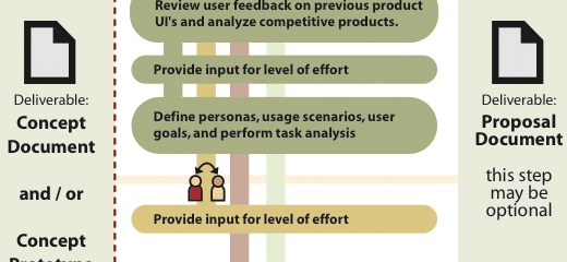
No web design process is perfect. But this diagram, co-created by various design departments at AOL and edited by Erin Malone, is a good first step. Any one who’s tried their hand at designing a sizable, content-driven website knows that the moving pieces of design aren’t that easy to articulate. This diagram helps piecemeal the process, laying the groundwork for a pragmatic, user-driven design endeavor.
-
User Centred Design
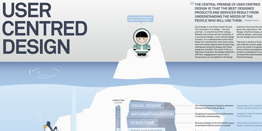
Finally, one of the freshest takes on illustrating user-centered design comes from Pascal Raabe, a multi-disciplinary designer hailing from the United Kingdom. His diagram, User Centred Design, explains the nuances inherent in this oft-misunderstood process. What’s great about Pascal’s diagram is that it marries familiar elements from other prominent UX diagrams (such as those by Jesse James Garrett, Magnus Revang, and Peter Morville). In addition, Pascal finds the time (and, frankly, the space) to explain how timeliness affects goal-driven design as well as various ways in which designers can assess common accessibility concerns. A brilliant piece.
More to Share?
These eight diagrams are only those that I find most useful; what are yours? Fill in the gaps below!