As UX designers, it’s our job to make sure users can accomplish what they set out to do—and if we’re really on a roll—make them happy in the process. But UX designers don’t often have the final say, and decisions are made that can block users from doing what they want to do, all often in the name of a bottom line. At best, this is frustrating. But at worst, these annoying practices can set users into a fit of rage.
I use the term “rage” sort of lightly here, but I imagine many of our readers can relate: how’d you feel the last time you tried to read an article or visit a website for quick information when an annoying overlay or interstitial blocked your access? I can tell you, the burst of anger I feel when this happens is akin to getting dangerously cut off in traffic. I am instantly filled with hatred, and I immediately abandon the website I was trying to read in favor of another Google result that sucks less.
Of course, it’s not always these overlays that can enrage users. From dark patterns to a more innocent, poorly-thought-out interaction, if you’re getting in your users’ way, you’re doing everyone a disservice, no matter how padded the metrics are.
But how can you tell if users are becoming angry with your website? The short answer is, it can be tough. UX heuristic reviews can be super helpful, as can basic usability testing. These things, however, take a lot of time and, in some cases, resources.
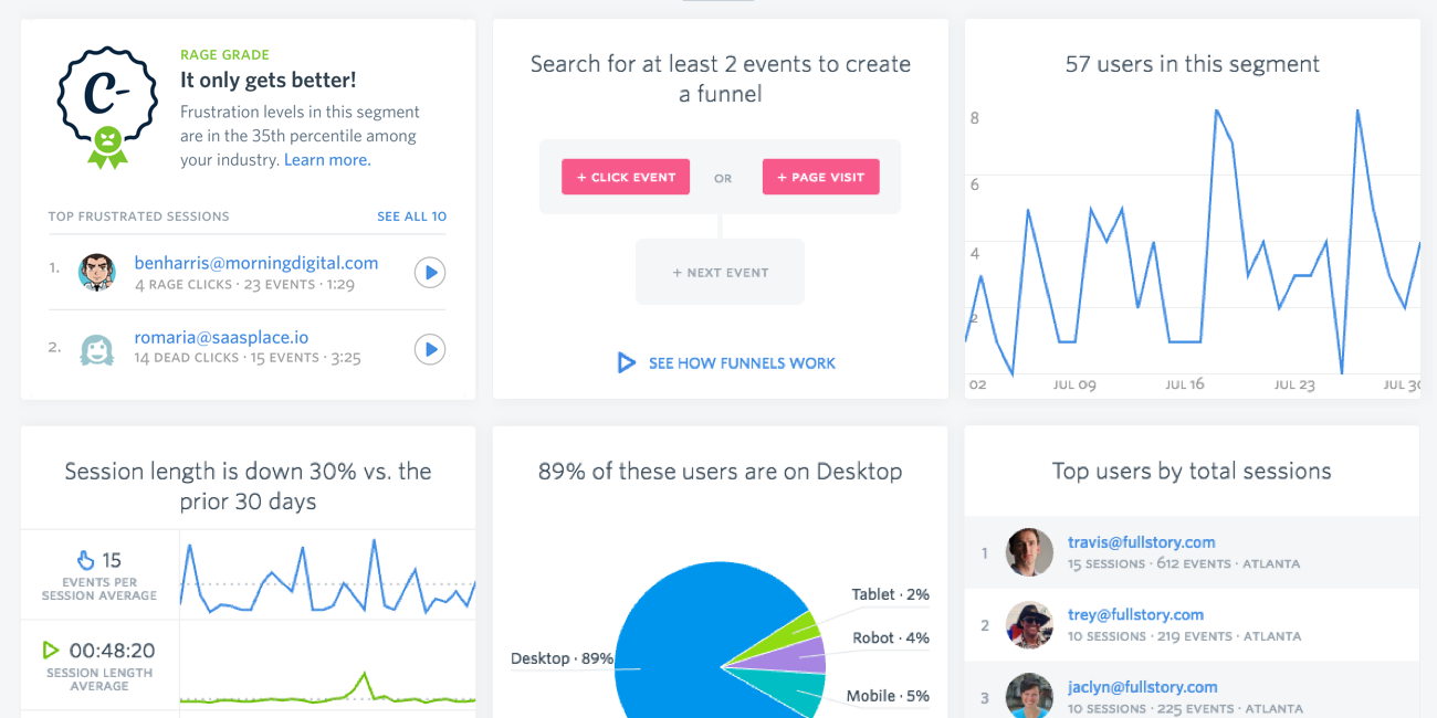
One tool I’m pretty hopeful about (but haven’t used myself just yet) is this feature that our friends at FullStory just released called Rage Grade. Its sole purpose is to measure levels of frustration in your users, so that teams can identify when things are trending poorly. Here are a few ways that the Rage Grade is trying to help (in their words):
- Machine-trained heuristics that allow you to measure frustration transparently, including errors and dead clicks, abandoned form detection, thrashing mouse movements, active time on page, and more
- Analysis of support tickets or collected feedback, selecting for squeaky-wheel customers and dramatically bad experiences
- A look into how your customer frustration stacks up against other companies like yours
- Highlights of the top 10 most frustrated sessions in your app (without having to do any manual searching)
Of course, this isn’t necessary for everyone. It’s definitely an investment, and is probably much more useful for commerce-oriented organizations than it is for, say, an organization’s “brochure” site. If you’re driven by conversions of some kind, having a RageGrade through some tool effectively monitoring user frustration? Well that can make a huge difference.
Don’t be a jerk
Just please, please, while deploying new conversion tactics or interactions, always ask the question: will this send my users into a fiery rage fueled by my own poor decisions? And for the love of all that is holy, be honest with yourself. And if you’ve tried FullStory’s Rage Grade, I’d love to hear how you’ve found it so far.
Let us know though: what other ways do you try and monitor / measure user frustration?
Ready to get your feet wet in Interaction Design? In this article we touch briefly on all aspects of Interaction Design: the deliverables, guiding principles, noted designers, their tools and more. Even if you're an interaction designer yourself, give the article a read and share your thoughts.
