eCommerce sites are competing for customer attention and loyalty. The user experience features included in a site are the focal points for engaging customers, and can make or break the purchase process.
Editor’s note: In the spirit of full disclosure, the author of this article is also the founder of Usography.
But UX features aren’t free. In some cases, they are very, very expensive. Selecting the right feature set is an exercise that should be as well-informed as possible, and should take into account available resources, industry best practices, and the competitive landscape.
Usography reviewed 100 top e-commerce sites for its recently published Retailer UX Audit. In the process of conducting the audit, we were surprised to discover the user experience features that were missing from top e-commerce sites, sites that receive millions of visitors per month, and earn millions of dollars in revenue.
Here we’ll take a look at ten UX features that were missing from 90 percent or more of the sites we reviewed for the Spring 2011 UX Audit. We selected these features (from the complete feature list) based on their infrequent occurrence on e-commerce sites, and on their potential to engage customers and increase sales. They are presented below in order of decreasing occurrence. In parentheses next to each feature is the number of sites we reviewed that had the feature in the Spring 2011 UX Audit.
Product Videos (9/100)
A minute of video is worth 1.8 million words, according to Dr. James McQuivey of Forrester, a leading technology research firm. Product videos engage attention and convey information in a way that doesn’t require much effort on the part of users. Videos bring a product to life more than static images. Because of their potential for increasing sales as well as improving search engine placement, product videos are likely to become a standard feature on e-commerce product pages in the near future.
However, retail sites have been slow to include them to date. Some e-commerce sites that do include them are Zappo’s (illustrated below), Patagonia, QVC and Burberry.
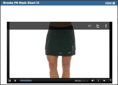
Zappos, hitting a UX home run.
Order Online, Pickup in Store (9/100)
Walmart’s e-commerce site was in the news earlier this year for starting to offer “order online, pickup in store” functionality. Pairing the convenience of online shopping with the immediate access of a store location is a winning combination that less than 10% of the sites we reviewed had taken advantage of. Some of the sites we reviewed that did have this feature, in addition to Walmart, were Nordstrom (illustrated below), Sears, and Container Store.
Admittedly, supporting this feature requires substantial backend logistics. If someone purchases a product in the store, and someone is looking at the same item online, the store inventory has to let the online catalog know in real time that one fewer of that product is available. Keeping store inventory and online inventory in sync is a feat that not every retailer can manage with current technology, but it is a UX feature that customers are likely to look for in increasing numbers as more retailers offer it.
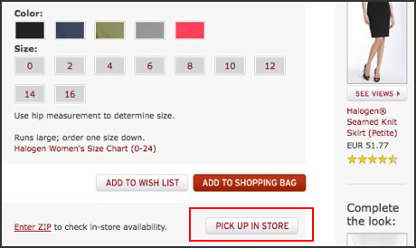
Nordstrom’s Pickup option.
Price Drop Alert (5/100)
Price is a key determining factor for purchase decisions. Customers often hop from one site to the next to find the best price. It makes sense, then, to let customers know when the price of a product they have indicated an interest in drops. It’s an incentive to return and buy it. Customers have to surrender their email address to use this feature, so it’s a win-win situation.
Nevertheless, only 5 of 100 top e-retailers had this feature in Usography’s most recent UX Audit. Among them were Newegg (illustrated below), Tool King, and Rugs USA. Of the sites that did offer this feature, the most common UX design was a Price Alert link adjacent to the product price or Add to Cart button.
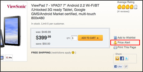
Newegg’s price drop alert.
Customer Product Images (5/100)
Product catalog images are idealized views of a product, paired with idealized people. Customers’ homes and bodies are different. They realize that, and it causes hesitation when shopping online: What will that look like on me? Or in my house?
To deal with this objection head-on, some retailers are allowing customers to post their own image of a product they have purchased directly on that product’s detail page. There is a risk, of course, that a less than perfect image will break the sale. But retailers like Petco (illustrated below), Northern Tool, and Zales feel that the risk is outweighed by the persuasive power of customers who bought the item and liked it enough to return and post a picture. In Zales product reviews, customers upload images that show how diamond products look on their hands. In the Petco customer image below, a cute Chihuahua models a dress on the product’s detail page.
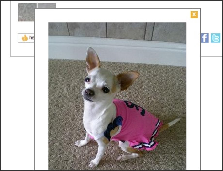
Chihuahua model at Petco.com
Product Details in Spanish (4/100)
Given the census data regarding the growth of the hispanic population in the USA, it is astonishing that only 4 out of the 100 top retailers reviewed in the UX Audit include the option on product detail pages to view the page in Spanish. Granted, there is a substantial cost associated with translating a massive product catalog into another language. But having a product page that a percentage of your site visitors can’t read is a large, and growing, missed opportunity. A couple of sites that did include Spanish product pages were Victoria’s Secret (illustrated below) and Rooms To Go.
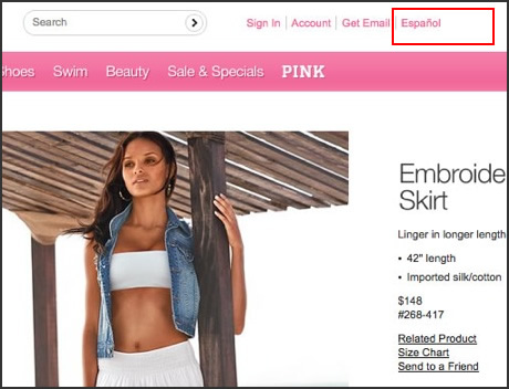
Victoria’s Secret acknowledges their multilingual audience.
Customer Product Tagging (3/100)
Letting customers create their own tags for products keeps the taxonomy fresh and relevant. It also gets customers involved with products that they like. When a customer sees that another customer described a product in a certain way, it seems more authentic and natural than the terms marketers have devised to describe that same product. After all, they weren’t paid to say it.
Furthermore, customers typically have to log in in order to tag a product, which is a step that supports ongoing loyalty and self-investment. The three sites we reviewed that included this feature were Urban Outfitters (illustrated below), Amazon.com, and Zappo’s.
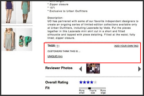
Crowdsourced tagging at Urban Outfitters
Co-Shopping (2/100)
Co-shopping is UX feature that lets people in different locations view the same product page, and chat in a sidebar about the product. Usography has noted a decrease in the availability of this feature since Buy.com purchased DecisionStep, creators of the leading co-shopping solution called Shop Together.
The decrease in availability is unfortunate, because there are situations in which people who are not at the same location want to view products together, chat about them, navigate to other products, etc. People working for the same company who are located in different cities, or even spouses who are temporarily apart but need to make an online purchase decision, can use co-shopping to complete the transaction. At the time of our Spring 2011 UX Audit, the only retail sites we reviewed that offered the co-shopping feature were Buy.com and Dell.com (illustrated below).
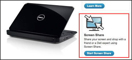
Coshopping, alive and well at Dell.
BFF/Text Us (1/100)
Charlotte Russe was the only site we reviewed that had this feature. It makes sense that any retailer that sells to Millennials would set up a communication channel based on texting. But texting is not just for Millennials. SMS text messaging is the most widely used data application in the world, with over 2 billion active users! So why is Charlotte Russe (illustrated below) alone out there with this feature?
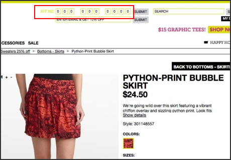
Charlotte Russe sets up texting.
What Other Customers Are Viewing Now (1/100)
Customers looking for ideas or wanting to know what items are hot right now may like a window into what other customers are viewing at any given moment in time. Buy.com has an elegant feature that does just that. It’s hard to appreciate the impact of this UX feature in the static image below. It’s worth a look at it in action on Buy.com to see how such a feature could enhance browsing and serendipity.
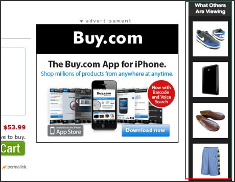
Buy.com allows users to see who’s looking at what.
Virtual Try-On (0/100)
Well, none of the retailers we reviewed had this feature. At least not on the product detail page (if a feature is buried somewhere outside the main product catalog path, we didn’t count it.) Why do we include it here? Because it is arriving on the scene, and will usher in a more realistic form of online shopping that makes store visits less necessary for certain categories of merchandise. Virtual Try-On has recently made advances in consumer awareness through augmented reality apps that are appearing on the scene, such as Zugara (shown below as implemented on the Fashionista / Tobi site).
The feature isn’t limited to apparel shops, although that’s the product category that seems to garner the most attention. It could also show BMW customers what they would look like pulling that new metallic blue Series 7 into the luxury driveway like those featured at https://didsburydriveways.co.uk/. Or, how your living room would look with different kinds of furniture and decor. The Virtual Try-On feature is so compelling for customer engagement that we’ll continue to include it in the UX Audit, even with a score of 0.
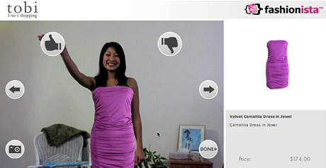
Zugara helps users see possibilities, with a little help from augmented reality (AR).
Editor’s note: For more info about the technology behind augmented reality (which is needed for virtual try-ons), check out this explainer at How Stuff Works.
Onwards…
UX Features are focal points of attention on e-commerce site. Understanding how your customers shop for your products, and what competitors in that category offer in terms of features, are key building blocks in a winning UX strategy.
