Many iOS (iPad and iPhone like Refurbished iPhone Sydney) users don’t know the basic gestures or default system tools that, with the correct knowledge, make using these devices so easy. Designers should be aware of these issues and either offer guidance or provide alternate solutions that compensate for this knowledge gap.
To use any software, some understanding of how to use both the software and hardware is required. Many users lack this knowledge, which, when we break it down, is why the UX field exists. Perhaps Jared Spool described this best when he coined “The Knowledge Gap” as the difference between a user’s actual knowledge and the target knowledge (what is needed to complete a task), and asserted that for a design to be intuitive, it needs to bridge this gap. Because of this, our primary task as UX designers and researchers is often to understand this gap and design solutions that guide customers through it with ease and perceived satisfaction.
Though Apple has received plaudits for their intuitive, easy to use products, there can still be a significant knowledge gap when it comes to touch-based interfaces. iPhone and iPad users are no longer early adopters—these are regular people who don’t want to think about technology. In addition, most have had very little exposure to touch-based navigation prior to their iOS device, so their knowledge gap is wide, especially for the first year or two that they are using the device. As a result, there are many gestures and behaviors that users simply don’t know about or notice. As designers, our best defense to this is to be aware of these gaps and design for (or around) them.
Though surely there are other examples, here are five specific issues that I have observed, and some suggestions for how to work around them to provide a better overall app or iOS-optimized website experience.
1. Two fingered embedded DIV scroll
Whenever there is a scrollable area (typically a DIV) that is embedded within another web page, this area can be scrolled on the iPad by swiping up or down with two fingers (this also includes scrollable areas within lightbox overlays). Unfortunately, there is nothing intuitive about this control, nor any reason a user would expect it to work. Of the users I observed, none used this technique. In fact, through my personal conversations with even the most hard-core Apple lovers, I have yet to find someone who knew about this gesture before I introduced it to them. Surely some users are aware of it, but my evidence suggests that most are not. As such, designers need to understand that any content hidden behind this scroll will likely be inaccessible for most users.

Note the two modular boxes with implied scrolling.
The obvious solution to this problem is to not use this technique with pages that will be accessed on iOS devices. Unfortunately, since this may already apply to any publicly available website, the design decision may have already been made, and the cost and effort to change it may be too high.
Another option would be to use CSS to sense the iOS device and then alter the display. If there is room to expand the area to fit the content (which may be the case in the image above), that may be the best solution. If not, a message could be displayed to iOS users that explains how to view the hidden information. It is not the most elegant solution, and could get unruly if you add too much messaging, but it may still pay dividends if the hidden content is crucial for task success.

Here’s an example of gesture instruction.
2. Swipe reveals sub-menu
A common technique for app designers is to hide menu options behind a swipe. From a design standpoint, this is an elegant solution in that the screen remains uncluttered, yet still offers robust functionality. A common example is how one can swipe an email (in the default iOS email reader) to reveal a delete button. Twitter’s iPhone app takes this concept a step further by revealing a menu of 6 choices, including reply, retweet, etc. after swiping an individual tweet.

Mobile Twitter’s swiped sub-menu, in all its glory.
Unfortunately, there is no indication on the screen that this behavior exists, so the only way for a user to discover it is either: by accident, because they swipe everything, or because someone tells them about it. As a touch-specific behavior, this is actually quite nice to use once discovered, but, for all but the most savvy users, a hidden menu might as well not exist.
Twitter and Facebook handle this issue two different ways, each of which have their merits and potential problems. Twitter’s iPhone app shows absolutely no indication that a swipe will bring up a hidden menu, so theoretically a user could interact with this app on a daily basis without knowing that this option even exists. If the user taps a individual tweet, however, the expanded view of that tweet appears with all the same options that were offered in the hidden menu. Thus, the hidden option remains a shortcut for advanced users, but more novice users can still complete each task on a subsequent screen.

Facebook Mobile’s hidden menu.
Facebook, on the other hand, shows a little [+] icon to the right of each entry in the feed. Tapping this icon brings up a hidden menu with “Like” and “Comment” options. The menu option is much more overt, and probably better for users who are less likely to try (or know about) the swipe gesture.
Then again, Facebook does not have a tap action for each entry, so nothing happens on tap. If, for some reason, a tap action was needed (in a product listing on a commerce app, for example), this might not be an option.
Either of these options might work for various situations, but we should never rely on the user knowing how to find a hidden menu with a swipe.
3. Prev/Next button on multi-field forms
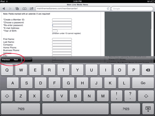
There’s no tab button on the iOS keypad. There is, however, a little “Next” (and “Previous”) button at the top of the keyboard, which is the easiest way to move from field to field on a multi-field form. Unfortunately, many people either don’t see it or don’t know what it does. In the study I observed, users were far more likely to tap the next field with their index finger than use the next button. (I even catch myself doing this from time to time!)

Though this is a problem in both custom apps and Safari, it is especially problematic in the latter, as the device will naturally scale the page down to fit in the window, making each form element quite small.
Though we can certainly hope that more users become aware of the “Next” button, it isn’t necessarily our job to educate them. What we can do, however, is make sure that form fields are large enough that they are easily tappable. When the fields are too small, it encourages multiple taps (including the frustrated “hard tap”), tapping the wrong field (when they are close together) or accidentally tapping a link that may be nearby. If we provide large fields that are easy to tap, users need not learn to use “Next” to have a good experience.
4. Dealing with Auto-Correct / Magnifying glass for text editing
The perils of auto-correct are not exactly a secret; there are many hilarious websites dedicated to this phenomenon. But when a user is trying to fill out a form on your website or app, and a key input field is repeatedly being corrected incorrectly, they will hardly find it funny.

Yes iPhone. That’s exactly what I meant.
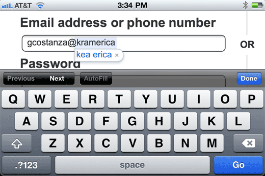
Perhaps the reason why so many funny and not-so-funny auto-correct mishaps occur is because users don’t really understand how to work with it. I observed one person, for example, who was actually very familiar with the standard iPad gestures, try to type her email address 4 times, only to have it auto-correct each time. She always had the option to click the little “x” to prevent the auto-correct, but she never used it. Perhaps she assumed the device would learn. Perhaps she thought the little bubble was to accept the correction, not to cancel it. Either way, she clearly did not know how to get the proper result, and was noticeably frustrated and eventually gave up.
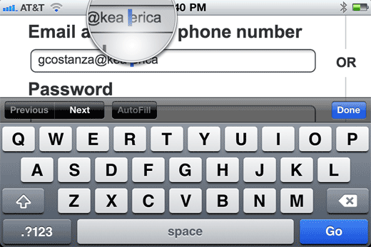
Interestingly, this same woman was the only person I observed who utilized the tap and hold gesture to launch the magnifying glass (to edit her auto-corrected text). Other users either tried to tap the spot where they wanted the cursor to go (which rarely works, no matter how hard you tap), or erased all their typing after the error and tried again. So, although this one user had success with the magnifying glass, it is clear that many more users are unaware that this great feature is even available to them.

What can we do about these gaps in knowledge? We can disable auto-correct when it does not make sense. There’s no need for this feature on a field for someone’s name, address, email address or town name, but, in many cases, it will be enabled by default. These are not common dictionary terms. Just the same, if your search engine typically receives terms that are not common words, such as brand names or technical terms, you might also consider disabling auto-correct for this field (perhaps replacing it with an auto-suggest list of popular terms).
5. What push notifications are
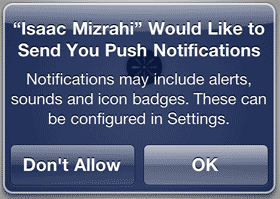
This isn’t really related to navigation, but it is another very problematic interaction specific to iOS apps. The first thing that happens to a user when they load a new app (that features push notifications) is that they get this message:

In the sessions I observed, two common misunderstandings emerged:
- Because they didn’t know what the app was going to be notifying them about, the user just chose “No.” This is similar to the automatic uncheck of the “email me promotional offers” box in eCommerce checkout. I don’t understand this, so I don’t want it.
- Other users chose “Yes”, stating that they were worried the app wouldn’t work correctly if they chose “No.” “I don’t understand this, so I better accept it.
The common thing between the two types of users? Neither understood how the app would be using push notifications.
It’s not even the app designers’ fault—Apple’s message is confusing. It gives very little indication of what content will be included in these notifications. In addition, since this is the first thing the user sees upon loading the app, they may not know what content the app contains or how push notifications would benefit them. Without this information, they will jump to conclusions. In the testing I observed, most users expected the notifications to be personalized, with customized offers for them, based on past behavior, which (for the app we were testing) was actually not the case.
Since we can’t change Apple’s default messaging, and they don’t offer any alternatives, one way around this would be to turn off push notifications by default. Then, write a custom script that will prompt the user after they have had some time with the app, that gives a detailed explanation of why they should want push notifications and encourages them to turn them on.
Mission: Incomplete
This is not meant to be a complete list of gestures or behaviors that cause trouble for iOS users, but hopefully I will have illustrated how the lack of understanding can trip up users, and how we as designers can attempt bridge this knowledge gap. If you are designing for another touch-based platform (such as Android), the same concepts apply, though the specific issues may be slightly different.
The very best way to determine which issues plague users most, of course, is to observe them directly in usability sessions. Maybe they all know how to use the double-finger scroll, so you can focus optimization efforts elsewhere. Maybe a whole new issue will be uncovered.