Does it seem like you’re doing everything you can to create an intuitive user-oriented website, but for some reason, you’re still seeing a lot of abandoned shopping carts? You’d be surprised how many website owners are battling the same problem. We analyzed the reasons for this behavior and created a list of the most common user frustrations in the world of online shopping as well as the improvements you can make to prevent abandoned baskets and boost your sales.
This article will explain what is wrong with your ecommerce UX and why people leave your website before making a purchase, as shown by research.
What is cart abandonment?
Cart abandonment happens when a website visitor leaves before completing a transaction, i.e before making a purchase. But don’t get too frustrated yet, a certain amount of abandonment is absolutely natural. According to research, more than 70% of users who add a product to their cart leave without completing the checkout process.
As Wikipedia states,
“The abandonment rate is the ratio of the number of abandoned shopping carts to the number of initiated transactions”
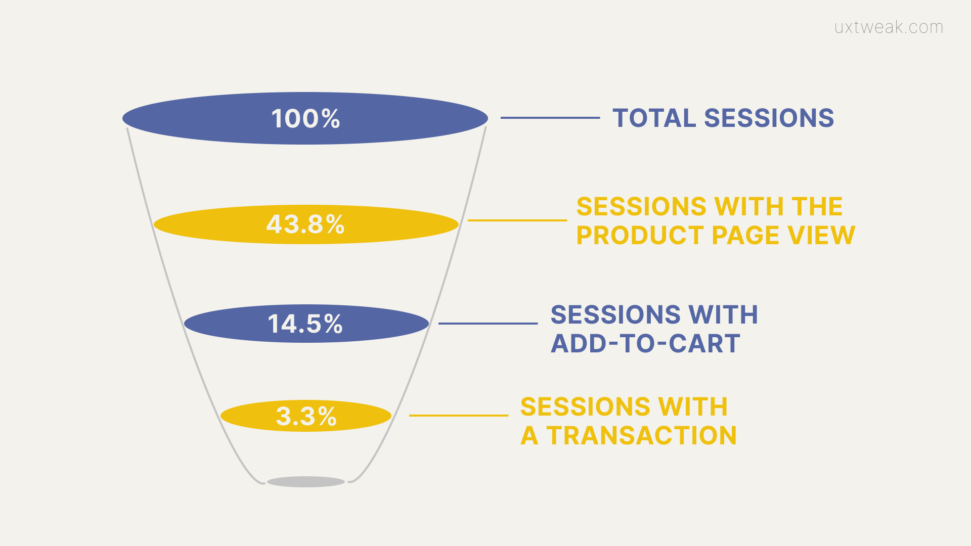
The average conversion rate is roughly 3%, which means that only about 3% of website visitors make the initiated purchase. And even though it’s completely normal for people to abandon their carts, there is still a reason behind every unfinished checkout. And we are going to tell you what they are.

Why does it happen?
There are tons of unavoidable reasons for high abandonment rates. For starters, your visitors may have just arrived to learn more about your products after seeing an advertisement, without any intention of buying. They could’ve been just casually browsing and comparing the prices or checking your website out before visiting the offline store.
Another cause might be the website’s general accessibility, which could imply that it is too slow, has too many pop-ups, hard to navigate, or simply not optimized for all types of devices. In fact, when compared to tablets and desktops, the average rate of abandonment for mobile devices is 85 percent, which is obviously much higher. Non-responsive websites are probably one of the most common modern reasons for an unfinished purchase, it’s just so annoying!
Visitors who have previously added items to the cart but have left it there fall into the third category. But why would they abandon the purchase at the final stage? This clearly means that their decision could have been reversed. And did you know you can do that by simply improving your checkout UX design? This, actually, can help you achieve a significant rise in conversion rates – more than 35%.
Common Reasons for Cart Abandonment
According to a recent study, conducted on 4 329 adults from the United States, absolutely everyone can improve their website’s checkout and minimize abandonment. Now that we know it’s entirely possible, let’s jump into explaining the 10 most common reasons your visitors leave before buying.
1. Extra costs
Imagine how disappointed and fooled a person feels when they are finally ready to buy something but have to find out at the checkout that the shipping fee is too high for their budget. This type of surprise is nobody’s favorite.
Recommendations:
- Show all the extra charges upfront, at the product page, for example. It’s also a great practice to come up with various delivery options. Let them know that the faster the shipping, the more it will cost and leave the decision on them.
2. Forcing users to register in order to buy something
You have to understand that not everyone is ready for that level of commitment. People can be in a rush or just not in a mood for creating another account today. A lot of the time we are just looking for a one-time purchase and can easily get annoyed with all that register/login process.
Recommendations:
- Offer a guest checkout option and watch your conversions go up.
3. Slow delivery
There are people who are willing to pay significantly more, just to get the product as fast as possible. Allowing different delivery options, such as express, for example, will not only satisfy the customers but will make you stand out from the competitors.
Recommendations:
- Come up with different shipping methods
- Allow various delivery times
4. Complicated checkout process
Being the final and the most important stage of the buying process, checkout should be a perfect flow. If it’s not fast and easy, requires filling in dozens of fields with extra information, it will cause even more unfinished purchases. Just so you understand, 2 out of 10 shoppers will give up such a transaction.
Recommendations:
- Keep it fast and simple
- Do a one-page checkout if possible or divide it into stages and put the progress bar on top of the page
- Get rid of all the extra fields
- Offer auto-fill
- Set up auto-save so that users don’t have to fill it all over again in case they leave the page
- Add a drop-down menu
- Use a checkbox at billing and shipping address as they are often the same, to save customer’s time
5. Website doesn’t look trustworthy
No matter how secure your transactions are, if the page doesn’t have a security icon displayed on it, customers are not likely to trust you with their credit card number and personal info.
Recommendations:
- Show your SSL certificate
- Use the padlock icon
- Add trust badges
6. Technical errors and lags
This can happen to any type of website as technical difficulties and faults are a part of any technology. However, you should try your best to avoid these situations as they quickly reduce trust and make customers feel annoyed and unsafe.
Recommendations:
- Keep an eye on your analytics
- Do regular website reviews, from the homepage to the checkout, to ensure that no issues are preventing customers from completing their purchases
- Work with proven eCommerce platforms such as Shopify, WooCommerce, etc.
7. Unfriendly return policies
According to the 2017 UPS survey, 68% of website visitors will check the return & refund policy before buying something online. There is no worth in making it difficult for customers to return the products. The easier your policy, the more trust and loyalty you’ll get from the buyers in return.
Recommendations:
- Create a return policy that is simple, straightforward, and beneficial for the customers.
- Make it easy to find. Put it on the product page as well as on the menu. This will save some extra time for the customers and show you are not trying to hide anything.
8. Insufficient payment methods
Having classical options only is no longer enough. Today everybody is used to a different payment method and you can easily lose a customer if you fail to provide them with various payment options.
Recommendations:
- Apart from the classical methods, offer to pay via Apple Pay, Google Pay, PayPal, maybe even cryptocurrency.
9. Declined credit card
This is another unpleasant moment when at the end of the checkout process, the system shows “Card declined by processor”. The problem usually comes from the side of the cardholder’s bank so you can’t really help it. However, you can and must immediately offer an alternative.
Recommendations:
- Don’t make them leave unsatisfied with an unfinished transaction. Offer to try another card or a different payment method.
10. No free shipping option
The truth is, nowadays free shipping is everywhere. That’s why your website visitors will most likely expect you to have it as well. And if you don’t offer that option, one of your competitors sure does.
Recommendations:
- Offer free shipping if possible. If it’s not very beneficial for your business, allow free shipping for purchases above the average order value.
Cart abandonment rate statistics
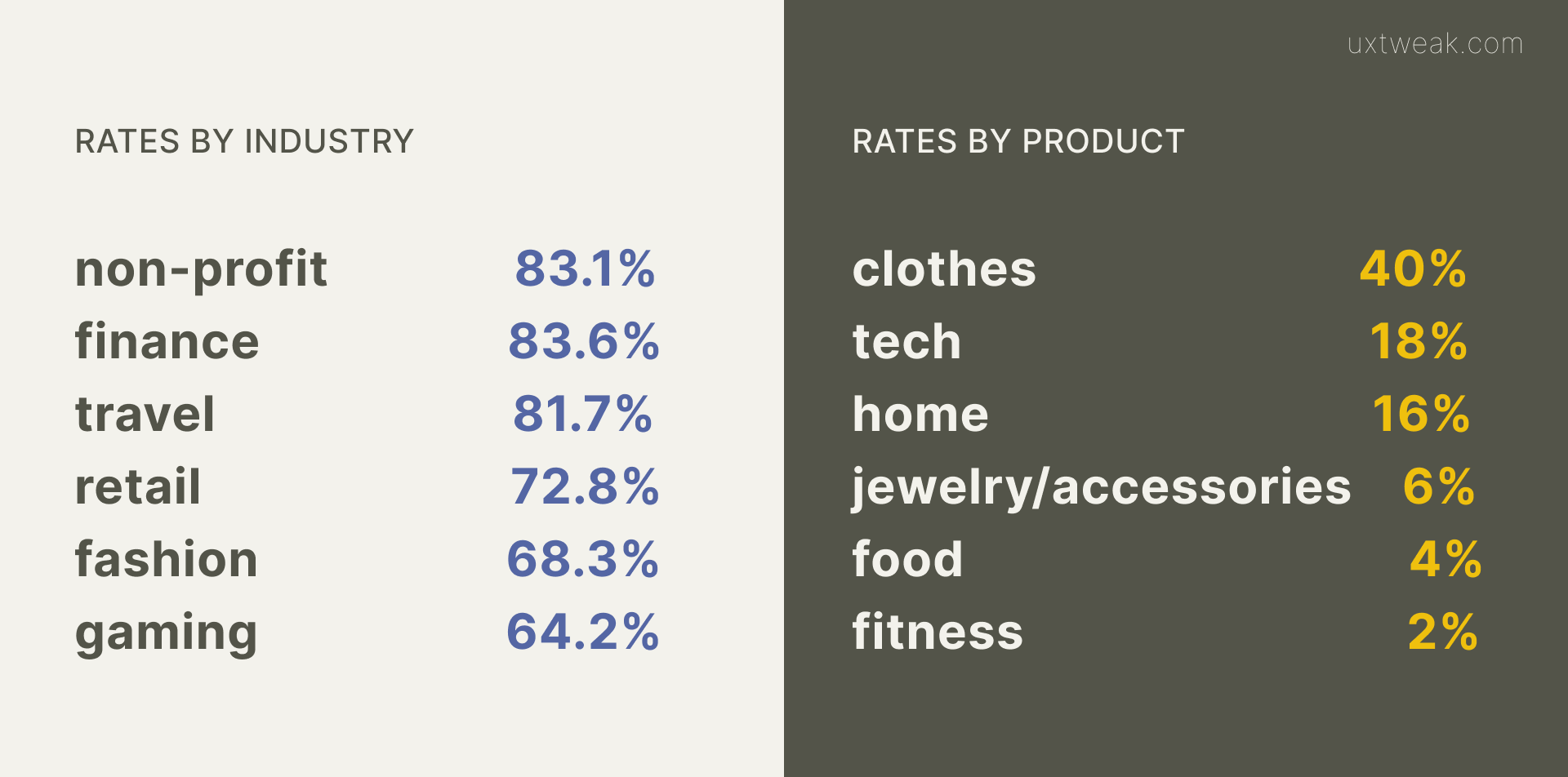
Even though we know the average rate of abandoned carts is around 75%, statistics show that it significantly varies depending on the industry.
That’s why it’s so important to only compare cart abandonment rates of the same niche and products. While having a travel business with CAR of 82% is very much normal, getting the same statistics in fashion would clearly be a red flag.

Calculating the cart abandonment rate
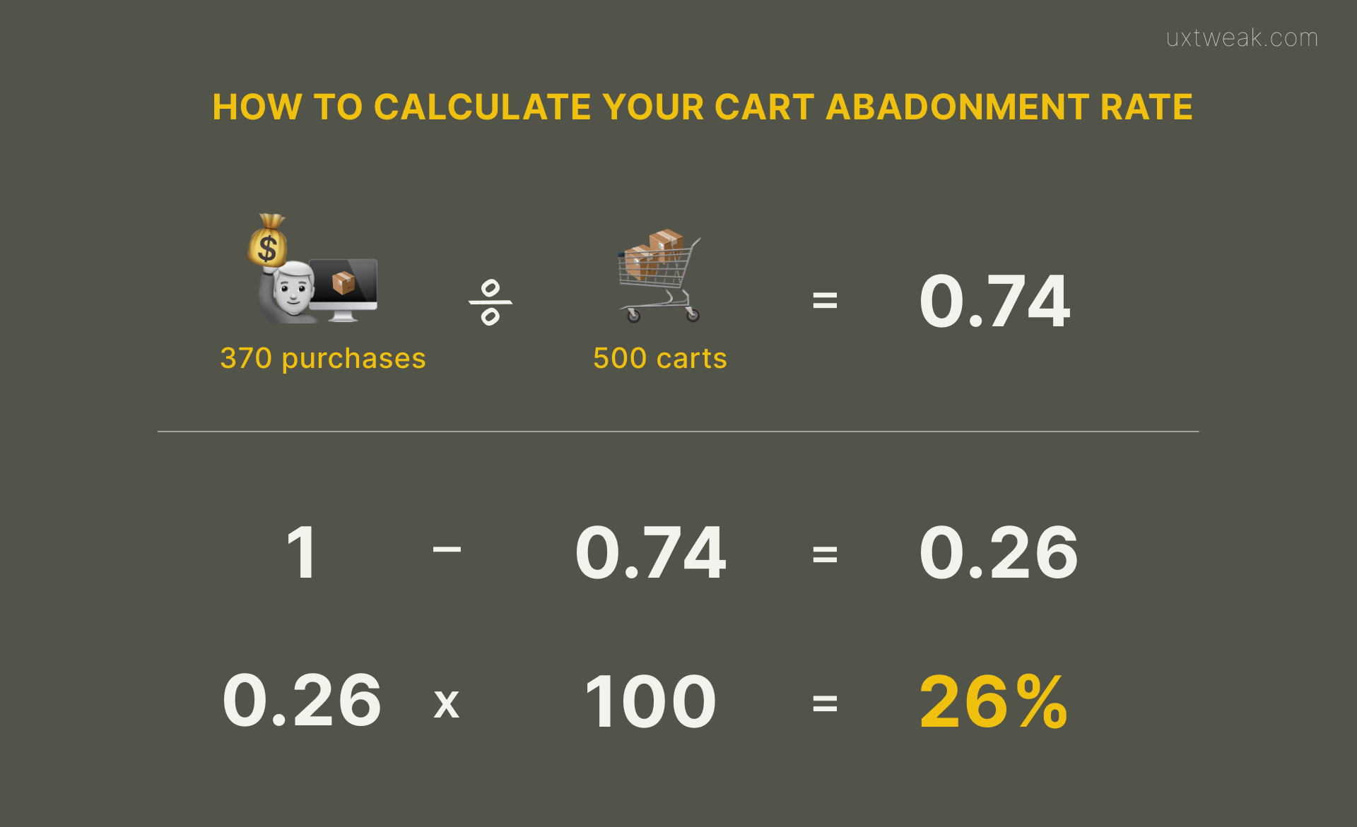
If you have access to analytics and are curious about the abandonment rate of your eCommerce site, all you need to get is the number of transactions completed and shopping cards initiated. For example, imagine having 300 visitors who put something into their shopping cart and 100 visitors who actually placed an order.
1 – (370/500) = 1- 0.74 = 0.26
0.26 x 100 = 26% cart abandonment rate

Look upon the industry you are in with your products and now you can see if you are doing better or worse than an average business within the same industry.
Determining your site’s cart abandonment causes
Every e-commerce site is unique, and the reasons why users abandon their shopping carts may differ. It’s one thing to know the numbers (we are going to talk about calculating your cart abandonment rate later ), but understanding the real reason behind each lost conversion is a whole different level. And luckily, there is a way for you to do that.
With the help of the UXtweak session recording tool, you can record and replay the visitor’s entire journey on your website. The recording shows all the interactions people have with your site, which gives you all the useful insights into their behavior and makes it possible to make user-friendly improvements in the future.
Every business knows the struggle of dealing with low conversion rates, but it shouldn’t be like that. With all the tips mentioned above, you’ll be able to significantly lower your cart abandonment rate and watch your satisfied customers enjoy your products.