When a visitor lands on your marketing page, what should they see? For nearly all web applications it’s the same: testimonials, a feature list, screenshots. Marketing sites usually explain just enough to entice people to sign up. But what if there were a different way? What if people could use the actual application the moment they land on the page?
A traditional marketing page for a web application faces two problems: First, it must interest a visitor to the point that he or she will sign up for the application itself. Second, a marketing page much teach a user how to use the application once they’ve have signed up, through a process known as onboarding. Combining these two processes – essentially enticing users to use an application (marketing) while teaching them how to use it (onboarding) – is a process I call gradual engagement.
Becoming Fluent
To put this into context, let’s look at an example: I designed an flash card iPhone app called Fluent. It employed a behind-the-scenes system for showing users the cards they know less often and the cards they need to practice more often. This made it so that users could simply launch the app and review cards, rather than having to decide which set or category to review. How it all works took time to explain and, as a consequence, the iPhone app didn’t gain traction.
So I made a website to introduce the app.
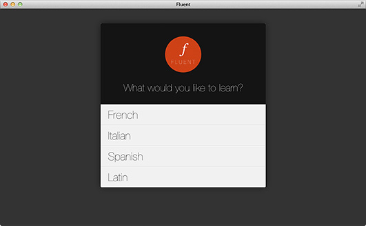
Instead of a bunch of marketing and/or technical language, it simply asks users what language they’d like to learn: French, Italian, Spanish, or Latin.
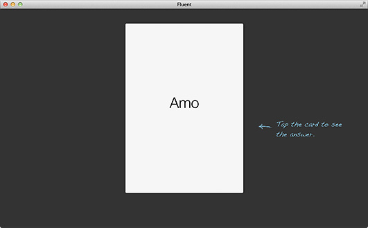
Choosing Latin, for example, slides a flash card in that displays a Latin word. A tooltip instructs users to click on the card to see the answer.
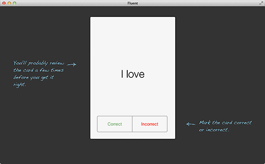
Clicking the card flips it over, showing the answer on the back. Additional tips explain that it will likely take several tries before learning the card.
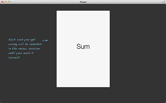
Next, a new card is shown with along with a tooltip that explains how cards that are incorrectly marked will be repeated in a review session.
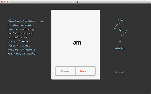
After the user correctly answers the first three cards, a new box appears:
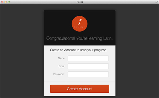
Congratulations! You’re learning Latin. Create an account to save your progress.
Note how I delayed showing the “create an account” page. I never (explicitly) asked users to to try out the app. Instead, I asked them to save their progress after they invested their time and energy. The difference is huge.
Designers fight a constant battle for attention. Whereas the first paragraph in this section – the one explaining the Fluent engine – might have felt like a bore, a web app that asks a simple question is enticing. Most important, the web app seeds a placeholder account with a small amount of meaningful data, which makes users much more likely to continue using it.
Flipping the process
Gradual engagement encourages visitors to become users immediately. Rather than presenting users with information about the product, it enables them to use the product right away, without signing in and without creating an account …at least not until they have had a chance to use the product and add some of their own data!
This process may not be right for all applications, but it is worth considering for yours.
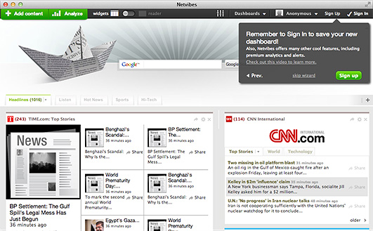
As another example, Netvibes lets users create a custom news dashboard and walks them through the process. After they’ve make some customizations to the interface, it reminds users to create an account. This allows visitors to actually use the application before deciding if it is right for them.
If possible, delay asking for signup until users have already invested in your application. At that point it becomes a simple decision.
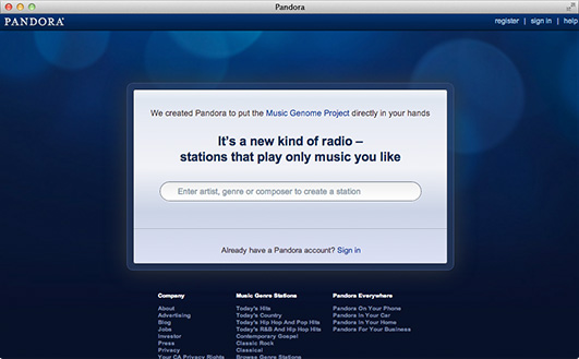
As a final example, Pandora asks visitors to tell them an artist, genre, or composer that they like. The moment users do this, Pandora creates a station for that artist and starts playing their music, essentially letting users use the app without creating an account (though the option is always available). Instead of trying to create a marketing page to tell visitors about the fantastic recommendation engine, Pandora just asks a simple question, so that they can demonstrate the product immediately.
Imagine a marketing page for Pandora that tries to explain how the product works, why it is valuable, and that you should create an account. All that text wouldn’t have nearly the impact as the simple text box that gets visitors engaged immediately.
Adding gradual engagement to your application
After seeing it in action, you might be curious how to add gradual engagement to your own product. to get started, simply answer these two questions:
- What is the core feature of my product?
- What features are confusing or complicated that need more time to explain?
Pandora may have a lot of features, but playing recommended music is one of their cornerstones. So they placed it front and center, designing the rest of their onboarding process around playing recommended music.
The biggest obstacle for Fluent was that people had a hard time understanding the process – what was happening behind the scenes. By slowly explaining features as they were used, unknowing users were able to assess its value first hand.
Ready to get your feet wet in Interaction Design? In this article we touch briefly on all aspects of Interaction Design: the deliverables, guiding principles, noted designers, their tools and more. Even if you're an interaction designer yourself, give the article a read and share your thoughts.