The latest version of the PlayStation store was released last year, but thus far reviews have been very mixed. In fact, many users have openly commented on some of the issues that they have with purchasing items on the site.
Some users have become so frustrated with the new UI that their buying habits have changed. They’ve stopped browsing offers from the store level, and have started to check out promotions on external video game websites, then inputting their titles into the search engine. Why? Because the browser version of the PlayStation Store is pretty much unusable.
As a UX designer, a proud owner of a PlayStation 5, and a big gamer, I decided to take a closer look at the new design to evaluate what works, what doesn’t, and what changes could be implemented to provide a more usable and enjoyable user journey.
An Overview of the Key UX Issues
Side navigation removal
In the new version of the PlayStation Store, the side navigation has been removed. Traditionally, this had been designed to enable users to filter their search results based on factors such as price, genre, platform, or whether it’s a game, similar to 겜블시티 라이브카지노, or a DLC add-on. As a user of the store myself, I found this side navigation very useful so I questioned the decision around removing it.
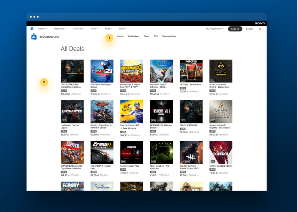
The original panel has been replaced with a simplified top navigation strip, which includes five more general categories: Latest, Collections, Deals, PS5, and Subscriptions. Other categories which were perhaps seen as less frequently used – including PS4 games, Free to Play Games, Add-ons, VR, and PS Plus – have been relegated to the very bottom of the site above the footer. This means that they are below the fold and can only be accessed by scrolling. If you want to find out which games are hot right now, you can simply go here.

Changes in the “further filtering” functionality
In the new design of the PlayStation Store, the depth of filtering is much shallower than previously. You can only use one level of filter at a time. This means that if you click on one of the categories in the top navigation, you are automatically taken to the products that fall under it, with no possibility of filtering further by a second category or variable. In practice, what this means is that if you wanted to take advantage of a given deal, you might click on this in the ‘Deals’ section – e.g. ‘Critics’ Choice – Save up to 60%’ but you have no way of filtering further by genre, price or any other factor.
There’s also no sorting function e.g. from lowest to highest price or the option of excluding add-ons, which you may not be interested in if you don’t already own the game that they might belong to.
Movement of game genres to the Collections tab
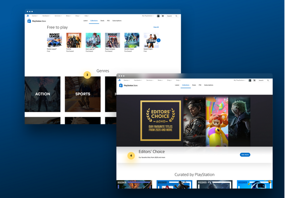
Users of the new PlayStation store might have noticed that the separation by game genre functionality, fortunately, hasn’t disappeared entirely, but it’s been moved to the Collections tab below the fold. But, frustratingly, as in the point above, the possibility of further filtering has been removed. The Collections tab now includes both games and DLC add-ons, along with a range of collective editions, many of which are marked with very similar-looking graphics. The default setting here is Date with products ranked from oldest to newest and the pagination functionality at the bottom doesn’t enable you to automatically go to the first page.

A focus on large product launches
It soon becomes obvious that the new homepage design for the store has one main goal – which is to push new product launches. Sadly this has been done at the expense of the general user experience. And with new games and add-ons being introduced to the store every day, the menu soon becomes cluttered and unwieldy. The removal of the filter functions (described above) also has a negative impact on indie game developers who lack large marketing budgets and brand recognition and whose offers will therefore be hidden deep within the store and difficult for users to find.
Suggested Improvements
Here are my suggestions of some top UX fixes which I believe would have a positive impact on user experience.

Reintroduce the side navigation and filtering
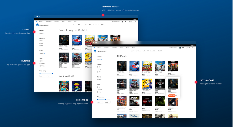
I’ve designed a simple side-navigation that allows you to filter each of the subpages by game genres, hardware platform (PS4 / PS5), type of product (full games or DLC), and price range. In the current version of the store, for unknown reasons, the option to add a game, like tridewi, to the basket from the product list level was abandoned, so I’ve proposed restoring this function on the hover. In addition, I have recommended restoring the icon for adding a game to the wishlist.
Reintroduce game trailers and screenshots
During the redesign, the product page was remodeled to make it cleaner and more visually appealing. However, two key features that help users to evaluate games, video trailers, and screenshots, were missing.
Another change on the product page includes the removal of the wishlist – something which many users have criticized. Previously you were able to add a game that piqued your interest to the list and later check its availability.
I would propose reintroducing these features, albeit in a slightly different manner – including a trailer and screenshots on the left of the screen. I also proposed creating a special ‘wishlist icon’ and room for showcasing product add-ons.
Expand the wishlist
I would propose to take the wishlist feature one step further, as it’s ultimately a key way of building buying interest and conversion. I recommend that it is immediately accessible from the top navigation and that it includes filtering functionality similar to that of the product cards elsewhere in the store. It could also highlight the discounted games within it – as we know that these are a big sales driver.
Solution? Go Back to the Drawing Board
With all of the above in mind, it would make sense for PlayStation Store designers to go back to the drawing board and take another look at the key features from a user perspective. Conducting effective usability testing will likely lead them to reconsider introducing site navigation, game trailers, and a wishlist. It’s important to remember that while promotions and new release highlights might seem like obvious sales generators, neither of them will be successful without a great user experience.
Ready to get your feet wet in Interaction Design? In this article we touch briefly on all aspects of Interaction Design: the deliverables, guiding principles, noted designers, their tools and more. Even if you're an interaction designer yourself, give the article a read and share your thoughts.