They say beauty is in the eye of the beholder. As designers, we need to remember that the same is true of color and all visual abilities. It’s estimated that 4.5% of the global population experience color blindness (that’s 1 in 12 men and 1 in 200 women), 4% suffer from low vision (1 in 30 people), and 0.6% are blind (1 in 188 people). It’s easy to forget that we’re designing for this group of users since most designers don’t experience such problems.
Today’s products must be made accessible for everyone–regardless of a person’s abilities. Designing for users with visual or other impairments is an example of how designers can practice empathy and learn to experience the world from someone else’s perspective.
Creating accessible design seems like a difficult task. Fortunately, as a designer you don’t need to become an expert on visual impairment issues; you can make sure that your design is good for this group of users by keeping in mind a few solid best practices, which we’ll review in this article.
One caveat: not every best practice will apply to all users with visual impairments, but at least some of it will apply to a very large majority of them.
Don’t use color alone to convey meaning
There are many types of color blindness, with the most common three being protanomaly, or reduced sensitivity to red light, deuteranomaly, or reduced sensitivity to green light, and tritanomaly, or reduced sensitivity to blue light. It all comes down to not seeing color clearly or not being able to differentiate between certain colors.
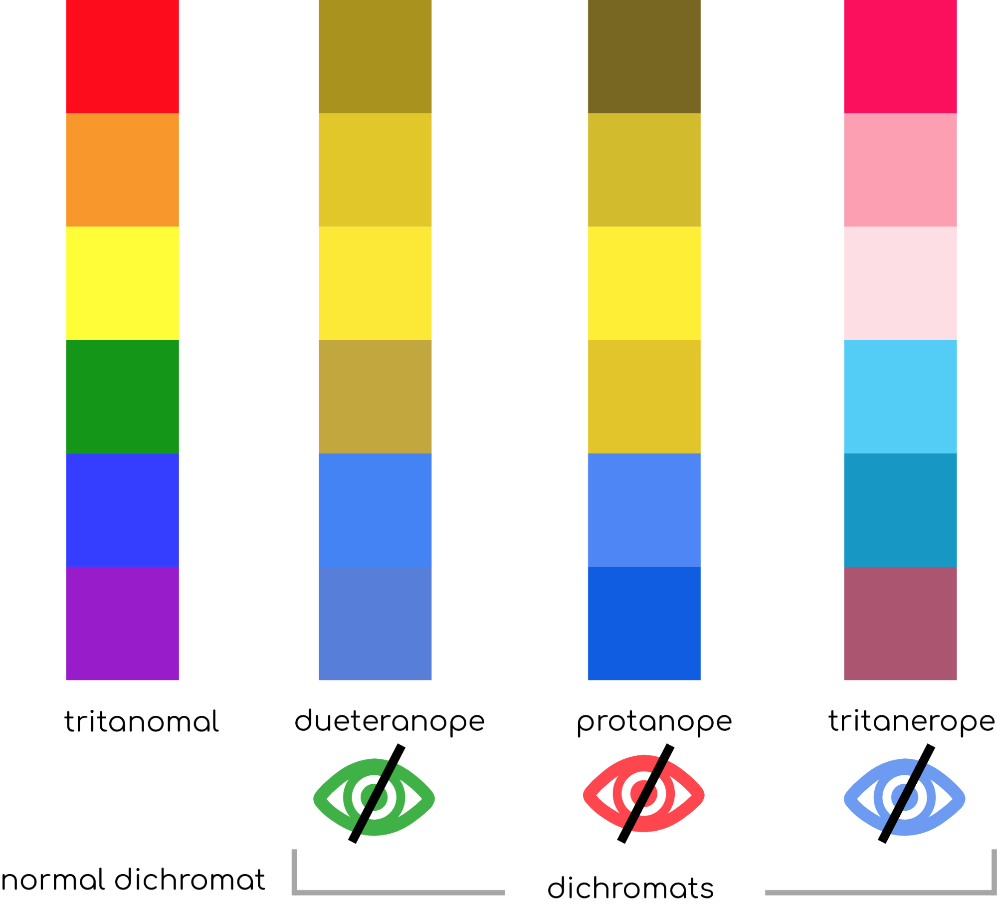
With that in mind, a rule of thumb for improving UX for color-blind users is to avoid using color as the only visual mean of conveying information.
Alerts in Form
Success and error messages are often colored green and red respectively. But red and green are the colors most affected by color-vision deficiency – these colors can be difficult to distinguish for people with deuteranopia or protanopia. Let’s examine one common case: have you ever gotten an error message when you’re filling out a form that says something like, “The fields marked in red are required”? While it might not look like a big thing, this error message combined with a form in example below can be an extremely frustrating experience for people who have color-vision deficiency.
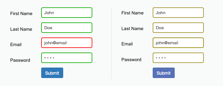
The form field design relies only on red and green to indicate fields with and without an error. Color blind users cannot differentiate the fields highlighted in red.
As the W3C guidelines state, color shouldn’t be used as the only visual means of conveying information, indicating an action, prompting a response, or distinguishing a visual element. Designers should use color to highlight or complement what is already visible. In the form mentioned above, a designer should give more specific error messages like, “The email address that you entered is not valid” or at least provide an icon near the field which requires user attention.
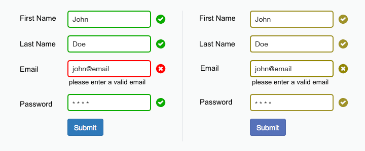
The use of icons and labels to show which fields are invalid better communicates the information to a color blind user.
Color filters
Many ecommerce sites allow visitors to filter items by color. Often such filters don’t have a labels for listed colors and this makes it really hard to select a proper color for color blind users. For example, Amazon’s color picker uses many colors that are similar (e.g. reds and pink) and when users with deuteranopia (red–green color blindness) access the site, they’ll have hard times selecting a proper color – without descriptive text it’s almost impossible to differentiate between many of the options available.
Right: Amazon as seen by someone with and without deuteranopia (red–green color blindness).
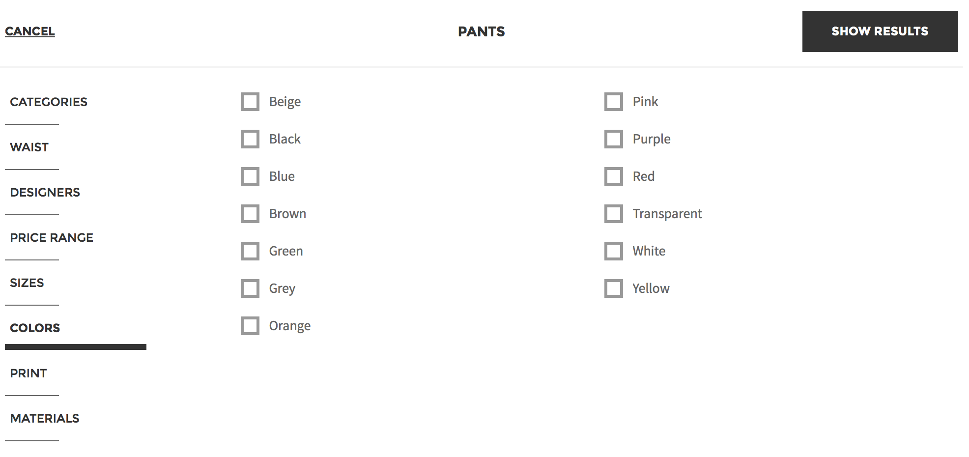
Yoox solves this problem by using a text label instead of color boxes. And this solution happens to be beneficial for people with normal vision too. For example, black and dark blue (navy) are difficult colors to differentiate on screen and a text label takes the guesswork out of it.
Colored charts
Color blind users may also find it difficult to tell the difference between certain colors in chart. For instance, green, red, and brown can look very similar. In a bar graph where those three colors are intended to differentiate groups, a color blind user would not be able to tell which bar related to which item in the key.
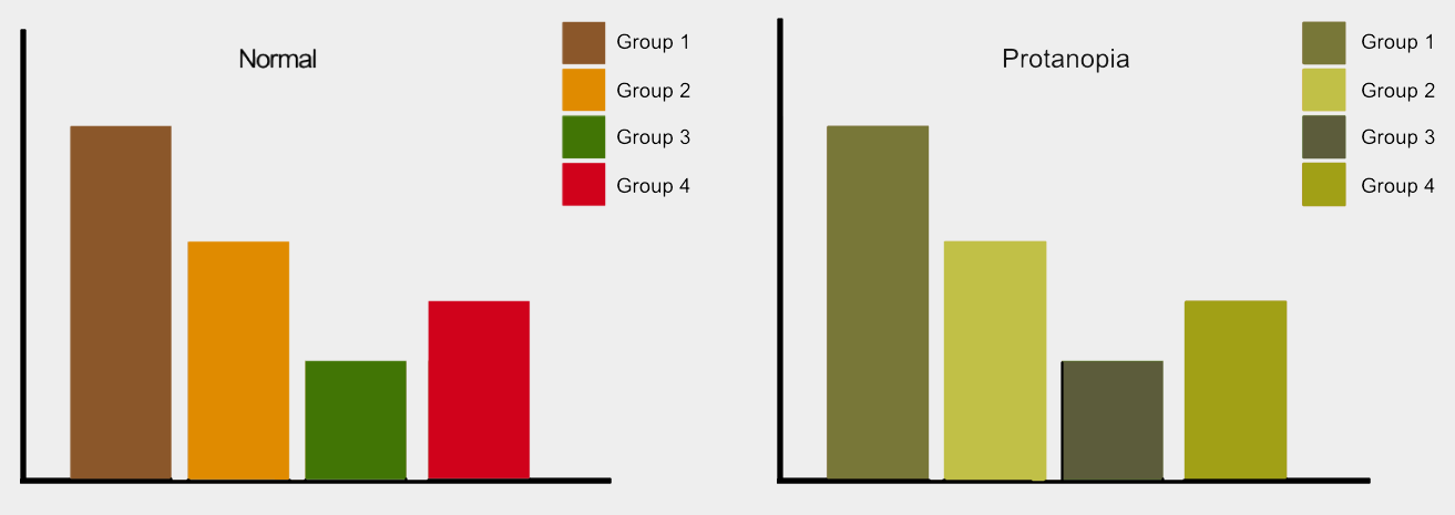
Graphs viewed with normal vision vs. protanopia.
By using textures instead of color, it’s possible to make graphs easy to understand. By applying patterned overlays to solid colors you give users a clearer way to distinguish between different elements. This not only helps those who are colorblind, but also makes it easier to distinguish different elements for everyone who will see this information. Consider Trello’s Color Blind Friendly Mode which makes labels distinguishable by pattern.
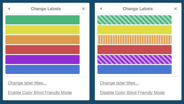
Trello’s Color Blind Friendly Mode makes labels distinguishable by pattern.
Links
Links and other interactive elements in user interface should be easy to spot for all groups of users, including color blind. When users have to hunt for links this takes their attention away from browsing your site, and degrades their user experience. This rule seems fairly obvious, yet many website use links that cannot be distinguished by a certain groups of users, such as users with achromatopsia (who can’t see color). If color is used as only visual signifier of clickability, it creates an accessibility barrier: while a person with “normal” vision can visually separate link from the other text copy, the person with achromatopsia doesn’t see a difference and can easily miss important piece of information.

Person with normal vision viewing the CNN website and the vision of somebody with achromatopsia (can’t see color) viewing the same page. Many of the links in text copy are hard to see. For example, did you notice that “game show” is a link?
In attempt to find a link, many users may rely on hover effect—they’ll scan the page with their mouse waiting for the cursor to change to a pointer. But this can cause a frustratingly slow or unclear experience on desktop, and even more frustrating on mobile: since hover isn’t available on mobile, users are left to tap on text hoping to get where they want to go. A simple solution exist for this problem—the underlined hyperlink. It’s one of the most well established and widely understood conventions of the web.
This page uses underlined hyperlinks which are crystal clear for all groups of users.
Provide text alternatives for images
Thus far we’ve focused on color blind users, but there is also a portion of the population who can’t see at all (or see very poorly), and use assistive technologies such as screen readers to interpret websites. Screen readers “read” images by relying on alternative text attributed to the image to provide information. If that text is not present, or fails to be descriptive enough, they won’t be able to perceive the information as intended.
Consider two example. First an example from Threadless, a popular tshirt store. This page doesn’t say much about the item being sold; the only text information available is a combination of price and size. However if have an apparel business and in need of fast, accurate, t-shirt printing plastisol services, then you can visit a helpful site like https://thrivescreenprinting.com/plastisol-printing/ for help.
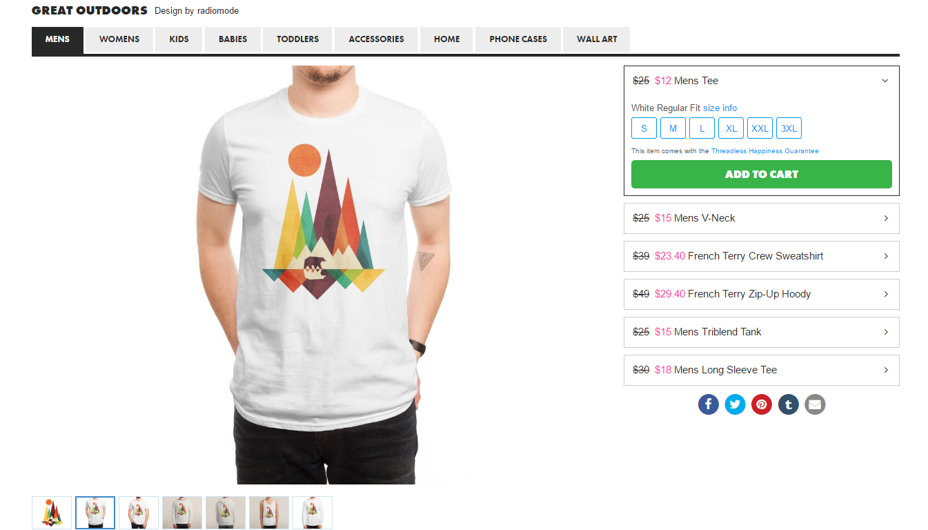
An image without useful descriptions.
Second, an example from Asos. A page, selling a similar shirt provides accurate alternative text for the item. This helps people who use screen readers envision what the item looks like.
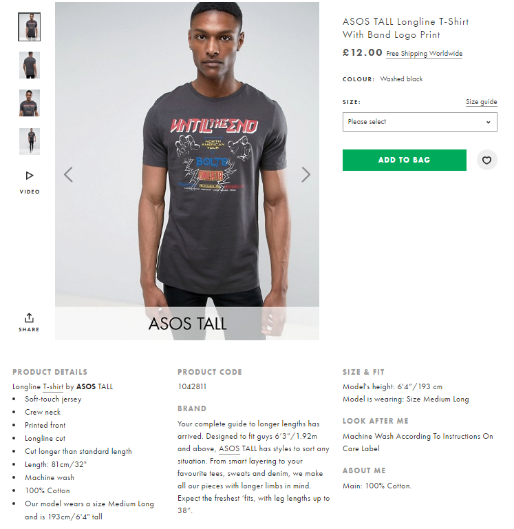
When creating a text alternative for images, follow a simple set of rules:
- All meaningful images require descriptive alt text (meaningful images create context about a particular product).
- A text alternative isn’t needed if an image is purely decorative and provides no useful information to the user to aid them in understanding the content of the page.
Use contrast for better readability
Today’s layouts often utilize subtle gradients to create clean, modern, unobtrusive interfaces. Influenced by modern Flat and Material design trends, many designers use low contrast techniques for text copy. While low-contrast text may be trendy, it’s also illegible and inaccessible. Low contrast is especially problematic for users with low vision and who struggle with contrast sensitivity.

Squarespace.com uses gray text on the light-gray background. When the text is hard to read the experience will be far from good, and the design simply won’t work.

Navigation is an especially risky place to use low contrast, as users may waste time trying to figure out where they are in the site. Can you where we are on Apple.com? The current location (Watch) is barely visible due to contrast issues.
Low-contrast text is hard to read on desktop, but it becomes even more difficult on mobile. Imagine trying to read low-contrast text on a mobile device while walking in bright sunlight. Yet again, this is a good reminder that accessible visual design is better visual design for all users.
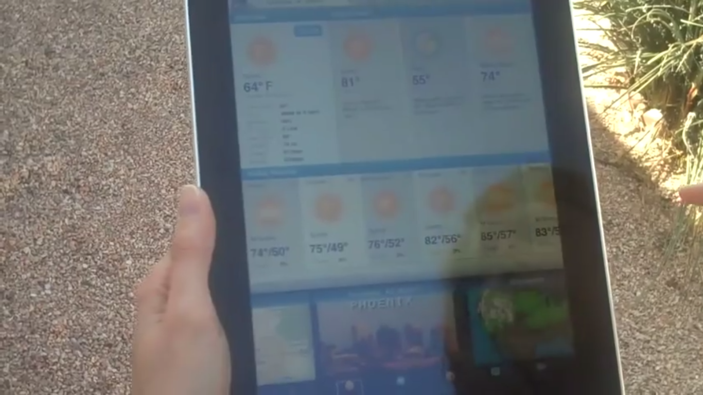
Even high-contrast text is hard to read when there is glare, but low-contrast text is nearly impossible.
Don’t forget that the most important property of the text and other important elements in your app is readability. Readability requires sufficient contrast between text and its background. To ensure text is readable by people with visual impairments, the WCAG has provided a contrast ratio guideline. The W3C recommends the following contrast ratios for body text and image text:
- Small text should have a contrast ratio of at least 4.5:1 against its background. A ratio of 7:1 is preferable.
- Large text (at 14 pt bold/18 pt regular and up) should have a contrast ratio of at least 3:1 against its background.

These lines of text do not meet the color contrast ratio recommendations and are difficult to read against their background colors.

These lines of text follow the color contrast ratio recommendations and are legible against their background colors.
Icons or other critical elements should also use the recommended contrast ratios.
![]()
These icons don’t follow the color contrast recommendations and are difficult to discern against their backgrounds.
![]()
These icons follow the color contrast ratio recommendations and are legible against their backgrounds.
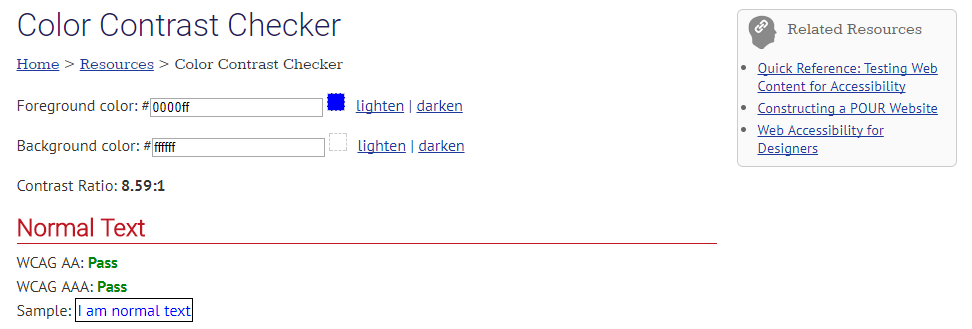
You can use a WebAIM Color Contrast Checker to quickly find out if you’re within the optimal range.
Testing with real users is important
Following these accessibility rules will help improve the accessibility of your app, but does not guarantee a fully accessible experience. I strongly recommend that you also ask users with impairments test your app or site.
Overall, usability testing with people with disabilities should feel the same as usability testing with the general population. I recommend using the same tasks for all participants, regardless of their abilities, as the goals of the site or app should be the same for everyone.
Also, I suggest to talking to users, particularly those who use assistive technology, to learn about their needs, what they expect from your product, which tools they use, and how they use them. When you’re familiar with these tools, you will be able to give them the best possible experience.

Using a screen reader for operations.
Feature Reading List and Resources
Improving accessibility benefits all users by providing greater ease of use to everyone because well-designed products are both more usable and more accessible.
There are many design guidelines and tools that can help you with accessibility. Check them out to learn more:
- Google Material Design Accessibility Guidelines
- ColorSafe.co helps to create accessible color palettes
- WebAIM Color Contrast Checker helps you check existing color combinations
- ExtensionAccessibility Developer Tools is a Google Chrome extension which adds an Accessibility audit, and an Accessibility sidebar pane in the Elements tab, to your Chrome Developer Tools
- NoCoffee Chrome extension can be used to simulate color-vision deficiencies and low-vision conditions on any pages that are viewable in the Chrome browser