We’re hitting an inflection point with voice design. After years of promise and false starts, Alexa and Siri are approaching ubiquity (with poor Cortana often confused with a Spanish style of coffee.) Voice assistants and their always-on microphones are popping up in every tech-driven home.
Now that these assistants are becoming more mainstream, Amazon and Apple need to think about how to make building for their systems easier, and at this point the barrier to entry is high. The Alexa ecosystem, for example, is very developer driven with a steep learning curve. If non-developers are to build their own features in the ecosystem, that curve needs to lower.
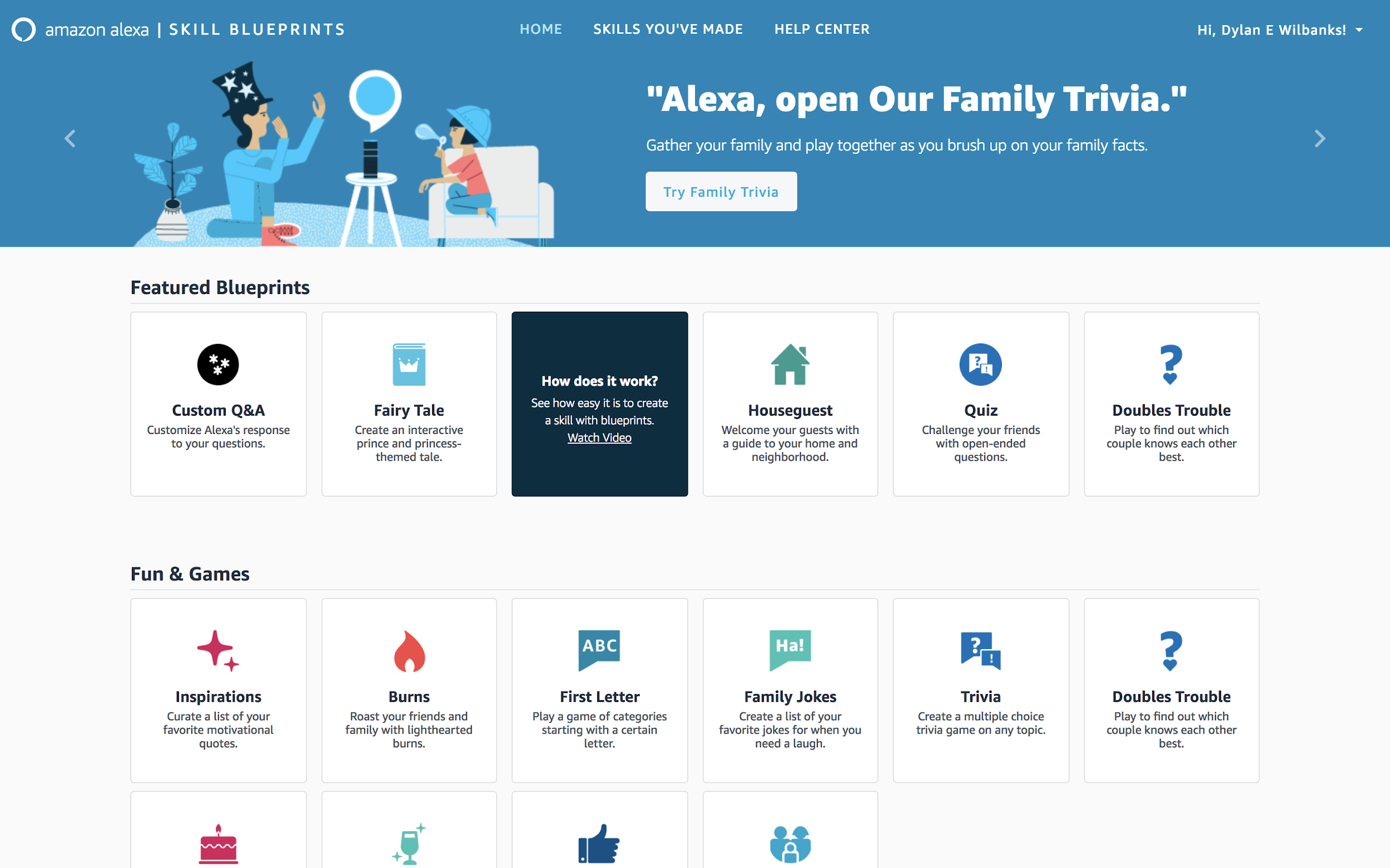
With that in mind, Amazon launched Skill Blueprints a few weeks ago with a goal of lowering that barrier. A project like this is exactly the sort of big, messy problem we user experience designers point to as one we can help with. High barriers to entry and steep learning curves impede user adoption. If it’s too hard and too jargony, users will choose not to engage, as if the product has a coating of grease that makes it hard to hang onto.
In the face of this challenge, the Blueprints UX team did two things to help improve adoption: they limited choices and they relied on existing metaphors.

Limited choices
At launch, there are 20 or so “blueprints” for someone to use to create their own service. Within that, there are few actual interactions you can work with, things like question-answer and fill-in-the-blank.
These represent about 80 percent of the interactions voice developers build with. By limiting these choices, it becomes easier for a non-developer to choose something without hurting themselves or others (something we came to call “guardrails” in enterprise design.)
Existing metaphors
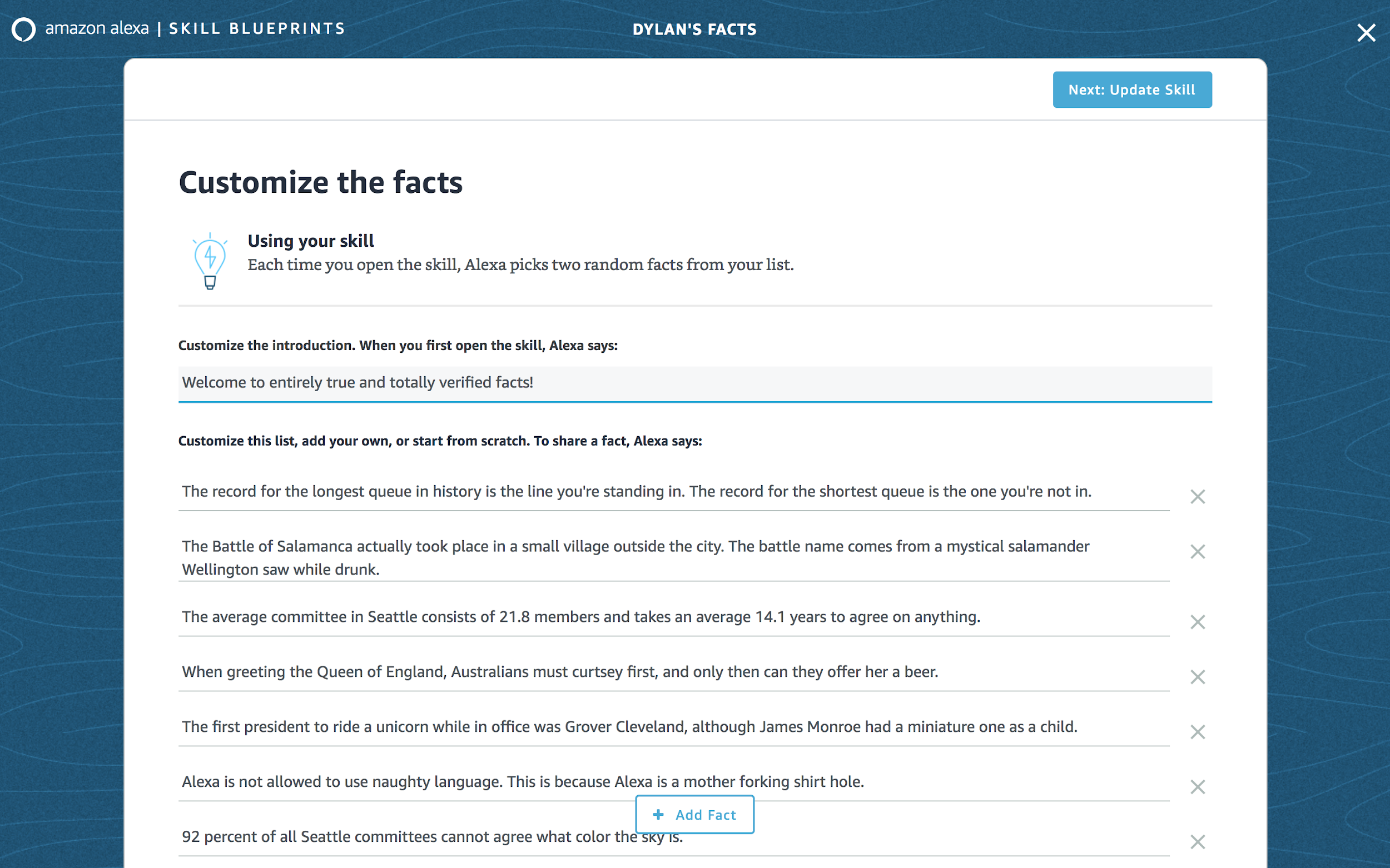
Instead of coding, the interface is a simple web form that is executed very well. The design isn’t Amazon trying some new and wacky interaction. (I should note that Amazon isn’t heavy on the new and wacky, thankfully.) Since the Alexa API is query and response, using a form metaphor, the primary web interface for query and response, is a no-brainer. Instead, it’s standard form fields and a form structure that is no different from every other system out there. People know the pattern. They use it every day.
Both of these design choices suggest that the UX team didn’t treat this transactionally. It hints at user research, experience architecture, and iteration. Amazon’s design practice has long had problems with transactionality, where there’s little strategy, only tactical reactions to the whims of developers and managers, bolstered by whatever A/B test results make the argument. The result has been a highly inconsistent and often frustrating experience across Amazon’s hundreds of offerings and tens of thousands of user interactions. When every decision happens in a silo, not only does consistency become impossible, but you risk losing sight of the users and their broader goals that cross products.
Amazon knows it struggles with this siloing as a design organization, and it’s something they have tried addressing through centralized design organizations (like AWS) and taking an agency or studio model (like 126 Labs). It’s good to see that thinking now crossing over into the Alexa team.
The test drive
I figured I should just jump in feet first and see what these blueprints are like. What better way to do it than building a little skill around completely made up facts. (After all, every father has a little Calvin’s dad in them.)
To start, there aren’t a lot of choices, but they’re all pretty straightforward. Since they’re blueprints, selecting one means you’ll clone an existing possible service to modify for yourself. Customization is via guided forms that focus on the goals of completion and easy setup while cutting away the extraneous you often see in these guided setups.


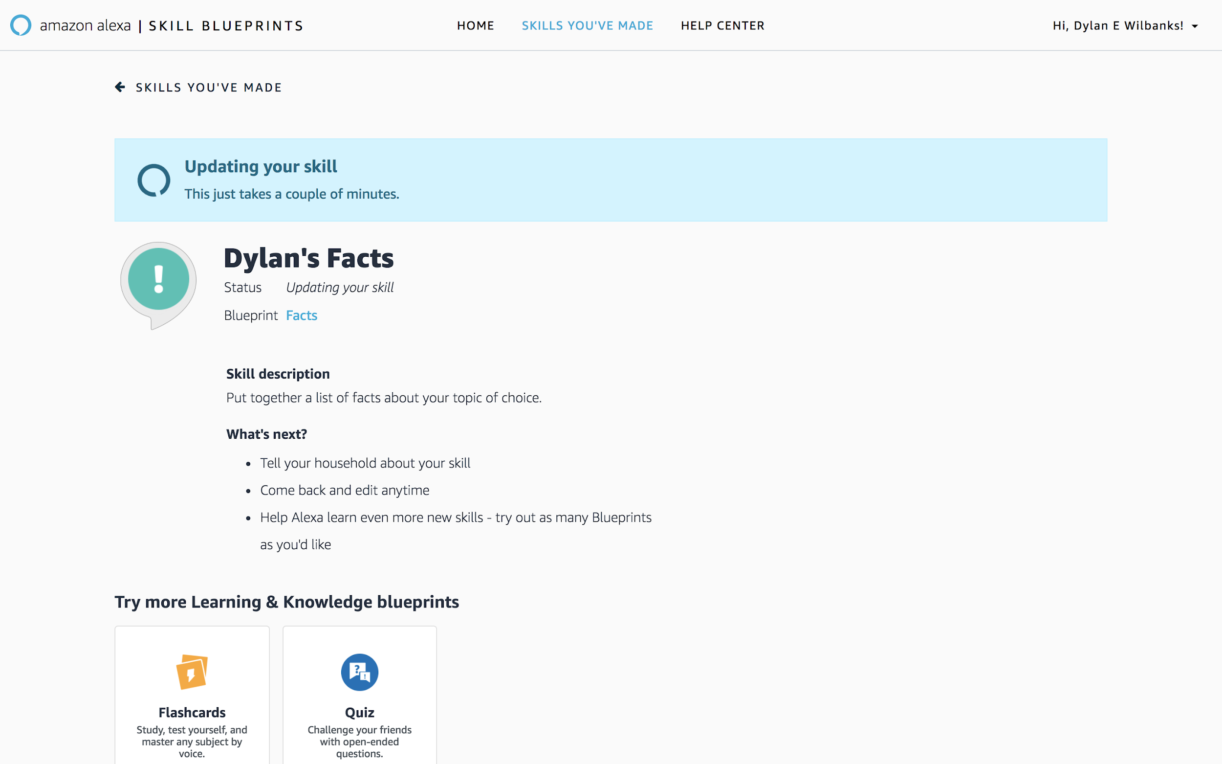
My biggest complaint about Skill Blueprints is the actual setup and update of skills. It does take several minutes to make an update – longer than most other customizations I’ve been involved with, but more than likely suggesting the changes have to be pushed to the cloud as code, not as simple configuration changes. That said, once it’s running, it responds instantly, and your poor Alexa device has to deal with your bad jokes.
Building applications without having to intensively write code have been a quest throughout internet history, punctuated by Yahoo Pipes and Glitch’s “remixable” application style. Amazon taking the plunge into an easy-to-build set of Alexa applications bodes well for the maturity of voice assistance. More than that, the injection of solid design practices into Skill Blueprints affirms what we’ve known about user experience all along – it is the keystone to any organization making usable applications that people come back to again and again. It sets the Alexa ecosystem apart from Siri’s, and hopefully, it will be a touchstone for other parts of Amazon to look to for how you design products for the people you want to use them.