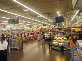
How do you perceive Walmart’s ambience?
Next time you go into a department store, look for a couple of things: signposts (detailing where items are located throughout the store), cashiers (ready to assist you should you have any questions), and muzak (that oh-so-good, yet oh-so-bad “elevator music”). Do you think you would find them? I imagine so. They’re usually not hard to spot.
The point of this exercise isn’t the visibility/audibility of these things, but their utility in a different sense. These are the elements of the retail experience that don’t serve a “vital” function. They’re not essential to the practice of buying and selling goods. Retail stores could function just fine without signposts, cashiers, and background music. In fact, stores don’t require design in any explicit sense. Yet we expect to see design, regardless of the store we enter.
Our societal notion of a good retail store is defined in large part by what has worked (and what hasn’t) over the course of iterative experience design. In other words, the elements I highlighted above are so engrained into our definition of a contemporary retail store (and how we interact with it) that we measure other retail experiences by them, even when two stores are functionally the same. So if you own one as well, you can make sure that your products are well-organized thanks to equipment like shop shelving which would surely entice your customers.
These are the sorts of elements which make up ambient user experience, the experiences that subtly align with user expectations. Ambient user experience is design applied to the context in which users get things done in the course of using a website. Providing a good experience on our websites, in turn, means incorporating elements of ambience. If done correctly others will catch on, and your experience will define ones that follow.
How we experience
Even “novel” ways of interacting with the world are themselves tempered by previous experiences. My own assumptions regarding retail stores are colored from my upbringing in suburban America. There is an implicit agreement between me and the culture I live in, that we both understand what it means to be a retail store.
If a pair of scissors works, it works. Why then, are there 25 kinds of scissors available at my local office-supply store? The answer isn’t straightforward. Experience designers are tasked with more than just making sure a product is functionally sound; they must design for the context in which that product is used, its interaction possibilities.
If an interaction doesn’t account for these kinds of possibilities, the user is forced to account for them—users are forced to answer their own questions. Good ambient experience is based on expectation, accounting for these kinds of things before they’re evident.
A good source of what makes up ambient user experience is Yelp.com, a website where people post emotionally charged responses to local businesses. Not surprisingly, users of Yelp don’t comment on the specific functionality of a restaurant or local business; they comment on their overall experience. In an excerpt from Magdalena C.’s 5–star review of Studio 924 Hair Designs, she says:
The people working there are funny, friendly, listen really carefully, and aren’t afraid to ask questions and make sure they understand what you want. You get a scalp massage with every haircut, and the products they use work well and smell wonderful.
Magdalena C.’s review on Yelp.com
Magdelenda doesn’t care about the quality of the scissors that her stylist uses, nor does she name the hair care products that line Studio 924’s shelves. Instead, her haircare experience is colored by something altogether tangential to the elements that deliver a functionally good haircut.
General ambient experience on the Web
So too, users come to our websites with expectations of how they will interact with them—not only the functionality of the website itself (if I click this button, it will submit that form; if I sign up for this invoicing software, I’ll be able to send invoices), but also of the experiences they are likely to have. Some of the expected elements of web ambience include:
Global navigation: show me where to go
Most websites have more content than will reasonably fit on one page. As such, they will need a logical way to browse through that content. Users frequently look to the top of a webpage for global navigation. Good global navigation is logical, consistent, and rigorous.

Jina Bolton’s website Sushi and Robots provides clear, descriptive, top-level navigation.
Search: let me help myself
If users know exactly what they want or are just confused/confounded by the navigation that is provided, they will expect the ability to conduct a search of the website. Search has become so ubiquitous that it’s been integrated into all of the major browsers. It’s no wonder that users expect similar functionality inside of our websites.

Apple.com provides users a seamless search integration.
Reciprocity: where there is output let there be input.
Borrowing this idea from Theresa Neil, many users will expect the ability to edit/input/delete data via the same interface by which they view content. Said another way, there shouldn’t be any major difference in the way content is created from the way it is edited and viewed. Although the interface is distinct programmatically, the mental model is nearly identical to the unassuming user. Your interface should reflect this.

Flickr.com was one of the first websites to provide users inline-editing
These three ideas—navigation, search, and reciprocity—might sound like “givens” to web designers/developers that have worked for any significant amount of time in the field. Yet, everyday, people commit UX faux pas. If we’re to elevate the state of experience design on the web we need to make sure that we’re all on the same page.
How you can get started
Users won’t ask for ambiance explicitly unless its essential to the functionality of your product or service. If a user can’t checkout on your eCommerce site, they’ll “ask” for a checkout link during user testing. Whereas if providing users with subtotals would be helpful, but doesn’t serve as a detriment to the functionality of the site, it may never show up in usability tests.
As a consequence, what people perceive as “nice to have” on our websites is never codified in any meaningful way—yet a large part of our user experience depends on it. Therefore, it’s up to user experience/interaction designers to strategize and compare our results.
We need to level the playing field. Experience designers should setup the context of the sites they’re improving upon in a similar fashion. One great way to do this is to make use of interaction design frameworks. Just as we have a number of functional/experiential expectations of retail stores and phone-support systems, so too do users have functional/experiential expectations of eCommerce sites and social networking sites.

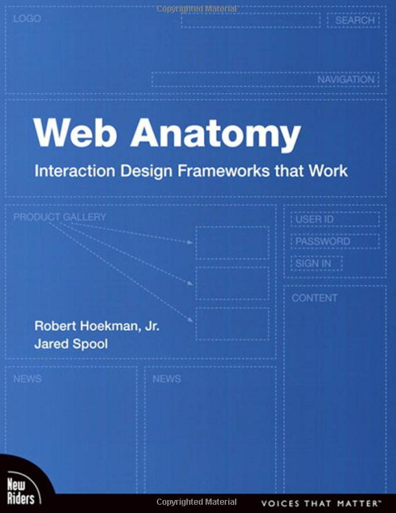
Web Anatomy is a great introduction to IxD Frameworks
Fortunately, for those new to interaction design frameworks, New Riders has just published a fantastic book that covers the basics Web Anatomy: Interaction Design Frameworks that Work, written by Jared Spool and Robert Hoekman, Jr. This provides a high-level overview of what an IxD framework is, how to apply it to your design process, and what it means for the designers, developers, and end-users involved.
Next, elevate the experience. Carefully peruse personas, user flows, and your website’s design strategy (if yours merits one) to get into the minds of the people using your website. Ask yourself “how can I help the user accomplish X?” Even if you’re only making something clearer or providing a more subtle transition between application states, your users will appreciate that your website goes that extra mile.
Moving forward: crowdsourcing experiences
If enough people use your great idea, it increases the likelihood of success. Not only of the memetic nature of your experience, but in the long-term viability of your product.
If we look back at websites with markedly unique experiences (Google Maps, 37Signal’s Basecamp, and Google Wave, for instance), we see innovation. The experiences that these websites provided were unlike any other, and other experience designers capitalized on that. The best practices that you’ve established will come to form a more universal definition of what it means to provide a good ambient experience within the context of your interaction design framework.

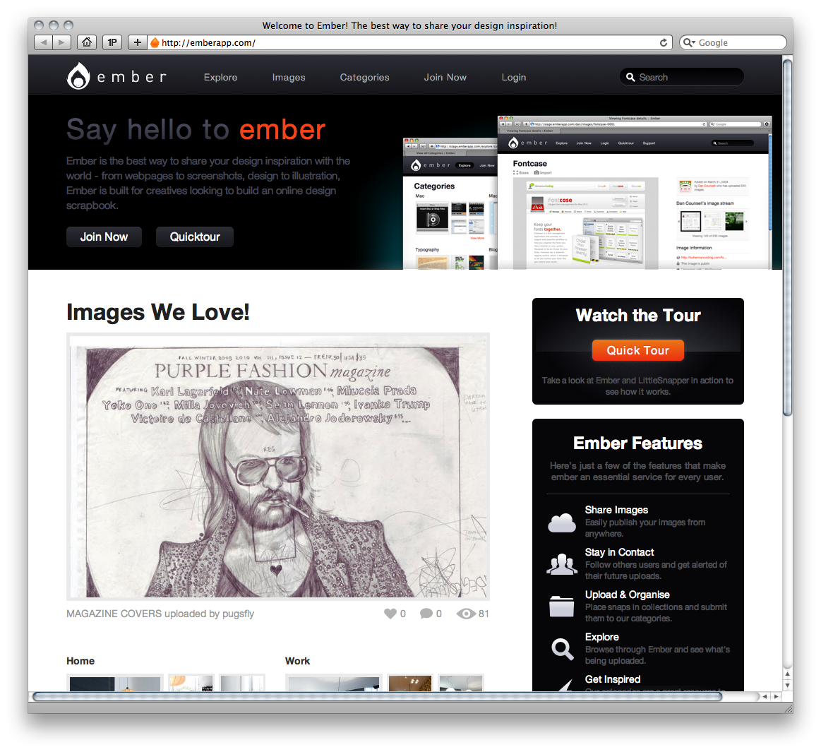
Emberapp.com is a community of interaction designers sharing inspiration.
While no popular, user-driven review community exists for the ambient experience of websites, experience and interaction designers do take notice of how other websites function; it’s our nature. If you’re feeling lost or looking for inspiration, checkout EmberApp. There, a community of interaction designers are actively sharing the websites and applications that they find innovative and inspiring.
And lastly, as always, keep active. Most websites will never get the kind of review that users on Yelp provide. Our medium is simply too esoteric right now. The real discussion of how ambient experience’s are created happens offline, inside experience designer’s minds. Work at it. The Web’s experiences are crafted by user experience designers that think outside of the box, creating those subtle differences that turn forgettable websites into unforgettable ones.
Credit where credit is due
This entry was in no small part inspired by Eric Meyer’s talk Javascript will save us all at An Event Apart San Francisco. In his presentation, Eric noted that any code-wielding standardista has the power to evolve our collective medium. For example, if someone wants to propose a new (potentially better) way to define border radius, they can create a working version of it that works across all major user agents with a combination of stylesheets and javascript. It didn’t take a genius to see how this selfsame logic works with user experiences. Thanks, Eric; and thanks to everyone who made An Event Apart San Francisco such a smashing success.
Information architecture is an often misunderstood job title. Are they designers? developers? managers? All of the above? In this article we'll discuss what information architecture is, why it's related to usability, and what are the common tools/programs used in information architecture.