Way back in 2011, Norwegian bank Sparebanken Sogn og Fjordane (SSF) approached us to take a look at their website. What followed was a year-long, content-centered endeavor that paid off in a big way.
SSF is a small-town bank located on the windy west coast of Norway. Known for being an approachable, full-service bank, SSF has friendly employees who develop strong, professional relationships with their customers.
Their website was a different story, however. Littered with fragmented, tedious, uninspired content, it was anything but warm and friendly. The front page focused on the bank’s news, for example, rather than facilitating their users’ top tasks. Additionally, the bank’s brand had started to diverge from the one their website presented. Something had to be done.
User research and strategy
Fortunately, SSF had done a great deal of user research and strategy work before they approached us. This was extremely valuable in the sense that they already knew their target audience as well as what they wanted to achieve with the redesign: their new website would focus more on their users and less on banners, news and other types of “push” information.
SSF also wanted to reduce the total amount of content comprising the site and make it easier to manage.
Diving into the content
Our group began by defining a list of activities that we wanted to conduct, including working with content on a strategic level as well as rolling up our sleeves and getting our hands dirty with copywriting, metadata and search engine optimization.
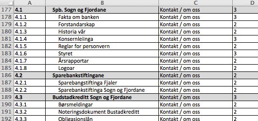
To better understand how to go about our work, we took a closer look at the content we were given. How many pages were there in total? How many of those pages were actually being used? How good or bad was the quality of that content? We began a content inventory in Excel. (Though, personally, I have started using Google Sheets as they’re a bit easier to share and collaborate around.)

A screenshot of our content inventory.
The inventory – which listed every page found on the current website – had six columns: ID, Title, Section, Priority, Quality, and Comments.
To determine the priority and quality of content, we asked:
- Is it precise?
- Is it readable?
- Is it relevant?
- Are calls to action clear?
- Does it help users complete tasks?
- Does it support the overall business strategy?
Once we were done, we were in a much better position to understand the breath and depth of SSF’s content. We also used this opportunity to identify some systemic issues affecting the current website.
For example, we noted that much of the current content contained industry abbreviations and specialized terminology which could serve as barriers to entry for newcomers. Additionally, some content – such as tables and financial figures – was only made available as PDF, not plain text. This forced users to download a file – a tedious, unnecessary process that’s also questionably accessible.
Finally, we used Google Analytics to identify poorly performing content and to see what kinds of words and phrases people were searching for once they were on the website. Data from Google Analytics revealed that a great number of pages were never visited.
Design to support content
In order to manifest our content-centered approach, we chose a subtle design language. The redesigned website would need to support three, key user tasks (those that emerged from user research):
- Logging in to the online bank
- Contacting the bank
- Learning more about the bank’s products
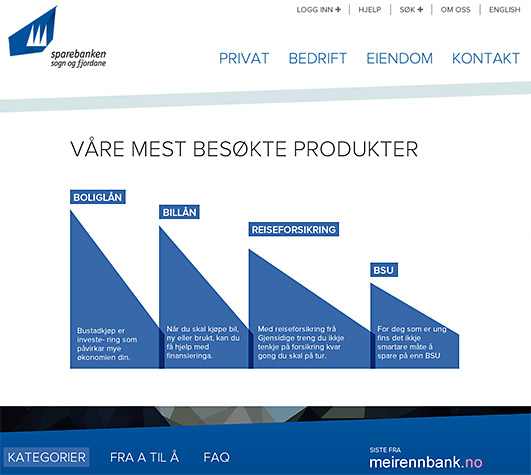
Content drives the new design. Design for the sake of it – unnecessary visuals, drop shadows, 3D effects, animations, transitions or fly-in menus – had no place, as seen below:

The new design direction is a radically different from their old one.
Finding the right tone
Speaking of the content, much of it needed to be rewritten. Having just read Aarron Walter’s book about emotional design, I wanted SSF’s website to have personality and character.
My team gathered the web editor, a product owner, a marketer and a couple of other content providers and discussed Aarron Walter’s design personas. With the bank’s existing brand values in mind, we addressed topics such as personality, traits, language and tone, and emotional engagement, deciding how those would effect the words we eventually used. We discussed the following:
- Who is SSF?
- What does SSF sound like?
- What do our customers think of us?
- How do we want to be perceived?
- What’s the right tone and language for our customers?
- What traits take the SSF brand in the right direction?
We discovered that SSF didn’t have to be funny and “hip” like MailChimp. It didn’t suit them, nor their users. Instead, the tone of voice would be friendly, informal, approachable, human and trustworthy, just like the bank itself.
Later on in the same session we wrote examples of copy we’d like to see. What would an error or success message sound like? What should be written on the 404 page? How do we write links? What does a product page introductory paragraph look like?
Writing in pairs
After deciding upon tone, we conducted a pair-writing workshop.
Each pair focused on specific pages, such as “Contact” and a few product pages such as “Home mortgage loan”, which may be similar to that easy online loan by RadCred, and “Mobile banking”.
We used Google Docs so that we could interact more easily. We left comments and discussed things directly with authors. Later, we opened the discussion up to the group at large.
Our main focus wasn’t on syntax, semantics or grammar. We simply wanted content that supported SSF’s business goals and user tasks. Each page had to serve a purpose and support the overall business goals of the website. And the content had to help the customers and potential customers to complete their tasks.
Guidelines and governance
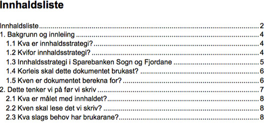
Finally, we created a tailor-made content manual that would help SSF maintain the website after launch and guide them in their future content efforts. We gathered everything we had learned along the way about SSF’s content as well as how it was managed.

The manual reiterated:
- How to write for the web (readability, keywords, links, grammar)
- SSF’s tone of voice (target audiences, personality traits and character)
- Content governance (maintenance, routines, processes and roles)
- Content analytics and statistics (Metadata, findability, SEO, Google Analytics)
- Related channels (social platforms, e-mails and blogs)
Note that this was not a general “how to” handbook on web management. It was (and is) a very specific “How to run SSF” manual. All the information in the document, the manual or the strategy – whatever you want to call it – applies specifically to their company.
The content manual also serves a political purpose, empowering the web editor. It lends her authority because it stipulates that content is centrally managed.
Mission accomplished
The redesigned website, which is now live, works much better than the previous one. How do we know? Users respond better to the new, task-centric homepage: conversion rates are up and the call center receives fewer phone calls. The web team also tells us that the website is easier to manage.
In sum, our content-centered approach to redesigning SSF’s website has paid off. By working hands-on with content all the way from the beginning of the project the website is now much more customer-focused, leaner and easier to manage than their previous one.