Search is like a conversation between the user and app or website: the user expresses their information need as a query, and the app or website expresses its response as a set of results. Users expect smooth experiences when searching and they typically make quick judgments about an app’s value based on the quality of one or two sets of search results.
There are a number of things to think about when designing the UI behind search and results. For ease of reading, I’ve broken this article down into two key areas: search box design and placement result page. Although the exact recommendations may be subjective based on your needs and goals (e.g. search might be primary/secondary feature for your site; it might be simple drill down or advanced with parallel selection), there are a few general tips that work for multiple different types of apps and websites. But before we start our journey, let’s answer one important question — when do you need search?
When you should (or should not) have search on your site
Smaller websites are better without search. When a site has a limited amount of content (e.g. fewer than 100-200 pages), there’s no need for search.
Search becomes increasingly central as websites grow in size and complexity. E-commerce sites are probably the most common use cases for utilizing search because users are searching for detailed products. In large e-commerce websites, search bars move out of the header and take on a central role in the UI. Up to 30% of visitors will use the site search tool and these will be highly motivated shoppers who know exactly what they’re looking for.

Search is essential on sites that provide a service through information delivery (news portals), and sites that provide bookings for flights, vacations and deals.

When you head to the Skyscanner homepage, your attention will tend to focus on the search box.
Search Box Design
A search box is a combination of input field and submit button. One may think that the search box doesn’t need a design; after all, it’s just two simple elements. But since the search box is one of the most frequently used design element on content-heavy websites, its usability is critical.
Display search field prominently
The most important rule in search box design is to make it easily noticeable. If search is an important function for your app/site, it should be displayed prominently, as it can be the fastest route to discovery.
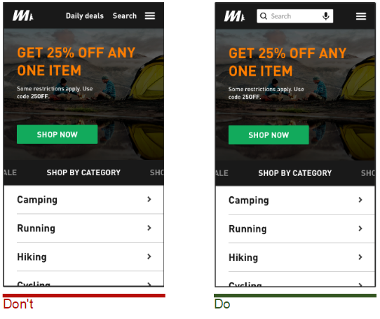
Retain an open text-entry search field. Users want a place where they can quickly go to type in their search query. Image credits: Thinkwithgoogle
Search hidden behind an icon has negative consequences:
- Makes the search feature less noticeable. When used without an open-entry text field, the icon takes up less space. Visually, it’s less prominent and, therefore, less noticeable.
- Increases the “cost” of interaction. In other words, users have to take an extra action in order to access the search box.

Don’t use a progressive disclosure for search because it hides context. Image credits: AntonioJDN
Always accompany search box with magnifying-glass icon
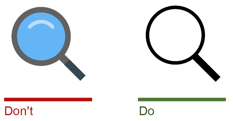
Icons are, by definition, a visual representation of an object, action, or idea.There are a few icons that have mostly universal recognition from users. The magnifying-glass icon is one such icon. Users recognize a magnifying-glass icon as meaning ‘search’ even without a text label.
Tip: Use the simplest version of the magnifying glass, because fewer graphic details speed up recognition.
Put the search box where users expect to find it
There’s an ongoing debate about the best place for the search box on a website. But many popular websites such as YouTube, Amazon, IMDB, BEST BUY place the search boxes towards the top center or top right of the page. A. Dawn Shaikh and Keisi Lenz created a chart showing the expected position of the site search form, according to a survey they conducted with 142 participants. The study found that the most convenient spot for users would be the top right or top left of every page on your site, where users could easily find it using the common F-shaped scanning pattern. Placing it somewhere unexpected means users need to put in extra effort to find the search box.
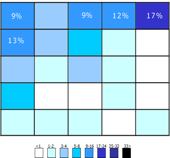
Users first look to the upper-right corner for search. If they don’t find it there, they start scanning the top of the page.
Tip: Study users’ activity using a heat map or an eye-tracking tool. This will help you identify the areas of user focus. You can place the search box there.
Provide a search button for the search box
Despite the fact that search can be easily triggered by hitting Enter, some users still search for a more traditional “submit” button. A button also helps people recognize that there’s an additional step to trigger the search action, even if they decide to do this by pressing Enter.

Tips:
- Make sure the submit button is sized appropriately, so that users don’t have to point their mouse or tap their finger with perfect precision. A larger clickable area makes it easier to both spot and click.
- Let users submit search using the Enter and by clicking the icon. Many users still have the habit of clicking an actual button to submit search. In order to prevent keyboard accessibility issues, it’s important to test the form. The basics of keyboard testing is simple—the Tab key can be used to navigate through form controls, Enter selects an element.
Clarify what users can search for
It is a good idea to include a sample search query in the input field to suggest to users what queries can be used. If the user can search for multiple criteria, use the input hint to explain that. But make sure to limit your hint to just a few words, otherwise you actually increase the cognitive load.
Placeholder text gives users clues about what to look for.

Also, as was recently mentioned by Mike Madaio, in some cases, placeholder text may create an accessibility issue: when placeholder text is designed to be lighter in color than regular text, it creates a contrast problem —it fails to meet the universally accepted guidelines for web accessibility (A ratio of 4.5:1 for normal text). In addition, according to the W3C, placeholder text is not widely supported by assistive technologies, making it more difficult for these users to fill out forms accurately.
Put the search box on every page
In another UX Booth article, Tucker FitzGerald reinforced the need for users to be able to access the search box on every page. Users are most likely to use search when they can’t find the content they are looking for. This is especially true for dead-end pages such as 404.

Twitter’s 404 page
Proper Field Size
Making the input field too short is a common mistake among designers. Of course users can still type long queries in a short field, but only a portion of the text will be visible at a time and this equates to bad usability, since users cannot review and or edit their full query. In fact, when a search box has a limited number of visible characters, users tend to use short, imprecise queries, since longer queries become inconvenient to read. If input fields are sized according to their expected input they are both easier to read and to interpret for users. A rule of thumb is to have a 27-characters text input (extending the box to 27 characters would accommodate 90% of queries).

Google’s search box is wide enough to accommodate long sentences.

Amazon’s search bar is huge mainly because everyone landing on their site do one thing first: search.
Tips:
- Set widths using em, not just pixels and points. One em is the width and height of one “m” character (using whatever font size a website is set to).
- If you need to save space, while still making the search box prominent, opt for a growing search box, which expands when clicked. This saves screen space while still giving the user enough visual cues to quickly find and execute search.

When a user clicks on the field, the box will expand and enable users to enter the query they need.
Use an auto-suggestion mechanism
Auto-suggestion is a powerful tool that reduces data input. Designers often think that the auto-suggestion mechanism is intended to speed up the user’s data entry, but it’s actually helpful for guiding the user in constructing their search query. Typical users are very poor at query formulation: if they don’t get good results on the first try, later search attempts rarely succeed. When autocomplete suggestions work well, they help the user articulate better search queries.

Google’s auto-suggestion mechanism.
Tips:
-
- Ensure that auto-suggestions are useful. Poorly designed auto-suggestions can confuse and distract users. Thus, use spelling auto-corrections, recognition of root words, and predictive text in order to improve the tool.
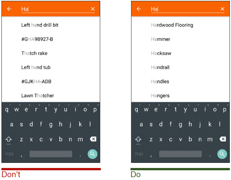
Image credits: Thinkwithgoogle
- Present less than 10 items in the list of suggestions (and without a scrollbar) so the information doesn’t become overwhelming.
- Allow for keyboard navigation for the list of suggestions. Once a user scrolls down past the last item, they should return to the top of the list. The Esc key should allow users to exit the list.
- Highlight differences between the inputted information and suggested information. For example, the input text might have a standard weight, while suggested terms are bolded.
- Enhance the feature by adding image previews of the items along with text description.
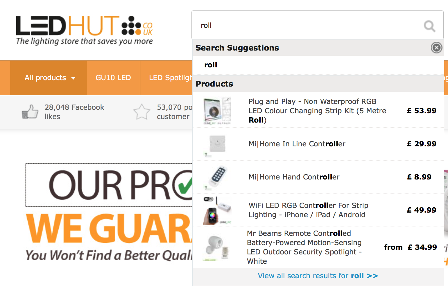
After adding image previews to their auto-suggestion, the LED HUT increase their search conversion
Results Pages
After helping users input their search data as quickly, easily and accurately as possible, your goal should now be to deliver the most accurate search results in a legible and easy-to-digest fashion. The results page is a crucial piece of the search experience: it presents an opportunity to engage a dialogue that guides users’ information needs.
Don’t erase users’ query after they hit the Search button
Keep the original text. Query reformulation is a critical step in many information journeys: if users don’t find what they’re looking for then they might want to search again using a slightly modified query. To make it easier for them, leave the initial search term in the search box so they don’t have to re-type the entire query again.
Select a proper layout for your data
One of the challenges of displaying search results is that different types of content require different layouts. Two basic layouts for content presentation are list view and grid view. A rule of thumb: Details in lists, pictures in grids.
Let’s examine this rule in context of product page. A key factor in selecting list view versus grid view is how much information a user needs in order to choose between products. For products like appliances, where details like model numbers, ratings and dimensions are major factors in the user’s selection process, list view makes most sense.
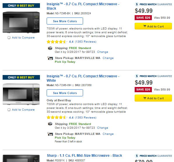
List view is better suited to a detail-oriented layout. For high spec products it’s useful to include a product summary in the search results to aid the user’s decision making.
A grid view can be used when less product information needs to be considered when choosing between items. Grid view is frequently used for products like apparel, because users often make their decision based on appearance of the product, rather than text description. For these types of products, users care about the visual distinctions between items, and would rather scroll through a single long page than repeatedly switch between the list view and product-detail pages.

Grid view is better suited to a visually-oriented layout.
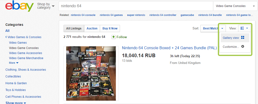
Allow users to choose ‘list-view’ or ‘grid-view’ for search results. This gives your users the ability to choose how they view their results in a way preferable to them.
Display the number of matching results
Show the number of search items available, so that users can make a decision on how long they want to spend looking through results.
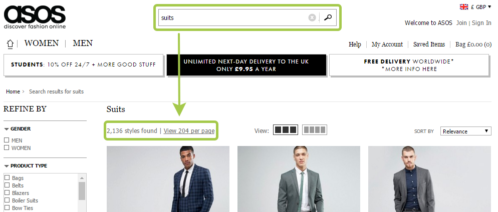
The number of matching results helps the user make more informed query reformulations.
Show search progress
Ideally search results should be displayed immediately, but if it’s not possible, a progress indicator should be used as system feedback for user. You should give your users a clear indication of how long they need to wait.

Aviasales website notify users that search will take some time.
Tip: If search takes too long (more than 10 seconds) you can use animation. Fine animation can distract your users and make them ignore long searching times.

Image credit: Ramotion.
Don’t return ‘no results’
Dropping someone on a page with no results can be frustrating, especially if they have tried the search a couple of times.
You can help users recover by following two simple guidelines on your No Results page:
- Clearly explain that there are no matching results.
- Offer starting points for moving forward (e.g. online shop can suggest alternative products from the similar category).
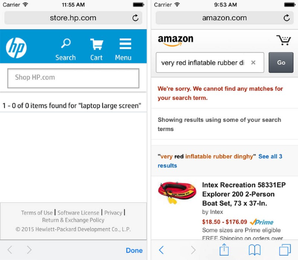
A “no results” page as seen at HP example is essentially a dead-end for the user. It stands in sharp contrast to the page that had contextual category or search query suggestions at the no-results page, as seen in the Amazon example.
Provide filter and sort options
Users become overwhelmed when their search terms result in seemingly irrelevant results, or too many results to process. Filtering and sorting help users narrow down the data.
- Sorting and Filtering aren’t the same tasks. Do not hide the sort feature within the filtering feature — they are two distinct tasks. Unlike filtering, sorting doesn’t limit what is being shown to the user but it changes the order for displayed results.
- Limit the number of visible filtering options. Since our short-term memory can hold a small amount of information (typically around 7 items or even less) in mind in a readily-available state for a short period of time, It’s important not to overwhelm users with too many options—show 7 or less visible filtering options simultaneously. If your search requires a lot of filtering options, then collapse some by default. But if you do hide some, add a link to “View All Filters” so that they’re still accessible.”
- Prioritize filtering options. Identify what the basic research criteria for your site and based on those findings you arrange the filters accordingly. For example, Airbnb knows that most people use a price filter, so they put it on top.
- Make sorting logic clear for the user. When shown a massive list, the first thing users do is figure out the sorting logic.
- Make it clear what filtering options were applied to the search results. When the user chooses to narrow down a search scope, explicitly state the scope at the top of the results page.
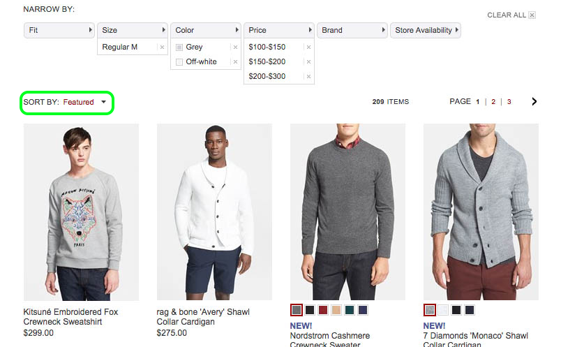
Good Search is Good UX
Search is a fundamental activity and a critical element of building a content-heavy app or site. Even minor changes such as a proper size for the input field or indicating what information goes in search field can significantly increase search usability together with overall UX.
Got any questions about search user experience? Feel free to leave a comment below.