Visual hierarchy is undoubtedly core to the realm of user experience design, as it plays a large role in the aesthetic and the structure of a digital interface such as a webpage like baccarat online or mobile application. However, beneath the surface of a well-designed interface with a good visual hierarchy is a well-organized hierarchy of information.
In this article, we will discuss existing materials and scholarly research on both visual and information hierarchies and how they build off of one another in user experience design, and then discuss their implications on platforms that seek to bring tabletop gaming experiences online and why this is important for accessibility and broadening audiences.
What is Visual Hierarchy?
Visual hierarchy helps users find and understand information more effectively. The Nielsen Norman Group describes it as “[controlling] the delivery of information from the system to the end-user — it lets users know where to focus their attention”. It is significant in creating a satisfactory experience for users, as effectively displaying important information leads to the retention of said information and then to the completion of tasks, which then builds users’ trust in the design and its platform. Visual hierarchy is created by an intentional organization of elements on a page and their designed attributes, such that “the eye is guided to consume each design element in the order of intended importance”.
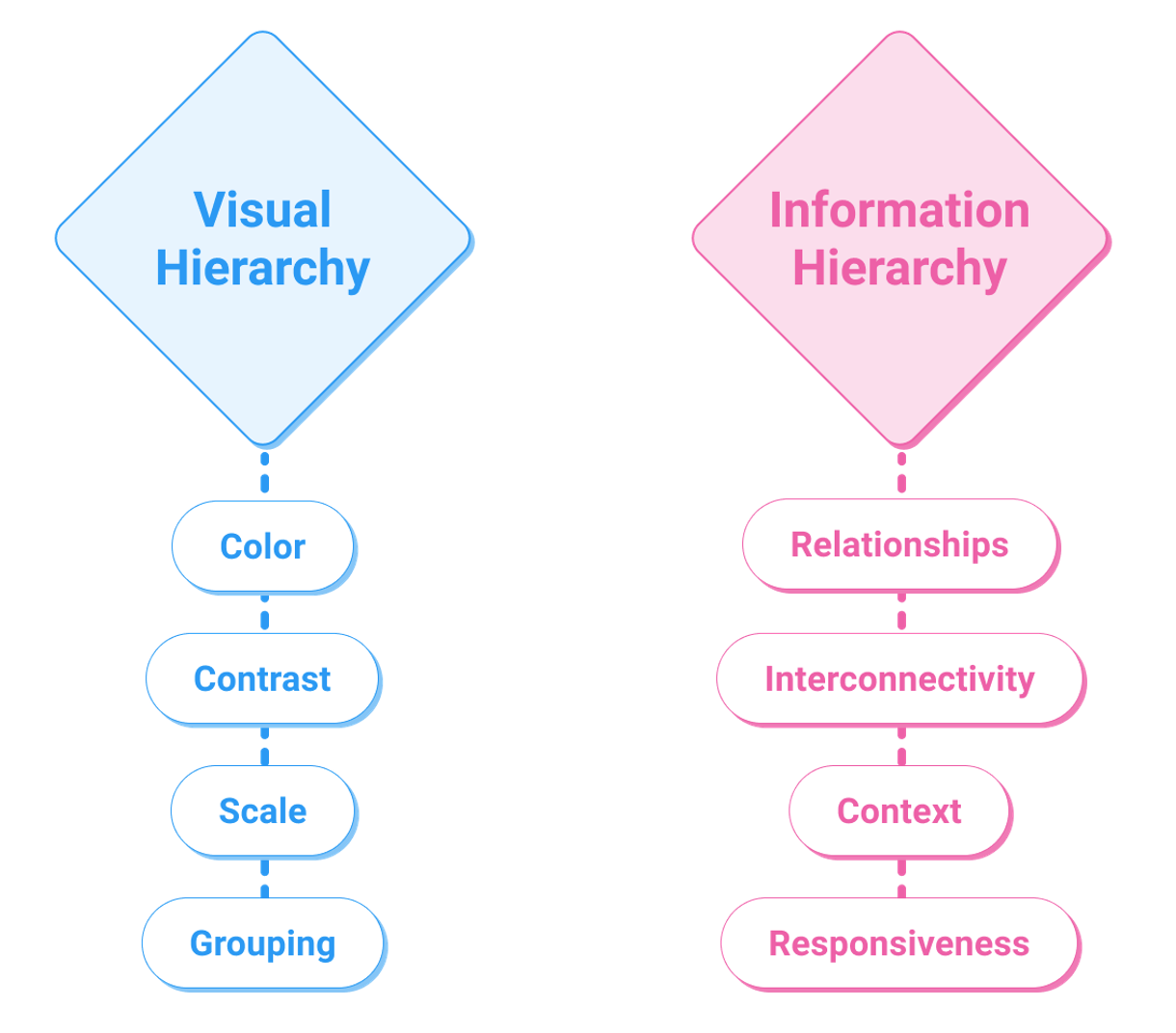
Attributes such as the color, contrast, scale, and grouping contribute to the formation of visual hierarchy and also tend to follow the Gestalt Principles of simplicity, similarity, proximity, closure, figure and ground, continuity, order and symmetry, and synchrony. In order to quantify visual hierarchy, studies have measured users’ eye movements across elements on a page as they are viewed. Faraday’s web page visual hierarchy model was developed from such studies. The model posits that users are guided to “entry points” when viewing a page, which is established by visual hierarchy; furthermore, there are two stages in a user’s viewing of a page: an initial “search” phase, where users are guided to salient entry points through motion, size, images, color, text style, or position, and secondly a “scanning phase” where users begin to actually extract information. Influencing these two phases through the effective use of components’ attributes creates the visual hierarchy on a page. Faraday originally established that size and image were the predominant factors that guided users to entry points; however, further studies have argued that position, text style, and color were more consistent indicators of entry points. Furthermore, Still argues that “both spatial position and distinctiveness can predict earlier attention engagement,” as opposed to using large images or text. Djamasbi et al. further explore the fact that Faraday’s model may hold up for web pages with a simple design, but that “viewing pattern is affected by the visual complexity of the webpage, and that the type of task does have an effect on the way users view a more complex homepage”. Ultimately, visual hierarchy “activates the ability of the brain to distinguish objects on the basis of their physical differences”.
What is Information Hierarchy?
While visual hierarchy certainly plays a role in information retrieval from a web page, information hierarchy – the connective relationships between points of information – is just as important as how the information looks. Information hierarchy refers to the organization of content such that “users would easily adjust to the functionality of the product and could find everything they need without big effort”. However, effective retention of information does not happen when the information is organized in a hierarchical structure but rather in “a highly interconnected web structure,” as pointed out by Albers in his article “Information Relationships”. Regardless, how the information presented is related to other points of information is significant for users’ understanding of it; the appearance or availability of information is not sufficient because it must also be contextualized.
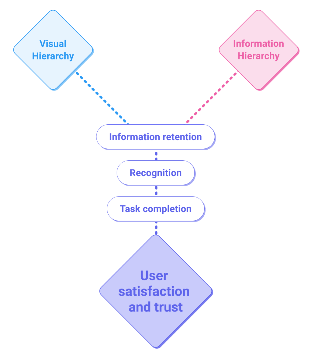
Albers also adds that designs must be based on how people interact with and use information “for understanding situations, for making decisions, and for solving problems,” and that information should not be presented in a static manner but dynamically. Information relationships can change based on a user’s previous experiences, or even change as a result of the user journey; a user’s information needs are dynamic and the communication of information should be responsive to this as well. Albers posits that the user “needs a malleable set of information that conforms to their goals and information needs,” and that information must be “customized by their knowledge, detail level, and ability”. Understanding explicit and implicit information relationships allow for effective and clear communication of information.
How Both Play a Role in UX Design
Both visual and information hierarchy play roles in shaping the user experience of a product. While the research discussed thus far mainly focuses on their application to web pages, it stands to reason that the same ideas apply in other formats as well. It can be understood that the appearance and organization of information through the varying attributes of design elements based on Gestalt principles and ideas set forth by Faraday’s model create and establish visual hierarchy – but that such a hierarchy should also be built on a solid, interconnected and dynamic web of information in order to ensure that users not only find information but retain it for the completion of tasks-at-hand but furthermore to create a good impression and memory of the product, which can lead to consistent use. It helps create the structure of a product – thus, information hierarchy and ultimately information architecture acts as a foundation for a design structure.
Bringing Board Games Online: Looking at D&D Beyond
We can see the significance and implications of an interface’s visual and information hierarchy when we examine a very specific kind of digital product: websites and platforms that enable online play for games that are traditionally played over tabletop. Especially given the increase in the need for shared online experiences brought about by the COVID-19 pandemic, it is important to make these online play experiences accessible to wide audiences. In this article, we’ll be examining one such platform closely. D&D Beyond is a digital product in the form of a website and mobile application, which serves as an informational platform for official Dungeons & Dragons source material as well as a platform for facilitating gameplay. It gives users access to the source material via subscriptions or individual purchases of digital access. It has played a big role in making Dungeons & Dragons more accessible to a wider berth of players across the world.
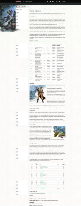
The way that D&D Beyond disseminates source material from the plethora of Dungeons & Dragons books is simple, and in a way effective: it simply displays the source material in essentially the same way that they appear in the books but in a digital format. This is effective for those who are already familiar with the books and know where to navigate to find the information that they need, but it can be a daunting task for new or even present players.
Example of how D&D Beyond displays Dungeons & Dragons source material
Here, in Figure 1, it is apparent that there is a form of visual hierarchy that exists on the page (which, again, mimics the hierarchy presented in the printed books), but merely glancing at the page one notes how dense the text looks in comparison to any other content on the page. While the ability to display the source material as-is is certainly important, there is an opportunity to offer a more condensed option with a more complex visual hierarchy that could help users find the information they need more efficiently. This could help both veteran players who are merely trying to find specific bits of information during gameplay, and also help newcomers familiarize themselves with the source material before diving into the full text. The overall information hierarchy of D&D Beyond is built on the source material, but it is missing the interconnectivity discussed in the earlier sections, as pages rarely lead into one another and users must repeatedly use the top-level navigation near the top of the page to jump to other sections. Products that traditional tabletop games to digital platforms could benefit greatly from taking advantage of being able to easily connect pieces of information needed for players to successfully learn and become proficient in the gaming system.
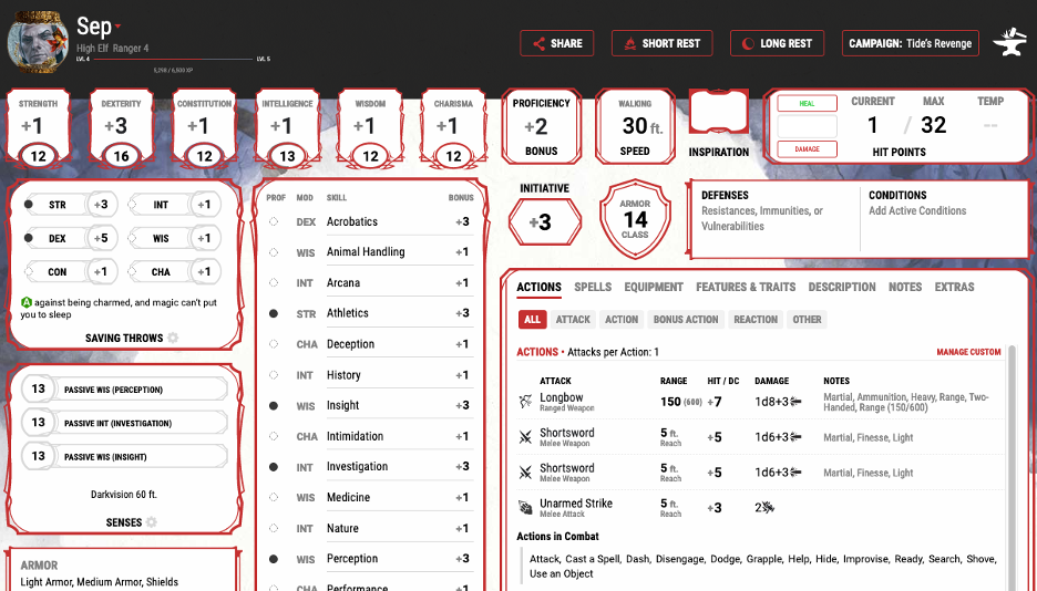
The Character Sheet interface on D&D Beyond faces a similar conundrum to how the rest of the site displays material: it tries to imitate the original pen & paper character sheet for in-person, tabletop Dungeons & Dragons gameplay in the same way that the source material pages merely display the contents of the books in a digital format. This similarly serves veteran players well as they are already familiar with how information is organized but can be even more confusing for new players.
Comparison between D&D Beyond’s character sheet interface and original pen & paper.
Here, visual hierarchy plays an important role in making sure that players find the information that they need during a session, and to this end, the size attributes and groupings of elements such as Skills, Ability Scores, and Saving Throws are effective. However, where the D&D Beyond platform deviates from the pen & paper character sheet in displaying information in various tabs can be seen as both effective but also a detriment: while it helps to simplify the page by leveraging structures that are only possible on a digital interface, it presents extra steps for users to be able to find the information they need. Many of a character’s skills and abilities are summarized in the ‘Actions’ tab of the Character Sheet, but it is not readily apparent that information is available, and users may end up having to navigate through the different tabs to find the information they need regardless. Thus, the interface may benefit from a slight relabelling of the ‘Actions’ tab as something like ‘Quick Info’ which immediately imparts that information found here is meant to be a shortcut. Furthermore, while users can click on individual descriptions to find expanded information on a sidebar that appears, the interface lacks any direct links to the source material. So while it is useful to provide users with condensed information about their character, it still lacks interconnectivity to the rest of the source material available on the platform for those who want to contextualize information to help them in-game.
Conclusion
Good information hierarchy informs a good visual hierarchy, which contributes to a better user experience. Creating visual hierarchy assists users with information-seeking and retention, but what really helps create a lasting impression is the information hierarchy upon which the visual hierarchy can be built. Information hierarchy is the foundation for visual hierarchy and represents the relationships between the information presented, while visual hierarchy represents how the information looks. Creating relationships between information and presenting them effectively means that users can then easily find, consume, and retain information in order to help them complete tasks and build trust in the product.
In exploring how visual hierarchy affects user experience and how information hierarchy plays a role in the creation of visual hierarchy, we can explore how the D&D Beyond platform, as one example of an online platform for traditional tabletop gaming, can be improved in order to create a more positive user experience overall, all the while making the game more accessible to a wider audience and building trust with the platform. The same aspects that could improve D&D Beyond are, more importantly, applicable to the growing number of similar platforms for other tabletop games as well.
Sources
Albers, Michael J. Communication of Complex Information: User Goals and Information Needs for Dynamic Web Information. Erlbaum, 2005.
Albers, Michael J. “Human-Information Interaction.” Proceedings of the 26th Annual ACM
International Conference on Design of Communication – SIGDOC ’08, 22 Sept. 2008,
pp. 117–124. ACM Digital Library, doi:10.1145/1456536.1456560.
Albers, Michael J. “Information Relationships: the Source of Useful and Usable Content.”
Proceedings of the 27th ACM International Conference on Design of Communication –
SIGDOC ’09, 5 Oct. 2009, pp. 171–178. ACM Digital Library, doi:10.1145/1621995.1622027.
Djamasbi, Soussan, et al. “Visual Hierarchy and Viewing Behavior: An Eye-Tracking Study.”
Human-Computer Interaction. Design and Development Approaches, 2011, pp. 331–340.
Springer Link, doi:10.1007/978-3-642-21602-2_36.
Gordon, Kelley. “Visual Hierarchy in UX: Definition.” Nielsen Norman Group, 17 Jan. 2021, www.nngroup.com/articles/visual-hierarchy-ux-definition/.
“Information Architecture. Basics for Designers.” Medium, UX Planet, 25 May 2017,
uxplanet.org/information-architecture-basics-for-designers-b5d43df62e20.
Potvin, Pascal. “The Fundamentals behind Visual Hierarchy.” Medium, UX Collective, 11 Apr. 2019, uxdesign.cc/the-fundamentals-behind-visual-hierarchy-4323c85fb186.
Still, Jeremiah D. “Web Page Visual Hierarchy: Examining Faraday’s Guidelines for Entry
Points.” Computers in Human Behavior, vol. 84, 2018, pp. 352–359. ScienceDirect,
doi:10.1016/j.chb.2018.03.014.
