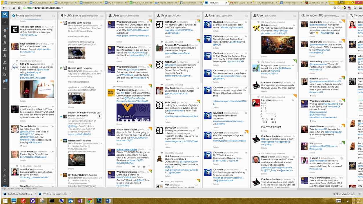
About a month ago, a student came into my office and called my attention to my computer monitor, with its dizzying array of eight data columns, each representing a different Twitter feed—3 personal, 3 for consulting work, and 2 for class. In any given moment, I had access to between 50 and 60 simultaneous tweets, each column updating in (near) real time. During the five minutes he spent in my office a cavalcade of Tweets streamed vertically down each column.

While I’ve always enjoyed Tweetdeck’s ability to collect and display such a sheer volume of information, I confessed, I’m becoming increasingly unsure my brain can handle the information.
Historically, access to information has always been limited by the speed of the dominant form of communication. Prior to the development of the telegraph system, messages could only travel as fast as the horses and riders could carry them— and even today, in a world of networked technologies, lack of access to information infrastructures has lead to situations in which some areas of the world have more access than others.
Fast-forwarding from the Pony Express days to our modern (hyper?)connected world, today’s technology user is able to transcend the limitations of space and time and dial up most any kernel of academic, business, or social knowledge with a few keystrokes, or even just a voice command, into a well-designed interface
This increased ease of information access has ushered in what many have dubbed the information economy: an economic (and cultural) marketplace marked by one’s ability to seek, locate, and use information to achieve a number of means. Such an economy is a boon for UX, as is suggests that information systems design, as it suggests that making information easy to assess makes that information more valuable. On the flip-side, facilitating access to information—such as my TweetDeck usage—might well introduce another unexpected consideration: can the human brain handle the multiplexity of this information?
In this article we’ll dig into information overload, how it happens, and how we as UX practitioners can provide our users with all the information we want, while avoiding the overload.
Information Economy = Information Overload
Many UX practitioners have noticed that their users don’t like to multitask, and tend to make assumptions. This is due to two things: the human brain’s limited processing capacity, and use of cognitive shortcuts, known as heuristics.
The human brain has a functionally limitless capacity for storage (some estimate as much as 2.5 petabytes of data, or three million hours of television), but our capacity to process simultaneous information is much lower. This is known as our “limited processing capacity” and it explains why we can’t actually multitask. Despite our individual claims as to how “really, really good we are at texting and driving,” research generally shows that our brains do not multitask but rather, they quickly switch from one task to the next. Simply put, while our computer operating systems can run several apps, tiles, or windows at once, we can only devote our cognitive resources to one of these at a time.

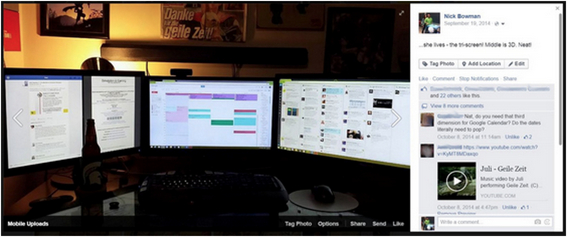
The author’s home office set up, along with accompanying commentary from his “friends.”
In addition, we tend to rely on shortcuts. Social psychologists Susan Fiske and Shelley Taylor wrote about these heuristics in 1984,arguing that humans are motivated to do less thinking whenever possible—we are cognitive misers. Heuristics allow us to process information quickly, rather than rationally. Although heuristics are largely responsible for social stereotypes, our reliance on heuristic over systematic processing frees up mental capacity for more important decisions. In fact, many of our heuristics are what cognitive psychologists Daniel Goldstein and Gerd Gigerenzer would call ecologically rational; that is, they give us more than enough information to make a useful decision for the given environment or problem.
For example, our research team has found that users rely on heuristics to navigate the app stores to choose a single-function app (such as a flashlight or dictionary app) from a market of hundreds of seemingly identical alternatives. Without heuristics, the user might waste hours deliberating between several apps that essentially do the same thing: turn on a light, or look up a word. We want to avoid this paradox of choice, where providing too much information around a trivial decision will hurt, rather than help our user to make a decision . For UX practitioners, we can identify the most useful heuristics, rather than cluttering the screen with as much information as possible. Put another way, users don’t need an abundance of information on-screen, but rather a few key points, aesthetically and elegantly framed.
More Information, More Interfaces, More Demanding
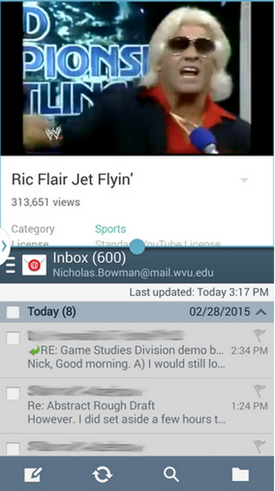
The app store isn’t the only place where users are drawn to multitasking. Computer science continually offers “solutions” for the bandwidth and device restrictions on information processing. My smartphone is able to process and display multiple operation windows at once, letting me, for example, refine my Ric Flair imitation before responding to my colleague’s emails.

Human restrictions to processing, on the other hand, are difficult to design around. Media psychologist Dr. Annie Lang of Indiana University proposes the limited capacity model of mediated message processing (L4CMP) to explain the mental encoding, storage, and retrieval processes involved in processing mediated information such as radio, television, film, and virtually any other information one receives from a screen. The L4CMP model essentially argues that information systems often fail for two fundamental reasons, both related to cognitive overload.
One is delivering information that requires more human/cognitive resources to process and store than the user has to offer (such as trying to have a conversation while driving, whether using a cell phone or in-person). The other is delivering information to a user who is not dedicating enough cognitive resources to the message at hand, i.e. “multi-tasking.” In both scenarios, a mismatch between the amount of information being delivered and the resources processing that information lead to a failure to communicate. Lang’s model also explains the struggle many organizations have to hold the user’s attention. Logging on to a major news web page, for example, might require textual channels (reading), audio and video channels (news footage), and social channels (discussion boards and social media feeds). Each channel provides a good deal of information on its own, but using several of them at once requires the allocation of potentially competing cognitive resources. When I try to watch Ric Flair on YouTube while also e-mailing my colleagues, I take in less of the video and also pay less attention to my e-mail.
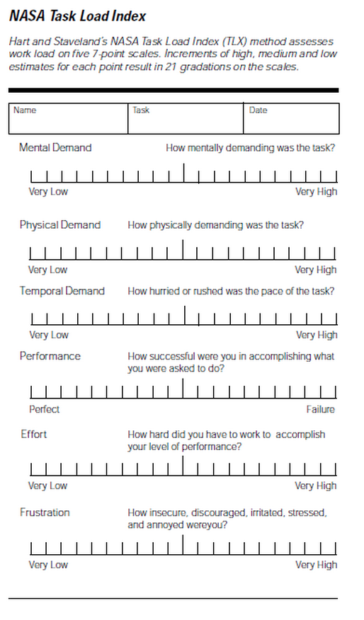
One way to understand how users are interfacing with and processing a given website or program might be to consider the site’s task load index. Sites with higher task load indices also have a more demanding interface, often the result of displaying too much content and taxing the user’s ability to process all of it. These overly demanding interfaces can diminish information recall, spark frustration, induce negative moods, and ultimately turn away users from the site. Understanding a site’s TLI can guide us in making design decisions to reduce a site’s mental or physical demand on the user.

Designing a Quality Cognitive Experience
While most us understand that user experiences need to be designed and programmed with bandwidth and computer processing limits in mind, we might not always consider that people have their own limits. When designing systems that are information-heavy:
- More information is not always more useful. Just as we generally embrace white space and other aesthetically pleasing minimalist designs for their visual simplicity, consider delivering the essential information without cluttering the user’s mind-space. We have a tendency to assume that when it comes to information processing, more information is always more useful. However, decision-making research shows us that not only can more information be more cognitively taxing, but it can also lead to suboptimal decisions.
- Consider ecological rationality. When designing systems, it can be helpful to understand the environment in which the information is being used. Consider a car’s dashboard— it might be nice to know the time of day and temperature outside, but rarely are these items placed in the driver’s line of sight; more essential and relevant information, such as speed, engine temperature, and fuel level, tends to occupy this space instead, as these are the primary bits of information that one likely relies on when driving. Knowing the environment with which a system is being used is helpful in identifying and maximizing the most useful heuristics.
- Use multiple channels with caution. Rapid advances in computing have allowed for advances in information delivery, with platforms normally typified by one sort of content shifting to integrate more types of content . Facebook, for example, moved from an initially textual platform, to pictorial, and now they intend to be nearly 100% video by 2020. Such shifts are integral to making information more accessible and more inclusive, but they bring with them a new host of cognitive taxes. We need to carefully weigh each new platform, test it, and consider not only what it can do, but what users will want via that specific channel.
An optimal system— at least from a human factors standpoint— is not necessarily one that delivers the most information, but rather one that delivers the most useful information in the most useful format. And as it happens, the most useful system isn’t the most comprehensive one, but the most rational for the given environment.
Ready to get your feet wet in Interaction Design? In this article we touch briefly on all aspects of Interaction Design: the deliverables, guiding principles, noted designers, their tools and more. Even if you're an interaction designer yourself, give the article a read and share your thoughts.